Managing sports and recreation activities involves tracking multiple factors—events, participants, revenue, costs, and satisfaction levels. Doing this manually can be time-consuming and error-prone. That’s where a Sports & Recreation Dashboard in Excel becomes a game-changer.
This dynamic and ready-to-use Excel template helps managers, event organizers, and sports facility administrators analyze data, visualize performance, and make informed decisions in real time. With multiple pages, charts, and visual indicators, it transforms raw data into actionable insights.
In this detailed guide, you’ll learn everything about the Sports & Recreation Dashboard in Excel—its structure, features, benefits, best practices, and more.
Click to Purchases Sports & Recreation Dashboard in Excel
What Is a Sports & Recreation Dashboard in Excel?
A Sports & Recreation Dashboard in Excel is a performance analysis tool that consolidates all essential metrics related to events, departments, venues, and participants into one interactive platform.
It allows you to monitor satisfaction ratings, profits, cost-to-revenue comparisons, and regional trends effortlessly. By leveraging Excel’s powerful formulas, pivot charts, and slicers, the dashboard offers a professional and visual way to manage your sports and recreation programs.
Whether you manage a local sports club, a recreation center, or a series of corporate events, this dashboard provides clarity and transparency into your operations.
Key Features of the Sports & Recreation Dashboard in Excel
The Sports & Recreation Dashboard comes with a well-organized layout consisting of five analytical pages and supporting sheets. Each section focuses on specific dimensions of performance—department, region, event type, and trends—making it a comprehensive solution for data-driven management.
Let’s explore its pages one by one.
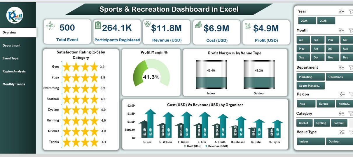
Overview Page – Your Command Center
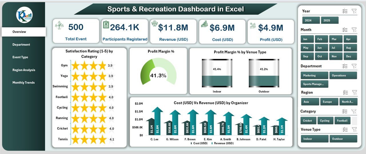
The Overview Page is the main dashboard interface. It provides a complete snapshot of organizational performance.
On the left side, you’ll find the page navigator, which allows users to jump between different analysis pages with a single click.
On the right side, slicers allow quick filtering based on time, category, or department.
At the top, five key performance cards display instant summaries such as:
✅ Total Events Conducted
✅ Average Profit Margin %
✅ Total Participants Registered
✅ Average Satisfaction Rating (1–5)
✅ Total Revenue (USD)
Below the KPI cards, you’ll find four insightful charts:
📈 Satisfaction Rating (1–5) by Category – Shows customer happiness across various categories.
💹 Profit Margin % – Helps monitor profitability trends.
🏟 Profit Margin % by Venue Type – Compares profitability across different venue types.
💰 Cost (USD) vs Revenue (USD) by Department – Reveals which departments are performing best financially.
This page gives a top-level performance summary that’s easy to interpret at a glance.
Department Analysis – Measure Team Performance
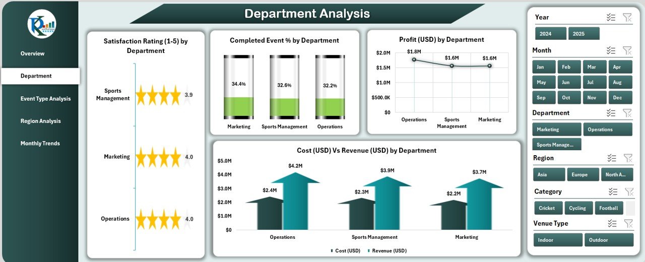
The Department Analysis Page focuses on evaluating how each department contributes to overall performance.
On the right, slicers allow users to view results by time period or department name.
The page includes four key charts:
⭐ Satisfaction Rating (1–5) by Department – Understand which departments deliver the best customer experience.
✅ Completed Event % by Department – Analyze the efficiency of event completion.
💵 Profit (USD) by Department – See which departments generate the most revenue.
💳 Cost (USD) vs Revenue (USD) by Department – Compare expenditures and income to identify cost control opportunities.
This page helps department heads evaluate their operational efficiency and financial performance, ensuring alignment with organizational goals.
Click to Purchases Sports & Recreation Dashboard in Excel
Event Type Analysis – Understand What Works Best
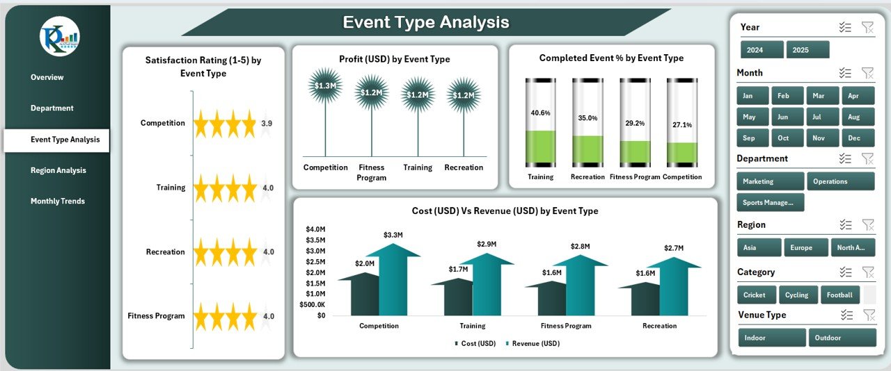
The Event Type Analysis Page allows you to compare performance across different event types, such as sports tournaments, recreation programs, or community events.
You can use slicers on the right to filter by event type, month, or year.
The visualizations include:
🥇 Satisfaction Rating (1–5) by Event Type – Know which events participants enjoy most.
📊 Completed Event % by Event Type – Identify consistency in event execution.
💰 Profit (USD) by Event Type – Highlight high-performing event categories.
💵 Cost (USD) vs Revenue (USD) by Event Type – Evaluate profitability and ROI for each event type.
By analyzing this page, managers can decide which event types should be prioritized or restructured for better outcomes.
Region Analysis – Track Performance Across Locations
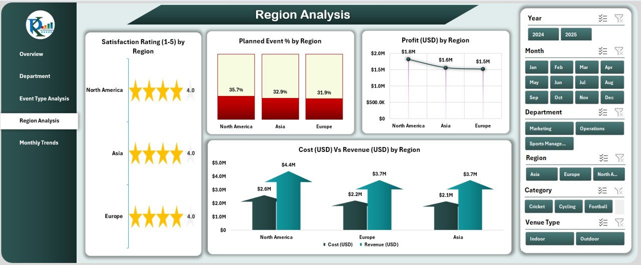
The Region Analysis Page visualizes performance by geographic region. This is especially useful for organizations managing multiple venues or operating across different cities or states.
You can use the region slicer on the right side to view performance for specific areas.
Key charts include:
🎯 Satisfaction Rating (1–5) by Region – Understand participant satisfaction in each region.
📅 Planned Event % by Region – Track how well each region executes planned activities.
💸 Profit (USD) by Region – Compare revenue performance geographically.
💼 Cost (USD) vs Revenue (USD) by Region – Highlight profitable and underperforming regions.
Regional insights make it easier to allocate resources, plan marketing campaigns, and forecast future performance.
Monthly Trends – Track Progress Over Time
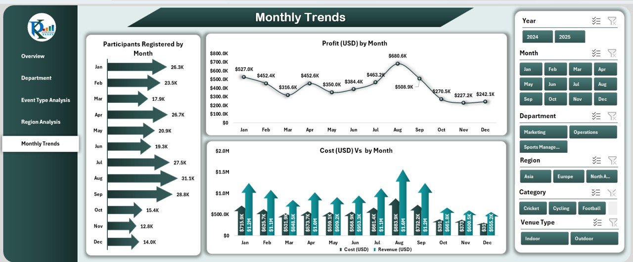
The Monthly Trends Page presents a time-based analysis that helps identify seasonal patterns and growth opportunities.
It includes three main charts:
📆 Profit (USD) by Month – See profitability changes throughout the year.
👥 Participants Registered by Month – Track engagement and participation over time.
💹 Cost (USD) vs Revenue (USD) by Month – Understand month-over-month financial performance.
This time-series view allows managers to spot trends, compare progress, and predict future outcomes based on past performance.
Support Sheets – The Backbone of the Dashboard
Every dashboard needs reliable data sources. The Support Sheets include:
-
Data Sheet – Stores all the raw data related to departments, events, costs, revenues, and satisfaction ratings.
-
Support Sheet – Contains reference data for slicers, dropdowns, and mapping categories.
Together, these sheets keep the dashboard dynamic and easy to update. Users can simply refresh or input new data, and all charts and KPIs update automatically.
Why Use Excel for a Sports & Recreation Dashboard?
Excel remains one of the most accessible, flexible, and powerful tools for data visualization and reporting. Here’s why this dashboard works so well in Excel:
🧮 No additional software required – Easy to use across devices.
🔄 Dynamic interactivity – Slicers, pivot tables, and charts enable real-time analysis.
📊 Visual storytelling – Built-in graphs and conditional formatting make insights clear.
💻 Customizable – Add or remove KPIs and adjust charts as per business needs.
🗂 Data-driven management – Enables better tracking, planning, and reporting.
Advantages of the Sports & Recreation Dashboard in Excel
Click to Purchases Sports & Recreation Dashboard in Excel
Let’s explore the key benefits of using this dashboard in daily operations.
1. Centralized Data View
It consolidates information from multiple departments and venues into a single view, reducing the need to manage multiple spreadsheets.
2. Improved Decision-Making
Interactive charts and real-time updates help managers make quick, data-backed decisions.
3. Enhanced Profitability Tracking
Users can monitor costs and revenues to identify high-margin events and minimize losses.
4. Performance Monitoring
KPIs related to satisfaction, participation, and event completion provide a holistic picture of performance.
5. Time Efficiency
The automated structure saves time spent on manual data entry and repetitive reporting tasks.
6. Visual Clarity
Charts, slicers, and color-coded visuals make complex data easy to understand, even for non-technical users.
How to Use the Sports & Recreation Dashboard in Excel
Getting started with this dashboard is simple. Follow these steps:
-
Input Your Data – Enter all event details, costs, revenue, and satisfaction data into the Data Sheet.
-
Refresh the Dashboard – Click the refresh button or refresh pivot tables to update all visuals.
-
Use Slicers to Filter – Navigate through months, departments, or event types using slicers.
-
Review the Overview Page – Check your top KPIs and summary charts for instant insights.
-
Drill Down Deeper – Explore the other pages (Department, Region, or Event Type) for more detailed analysis.
In just a few clicks, you’ll have a complete performance report ready for management review.
Insights You Can Gain from the Dashboard
This dashboard offers several actionable insights, such as:
-
Identifying which departments or events contribute most to profitability.
-
Understanding regional performance gaps.
-
Comparing satisfaction ratings to uncover areas for improvement.
-
Monitoring cost-to-revenue ratios for better budget management.
-
Tracking participant growth and engagement over time.
These insights help you optimize strategy, improve operations, and achieve higher participant satisfaction.
Best Practices for the Sports & Recreation Dashboard in Excel
To get the most out of your dashboard, follow these best practices:
✅ 1. Keep Data Clean and Consistent
Always use standardized entries for event types, departments, and regions to ensure accurate chart grouping.
✅ 2. Refresh Regularly
Update and refresh the dashboard whenever new data is added to keep reports current.
✅ 3. Use Filters Effectively
Utilize slicers to analyze specific time periods or segments for more focused insights.
✅ 4. Review KPIs Monthly
Regular monitoring ensures early detection of performance gaps and emerging opportunities.
✅ 5. Backup Your Data
Maintain version history or backups to avoid accidental data loss.
✅ 6. Visual Optimization
Avoid overloading charts; highlight only relevant metrics for clear storytelling.
✅ 7. Share with Stakeholders
Export the dashboard as a PDF or share via Excel Online to keep everyone aligned.
Following these best practices ensures your dashboard remains accurate, meaningful, and easy to interpret.
Who Can Benefit from This Dashboard?
This Excel template is suitable for a wide range of users, including:
🏀 Sports Clubs & Academies – To track event participation and performance.
🏋️ Recreation Centers – To manage programs, satisfaction, and profits.
💼 Corporate Event Teams – To evaluate ROI on sports and wellness programs.
🏫 Educational Institutions – To measure student participation and sports performance.
🏆 Municipal & Community Organizations – To oversee recreational event planning and public engagement.
Its flexibility allows customization to fit any organization that manages events, participants, and budgets.
Real-World Use Case Example
Imagine you’re managing multiple sports centers in different regions. Each center hosts monthly events—fitness programs, tournaments, and training sessions.
Using this Sports & Recreation Dashboard, you can instantly see:
-
Which regions generate the highest profit margins.
-
Which event types have the best satisfaction ratings.
-
Which departments consistently exceed targets.
-
Which months have peak participation.
This level of visibility helps in budget planning, resource allocation, and strategy improvement across your entire organization.
Tips to Customize the Dashboard
You can easily modify the dashboard to suit your organization’s needs:
-
Add new KPIs such as Net Promoter Score (NPS) or Utilization Rate.
-
Change color themes to match your branding.
-
Add new charts or cards for metrics like Total Events Planned vs Completed.
-
Integrate with Power BI for advanced analytics and automated data updates.
Excel’s flexibility means you can continue improving your dashboard as your organization grows.
Conclusion
The Sports & Recreation Dashboard in Excel is a powerful, user-friendly, and cost-effective tool for tracking event performance, satisfaction levels, and profitability.
With multiple analytical pages, slicers, and charts, it simplifies complex data into visually appealing insights. Whether you run local sports programs or manage large-scale recreation facilities, this dashboard ensures you stay on top of operations and performance metrics.
By using this template, you not only save time but also make smarter, data-driven decisions that drive growth and efficiency.
❓ Frequently Asked Questions (FAQs)
1. What is a Sports & Recreation Dashboard in Excel used for?
It’s used to track and analyze sports and recreation data such as events, participants, costs, revenue, and satisfaction levels in one visual report.
2. Can I customize this dashboard?
Yes, you can modify KPIs, charts, and visuals to match your organization’s goals or branding needs.
3. How do I update the dashboard data?
Simply enter or import new data into the Data Sheet and refresh all pivot tables or charts to reflect updated values.
4. Is Excel suitable for managing large datasets?
Yes, Excel can handle thousands of records efficiently. For very large datasets, you can connect Excel with Power BI or databases for scalability.
5. Who can benefit from this template?
Event managers, sports administrators, recreation centers, schools, and corporate teams can all benefit from this dashboard.
6. Do I need advanced Excel skills to use it?
Not at all! The dashboard is designed for easy use. Basic Excel knowledge is enough to navigate and interpret insights.
Visit our YouTube channel to learn step-by-step video tutorials