Startup ecosystems are growing rapidly across the world. Governments, incubators, venture capital firms, and innovation centers constantly invest in startup hubs to support entrepreneurs and accelerate innovation. However, managing a startup ecosystem requires continuous monitoring of performance indicators such as startup growth, funding progress, incubation success, and operational efficiency.
Many startup hubs still rely on scattered spreadsheets and manual reports to monitor these indicators. As a result, managers struggle to evaluate startup performance, track funding progress, or measure the success of incubation programs. Because of this lack of centralized analytics, decision-makers often miss valuable insights.
Therefore, startup accelerators, incubators, and innovation centers increasingly use data-driven dashboards to monitor performance. One powerful solution is the Startup Hubs KPI Dashboard in Power BI.
The Startup Hubs KPI Dashboard in Power BI is a ready-to-use analytics dashboard that helps startup ecosystem managers track critical key performance indicators (KPIs). Because the dashboard consolidates data into interactive reports, it allows stakeholders to monitor performance, analyze trends, and make data-driven decisions.
In this article, we will explore everything about the Startup Hubs KPI Dashboard in Power BI, including its features, benefits, working process, best practices, and frequently asked questions.
Click to Purchases Startup Hubs KPI Dashboard in Power BI
What is a Startup Hubs KPI Dashboard in Power BI?
A Startup Hubs KPI Dashboard in Power BI is an interactive business intelligence tool designed to monitor the performance of startup incubation centers, accelerators, and innovation hubs.
This dashboard collects and visualizes key startup metrics such as:
-
Number of active startups
-
Funding raised
-
Incubation success rate
-
Startup survival rate
-
Investor engagement
-
Program completion rates
Because the dashboard runs on Microsoft Power BI, users can analyze data through interactive charts, slicers, and KPI cards.
Moreover, the dashboard connects to Excel data sources, which makes it easy to update and maintain the data regularly.
As a result, startup hub managers can quickly identify growth opportunities, track performance trends, and improve ecosystem management.
Why Do Startup Hubs Need a KPI Dashboard?
Startup ecosystems involve multiple stakeholders such as entrepreneurs, investors, mentors, and incubators. Therefore, tracking performance manually becomes extremely difficult.
A KPI dashboard simplifies this process.
Startup hubs need a KPI dashboard because it helps them:
-
Monitor startup ecosystem performance
-
Track incubation program success
-
Measure startup funding growth
-
Identify operational inefficiencies
-
Improve decision-making
Furthermore, a centralized dashboard ensures that all stakeholders view consistent and updated data.
Because of these benefits, many innovation centers now adopt Power BI dashboards to monitor startup performance.
Key Features of the Startup Hubs KPI Dashboard in Power BI
The Startup Hubs KPI Dashboard in Power BI provides a structured and interactive reporting environment. The dashboard includes three main report pages, each designed to analyze specific performance metrics.
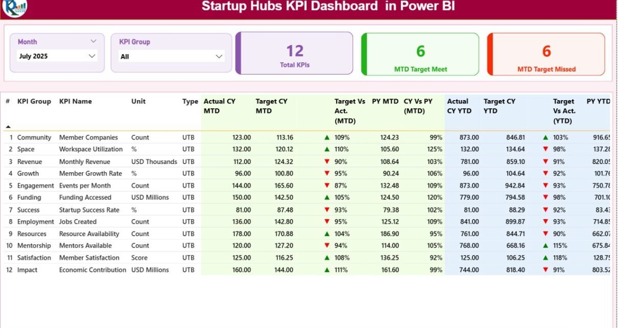
1. Summary Page – Central Performance Monitoring
The Summary Page acts as the main dashboard where users can view the overall performance of startup hubs.
At the top of the dashboard, users can select filters using:
-
Month slicer
-
KPI Group slicer
Because of these filters, users can easily analyze performance for a specific time period or KPI category.
Key KPI Cards on the Summary Page
The dashboard displays three important KPI cards:
-
Total KPIs Count
-
MTD Target Meet Count
-
MTD Target Missed Count
These cards immediately show whether startup hub performance meets defined targets.
Detailed KPI Table
Below the KPI cards, the dashboard displays a detailed KPI table that includes the following metrics.
KPI Number
This represents the sequence number of each KPI.
KPI Group
This defines the category or group of the KPI, such as:
-
Funding performance
-
Startup growth
-
Operational efficiency
KPI Name
This column shows the name of the KPI being tracked.
Unit
This indicates the measurement unit, such as:
-
Percentage
-
Number
-
Currency value
KPI Type
Each KPI includes a type indicator:
-
LTB (Lower the Better)
-
UTB (Upper the Better)
Because of this classification, the dashboard correctly interprets KPI performance.
Monthly Performance Metrics (MTD)
The dashboard tracks Month-To-Date (MTD) performance using several indicators.
Actual CY MTD
Represents the actual value of the KPI for the current month.
Target CY MTD
Shows the target KPI value for the current month.
MTD Icon
The dashboard displays visual indicators:
-
▲ Green arrow – Target achieved
-
▼ Red arrow – Target missed
Therefore, users can quickly identify KPI performance without analyzing numbers manually.
Target vs Actual (MTD)
This metric compares the actual value with the target value.
Formula used:
Actual Number / Target Number
This percentage indicates whether the KPI meets expectations.
PY MTD
Displays the previous year’s value for the same month.
CY vs PY (MTD)
This metric compares current month performance with the same month of the previous year.
Formula used:
Current Year MTD / Previous Year MTD
Because of this comparison, managers can easily evaluate growth trends.
Year-To-Date Performance Metrics (YTD)
In addition to monthly analysis, the dashboard also tracks Year-To-Date performance.
Actual CY YTD
Shows the current year’s accumulated actual value.
Target CY YTD
Displays the target KPI value for the current year.
YTD Icon
Visual indicators help users understand KPI performance quickly:
-
▲ Green – Target achieved
-
▼ Red – Target missed
Target vs Actual (YTD)
Formula used:
Actual YTD / Target YTD
PY YTD
Shows previous year’s YTD value.
CY vs PY (YTD)
Compares current year performance with previous year performance.
Because of this analysis, organizations can track long-term improvement trends.
2. KPI Trend Page – Performance Trend Analysis
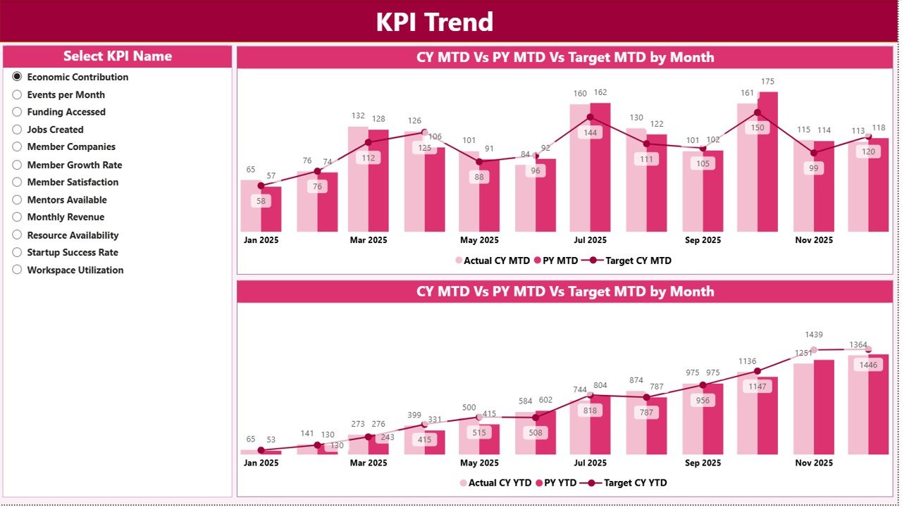
The KPI Trend Page helps users analyze KPI performance over time.
On this page, the dashboard displays two combo charts:
-
MTD performance comparison
-
YTD performance comparison
These charts compare:
-
Current year actual values
-
Previous year values
-
Target values
KPI Selection Slicer
The page also includes a KPI Name slicer on the left side.
Because of this slicer, users can select a specific KPI and view its trend analysis instantly.
Therefore, decision-makers can identify:
-
Performance improvements
-
Performance declines
-
Seasonal patterns
3. KPI Definition Page – KPI Documentation
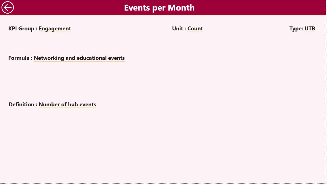
The KPI Definition Page serves as a documentation page for KPI details.
This page remains hidden and appears only when users drill through from the summary page.
The KPI Definition page displays:
-
KPI Number
-
KPI Group
-
KPI Name
-
KPI Unit
-
KPI Formula
-
KPI Definition
-
KPI Type (LTB or UTB)
Because this page provides detailed KPI documentation, it improves transparency and understanding of performance indicators.
Users can return to the main dashboard by clicking the Back Button located at the top-left corner.
Excel Data Source for the Dashboard
The Startup Hubs KPI Dashboard in Power BI uses an Excel file as the data source.
The Excel file contains three important worksheets.
1. Input_Actual Sheet
In this sheet, users enter the actual performance values for each KPI.
Required columns include:
-
KPI Name
-
Month (first date of the month)
-
MTD value
-
YTD value
Because of this structure, the dashboard automatically updates KPI calculations.
2. Input_Target Sheet
This sheet stores the target values for each KPI.
Users need to enter:
-
KPI Name
-
Month
-
Target MTD
-
Target YTD
These targets help the dashboard evaluate performance gaps.
3. KPI Definition Sheet
The KPI Definition sheet contains the metadata of each KPI.
Columns include:
-
KPI Number
-
KPI Group
-
KPI Name
-
Unit
-
Formula
-
Definition
-
Type (LTB or UTB)
Because of this configuration, the dashboard automatically links KPI calculations with their definitions.
Advantages of the Startup Hubs KPI Dashboard in Power BI
Using a KPI dashboard provides several benefits for startup ecosystem management.
1. Centralized Performance Monitoring
The dashboard consolidates all startup metrics in a single interface.
Therefore, managers can monitor ecosystem performance without switching between multiple reports.
2. Faster Decision-Making
Interactive visualizations help decision-makers quickly identify trends and issues.
Because insights appear instantly, managers can respond faster to changes.
3. Real-Time Data Analysis
Power BI allows frequent data refreshes.
As a result, users always analyze the latest startup ecosystem data.
4. Improved KPI Tracking
The dashboard tracks both MTD and YTD performance, which provides a comprehensive view of progress.
5. Better Strategic Planning
Trend analysis enables managers to identify growth opportunities.
Therefore, startup hubs can improve incubation programs and investment strategies.
Best Practices for the Startup Hubs KPI Dashboard
Organizations should follow several best practices when implementing a KPI dashboard.
1. Define Clear KPIs
Startup hubs must define meaningful KPIs such as:
-
Startup survival rate
-
Investment success rate
-
Incubation program completion rate
-
Funding raised
Clear KPIs improve decision-making.
2. Maintain Accurate Data
Always ensure that the Excel data source remains accurate and updated.
Because dashboards rely on data quality, inaccurate data leads to misleading insights.
3. Update Data Regularly
Organizations should update KPI data monthly or weekly.
Regular updates ensure that the dashboard reflects current performance.
4. Use Consistent KPI Definitions
Each KPI should have a clearly defined formula and definition.
Consistency prevents confusion among stakeholders.
5. Train Dashboard Users
Managers and analysts should understand how to use slicers, filters, and drill-through features.
Proper training improves dashboard adoption.
Click to Purchases Startup Hubs KPI Dashboard in Power BI
Who Can Benefit from the Startup Hubs KPI Dashboard?
Many organizations involved in startup ecosystems can benefit from this dashboard.
1. Startup Incubators
Incubators can monitor startup performance and program effectiveness.
2. Startup Accelerators
Accelerators can track funding progress and startup growth metrics.
3. Innovation Centers
Innovation hubs can analyze ecosystem development and collaboration outcomes.
4. Government Startup Programs
Government agencies can monitor national startup development programs.
5. Venture Capital Firms
VC firms can track startup performance and investment outcomes.
How Does the Dashboard Improve Startup Ecosystem Management?
Startup ecosystems involve many variables such as funding, mentorship, incubation, and market performance.
Because of this complexity, data-driven monitoring becomes essential.
The Startup Hubs KPI Dashboard in Power BI improves ecosystem management by:
-
Monitoring startup performance
-
Tracking funding progress
-
Measuring incubation success
-
Identifying performance gaps
-
Supporting data-driven decisions
Therefore, organizations can strengthen startup ecosystems and increase entrepreneurial success.
Conclusion
Startup ecosystems continue to grow rapidly, and managing them effectively requires reliable performance monitoring tools. Traditional reporting methods often fail to provide clear insights because they rely on scattered data and manual analysis.
The Startup Hubs KPI Dashboard in Power BI solves this problem by providing a centralized analytics platform for tracking startup ecosystem performance. The dashboard combines interactive visualizations, KPI comparisons, and trend analysis to deliver meaningful insights.
Because the dashboard connects to Excel data sources, organizations can easily update data and maintain the system. Furthermore, interactive features such as slicers, drill-through pages, and KPI indicators allow users to analyze performance quickly.
As a result, startup hubs, incubators, accelerators, and investors can make smarter decisions, improve program outcomes, and strengthen the startup ecosystem.
Frequently Asked Questions (FAQs)
What is a Startup Hubs KPI Dashboard?
A Startup Hubs KPI Dashboard is an analytics tool that tracks key performance indicators related to startup ecosystem performance, funding progress, and incubation success.
Why should startup hubs use Power BI dashboards?
Power BI dashboards provide interactive visualizations, real-time analytics, and centralized reporting. Therefore, startup hubs can monitor performance more efficiently.
What data does the Startup Hubs KPI Dashboard use?
The dashboard uses Excel data sources that include actual KPI values, target values, and KPI definitions.
What is the difference between MTD and YTD metrics?
MTD represents Month-To-Date performance, while YTD represents Year-To-Date performance.
Can the dashboard track multiple KPIs?
Yes. The dashboard can track multiple KPIs across different startup ecosystem categories such as funding, incubation, and startup growth.
Click to Purchases Startup Hubs KPI Dashboard in Power BI
Visit our YouTube channel to learn step-by-step video tutorials