Educational institutions across the world continuously expand international collaboration through student exchange programs. Universities, colleges, and academic organizations send students abroad while also welcoming international learners. However, managing multiple exchange programs, tracking costs, monitoring participation, and evaluating outcomes often becomes challenging when teams rely on scattered spreadsheets.
Therefore, institutions increasingly adopt structured dashboards that transform raw data into actionable insights. One of the most practical solutions is the Student Exchange Programs Dashboard in Excel.
In this comprehensive guide, you will learn what a Student Exchange Programs Dashboard in Excel is, why organizations need it, how it works, its features, advantages, best practices, and frequently asked questions. Additionally, this article explains how educational administrators can use Excel analytics to make smarter program decisions.
Click to Purchases Student Exchange Programs Dashboard in Excel
What Is a Student Exchange Programs Dashboard in Excel?
A Student Exchange Programs Dashboard in Excel is a ready-to-use analytical system designed to monitor, analyze, and manage exchange program performance using structured data and interactive visuals.
Instead of reviewing multiple reports manually, administrators can analyze program data from one centralized dashboard. Moreover, Excel automatically updates charts and KPIs when users change filters or update data.
This dashboard helps institutions monitor:
-
Student applications and approvals
-
Program costs and funding allocation
-
Scholarship distribution
-
Regional participation
-
Monthly program trends
-
Student satisfaction performance
As a result, decision-makers gain clear visibility into exchange program efficiency.
Why Do Educational Institutions Need a Student Exchange Dashboard?
Managing exchange programs involves coordination between departments, funding agencies, coordinators, and international partners. Without analytics, institutions struggle to evaluate performance.
However, a dashboard solves several challenges.
Common Problems Without a Dashboard
-
Data stored across multiple files
-
Difficulty tracking program costs
-
Limited visibility into funding sources
-
Slow reporting processes
-
Manual calculations causing errors
-
Lack of performance comparison
Therefore, institutions require a centralized analytics platform.
How Excel Dashboard Helps
-
Consolidates all program data
-
Automates analysis and reporting
-
Provides visual insights instantly
-
Improves planning and budgeting
-
Enhances transparency
Consequently, administrators spend less time preparing reports and more time improving programs.
Key Features of the Student Exchange Programs Dashboard in ExcelThink Tanks Dashboard in Excel
This ready-to-use Excel dashboard includes structured navigation and multiple analytical pages that simplify data exploration.
Page Navigator
Located on the left side, the Page Navigator enables users to switch easily between dashboard pages. Because of this feature, users access different analyses without searching through sheets manually.
How Many Pages Exist in the Dashboard?
The dashboard contains five analytical pages, each designed to answer specific management questions.
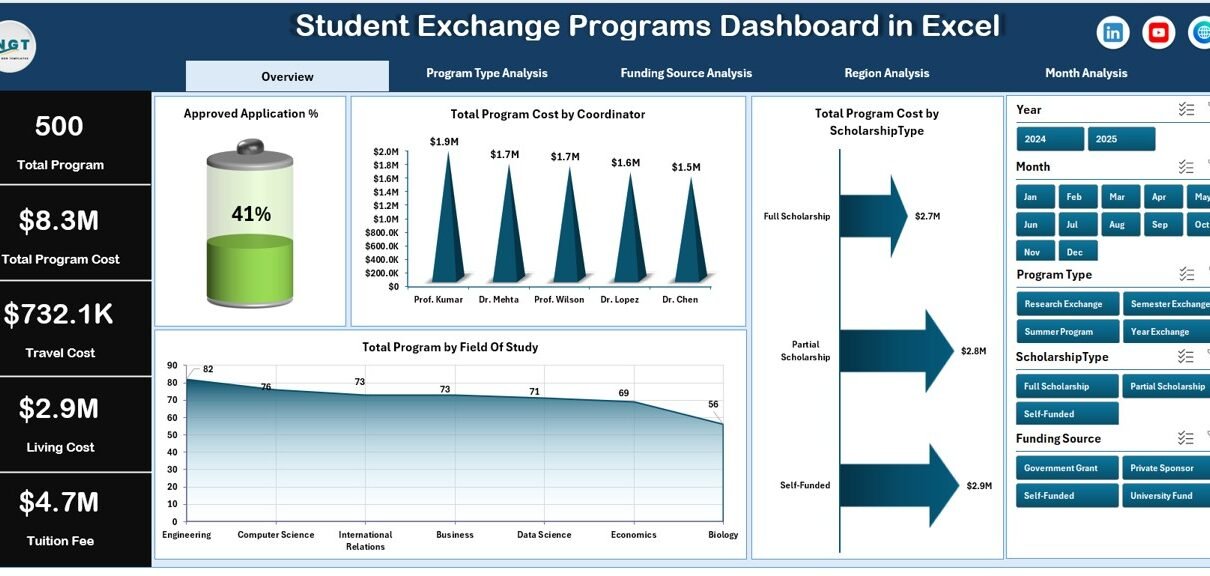
1. Overview Page – What Is Happening Overall?
The Overview Page acts as the main control center of the dashboard.
Key Elements
-
Right-side slicer (filter control)
-
Four KPI cards
-
Interactive charts
Charts Included
-
✅ Approved Application %
-
✅ Total Program Cost by Coordinator
-
✅ Total Program Cost by Scholarship Type
-
✅ Total Programs by Field of Study
What Insights Can Users Gain?
-
Approval rate trends
-
Coordinator performance comparison
-
Scholarship distribution analysis
-
Popular academic fields
Therefore, leadership teams quickly understand overall program performance.
2. Program Type Analysis – Which Programs Cost More?
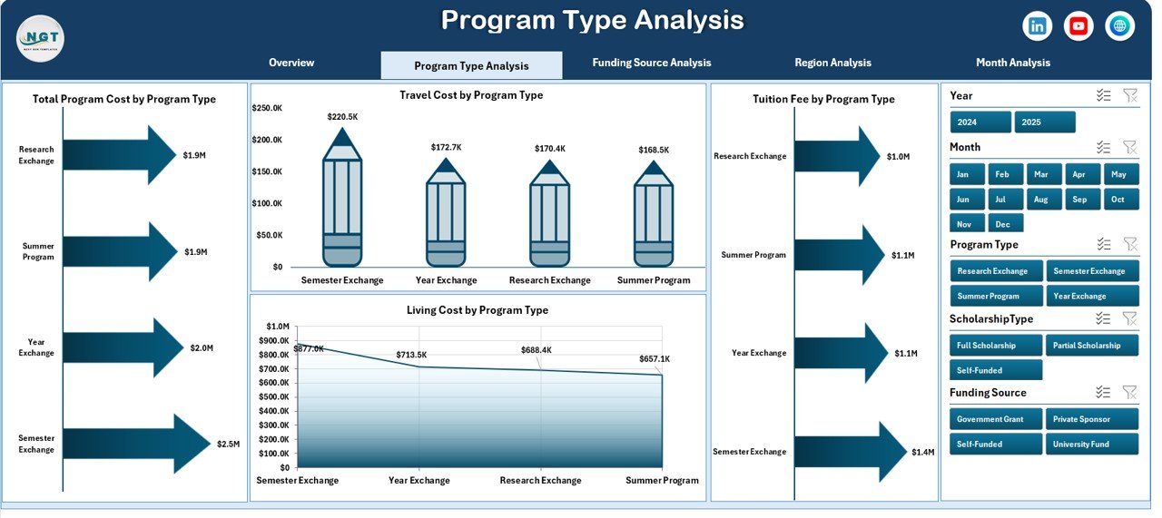
Different exchange programs involve varying expenses. Hence, analyzing program types becomes essential.
Dashboard Components
-
Right-side slicer for filtering
-
Four analytical charts
Charts Included
-
Total Program Cost by Program Type
-
Travel Cost by Program Type
-
Tuition Fee by Program Type
-
Living Cost by Program Type
Key Benefits
-
Compare program categories
-
Identify high-cost programs
-
Optimize budgeting decisions
-
Improve financial planning
As a result, institutions allocate resources more efficiently.
3. Funding Source Analysis – Where Does the Money Come From?
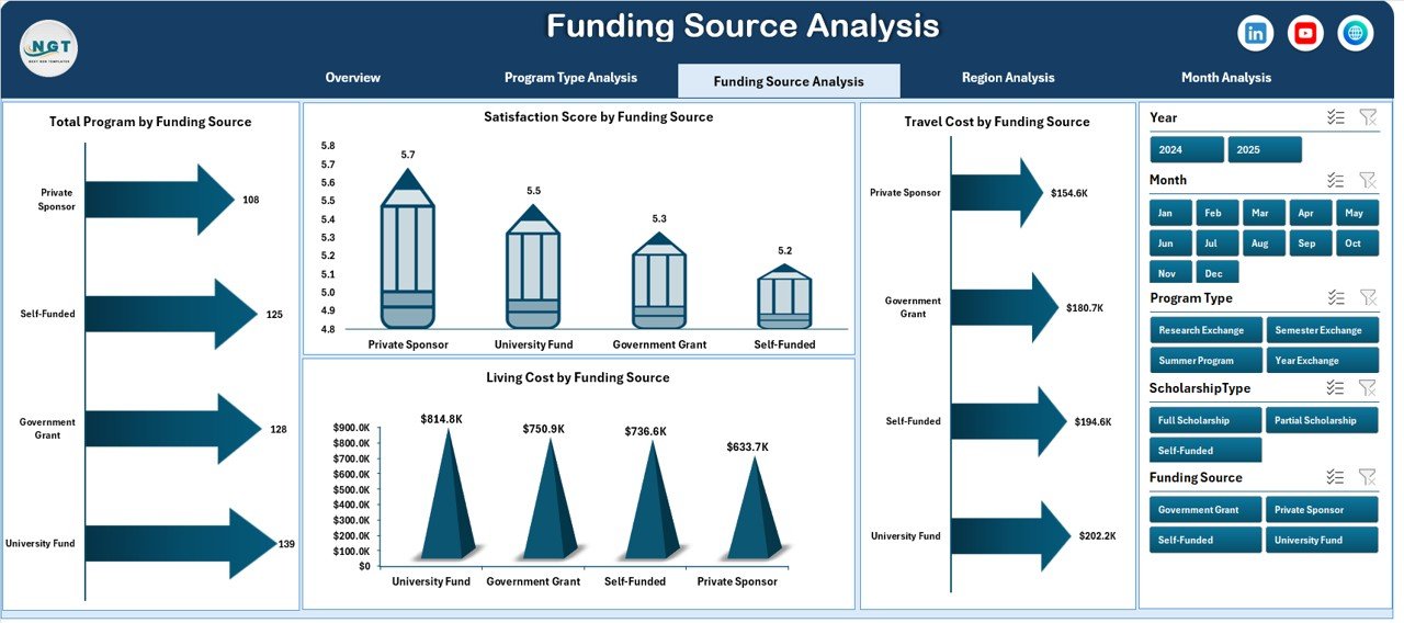
Funding plays a critical role in exchange program sustainability. Therefore, tracking funding sources helps institutions maintain financial balance.
Charts Included
-
Total Program Cost by Funding Source
-
Travel Cost by Funding Source
-
Satisfaction Score by Funding Source
-
Living Cost by Funding Source
Insights Generated
-
Most effective funding partners
-
Cost distribution by sponsor
-
Student satisfaction comparison
-
Funding impact evaluation
Consequently, administrators strengthen relationships with high-performing sponsors.
4. Region Analysis – Which Regions Perform Best?
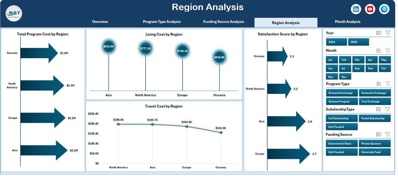
Exchange programs operate across multiple geographic regions. Hence, regional performance analysis becomes essential.
Charts Included
-
Total Program Cost by Region
-
Travel Cost by Region
-
Satisfaction Score by Region
-
Living Cost by Region
Analytical Advantages
-
Compare regional participation
-
Evaluate student satisfaction globally
-
Identify cost-heavy destinations
-
Support strategic expansion planning
Thus, institutions make location-based decisions backed by data.
Click to Purchases Student Exchange Programs Dashboard in Excel
5. Month Analysis – How Do Programs Change Over Time?
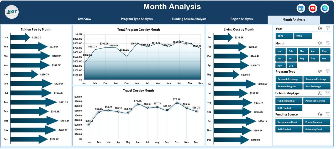
Seasonal trends influence exchange participation. Therefore, monthly analysis provides valuable planning insights.
Charts Included
-
Total Program Cost by Month
-
Travel Cost by Month
-
Tuition Fee by Month
-
Living Cost by Month
What Users Learn
-
Peak exchange months
-
Budget consumption trends
-
Seasonal cost variations
-
Planning timelines
As a result, universities schedule programs more effectively.
What Role Do the Data Sheet and Support Sheet Play?
Every dashboard relies on structured backend sheets.
Data Sheet
The Data Sheet stores all transactional records such as:
-
Student Name
-
Program Type
-
Coordinator
-
Funding Source
-
Region
-
Costs
-
Scholarship Type
-
Approval Status
-
Satisfaction Score
-
Program Dates
Because charts connect directly to this sheet, updates automatically refresh analytics.
Support Sheet
The Support Sheet manages:
-
Dropdown lists
-
Validation data
-
Helper calculations
-
Reference tables
Therefore, users experience smooth filtering and error-free data entry.
How Does the Dashboard Work Step by Step?
Understanding workflow helps institutions adopt dashboards faster.
-
Enter program data in the Data Sheet.
-
Use dropdown selections for accuracy.
-
Refresh Pivot Tables.
-
Apply slicers to filter analysis.
-
Review insights across pages.
Consequently, users generate reports within seconds.
Advantages of Student Exchange Programs Dashboard in Excel
Organizations gain significant operational benefits when they use structured dashboards.
✅ Improved Decision-Making
Administrators analyze real-time insights instead of guessing trends.
✅ Centralized Data Management
All program information stays in one secure file.
✅ Faster Reporting
Teams create reports instantly without manual calculations.
✅ Financial Transparency
Institutions monitor cost distribution clearly.
✅ Better Resource Allocation
Managers identify efficient programs quickly.
✅ Enhanced Collaboration
Departments share consistent data views.
✅ Easy Customization
Excel allows modifications without advanced technical skills.
Best Practices for the Student Exchange Programs Dashboard in Excel
Following best practices ensures long-term success.
1. Maintain Clean Data
Always use standardized formats and avoid blank records.
2. Use Data Validation
Dropdown lists reduce manual errors significantly.
3. Update Data Regularly
Frequent updates keep insights accurate.
4. Limit Manual Editing
Protect formula cells to avoid accidental changes.
5. Use Consistent Naming
Standard naming improves reporting clarity.
6. Monitor Key KPIs
Focus on approval rates, costs, and satisfaction metrics.
7. Backup Files Frequently
Maintain version control to protect data.
What KPIs Should Institutions Track?
Click to Purchases Student Exchange Programs Dashboard in Excel
A strong dashboard includes measurable KPIs.
Academic KPIs
-
Approved Application %
-
Program Participation Count
-
Field of Study Distribution
Financial KPIs
-
Total Program Cost
-
Travel Expense Ratio
-
Tuition Fee Analysis
Performance KPIs
-
Satisfaction Score
-
Coordinator Efficiency
-
Regional Performance Index
Tracking these indicators ensures program success.
How Can Universities Use Dashboard Insights Strategically?
Institutions can apply dashboard analytics in multiple ways.
-
Plan future exchange partnerships
-
Allocate scholarships effectively
-
Optimize travel budgets
-
Improve student experience
-
Identify underperforming programs
-
Support accreditation reporting
Consequently, analytics becomes a strategic asset rather than just reporting.
Common Mistakes to Avoid While Using Exchange Dashboards
Even powerful dashboards fail when users ignore best practices.
Avoid these mistakes:
-
Entering incomplete data
-
Ignoring slicer filters
-
Overloading charts
-
Not refreshing Pivot Tables
-
Using inconsistent cost categories
Therefore, proper usage ensures accurate insights.
Future Scope of Student Exchange Analytics
Education continues to become data-driven. Therefore, dashboards will evolve further.
Future enhancements may include:
-
Automated data imports
-
Cloud collaboration
-
Predictive analytics
-
AI-based trend forecasting
-
Real-time global monitoring
Hence, adopting dashboards today prepares institutions for future analytics.
Conclusion
Student exchange programs play a vital role in global education. However, managing multiple programs without structured analytics creates inefficiency and confusion. The Student Exchange Programs Dashboard in Excel provides a practical and powerful solution that transforms raw data into meaningful insights.
Because the dashboard centralizes information, automates analysis, and delivers visual clarity, institutions improve decision-making significantly. Moreover, administrators gain control over costs, funding sources, and program performance.
Ultimately, this dashboard helps universities build smarter, more efficient, and globally competitive exchange programs.
Frequently Asked Questions (FAQs)
1. What is a Student Exchange Programs Dashboard in Excel?
It is an Excel-based analytical tool that tracks exchange program performance, costs, approvals, and satisfaction using interactive charts and filters.
2. Who can use this dashboard?
Universities, colleges, educational consultants, international offices, and scholarship coordinators can use it effectively.
3. Do users need advanced Excel skills?
No. Basic Excel knowledge allows users to operate the dashboard easily.
4. Can institutions customize the dashboard?
Yes. Excel allows full customization of charts, KPIs, and layouts.
5. Does the dashboard update automatically?
Yes. Once users update the data sheet and refresh Pivot Tables, charts update instantly.
6. What type of data should users enter?
Users should enter student details, program type, region, funding source, cost breakdown, approval status, and satisfaction scores.
7. Why should institutions use Excel instead of other tools?
Excel provides affordability, flexibility, and ease of use without requiring specialized software.
8. Can this dashboard support future program expansion?
Yes. Users can add new data rows and categories without rebuilding the dashboard.
Visit our YouTube channel to learn step-by-step video tutorials