Subscription Business Dashboard in Power BI is a professionally designed, interactive analytics template built for subscription business owners, SaaS managers, revenue operations teams, and finance leaders who want to monitor revenue, customer retention, churn, satisfaction, and acquisition channels from a single dynamic interface. This template includes 5 interactive dashboard pages covering Overview, Plan Analysis, Revenue Insights, Customer Retention, and Acquisition Analysis — making it one of the most comprehensive subscription analytics solutions available in Power BI.
Whether you are tracking total revenue by region, analyzing churn rate by industry, measuring average satisfaction by plan type, or evaluating net revenue by acquisition channel, this dashboard gives you complete visibility into your subscription operations. Simply open the .pbix file in Power BI Desktop, replace the sample data with your own, and watch your entire dashboard update automatically.
Key Features of Subscription Business Dashboard in Power BI
This Subscription Business Dashboard in Power BI is packed with powerful features designed to give subscription businesses complete analytical control. The dashboard includes 5 interactive pages, 5 dynamic KPI cards, advanced slicers and filters, and detailed charts covering revenue, churn, retention, plan performance, and acquisition analysis. Every visual element is connected to the data model, so filtering one dimension automatically updates all related charts and cards across the dashboard.
The 5 KPI cards on the overview page display Total Support Cost, Total Subscriptions, Total Revenue, Net Revenue, and Cancelled Subscriptions at a glance. These metrics provide an instant health check of your subscription business. The advanced slicers allow you to filter by plan type, region, industry, billing cycle, and acquisition channel for targeted deep-dive analysis.
Dashboard Pages Explanation
1. Overview Page
The Overview page serves as the main landing page of the Subscription Business Dashboard in Power BI. At the top, you will find 5 high-level KPI cards showing Total Support Cost, Total Subscriptions, Total Revenue, Net Revenue, and Cancelled Subscriptions. Below the cards, interactive charts display Total Revenue by Plan Type, which helps you compare how different subscription plans contribute to overall revenue. The Churn Rate visualization shows the percentage of customers leaving your service, enabling quick identification of retention issues. Total Revenue by Region breaks down revenue geographically so you can spot high-performing and underperforming markets. Total Subscriptions by Month Name reveals monthly subscription trends and seasonality patterns. Multiple slicers are available to filter the entire dashboard instantly.
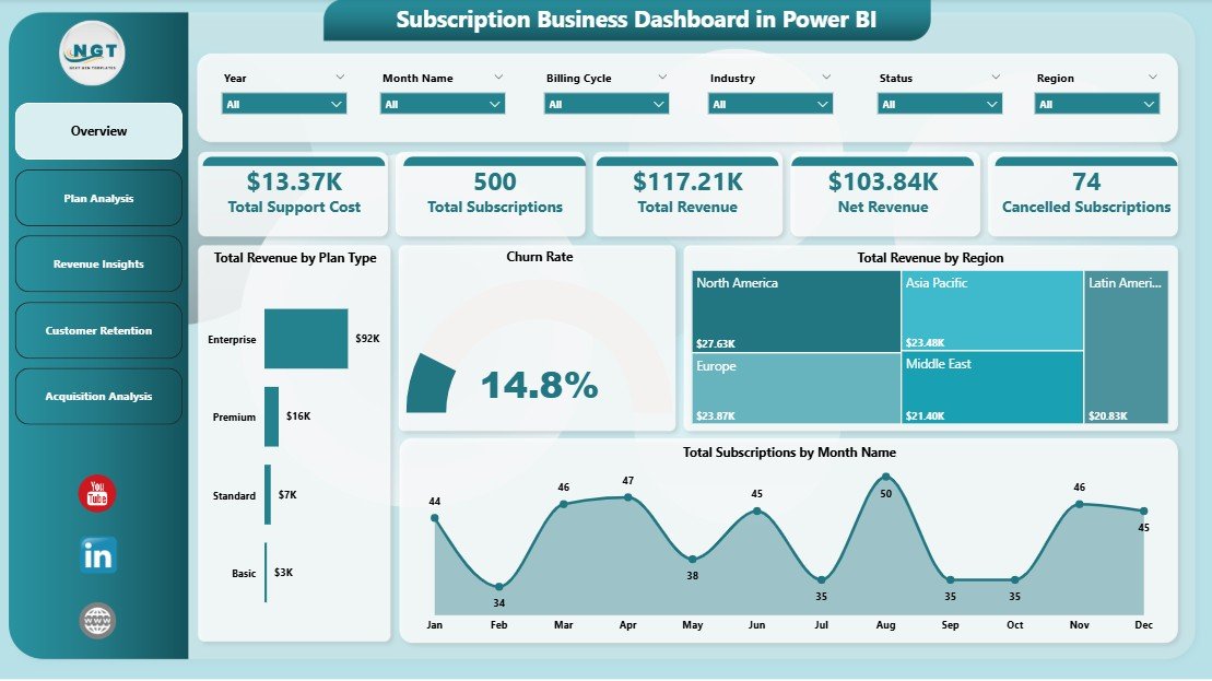
Subscription Business Dashboard in Power BI
2. Plan Analysis
The Plan Analysis page provides a deep dive into subscription plan performance. The Avg Satisfaction Score by Plan Type chart reveals which plans deliver the highest customer satisfaction, helping you identify your strongest offerings. Net Revenue by Region shows how net revenue distributes across different geographic markets after accounting for costs. Active Subscriptions by Plan Type displays the number of currently active subscribers on each plan, enabling you to understand adoption patterns and plan popularity across your customer base.
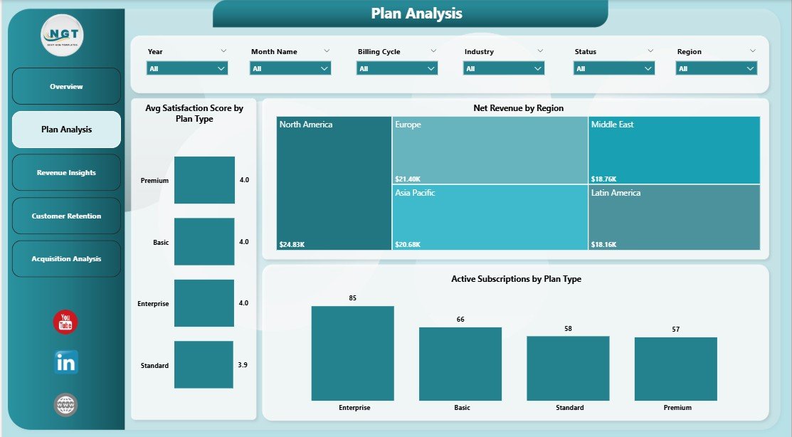
Plan Analysis
3. Revenue Insights
The Revenue Insights page offers comprehensive revenue analysis from multiple angles. Total Revenue by Industry breaks down your revenue across different industry verticals, helping you identify which sectors generate the most income. Total Support Cost by Region shows where your support expenses are highest, enabling cost optimization decisions. Total Revenue by Acquisition Channel reveals which marketing and sales channels drive the most revenue, so you can allocate budget more effectively and double down on high-performing channels.
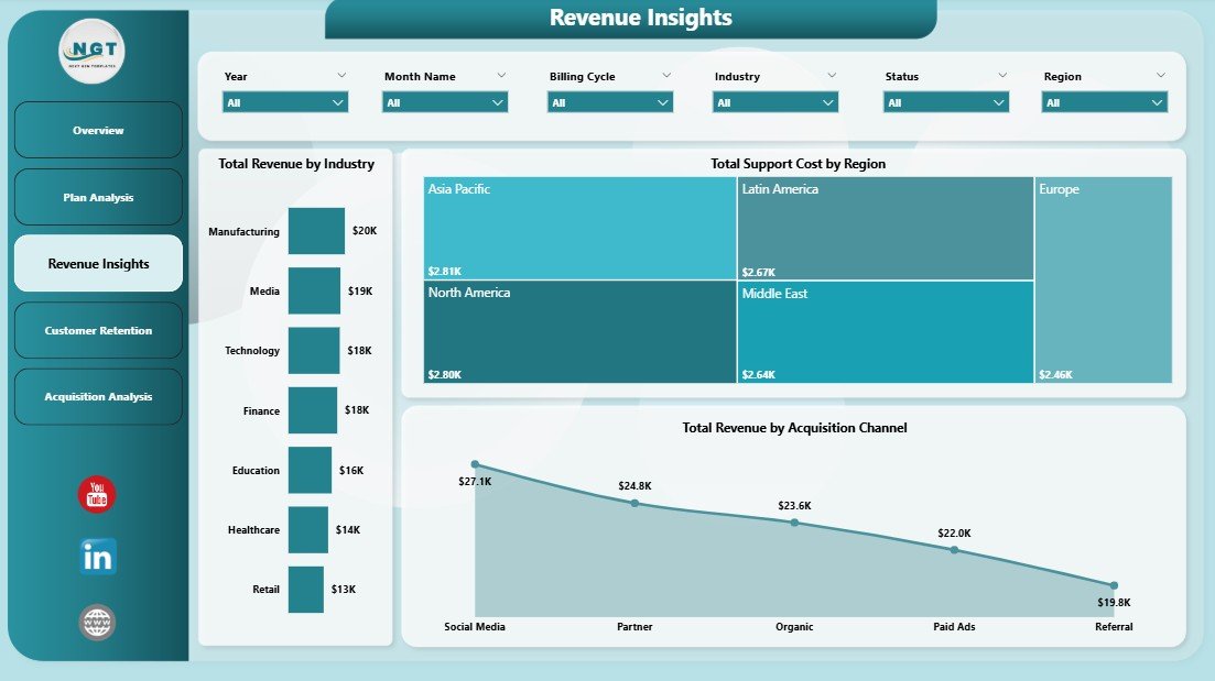
Revenue Insights
4. Customer Retention
The Customer Retention page is dedicated to understanding and combating customer attrition. Churn Rate by Industry reveals which industry segments experience the highest churn, allowing you to develop targeted retention strategies. Net Revenue by Acquisition Channel shows how much net revenue each acquisition source generates after factoring in support costs. Total Subscriptions by Renewal Status provides a clear breakdown of customers by their renewal disposition — active, pending, or churned — giving you visibility into the overall health of your subscriber base.
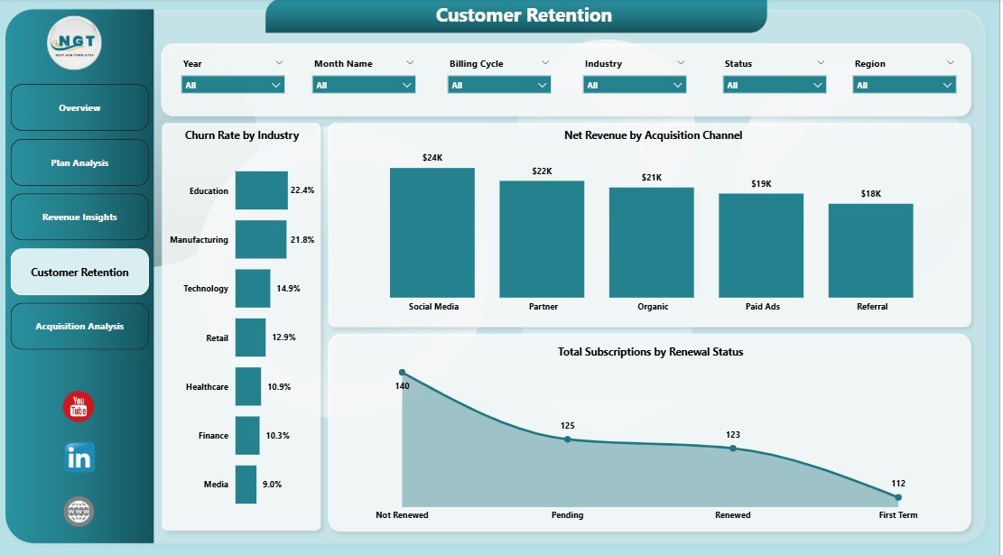
Customer Retention
5. Acquisition Analysis
The Acquisition Analysis page tracks how your business acquires and serves customers over time. Total Support Cost by Month Name reveals monthly support spending trends, helping you plan budgets and identify cost spikes. Total Subscriptions by Billing Cycle shows how customers distribute across monthly, quarterly, and annual billing options, which directly impacts your cash flow forecasting. Avg Satisfaction Score by Industry measures customer happiness across different sectors, enabling you to prioritize industries where satisfaction — and therefore retention potential — is highest.
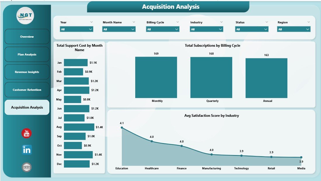
Acquisition Analysis
Advantages of Subscription Business Dashboard in Power BI
This dashboard offers several key advantages for subscription businesses. First, it consolidates all critical subscription metrics into a single interface, eliminating the need to switch between multiple reports or spreadsheets. Second, the interactive slicers and filters enable instant drill-down analysis without any technical expertise. Third, the 5-page structure ensures that every aspect of subscription management — from high-level KPIs to granular acquisition and retention details — is covered comprehensively.
Additionally, using Power BI as the platform means you can connect to live data sources, schedule automatic refreshes, and share dashboards with team members through the Power BI service. The template comes pre-loaded with sample data, so you can explore every feature before connecting your own data. This makes it an ideal starting point for organizations that want professional-grade analytics without months of development time.
Opportunities for Improvement
While this dashboard covers the essential subscription business metrics comprehensively, there are opportunities to extend its capabilities further. Adding cohort analysis would help track customer behavior over time by acquisition period. Integrating predictive churn scoring using Power BI’s AI capabilities could help identify at-risk customers before they leave. Expanding the dashboard with a financial forecasting page using DAX time intelligence functions would enhance planning capabilities. Finally, connecting directly to payment platforms like Stripe or Chargebee via Power BI connectors would enable real-time automated data ingestion.
Best Practices
To get the most out of your Subscription Business Dashboard in Power BI, follow these best practices. Update your data regularly — ideally weekly or monthly — to ensure all KPIs reflect current performance. Use the slicers strategically by filtering for specific regions, industries, or plan types when presenting insights to different stakeholders. Pay close attention to the Churn Rate and Customer Retention pages, as reducing churn by even a small percentage can significantly impact long-term revenue. Compare your Net Revenue across acquisition channels to optimize marketing spend and focus on the channels that deliver the highest return on investment.
Explore Relevant Templates
If you found this Subscription Business Dashboard in Power BI useful, check out these related templates from NextGenTemplates:
- Subscription Business Dashboard in Excel — Track the same subscription metrics with a pivot-powered Excel dashboard featuring 5 interactive pages, Data Sheet, and Support Sheet.
- SaaS Metrics Dashboard in HTML — Monitor MRR, ARR, NPS, CSAT, and churn risk in a browser-based interactive dashboard with zero installation.
- SaaS Metrics Dashboard in Excel — Track MRR, ARR, churn, retention, and expansion revenue with dynamic pivot-powered analytics in Excel.
- Subscription Box KPI Scorecard in Excel — Track and optimize subscription box KPIs with MTD and YTD performance analysis.
Browse all Power BI Dashboard Templates for more interactive analytics solutions.
Frequently Asked Questions
What KPIs does the Subscription Business Dashboard in Power BI track?
The Subscription Business Dashboard in Power BI tracks 5 key performance indicators including Total Support Cost, Total Subscriptions, Total Revenue, Net Revenue, and Cancelled Subscriptions. It also provides detailed analysis across churn rate, revenue by industry, acquisition channel performance, plan type comparisons, and satisfaction scores across 5 interactive dashboard pages.
Do I need advanced Power BI skills to use this template?
No. Simply open the .pbix file in Power BI Desktop, replace the sample data with your own subscription business data, and click Refresh. All charts, KPI cards, and visuals update automatically without any DAX editing or advanced technical knowledge.
Can I track customer churn and retention with this dashboard?
Yes. The dedicated Customer Retention page shows Churn Rate by Industry, Net Revenue by Acquisition Channel, and Total Subscriptions by Renewal Status. The Overview page also displays the overall Churn Rate for quick monitoring.
What is the best Power BI template for tracking subscription business metrics?
The Subscription Business Dashboard in Power BI is one of the best templates available because it includes revenue tracking, churn analysis, customer retention monitoring, plan performance comparison, and acquisition channel analysis across 5 interactive pages with dynamic filters and KPI cards.
Can I connect this dashboard to live data sources?
Yes. Power BI supports connections to databases, cloud services, APIs, and file-based data sources. You can replace the sample data with a live connection to your subscription platform and schedule automatic data refreshes through the Power BI service.
How many dashboard pages are included?
The template includes 5 fully designed interactive pages: Overview, Plan Analysis, Revenue Insights, Customer Retention, and Acquisition Analysis. Each page focuses on a different aspect of subscription business performance.
Conclusion
The Subscription Business Dashboard in Power BI is a comprehensive, ready-to-use analytics solution that empowers subscription businesses to monitor revenue, track churn, analyze customer retention, evaluate plan performance, and optimize acquisition channels — all from a single interactive interface. With 5 dashboard pages, 5 KPI cards, advanced slicers, and professional visualizations, this template transforms raw subscription data into actionable insights that drive smarter business decisions.
Click here to Purchase Subscription Business Dashboard in Power BI
Visit our YouTube channel for step-by-step video tutorials: Youtube.com/@PK-AnExcelExpert