In today’s competitive subscription economy, retaining customers is far more valuable than constantly acquiring new ones. Every renewal counts, and every churned subscriber represents lost recurring revenue.
That’s why tracking subscription performance through an insightful analytics tool is crucial.
The Subscription Retention KPI Dashboard in Power BI is a powerful solution that allows organizations to monitor key performance indicators (KPIs) for customer retention, renewal rates, churn, and overall subscription health—all in real time.
Let’s explore how this ready-to-use Power BI dashboard works, what makes it so effective, and how businesses can apply it to improve retention and revenue sustainability.
Click to Purchases Subscription Retention KPI Dashboard in Power BI
What Is a Subscription Retention KPI Dashboard in Power BI?
A Subscription Retention KPI Dashboard is a centralized reporting tool that visualizes how effectively your business retains existing subscribers over a specific period.
When created in Power BI, it becomes an interactive and dynamic system that pulls real-time data from Excel or other sources, allowing managers to evaluate retention performance instantly.
This dashboard consolidates essential metrics like renewal rates, churn percentages, monthly recurring revenue (MRR), lifetime value (LTV), and customer engagement data.
Instead of juggling multiple spreadsheets or manual reports, Power BI transforms raw data into meaningful insights using visuals, slicers, and drill-through pages.
Why Subscription Retention Matters
Subscription-based models rely heavily on consistency. Unlike one-time purchases, the true value of a subscriber unfolds over time.
When retention improves, it reduces the cost of acquisition, stabilizes cash flow, and boosts profitability.
Here’s why retention is critical:
-
🔁 Predictable Revenue: Higher retention ensures steady recurring income.
-
💰 Better ROI: It’s cheaper to retain existing customers than acquire new ones.
-
🌟 Customer Loyalty: Loyal customers promote your brand through referrals and reviews.
-
📊 Operational Efficiency: Stable customer bases allow better forecasting and planning.
Monitoring these metrics through a dashboard helps organizations act fast—identifying issues before they escalate into large-scale churn problems.
Key Features of the Subscription Retention KPI Dashboard in Power BI
This Power BI dashboard is designed with simplicity and functionality in mind. It contains three interactive pages, each serving a specific analytical purpose.
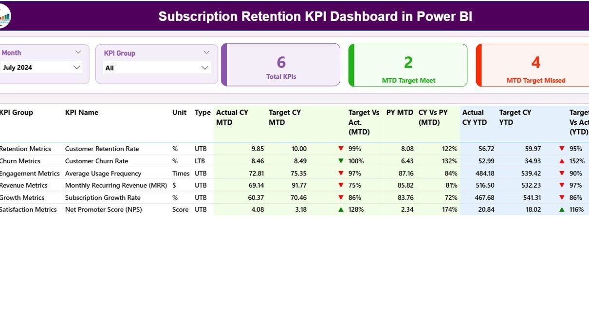
1️⃣ Summary Page — Your Retention Command Center
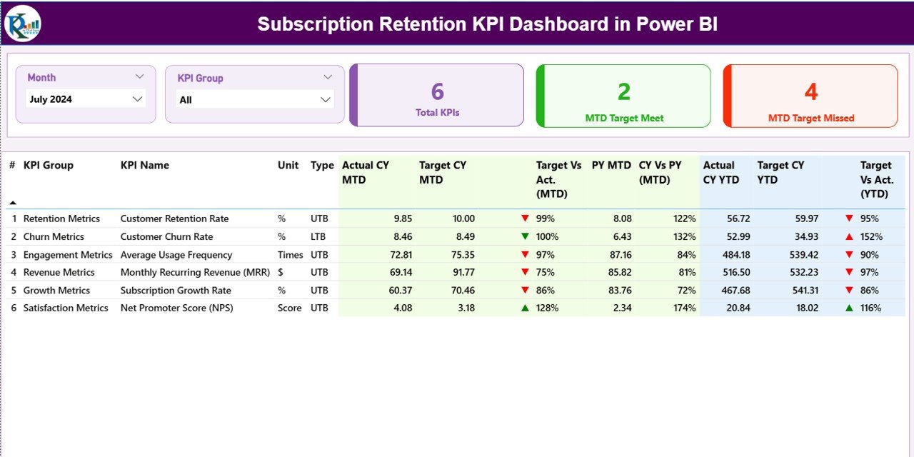
The Summary Page is the primary interface where you can view all KPI performances at a glance.
At the top, the dashboard displays Month and KPI Group slicers that let users filter data dynamically.
Below the slicers, you’ll find three key cards showing:
-
Total KPI Count
-
MTD (Month-to-Date) Target Met
-
MTD Target Missed
These cards give a quick snapshot of performance consistency and goal achievement.
Detailed KPI Table
The table below provides comprehensive information on every KPI:
-
KPI Number: Unique identification number for each KPI.
-
KPI Group: The classification or business area (e.g., Customer Experience, Finance, Marketing).
-
KPI Name: The specific performance indicator.
-
Unit: Measurement unit (e.g., %, $, count).
-
Type: Whether the KPI is Upper-the-Better (UTB) or Lower-the-Better (LTB).
-
Actual CY MTD: Actual performance for the current month.
-
Target CY MTD: Monthly target.
-
MTD Icon: Visual indicator—green ▲ for achievement, red ▼ for shortfall.
-
Target vs. Actual (MTD): Ratio of actual to target in %.
-
PY MTD: Previous year’s MTD data for comparison.
-
CY vs. PY (MTD): Percentage comparison between current and last year’s monthly values.
-
Actual CY YTD: Year-to-Date actual values.
-
Target CY YTD: YTD targets.
-
YTD Icon: Visual indicator for YTD status.
-
Target vs. Actual (YTD): YTD performance ratio in %.
-
PY YTD: YTD figures from the previous year.
-
CY vs. PY (YTD): Year-over-year comparison of YTD values.
This layout gives users a full 360-degree view of how retention KPIs evolve over time.
Click to Purchases Subscription Retention KPI Dashboard in Power BI
2️⃣ KPI Trend Page — Visualize Retention Dynamics
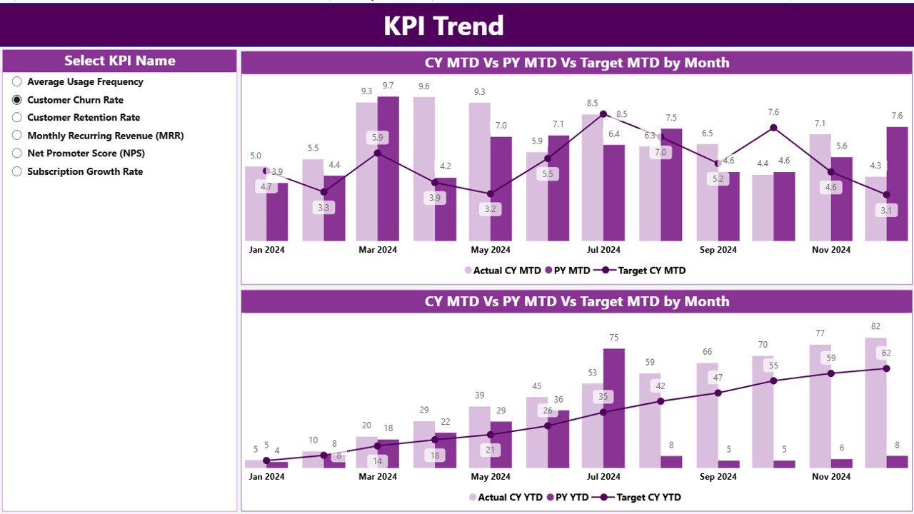
The KPI Trend Page focuses on patterns and performance evolution.
Here, users can explore two combo charts that show Actual vs. Target comparisons for both MTD and YTD metrics.
A slicer on the left allows selecting specific KPI names—such as Customer Renewal Rate or Churn %—to instantly view their trendlines across months.
This visual storytelling helps managers identify whether performance is improving, stagnant, or declining.
3️⃣ KPI Definition Page — The Reference Hub
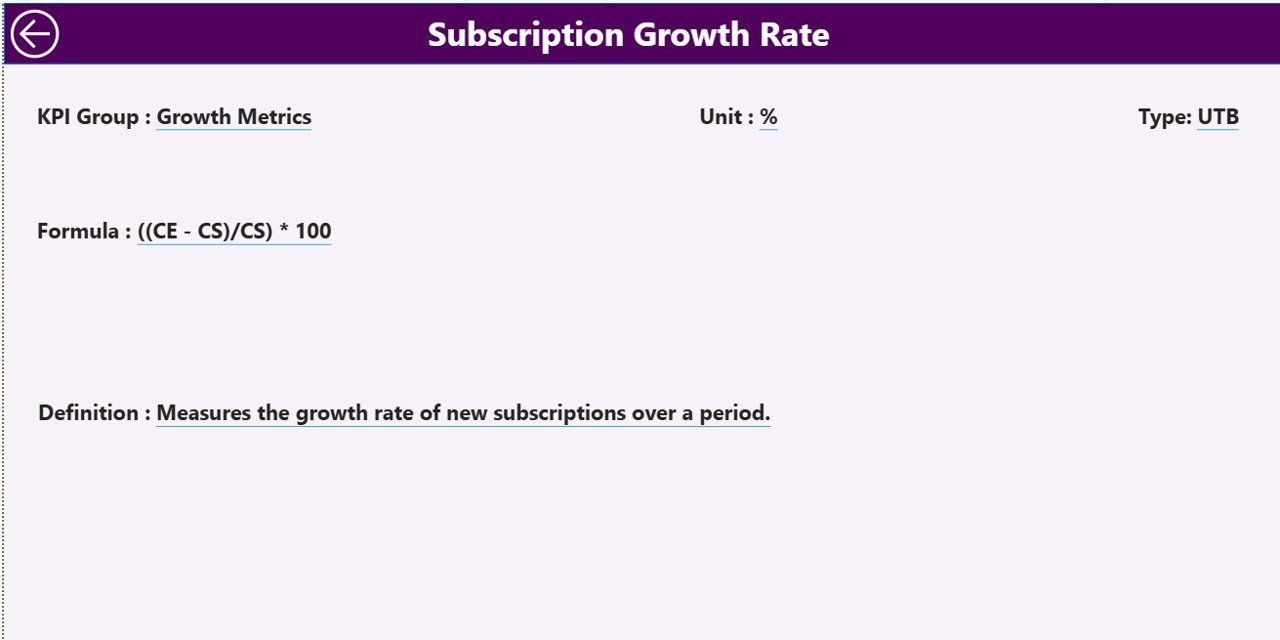
This is a hidden drill-through page where users can view additional details for any KPI.
By right-clicking on a KPI from the summary page and selecting Drill Through, the dashboard reveals information like:
-
KPI Formula
-
KPI Definition
-
Unit
-
Performance Type (UTB/LTB)
It serves as a quick reference for understanding how each KPI is calculated, ensuring data transparency across departments.
A Back button at the top-left corner navigates users back to the main summary page effortlessly.
Excel Data Integration — The Data Backbone
The dashboard pulls data from an Excel file consisting of three key worksheets.
Each sheet plays a vital role in maintaining accuracy and clarity:
1️⃣ Input_Actual Sheet:
Enter actual numbers for each KPI by month.
Columns include KPI Name, Month (first date of each month), MTD, and YTD values.
2️⃣ Input_Target Sheet:
Fill in target values for the same KPIs using the same structure—Month, MTD, and YTD.
3️⃣ KPI Definition Sheet:
List all KPI Numbers, Groups, Names, Units, Formulas, Definitions, and Types (LTB or UTB).
This structured data input ensures smooth refreshes in Power BI, enabling seamless updates whenever new data is added.
How Businesses Can Use the Subscription Retention Dashboard
Organizations across industries—SaaS, media, telecommunications, insurance, and more—can leverage this dashboard to:
-
Track Monthly and Yearly Retention Trends:
Analyze churn, renewal, and reactivation rates. -
Identify High-Risk Customers:
Spot early signs of disengagement and take preventive actions. -
Measure Campaign Impact:
Evaluate how retention programs, loyalty campaigns, or pricing changes affect customer stability. -
Compare Performance Over Time:
Measure progress using MTD, YTD, and year-over-year comparisons. -
Enable Data-Driven Decisions:
Power BI visuals empower leaders with interactive insights rather than static spreadsheets.
Advantages of the Subscription Retention KPI Dashboard in Power BI
Using this dashboard offers multiple benefits beyond simple reporting. Let’s explore the major advantages:
1️⃣ Centralized Visibility
All retention metrics appear in one place, eliminating fragmented data sources.
Teams can collaborate easily without switching between multiple tools.
2️⃣ Real-Time Monitoring
Instant data refreshes allow managers to act quickly.
Power BI connects directly to Excel or cloud data, ensuring up-to-date insights.
3️⃣ Visual Clarity
The dashboard converts raw data into charts, trendlines, and colored indicators that simplify complex metrics.
4️⃣ Performance Benchmarking
It helps benchmark current performance against targets, previous months, or even prior years.
5️⃣ Actionable Insights
By identifying low-performing areas, businesses can implement corrective actions immediately.
6️⃣ Time and Cost Efficiency
Automated reporting replaces manual effort, saving hours of repetitive work every month.
Opportunities for Improvement
Even with its robust design, the dashboard can evolve further.
Here are some ways to enhance its effectiveness:
-
📈 Integrate Predictive Analytics:
Add Power BI’s forecasting features to predict future churn or renewal rates. -
☁️ Connect to Cloud Data Sources:
Link CRM or billing systems for real-time updates beyond Excel. -
🎯 Add Segmentation:
Segment KPIs by region, customer tier, or subscription type to uncover deeper insights. -
🔔 Automated Alerts:
Create Power BI alerts to notify stakeholders when KPIs fall below threshold levels. -
💬 Embed Feedback Loops:
Collect qualitative feedback directly within the dashboard to understand churn reasons.
Best Practices for Using the Subscription Retention KPI Dashboard
Click to Purchases Subscription Retention KPI Dashboard in Power BI
To extract maximum value, follow these actionable best practices:
1️⃣ Define Clear KPI Targets:
Align retention goals with business objectives before tracking.
2️⃣ Update Data Regularly:
Keep the Excel sheets refreshed monthly to ensure accurate results.
3️⃣ Use Slicers Strategically:
Filter by month, KPI group, or business area to uncover specific patterns.
4️⃣ Interpret Trends, Not Just Numbers:
Look for long-term movement rather than one-off spikes.
5️⃣ Promote Department Collaboration:
Encourage marketing, finance, and operations teams to use the same dashboard for shared insights.
6️⃣ Review Drill-Through Pages Frequently:
Verify KPI formulas and definitions for consistency and data integrity.
7️⃣ Combine with Customer Feedback Data:
Enhance numerical insights with qualitative satisfaction metrics.
8️⃣ Visualize MTD and YTD Comparisons:
Always review both short-term and long-term performance together for balanced decision-making.
Conclusion
Customer retention is not just a metric—it’s the foundation of every successful subscription-based business.
With the Subscription Retention KPI Dashboard in Power BI, organizations gain a clear, visual, and interactive way to monitor retention, reduce churn, and improve customer lifetime value.
By connecting structured Excel data, leveraging trend analysis, and visualizing KPI health, decision-makers can move from reactive to proactive management.
This dashboard transforms raw data into actionable insights that directly enhance profitability and customer satisfaction.
Frequently Asked Questions (FAQs)
1️⃣ What is a Subscription Retention KPI Dashboard?
It is a Power BI dashboard that tracks key metrics like churn rate, renewal percentage, and customer lifetime value to help businesses improve subscription retention.
2️⃣ How is the data for this dashboard maintained?
The data is sourced from an Excel file with three sheets—Actual, Target, and KPI Definition. Updating these sheets automatically refreshes the dashboard visuals.
3️⃣ Can I customize KPIs according to my business model?
Yes. You can modify KPI names, formulas, or targets in the Excel source file, and Power BI will automatically reflect those changes after refresh.
4️⃣ How does Power BI improve retention analysis?
Power BI provides real-time visualization, easy filtering, and historical comparisons that help identify trends, gaps, and growth opportunities instantly.
5️⃣ What industries benefit most from this dashboard?
Any subscription-based business, such as SaaS, telecom, media streaming, education platforms, or membership services, can gain valuable insights from this dashboard.
6️⃣ Is it beginner-friendly?
Absolutely. The dashboard comes pre-built with slicers, drill-throughs, and visual icons, making it ideal even for non-technical users.
7️⃣ How often should I update my data?
For accurate reporting, update MTD and YTD values at least once a month, ideally at the month’s close.
8️⃣ Can this dashboard connect to CRM tools like HubSpot or Salesforce?
Yes. Power BI can connect to most CRM tools directly or via APIs, enabling automated and real-time data updates.
Visit our YouTube channel to learn step-by-step video tutorials