Managing a supply chain has always been a complex task. From tracking suppliers and products to monitoring urgent orders and high-value transactions, the need for a clear, visual, and data-driven system has never been more important. This is where a Supply Chain Dashboard in Power BI steps in to simplify decision-making, reduce operational delays, and improve procurement strategies.
In this comprehensive article, you’ll discover how a Power BI-based supply chain dashboard transforms raw data into actionable insights, how each component works, and why your business can’t afford to ignore it.
Click to Purchases Supply Chain Dashboard in Power BI
What is a Supply Chain Dashboard in Power BI?
A Supply Chain Dashboard in Power BI is a visual reporting tool built using Microsoft’s powerful data visualization platform, Power BI. It connects with data sources like Excel, SQL, or ERP systems and displays real-time metrics related to supply chain performance. This dashboard helps stakeholders monitor critical KPIs such as order volumes, supplier efficiency, cost trends, and geographical performance—all through interactive charts, slicers, and cards.
Instead of relying on scattered spreadsheets or outdated reports, businesses can now get a real-time 360° view of their supply chain.
Key Features of the Supply Chain Dashboard in Power BI
This ready-to-use dashboard contains five interactive pages, each designed to focus on a specific aspect of the supply chain. Let’s explore each one:
Overview Page – Your Command Center
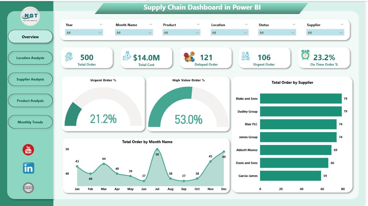
This is the main page of the dashboard and provides a high-level snapshot of your supply chain health. On this page, you’ll find:
-
Six slicers to filter data by criteria such as date, supplier, location, product category, and more.
Five KPI cards showcasing key metrics like:
- Urgent Orders (%)
- High-Value Orders (%)
- Total Orders
- Total Suppliers
- Total Products
Four charts that offer deep insights:
- 📊 Urgent Order Percentage
- 💰 High-Value Order Percentage
- 📦 Total Orders by Supplier
- 🗓️ Total Orders by Month
This page answers the big question: How is the supply chain performing overall?
Click to Purchases Supply Chain Dashboard in Power BI
Location Analysis – Understand Regional Trends
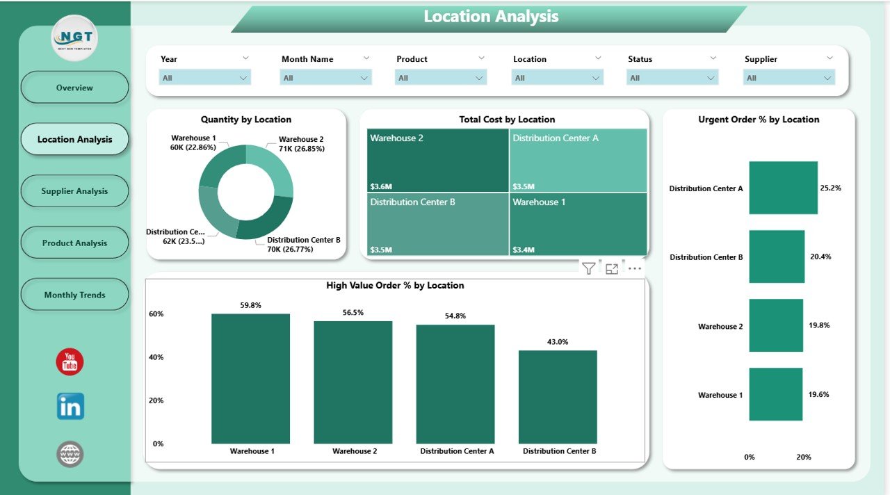
The Location Analysis Page breaks down performance by geographic areas or distribution centers. With six slicers for dynamic filtering, the visuals include:
-
🌍 Quantity by Location
-
💸 Total Cost by Location
-
🚨 Urgent Order % by Location
-
💎 High-Value Order % by Location
This page helps managers identify which locations are efficient, which are lagging, and where urgent or costly orders are concentrated.
Supplier Analysis – Evaluate Vendor Efficiency
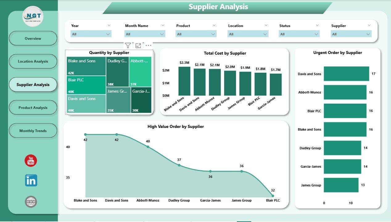
In this section, you can analyze the contribution and reliability of suppliers. Again, six slicers offer easy filtering, and the page includes:
-
📦 Total Quantity by Supplier
-
💰 Total Cost by Supplier
-
🚨 Urgent Orders by Supplier
-
💎 High-Value Orders by Supplier
Use this view to optimize procurement decisions, flag underperforming vendors, and prioritize high-value relationships.
Product Analysis – Dive into SKU-Level Insights
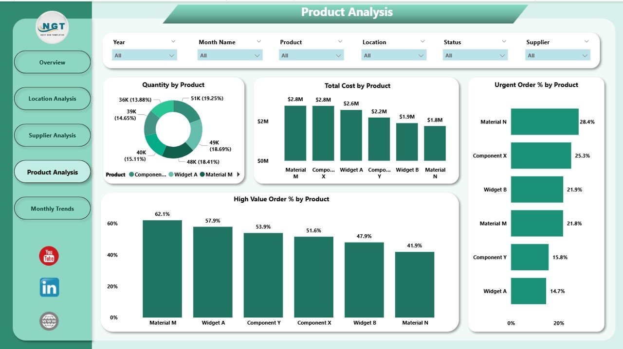
This dashboard page focuses on individual products or SKUs. It reveals which items drive cost, volume, or urgency. The visuals include:
-
📦 Quantity by Product
-
💰 Total Cost by Product
-
🚨 Urgent Order % by Product
-
💎 High-Value Order % by Product
This is essential for inventory planning and pricing strategies. You can easily identify which products contribute most to urgency or spend.
Monthly Trends – Analyze Time-Based Patterns
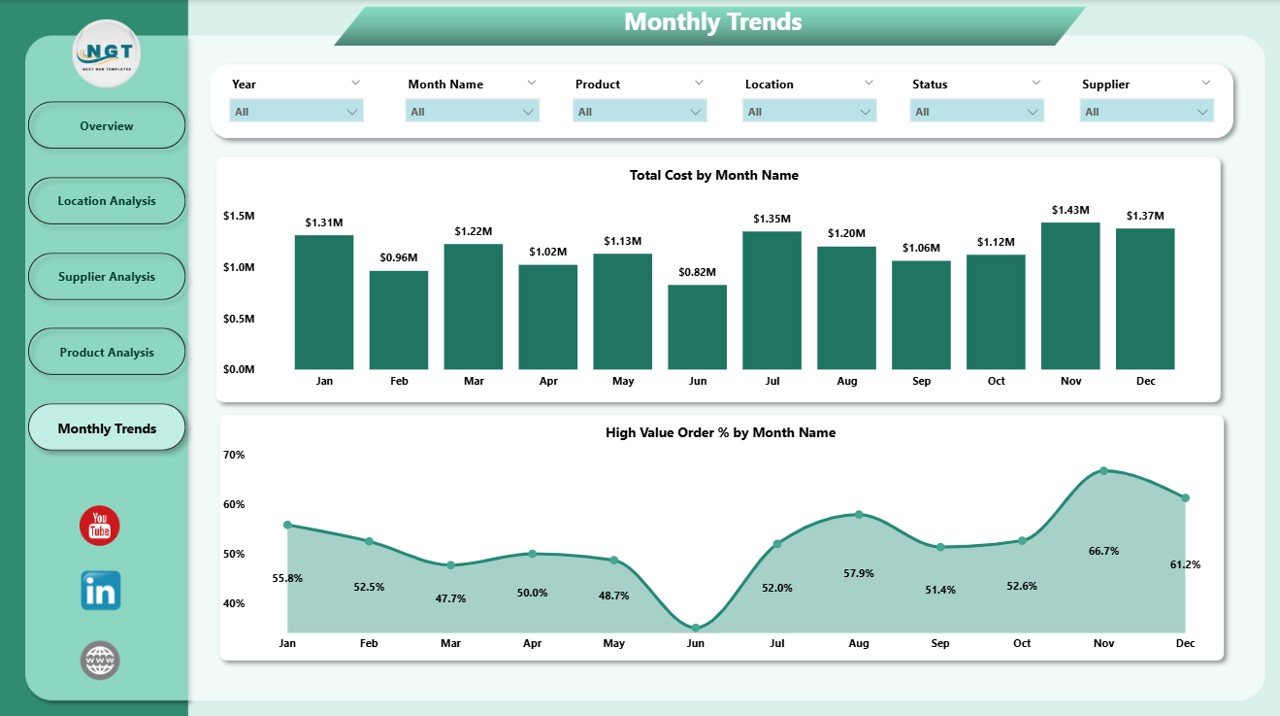
Understanding time-based patterns is crucial for forecasting and planning. This page includes:
-
📅 Total Cost by Month
-
💎 High-Value Order % by Month
Combined with filters and slicers, you can spot seasonality, trends, or anomalies in cost and order values.
Advantages of Using a Supply Chain Dashboard in Power BI
Implementing a dashboard like this brings multiple benefits. Let’s break down the main ones:
-
📊 Centralized Reporting: View all supply chain metrics in one place.
-
⏱️ Real-Time Updates: Power BI refreshes data dynamically.
-
📈 Interactive Insights: Drill down into any KPI for deeper analysis.
-
🤝 Better Collaboration: Share dashboards with stakeholders or teams securely.
-
📉 Reduced Errors: No more manual spreadsheet updates.
-
🧠 Data-Driven Decisions: Make informed choices on suppliers, locations, and inventory.
Use Cases Across Industries
This dashboard isn’t limited to one sector. It fits across various industries like:
-
Manufacturing – Track parts, raw materials, and supplier efficiency.
-
Retail – Monitor product flow and urgent orders during high seasons.
-
Pharmaceuticals – Ensure cold-chain compliance and monitor supplier delays.
-
E-commerce – Balance stock levels and track product performance.
Whether you’re a procurement manager or a logistics analyst, this tool adapts to your needs.
Best Practices for the Supply Chain Dashboard in Power BI
To make the most of your dashboard, follow these tried-and-true tips:
🔄 1. Automate Data Refresh
Use Power BI’s scheduled refresh feature to keep your dashboard always up to date. Link your Excel or ERP system to enable automatic updates.
📊 2. Use Slicers Wisely
Organize slicers (filters) logically. Group by time, location, supplier, and product. This enhances usability and insights.
🧾 3. Define KPI Benchmarks
In your backend Excel file, define what counts as an urgent order or high-value order. This keeps your visuals meaningful.
📌 4. Keep Visuals Focused
Avoid overcrowding. Use 3–5 visuals per page to keep attention on what matters most.
🗂️ 5. Separate Raw Data and Dashboard Pages
Store raw data on hidden tabs or in separate files. Keep the dashboard pages clean and performance-optimized.
👥 6. Assign Roles and Access Levels
Power BI allows role-based access. Limit who can edit vs. who can view to avoid accidental changes.
How to Get Started with Your Supply Chain Dashboard
If you’re new to Power BI or supply chain analytics, start simple:
-
Prepare your data in Excel with fields like Date, Product, Supplier, Quantity, Cost, Order Type, and Location.
-
Connect Excel to Power BI using the “Get Data” feature.
-
Build visuals for each page using Power BI charts (column, bar, donut, line).
-
Add slicers to make the dashboard interactive.
-
Publish to Power BI Service and share with your team.
Alternatively, you can use the ready-to-use template Download Here to skip the technical setup and start analyzing instantly.
Conclusion: Why Power BI is a Game-Changer for Supply Chain Analytics
The Supply Chain Dashboard in Power BI turns complex datasets into real-time decision-making power. You can monitor urgent orders, evaluate supplier performance, analyze products, and track cost trends—all in one place.
With just a few clicks, you can uncover bottlenecks, hidden opportunities, and performance gaps. This kind of visibility isn’t just helpful—it’s essential for growing businesses.
If you’re serious about improving your supply chain strategy, investing in a well-designed Power BI dashboard is a no-brainer.
Frequently Asked Questions (FAQs)
🔹 What data sources can I use with the Supply Chain Dashboard in Power BI?
You can connect Power BI to Excel, SQL Server, SharePoint, SAP, or any ERP system that supports data export. In this case, we use Excel as the data source.
🔹 Can I customize the KPIs shown in the dashboard?
Yes, the dashboard is fully customizable. You can change the formulas in Excel or Power BI to reflect your business-specific KPIs (like delivery time, defect rate, etc.).
🔹 What defines a high-value or urgent order in this dashboard?
This is customizable. Typically, urgent orders are flagged based on a delivery deadline, and high-value orders are defined by cost thresholds (e.g., > $10,000).
🔹 How often can I refresh the data?
With Power BI Pro, you can schedule up to 8 refreshes per day. With Power BI Premium, you can go up to 48 times daily.
🔹 Do I need coding skills to use this dashboard?
No coding is required. The dashboard uses drag-and-drop visuals and Excel as the backend. Basic knowledge of Power BI is enough.
🔹 Is the template mobile-responsive?
Yes, Power BI dashboards automatically adjust to fit desktop, tablet, and mobile devices.
🔹 Where can I get this ready-made Supply Chain Dashboard?
You can download it here from NextGenTemplates.com—fully prebuilt and ready to use.
Visit our YouTube channel to learn step-by-step video tutorials
Click to Purchases Supply Chain Dashboard in Power BI
Supply Chain Dashboard in Power BI