Sustainability has moved from being a “nice-to-have” initiative to a core business priority. Organizations across industries now track environmental, social, and governance (ESG) performance with the same seriousness as financial results. However, sustainability data often remains scattered across spreadsheets, emails, and manual reports. As a result, decision-makers struggle to get a clear and timely picture of sustainability performance.
That is exactly where a Sustainability Metrics KPI Dashboard in Power BI becomes extremely valuable. This dashboard converts raw sustainability data into clear, actionable insights. Moreover, it helps organizations track targets, monitor trends, and compare current performance with previous years—all in one interactive view.
In this in-depth article, you will learn what a Sustainability Metrics KPI Dashboard in Power BI is, why it matters, how it works, and how each page supports better sustainability reporting. In addition, you will explore its advantages, best practices, and frequently asked questions to help you implement it successfully.
What Is a Sustainability Metrics KPI Dashboard in Power BI?
A Sustainability Metrics KPI Dashboard in Power BI is an interactive performance management tool designed to track and visualize key sustainability indicators. Instead of reviewing raw Excel tables, users see meaningful KPIs, trend charts, comparisons, and visual indicators that highlight performance status.
Because this dashboard is built in Power BI and uses Excel as a data source, it offers both flexibility and power. On one hand, Excel allows easy data entry and updates. On the other hand, Power BI delivers strong visualization, filtering, and drill-through capabilities.
Most importantly, this dashboard focuses on Month-to-Date (MTD) and Year-to-Date (YTD) performance. As a result, sustainability teams can monitor short-term progress while keeping long-term goals in sight.
Many organizations already collect sustainability data. However, data collection alone does not create value. Value comes from analysis, comparison, and action.
A Sustainability Metrics KPI Dashboard in Power BI helps because:
-
Sustainability targets often span months and years
-
Stakeholders demand transparency and accuracy
-
Regulations require structured reporting
-
Leadership needs quick insights for decisions
Without a centralized dashboard, teams spend too much time preparing reports. Meanwhile, insights arrive too late. Therefore, a well-designed KPI dashboard ensures that sustainability performance stays visible, measurable, and actionable at all times.
How Does the Sustainability Metrics KPI Dashboard in Power BI Work?
This dashboard follows a clear and structured design. It uses an Excel file as the data source and a Power BI Desktop file for visualization. Because of this setup, even non-technical users can maintain the data easily.
The dashboard consists of three main pages:
-
Summary Page
-
KPI Trend Page
-
KPI Definition Page
Each page plays a specific role. Together, they provide a complete sustainability performance view.
Click to Purchases Sustainability Metrics KPI Dashboard Power BI
What Is Shown on the Summary Page of the Dashboard?
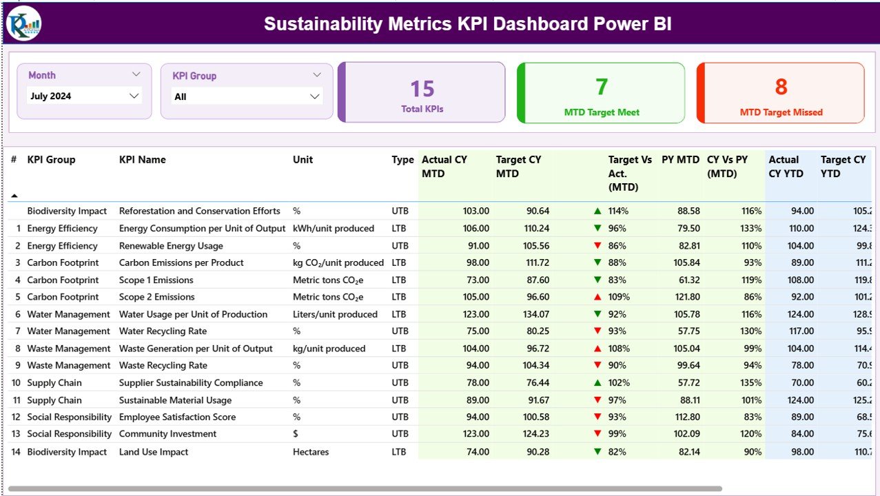
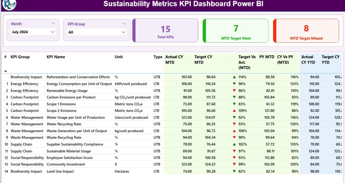
The Summary Page acts as the main landing page of the dashboard. It gives users an instant overview of sustainability performance across all KPIs.
Top-Level Filters and Cards
At the top of the page, you will find:
-
Month slicer to select the reporting month
-
KPI Group slicer to filter KPIs by category
These slicers ensure that users can focus on specific time periods or sustainability areas.
Below the slicers, the dashboard shows three important cards:
-
Total KPIs Count
-
MTD Target Met Count
-
MTD Target Missed Count
These cards immediately tell users how many sustainability KPIs perform well and how many need attention.
Detailed KPI Table Explained
The detailed table on the Summary Page provides deep insights into each sustainability KPI. Each column has a clear purpose.
KPI Identification Fields
-
KPI Number: A sequence number for easy reference
-
KPI Group: Category or theme of the KPI (for example, Energy, Emissions, Water, Waste)
-
KPI Name: Name of the sustainability metric
-
Unit: Unit of measurement, such as %, Tons, kWh, or Liters
-
Type: Indicates whether the KPI is Lower the Better (LTB) or Upper the Better (UTB)
This structure ensures consistency and clarity across all KPIs.
How Are MTD Values Displayed?
The dashboard highlights Month-to-Date (MTD) performance using multiple fields:
-
Actual CY MTD: Current Year actual MTD value
-
Target CY MTD: Current Year target MTD value
-
MTD Icon: Red ▼ or Green ▲ icon showing status against the target
-
Target vs Actual (MTD): Percentage calculated as
-
Actual MTD / Target MTD
-
-
PY MTD: Previous Year MTD value
-
CY vs PY (MTD): Comparison percentage calculated as
-
Current Year MTD / Previous Year MTD
-
Because of these fields, users can quickly see whether sustainability performance improves or declines compared to targets and past results.
How Are YTD Values Displayed?
In addition to MTD values, the dashboard also tracks Year-to-Date (YTD) performance:
-
Actual CY YTD: Current Year actual YTD value
-
Target CY YTD: Current Year target YTD value
-
YTD Icon: Red ▼ or Green ▲ icon for target comparison
-
Target vs Actual (YTD): Percentage calculated as
-
Actual YTD / Target YTD
-
-
PY YTD: Previous Year YTD value
-
CY vs PY (YTD): Comparison percentage calculated as
-
Current Year YTD / Previous Year YTD
-
As a result, decision-makers can evaluate both short-term and long-term sustainability progress in one view.
Click to Purchases Sustainability Metrics KPI Dashboard Power BI
What Is the KPI Trend Page and Why Is It Important?
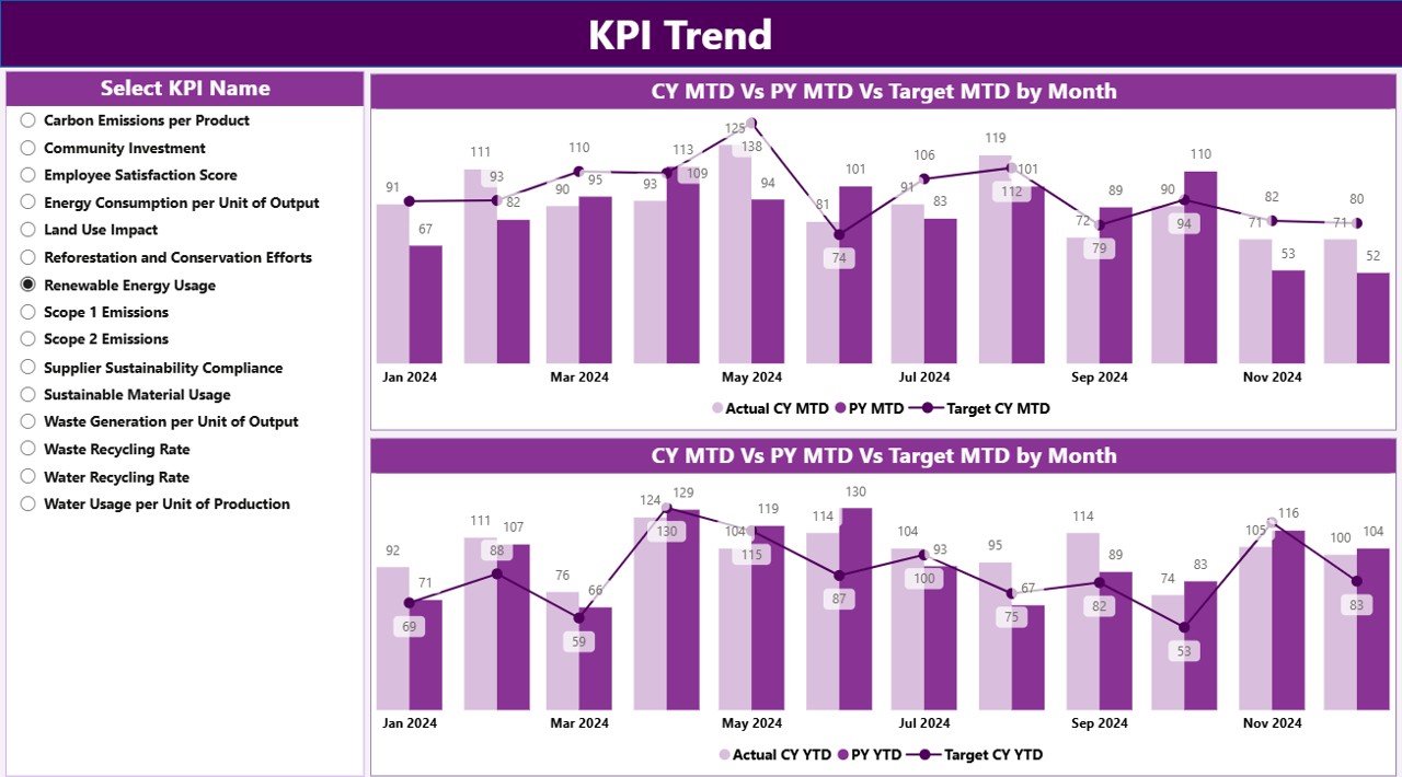
The KPI Trend Page focuses on visual trend analysis. While tables show numbers, charts reveal patterns. Therefore, this page plays a critical role in understanding sustainability performance over time.
Key Features of the KPI Trend Page
-
Two combo charts for MTD and YTD
-
Displays Actual Current Year, Previous Year, and Target values
-
KPI Name slicer on the left for easy selection
By selecting a KPI, users instantly see how performance changes month by month. This view helps identify seasonality, improvement trends, or recurring issues.
What Is the KPI Definition Page and How Does Drill-Through Work?
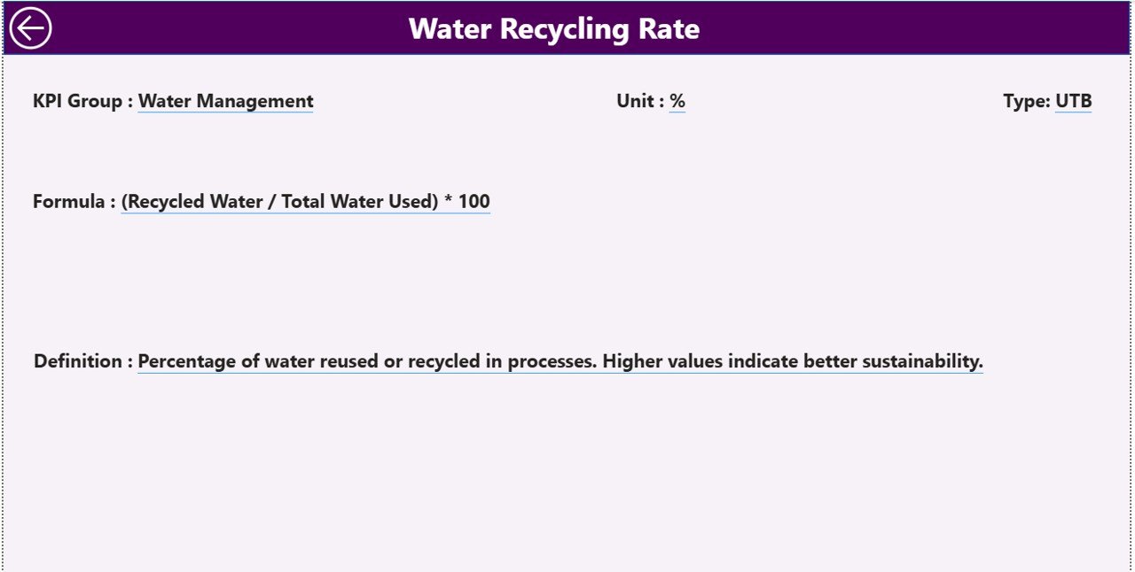
The KPI Definition Page serves as a reference and documentation layer. Although this page remains hidden, users can access it through drill-through from the Summary Page.
Information Available on the KPI Definition Page
-
KPI Number
-
KPI Group
-
KPI Name
-
Unit
-
Formula
-
Detailed Definition
-
KPI Type (LTB or UTB)
This page ensures transparency. Moreover, it helps new users understand exactly how each KPI works. A back button at the top-left corner allows users to return to the Summary Page easily.
How Is Excel Used as the Data Source for This Dashboard?
Click to Purchases Sustainability Metrics KPI Dashboard Power BI
The Sustainability Metrics KPI Dashboard in Power BI uses an Excel file with three structured worksheets. This approach keeps data entry simple while maintaining accuracy.
Input_Actual Sheet: How to Enter Actual Values
In the Input_Actual sheet, users enter:
-
KPI Name
-
Month (use the first date of the month)
-
MTD Actual value
-
YTD Actual value
This sheet captures real sustainability performance data.
Input_Target Sheet: How to Enter Target Values
In the Input_Target sheet, users enter:
-
KPI Name
-
Month (use the first date of the month)
-
MTD Target value
-
YTD Target value
This structure ensures clear comparison between planned and actual performance.
KPI Definition Sheet: Why This Sheet Matters
The KPI Definition sheet contains master data:
-
KPI Number
-
KPI Group
-
KPI Name
-
Unit
-
Formula
-
Definition
-
Type (LTB or UTB)
Because of this sheet, the dashboard stays consistent and well-documented.
Advantages of Sustainability Metrics KPI Dashboard in Power BI
A Sustainability Metrics KPI Dashboard in Power BI offers many advantages for organizations of all sizes.
Key Advantages Explained
-
Centralized Reporting
All sustainability KPIs appear in one dashboard instead of multiple files. -
Real-Time Insights
As soon as data updates in Excel, the dashboard reflects the changes. -
Clear Performance Visibility
Icons, percentages, and comparisons highlight success and risk instantly. -
Better Decision-Making
Leaders can act faster because insights remain easy to understand. -
Historical Comparison
CY vs PY analysis shows improvement or decline clearly. -
Scalable Design
Teams can add new KPIs or groups without redesigning the dashboard.
How Does This Dashboard Support Sustainability Goals?
Sustainability goals often require continuous monitoring. This dashboard supports those goals by:
-
Tracking progress against targets
-
Highlighting underperforming KPIs
-
Encouraging data-driven sustainability actions
-
Improving accountability across teams
As a result, organizations move from reactive reporting to proactive sustainability management.
Best Practices for the Sustainability Metrics KPI Dashboard in Power BI
Click to Purchases Sustainability Metrics KPI Dashboard Power BI
To get the best results, organizations should follow proven best practices.
Best Practices You Should Follow
-
Define Clear KPIs
Choose sustainability metrics that align with business goals. -
Maintain Consistent Units
Always use standard units to avoid confusion. -
Update Data Regularly
Schedule monthly updates to keep insights fresh. -
Validate Excel Data
Check entries before refreshing the Power BI file. -
Use KPI Groups Wisely
Group KPIs logically for better filtering and analysis. -
Train Users
Teach stakeholders how to use slicers and drill-through features. -
Review Trends Periodically
Use trend charts to identify long-term patterns.
Who Can Use a Sustainability Metrics KPI Dashboard in Power BI?
This dashboard benefits many roles, including:
-
Sustainability Managers
-
ESG Analysts
-
Operations Managers
-
Finance and Strategy Teams
-
Senior Leadership
-
Compliance and Reporting Teams
Because of its simple design, both technical and non-technical users can use it effectively.
Conclusion: Why a Sustainability Metrics KPI Dashboard in Power BI Is Essential
Sustainability reporting no longer remains optional. Organizations must measure, analyze, and communicate sustainability performance clearly. A Sustainability Metrics KPI Dashboard in Power BI provides the perfect solution for this challenge.
By combining Excel-based data entry with Power BI visualization, this dashboard delivers clarity, transparency, and actionable insights. Moreover, it supports both short-term monitoring and long-term sustainability goals. When used correctly, it becomes a powerful decision-support tool that drives meaningful change.
Frequently Asked Questions (FAQs)
What is a Sustainability Metrics KPI Dashboard in Power BI?
A Sustainability Metrics KPI Dashboard in Power BI is an interactive tool that tracks and visualizes sustainability performance using KPIs, targets, trends, and comparisons.
Why does this dashboard use Excel as a data source?
Excel allows easy data entry and updates, while Power BI handles visualization and analysis efficiently.
What does LTB and UTB mean in KPIs?
LTB means Lower the Better, while UTB means Upper the Better. These types define how performance is evaluated.
Can I add new sustainability KPIs to this dashboard?
Yes, you can add new KPIs by updating the KPI Definition, Input_Actual, and Input_Target sheets.
How often should sustainability data be updated?
Most organizations update sustainability data monthly. However, you can adjust the frequency based on reporting needs.
Is this dashboard suitable for ESG reporting?
Yes, this dashboard supports ESG reporting by providing structured, transparent, and comparable sustainability metrics.
Can non-technical users use this dashboard?
Yes, the dashboard design remains user-friendly. Slicers, icons, and drill-through features make navigation easy.
Visit our YouTube channel to learn step-by-step video tutorials