Sustainability has become a core responsibility for modern organizations. However, tracking sustainability goals without a structured system often creates confusion, delays, and missed opportunities. Therefore, organizations now need a clear, visual, and data-driven way to monitor sustainability performance.
That is exactly where a Sustainability Office KPI Dashboard in Power BI delivers real value.
In this detailed and SEO-friendly article, you will learn what a Sustainability Office KPI Dashboard in Power BI is, why it is important, how it works, its page-wise structure, data model, key advantages, best practices, and frequently asked questions. Moreover, this guide explains how sustainability teams can move from manual reporting to real-time insights using Power BI.
Click to Purchases Sustainability Office KPI Dashboard in Power BI
What Is a Sustainability Office KPI Dashboard in Power BI?
A Sustainability Office KPI Dashboard in Power BI is a ready-to-use, interactive analytics solution designed to monitor sustainability-related key performance indicators (KPIs) in a centralized and visual format.
Instead of relying on scattered Excel files, emails, or static reports, this dashboard consolidates sustainability data into a single Power BI file. As a result, sustainability managers can quickly track environmental, social, and governance (ESG) performance.
Furthermore, the dashboard uses Excel as a data source and Power BI for visualization, which makes it easy to maintain and scale. Because of this structure, both technical and non-technical users can work with the dashboard comfortably.
Why Do Sustainability Offices Need a KPI Dashboard?
Sustainability offices handle complex data across multiple initiatives. Therefore, manual tracking often creates inefficiencies.
A Sustainability Office KPI Dashboard in Power BI helps because it:
-
Provides real-time visibility into sustainability KPIs
-
Improves decision-making speed and accuracy
-
Ensures transparency and accountability
-
Reduces dependency on manual reports
-
Aligns sustainability goals with organizational strategy
Moreover, sustainability teams must report performance regularly to leadership, regulators, and stakeholders. Hence, a structured dashboard becomes essential.
How Does a Sustainability Office KPI Dashboard in Power BI Work?
The working logic of this dashboard remains simple and effective.
First, users capture sustainability data in an Excel file. Then, Power BI connects to this Excel file as a data source. After that, Power BI processes the data using measures and calculations. Finally, the dashboard presents insights through visuals, tables, icons, and charts.
Because of this workflow, users can update data without touching Power BI visuals. As a result, the dashboard remains dynamic and user-friendly.
What Are the Key Features of the Sustainability Office KPI Dashboard in Power BI?
This dashboard includes three structured pages inside the Power BI Desktop file. Each page serves a specific analytical purpose.
1) What Is Included in the Summary Page?
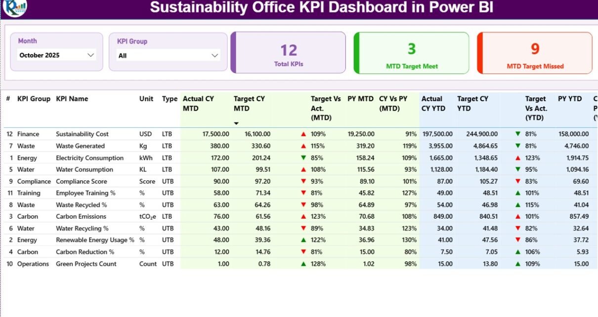
The Summary Page acts as the main landing page of the dashboard. It provides a high-level overview of all sustainability KPIs.
Key Elements of the Summary Page
Slicers at the Top
-
Month slicer
-
KPI Group slicer
These slicers allow users to filter data instantly. Therefore, decision-makers can focus on specific periods or KPI categories.
KPI Cards
-
Total KPIs Count
-
MTD Target Met Count
-
MTD Target Missed Count
These cards instantly summarize performance. As a result, users can quickly assess overall sustainability health.
Detailed KPI Table on the Summary Page
Below the cards, the dashboard displays a detailed KPI table with the following columns:
-
KPI Number
This column shows the sequence number of each KPI. -
KPI Group
This defines the category or sustainability area, such as Energy, Waste, Water, or Compliance. -
KPI Name
This specifies the exact sustainability metric being tracked. -
Unit
This displays the unit of measurement, such as %, kWh, Tons, or Count. -
Type (LTB / UTB)
-
LTB: Lower the Better
-
UTB: Upper the Better
-
-
Actual CY MTD
This shows the actual value for the current year month-to-date. -
Target CY MTD
This shows the target value for the current year month-to-date. -
MTD Icon
This uses ▲ (green) or ▼ (red) icons to show performance against target. -
Target vs Actual (MTD)
This percentage uses the formula:Actual MTD / Target MTD -
PY MTD
This shows the previous year’s MTD value for the same period. -
CY vs PY (MTD)
This percentage compares current MTD with previous year MTD using:Current Year MTD / Previous Year MTD -
Actual CY YTD
This shows actual year-to-date performance. -
Target CY YTD
This shows target year-to-date performance. -
YTD Icon
This visually indicates YTD performance using green and red arrows. -
Target vs Actual (YTD)
This uses the formula:Actual YTD / Target YTD -
PY YTD
This shows previous year YTD performance. -
CY vs PY (YTD)
This compares current YTD with previous year YTD.
Because of this structured table, users can analyze both short-term and long-term sustainability performance in one place.
2) What Does the KPI Trend Page Show?
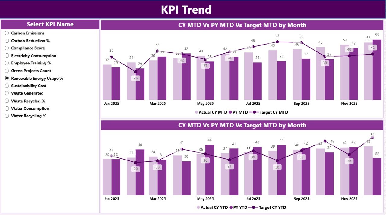
The KPI Trend Page focuses on performance trends over time. Instead of just showing numbers, this page helps users understand patterns.
Key Features of the KPI Trend Page
-
Two combo charts
-
MTD Actual vs Target vs Previous Year
-
YTD Actual vs Target vs Previous Year
-
-
KPI Name slicer on the left
Users can select any KPI to analyze its trend.
Because of these visuals, sustainability teams can quickly identify improvements, declines, and seasonal patterns.
3) What Is the KPI Definition Page?
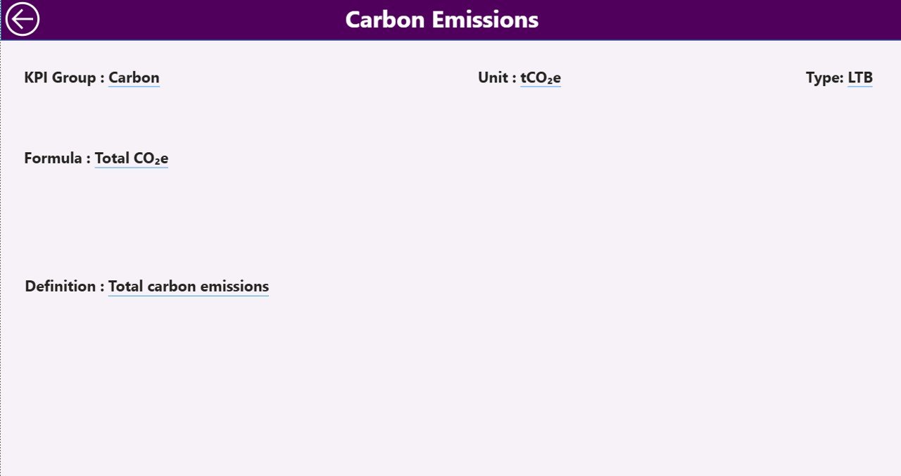
The KPI Definition Page acts as a drill-through page. This page remains hidden by default to keep the dashboard clean.
Click to Purchases Sustainability Office KPI Dashboard in Power BI
Purpose of the KPI Definition Page
-
Displays KPI Formula
-
Shows KPI Definition
-
Explains measurement logic
From the Summary Page, users can drill through to this page for detailed KPI explanations. Moreover, a Back button on the top-left corner allows users to return easily.
This feature ensures clarity and avoids confusion during reviews or audits.
How Is the Excel Data Structured for This Dashboard?
The dashboard uses Excel as its data source. The Excel file contains three structured worksheets.
1) Input_Actual Sheet
In this sheet, users enter actual sustainability performance data.
Columns to Fill:
-
KPI Name
-
Month (use first date of the month)
-
MTD Value
-
YTD Value
This design ensures consistency and avoids data errors.
2) Input_Target Sheet
In this sheet, users define sustainability targets.
Columns to Fill:
-
KPI Name
-
Month (use first date of the month)
-
MTD Target
-
YTD Target
Because targets remain separate, the dashboard can easily compare actual vs target.
3) KPI Definition Sheet
This sheet stores master KPI information.
Columns Included:
-
KPI Number
-
KPI Group
-
KPI Name
-
Unit
-
Formula
-
Definition
-
Type (LTB or UTB)
This structure improves governance and documentation.
What KPIs Can a Sustainability Office Track Using This Dashboard?
A Sustainability Office KPI Dashboard in Power BI can track a wide range of KPIs, such as:
-
Energy consumption reduction
-
Carbon emissions intensity
-
Renewable energy usage percentage
-
Waste recycling rate
-
Water consumption efficiency
-
Compliance audit completion rate
-
Sustainability training completion
-
Supplier ESG compliance
Because of Power BI flexibility, teams can easily add or modify KPIs.
Advantages of Sustainability Office KPI Dashboard in Power BI
Using this dashboard delivers several strategic benefits.
1) Centralized Sustainability Monitoring
All sustainability KPIs remain available in one place. Therefore, teams avoid fragmented reporting.
2) Faster Decision-Making
Visual insights reduce analysis time. As a result, leaders can act quickly.
3) Improved Transparency
Clear metrics and definitions ensure everyone understands performance.
4) Strong Performance Tracking
MTD and YTD views support both short-term and long-term analysis.
5) Easy Scalability
Excel-based input allows easy expansion without complex tools.
6) Professional Reporting
Power BI visuals improve stakeholder presentations and audits.
Best Practices for the Sustainability Office KPI Dashboard in Power BI
To get the maximum value, sustainability teams should follow these best practices.
1) Define Clear and Measurable KPIs
Always use clear units, formulas, and definitions.
2) Maintain Data Consistency
Use the first date of the month consistently across all sheets.
3) Update Data Regularly
Frequent updates ensure reliable insights.
4) Use LTB and UTB Correctly
Classify KPIs correctly to avoid misinterpretation.
5) Review Trends, Not Just Numbers
Focus on trend charts to identify long-term patterns.
6) Train Users
Ensure team members understand how to use slicers and drill-through.
Click to Purchases Sustainability Office KPI Dashboard in Power BI
How Does This Dashboard Support ESG and Compliance Reporting?
Sustainability reporting requires accuracy and consistency. This dashboard supports ESG reporting by:
-
Tracking environmental KPIs systematically
-
Comparing targets with actual performance
-
Maintaining KPI definitions for audit clarity
-
Supporting year-over-year comparisons
As a result, organizations can respond confidently to regulatory and stakeholder requirements.
Who Should Use a Sustainability Office KPI Dashboard in Power BI?
This dashboard suits:
-
Sustainability managers
-
ESG teams
-
Environmental compliance officers
-
Corporate strategy teams
-
Senior leadership
Because of its simplicity and power, it works well across industries.
Conclusion
A Sustainability Office KPI Dashboard in Power BI transforms sustainability tracking from manual reporting into actionable intelligence. By combining Excel-based data entry with powerful Power BI visuals, this dashboard enables sustainability teams to monitor KPIs efficiently, identify trends, and drive meaningful improvements.
Moreover, its structured pages, drill-through capability, and performance indicators make it a practical and scalable solution. Therefore, organizations aiming to strengthen sustainability governance should adopt this dashboard as a core reporting tool.
Frequently Asked Questions (FAQs)
What is the main purpose of a Sustainability Office KPI Dashboard in Power BI?
The main purpose is to track, analyze, and visualize sustainability KPIs in a centralized and interactive format.
Can non-technical users maintain this dashboard?
Yes, because users only need to update Excel input sheets.
Does this dashboard support MTD and YTD analysis?
Yes, it provides both MTD and YTD views along with target and previous year comparisons.
Can organizations customize KPIs?
Yes, teams can add, remove, or modify KPIs easily.
Why use Power BI instead of Excel alone?
Power BI offers better visuals, interactivity, and scalability.
Is this dashboard suitable for ESG reporting?
Yes, it supports structured ESG tracking and compliance reporting.
Visit our YouTube channel to learn step-by-step video tutorials