Teacher training institutes manage trainees, courses, funding sources, costs, and performance scores every day. They handle multiple programs, track satisfaction ratings, evaluate learning outcomes, and review monthly trends. Because of this, they require structured reporting and clear insights.
However, many institutes still depend on manual reporting. They review multiple Excel sheets, raw tables, and outdated summaries. This slows down decision-making and hides important training insights.
A Teacher Training Institutes Dashboard in Power BI solves these challenges. It converts raw training data into clean visuals. You get instant clarity on trainees, courses, funding sources, costs, and satisfaction scores. The dashboard includes multiple analytical pages, slicers, charts, and KPIs that make monitoring simple and accurate.
In this guide, you will learn what this dashboard includes, how each page works, and why it strengthens institute-level decisions.
Click to Purchases Teacher Training Institutes Dashboard in Power BI
What Is a Teacher Training Institutes Dashboard in Power BI?
A Teacher Training Institutes Dashboard in Power BI is a ready-to-use reporting solution for education and training organizations. It shows complete performance data across different dimensions such as course names, institute names, satisfaction ratings, funding sources, and monthly trends.
This dashboard helps:
-
Teacher training colleges
-
Government training institutes
-
Skill development centers
-
Private training academies
-
NGO-backed training programs
-
University training departments
Because the dashboard is fully interactive, users explore KPIs, charts, comparisons, and trends with ease.
Key Features of the Teacher Training Institutes Dashboard in Power BI
This dashboard includes five structured pages, each designed to analyze a specific area of training performance.
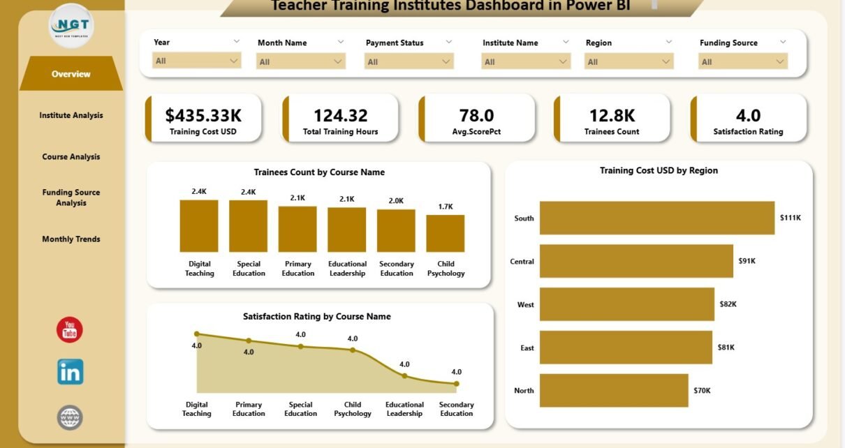
1. Overview Page – Main Dashboard for Training Insights
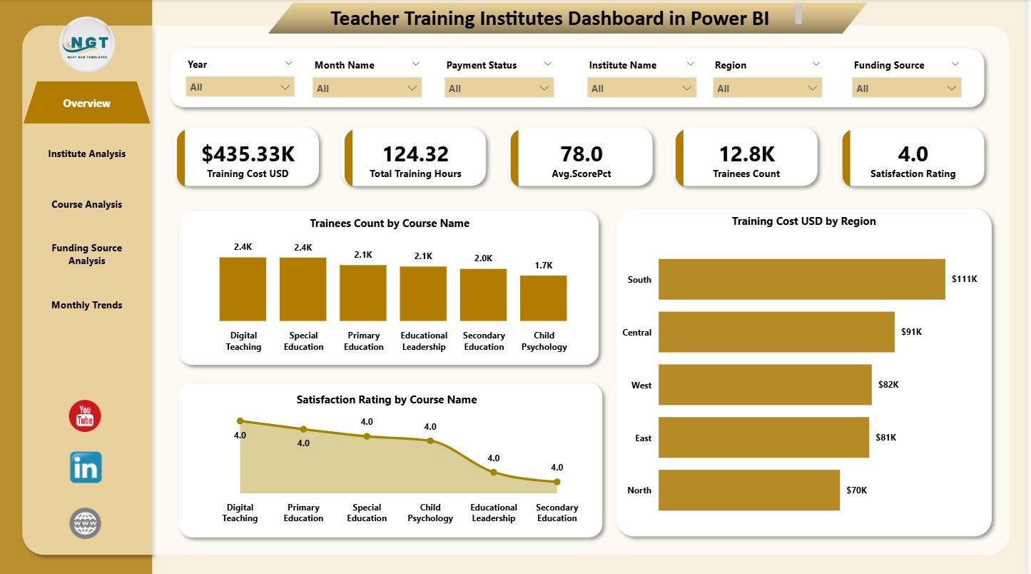
The Overview Page acts as the control center. It gives a high-level summary of everything happening in the institute.
five KPI Cards
The page shows six important cards that summarize key metrics such as:
-
Total trainees
- Total training hours
-
Total training cost
-
Average satisfaction rating
-
Total institutes
These cards help leaders understand overall performance at a glance.
Three Major Charts
You also see three charts:
-
Trainees Count by Course Name
-
Training Cost (USD) by Region
-
Satisfaction Rating by Course Name
These visuals help institutes analyze which courses attract more trainees, which regions spend more, and which programs perform better.
Click to Purchases Teacher Training Institutes Dashboard in Power BI
2. Institute Analysis
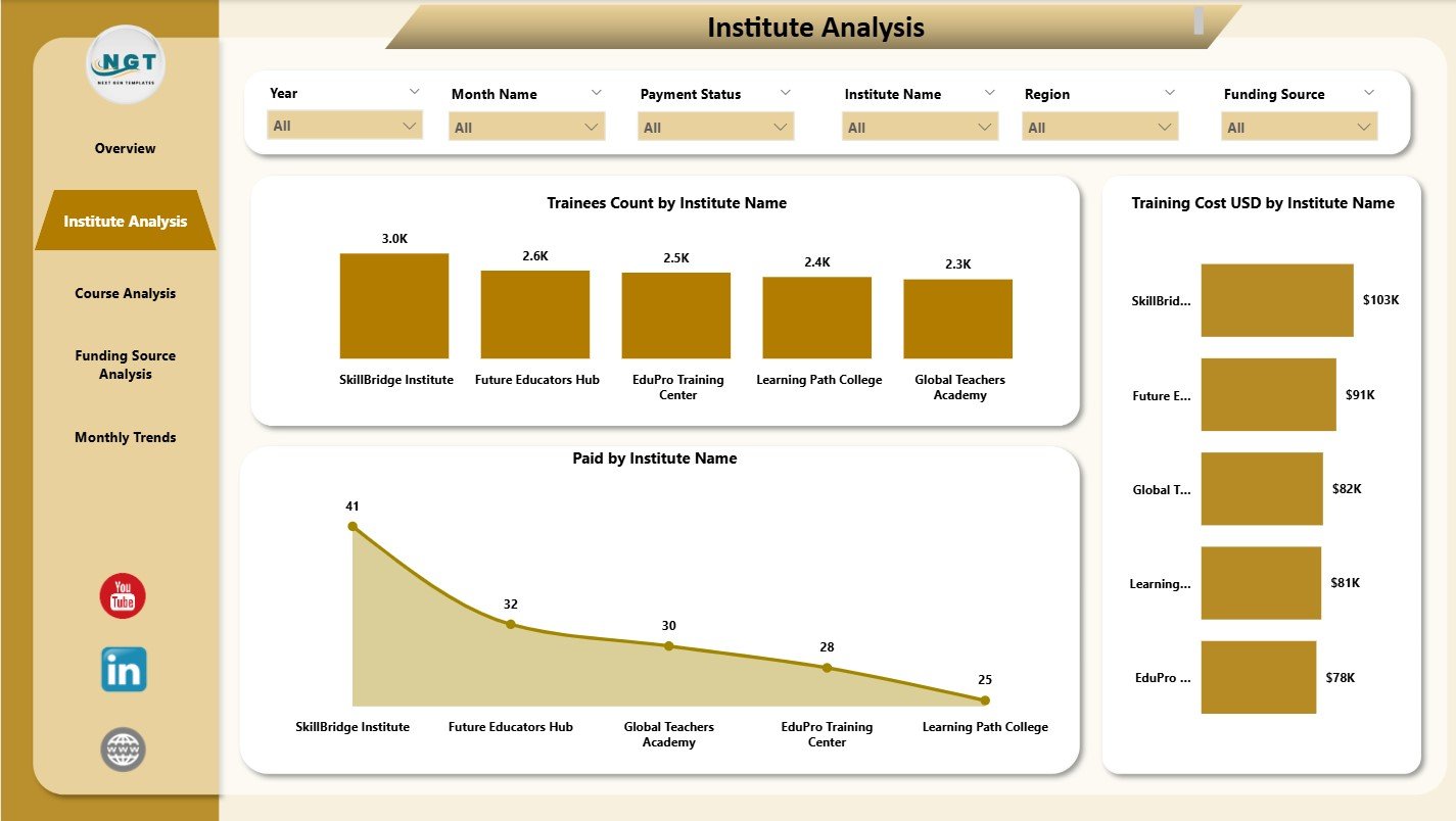
The Institute Analysis page helps you understand how each institute performs.
Three Key Charts
This page shows:
-
Trainees Count by Institute Name
-
Training Cost (USD) by Institute Name
-
Paid Amount by Institute Name
These charts reveal:
-
Which institutes attract the most trainees
-
Which institutes generate the highest cost
-
How financial contributions vary
Decision makers compare institutes easily and understand performance differences.
3. Course Analysis
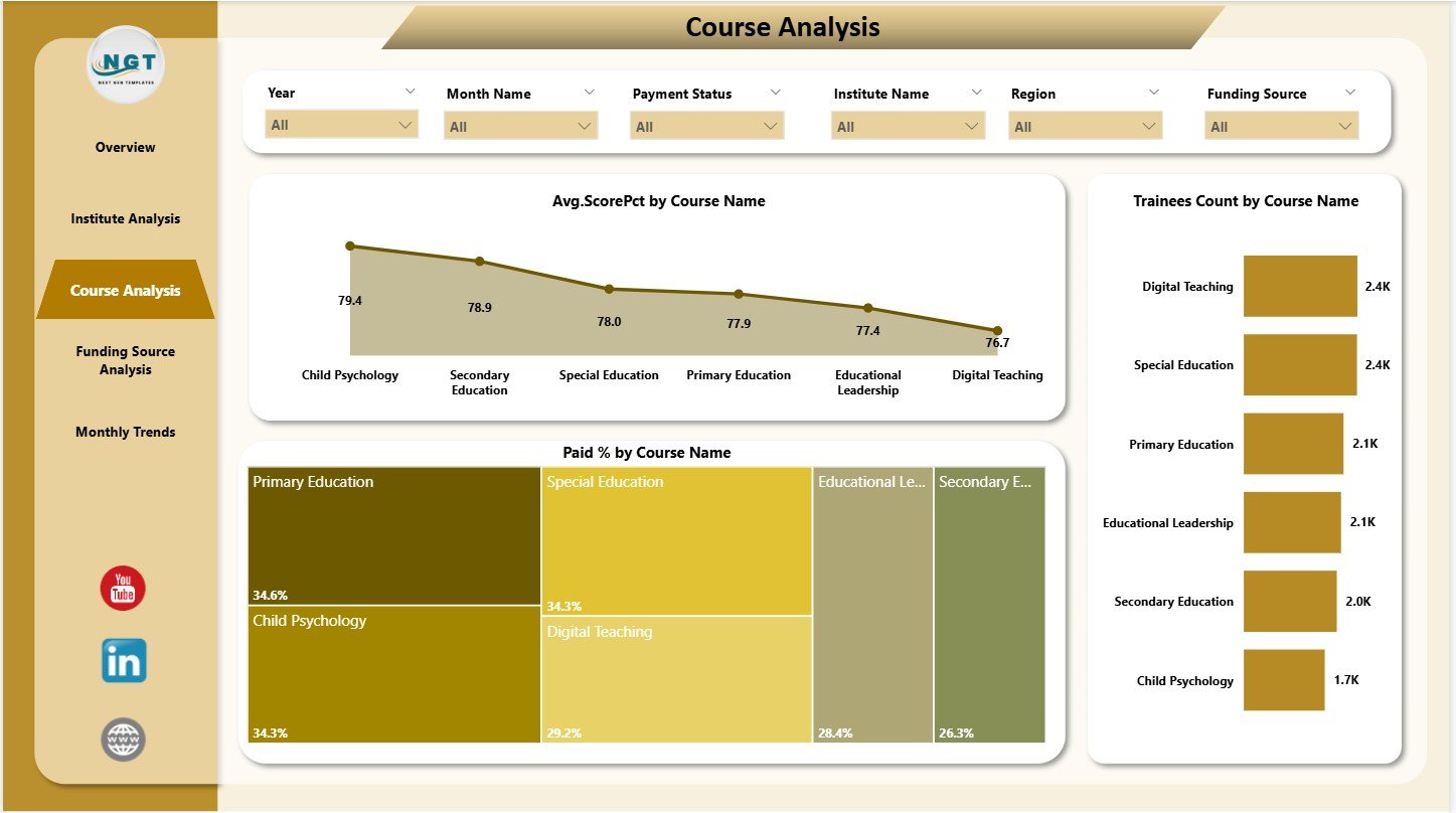
The Course Analysis page analyzes performance from the course perspective.
Three Course-Based Charts
This page includes:
-
Average Score (%) by Course Name
-
Trainees Count by Course Name
-
Paid (%) by Course Name
These charts show:
-
Course effectiveness
-
Popularity of different courses
-
Payment or fee completion patterns
Leaders use this page to evaluate which courses need improvement and which courses excel.
Click to Purchases Teacher Training Institutes Dashboard in Power BI
4. Funding Source Analysis
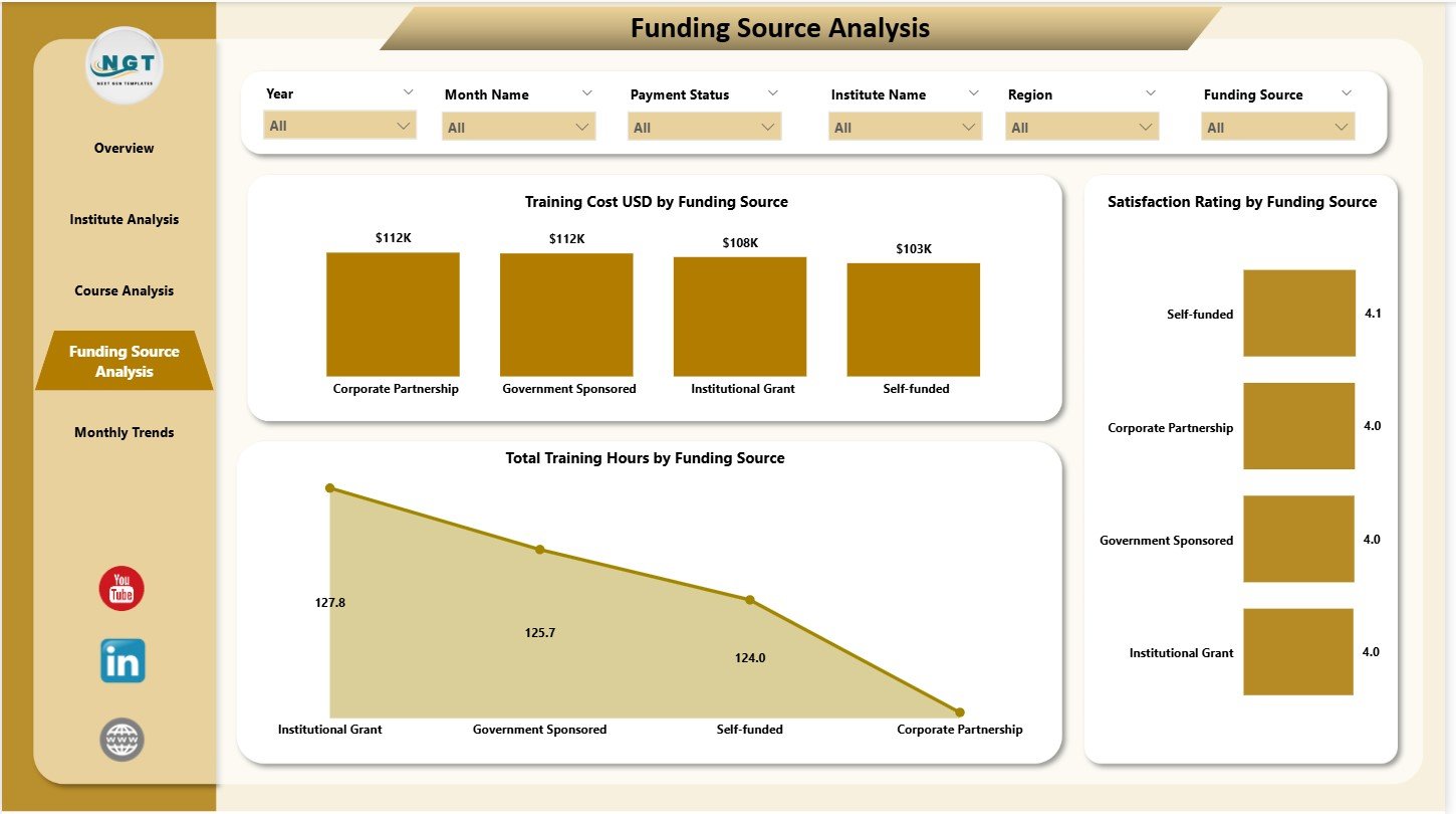
Many teacher training programs receive funding from:
-
Government departments
-
NGOs
-
Private organizations
-
Regional sponsors
-
Educational agencies
This dashboard includes a Funding Source Analysis page to study how these contributions impact training.
Three Funding-Based Charts
This page includes:
-
Training Cost (USD) by Funding Source
-
Satisfaction Rating by Funding Source
-
Total Training Hours by Funding Source
These visuals help institutions understand:
-
Which funding partners support more programs
-
How satisfaction varies across funding partners
-
Which funding streams deliver the most training hours
This level of detail improves budget planning and donor reporting.
5. Monthly Trends
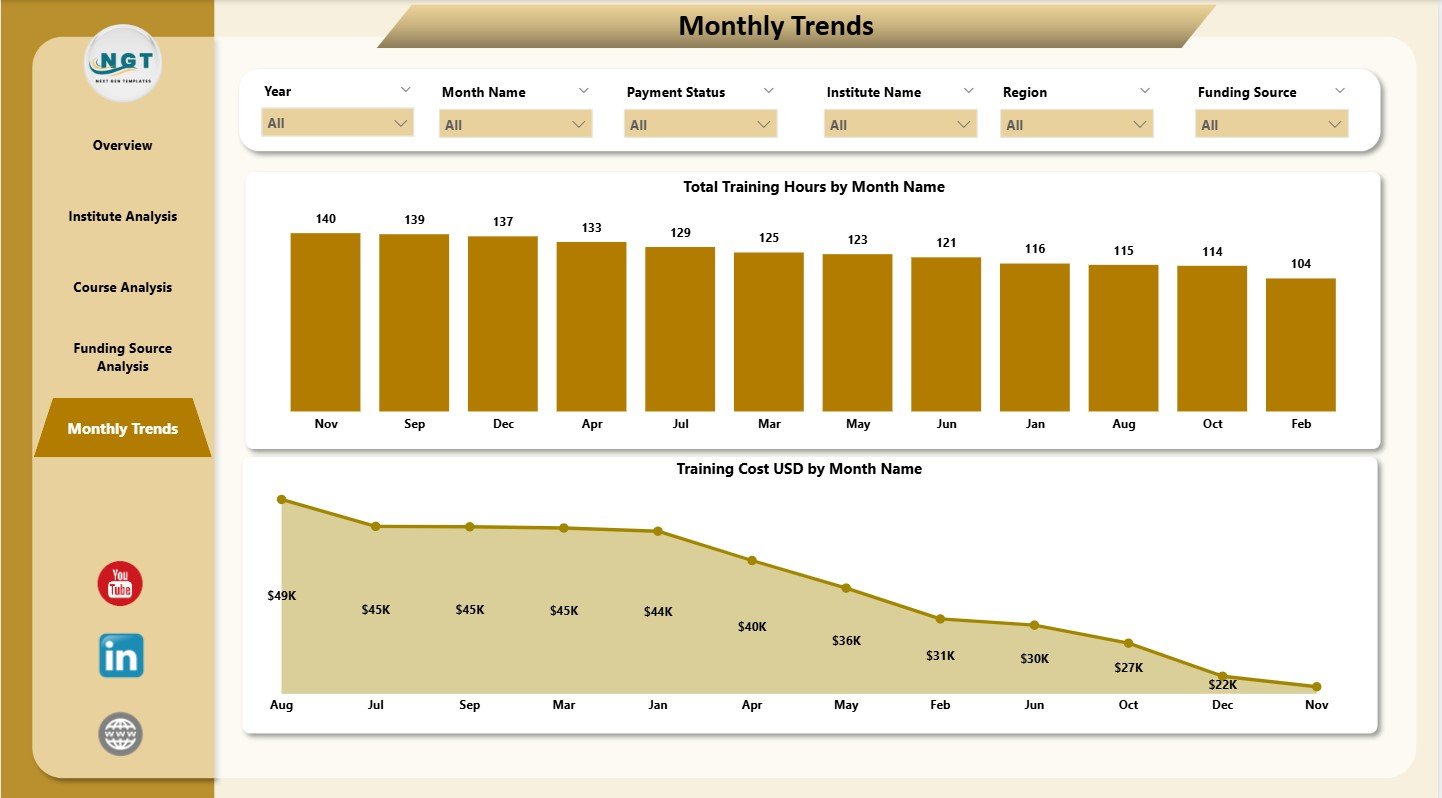
Training activity often changes by season, exam schedules, or funding cycles. The Monthly Trends page shows clear month-by-month patterns.
Two Monthly Charts
This page includes:
-
Total Training Hours by Month Name
-
Training Cost (USD) by Month Name
Monthly trends help institutes:
-
Monitor peak and low training months
-
Plan budgets
-
Allocate resources
-
Forecast demand
This makes the dashboard useful for annual planning and performance reviews.
Click to Purchases Teacher Training Institutes Dashboard in Power BI
Why Do Teacher Training Institutes Need a Power BI Dashboard?
Training institutions generate data every day. They manage:
-
Trainee enrollments
-
Course outcomes
-
Assessment scores
-
Funding distributions
-
Region-wise operations
-
Monthly expenditures
-
Satisfaction ratings
Without a dashboard, teams spend too much time merging reports and validating numbers.
This dashboard solves these issues because it:
-
Shows all data in one place
-
Provides clear visuals
-
Reduces manual reporting
-
Improves decision-making speed
-
Highlights improvement areas
As a result, institutes stay organized, efficient, and data-driven.
How This Dashboard Helps Training Institutes Improve Performance
This dashboard improves performance by:
-
Showing trainee participation
-
Tracking course outcomes
-
Highlighting funding efficiency
-
Clarifying monthly activity cycles
-
Breaking down cost behavior
-
Showing satisfaction trends
-
Helping compare courses and institutes
-
Supporting data-driven planning
Because Power BI creates dynamic visuals, institutes gain clarity faster.
Click to Purchases Teacher Training Institutes Dashboard in Power BI
Advantages of Teacher Training Institutes Dashboard in Power BI
1. Clear and Real-Time Insights
Leaders access updated data anytime and make fast decisions.
2. Strong Course and Institute Comparison
Charts show which courses or institutes perform well and which need attention.
3. Improved Training Quality
Satisfaction ratings highlight gaps in training delivery.
4. Better Fund Management
Funding analysis improves budgeting and partner reporting.
5. Transparent Monthly Reporting
Monthly trends reveal patterns and give accurate forecasting.
6. Easy Navigation
Each page includes slicers and simple layouts for smooth navigation.
7. Faster Reporting
Teams save time because the dashboard updates automatically.
8. Decision-Making Support
Data-backed insights help management plan future training programs effectively.
Click to Purchases Teacher Training Institutes Dashboard in Power BI
Best Practices for Using the Teacher Training Institutes Dashboard in Power BI
1. Update Data Every Month
Regular updates keep insights accurate.
2. Standardize Course and Institute Names
Consistent naming reduces reporting errors.
3. Review Course Analysis Before Planning New Programs
Understand what works before launching new training.
4. Compare Current and Past Monthly Trends
This reveals seasonal or funding-related performance changes.
5. Use Funding Source Insights for Better Budgets
Funding data helps allocate resources more effectively.
6. Track Satisfaction Ratings Frequently
Satisfaction scores highlight early signs of training issues.
7. Share Dashboard Access With Your Team
Collaborative analysis improves results.
Conclusion
A Teacher Training Institutes Dashboard in Power BI gives institutes a powerful way to analyze trainees, courses, funding sources, costs, and monthly trends. The five-page structure provides complete clarity. Institutes use it to measure performance, monitor quality, evaluate outcomes, and plan future programs.
Because this dashboard offers real-time visuals and requires no complex training, it becomes a valuable performance tool for any training organization. With continuous use, it improves decision-making, enhances reporting quality, and strengthens training outcomes.
Click to Purchases Teacher Training Institutes Dashboard in Power BI
Frequently Asked Questions (FAQs)
1. Who can use this dashboard?
Training institutes, educational centers, universities, NGOs, and government training bodies.
2. Does it track course-level performance?
Yes, the Course Analysis page reveals detailed insights on course performance.
3. Can I add more KPIs?
Yes, you can modify or expand the underlying dataset and visuals.
4. Is Power BI required to view the dashboard?
Yes, you need Power BI Desktop or Power BI Service.
5. Does the dashboard include satisfaction ratings?
Yes, multiple pages show satisfaction ratings by course and funding source.
6. Can I customize the charts?
Yes, Power BI allows full customization of all visuals.
7. How often should I update the data?
Update the data monthly or weekly depending on training cycles.
Click to Purchases Teacher Training Institutes Dashboard in Power BI
Visit our YouTube channel to learn step-by-step video tutorials