In today’s fast-changing digital world, technology departments play a vital role in ensuring smooth operations, innovation, and efficiency. However, measuring the success of technology initiatives often becomes a challenge. This is where a Technology KPI Dashboard in Excel comes into the picture.
A Technology KPI Dashboard is a structured and visual tool that helps IT managers, CTOs, and technology leaders track performance across critical areas. With the help of Excel, you can create a powerful, user-friendly, and interactive dashboard that consolidates KPIs into one place.
In this article, we will walk you through:
Click to Purchases Technology KPI Dashboard in Excel
-
What is a Technology KPI Dashboard in Excel?
-
Key features of this dashboard template.
-
How each worksheet works.
-
Advantages of using it in business.
-
Best practices for managing technology KPIs.
-
Practical use cases.
-
FAQs to answer your common queries.
What Is a Technology KPI Dashboard in Excel?
A Technology KPI Dashboard in Excel is a prebuilt reporting template that consolidates data from IT operations, digital systems, and projects into visual insights. It allows technology leaders to track monthly and yearly performance trends, compare actual numbers with targets, and evaluate performance against previous years.
Unlike complex software systems, an Excel-based dashboard provides flexibility, affordability, and ease of use. You don’t need specialized technical skills to operate it, which makes it a preferred tool for small to mid-sized businesses.
Key Features of the Technology KPI Dashboard
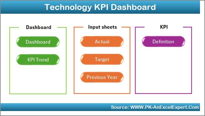
This Technology KPI Dashboard comes with 7 worksheet tabs, each designed to handle a specific function. Let’s explore them one by one.
Home Sheet
-
Acts as an index page.
-
Provides 6 navigation buttons to jump to respective sheets.
-
Offers a clean interface for easy access.
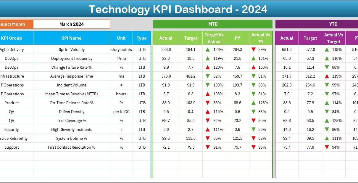
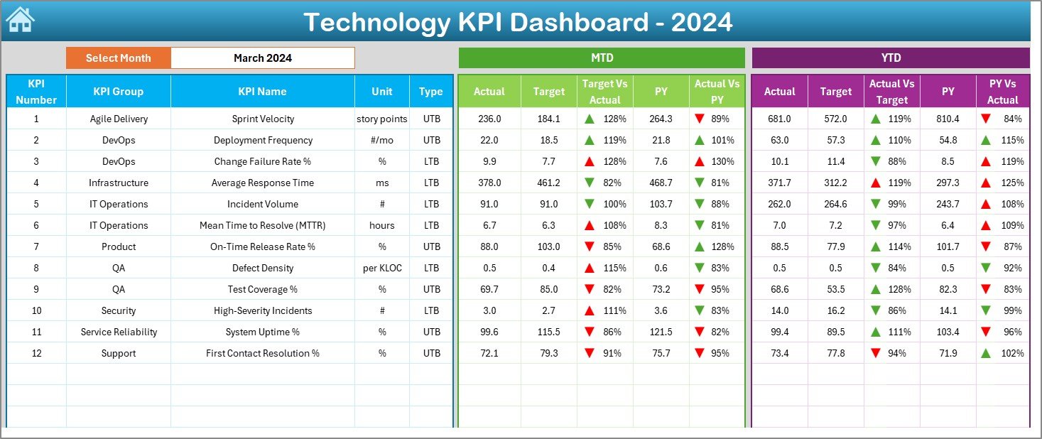
Dashboard Sheet Tab
-
The main dashboard view where all KPIs are displayed.
-
Month selection is available through a drop-down menu (Cell D3).
-
Automatically updates all numbers based on the selected month.
-
Displays MTD (Month-to-Date) and YTD (Year-to-Date) data.
Compares:
- Actual vs Target
- Actual vs Previous Year
-
Uses conditional formatting with arrows to highlight improvement or decline.
KPI Trend Sheet Tab
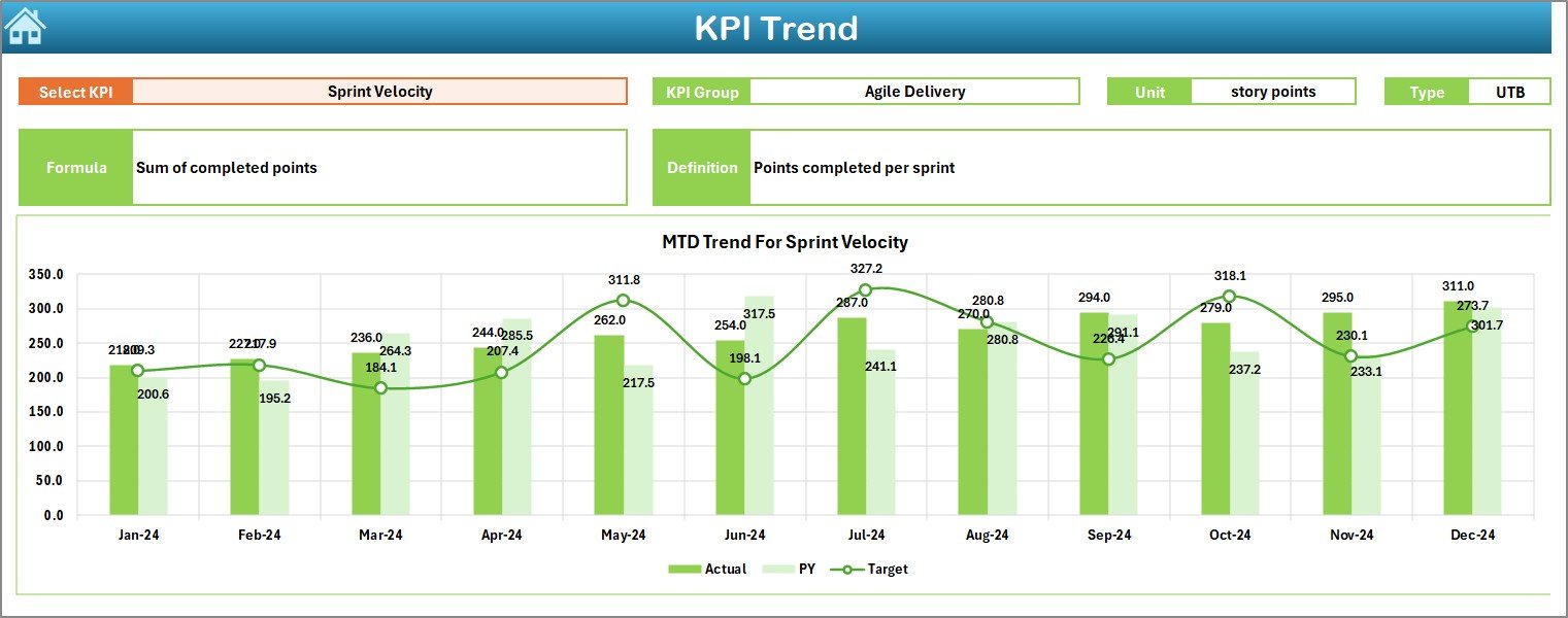
-
Allows selection of specific KPIs through a drop-down menu.
-
Displays detailed trend charts for MTD and YTD.
Shows KPI metadata such as:
- KPI Group
- Unit
- KPI Type (Lower the Better or Upper the Better)
- Formula
- Definition
Actual Numbers Input Sheet
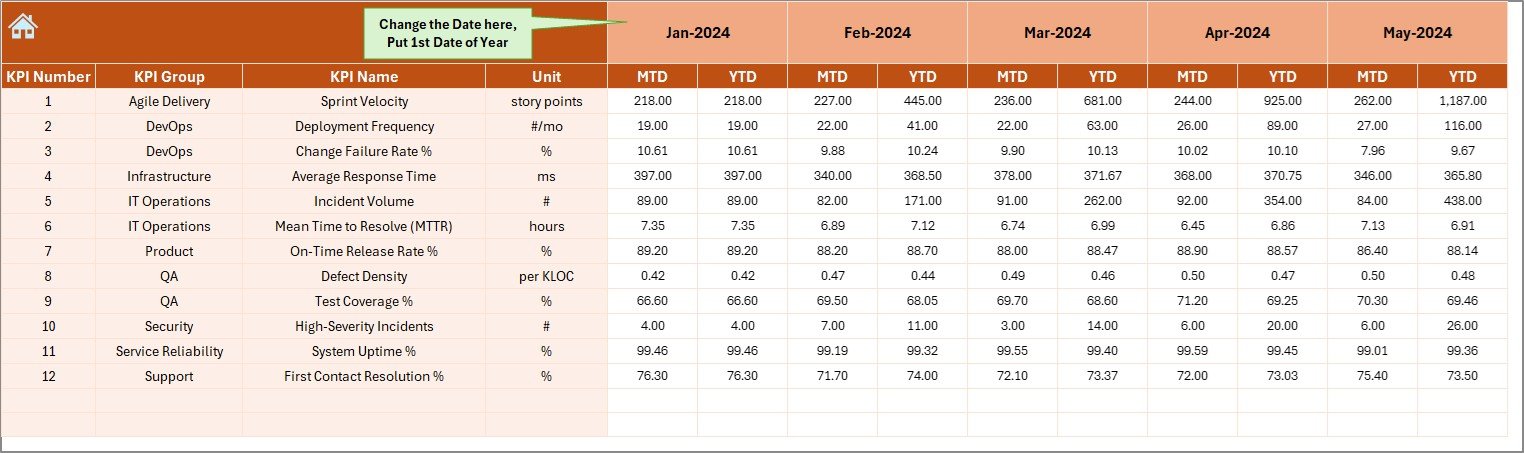
-
Used to enter real-time performance data.
-
Data is entered for MTD and YTD values.
-
Month selection can be updated from Cell E1.
Target Sheet Tab
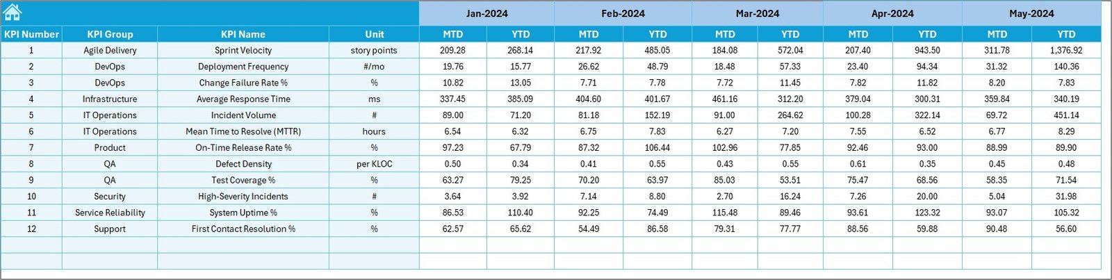
-
Stores monthly and yearly target numbers for each KPI.
-
Ensures alignment with organizational goals.
Previous Year Numbers Sheet
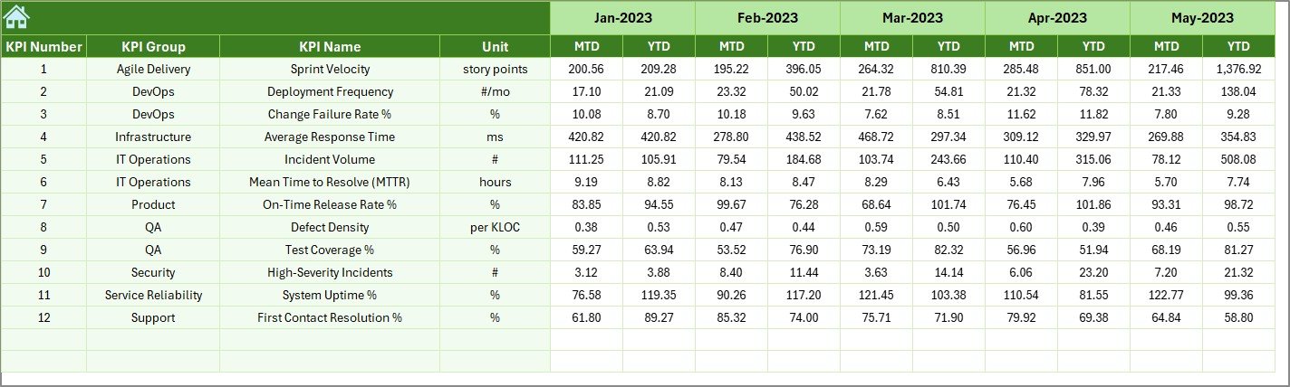
-
Stores historical performance data.
-
Enables comparison with last year’s numbers.
Click to Purchases Technology KPI Dashboard in Excel
KPI Definition Sheet
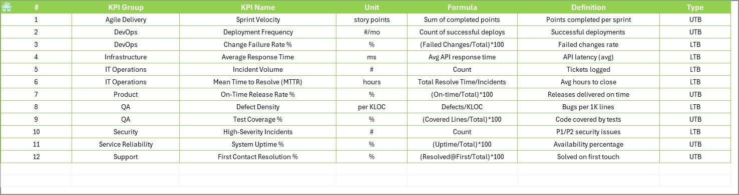
-
A structured list of all KPIs.
Includes:
- KPI Name
- KPI Group
- Unit of Measurement
- Formula
- KPI Definition
Why Do Businesses Need a Technology KPI Dashboard?
Technology teams manage everything from IT infrastructure and cybersecurity to digital transformation projects. Without proper measurement, it is difficult to know whether the department is moving in the right direction.
A Technology KPI Dashboard helps by:
-
Tracking IT costs vs budget.
-
Measuring incident resolution times.
-
Monitoring system uptime.
-
Evaluating user satisfaction with technology services.
-
Supporting data-driven decision-making.
Examples of Technology KPIs to Track
Here are some important KPIs you can include in your dashboard:
-
System Uptime % – Measures availability of IT systems.
-
Incident Response Time – Average time to resolve IT issues.
-
IT Cost per Employee – Technology cost efficiency.
-
User Satisfaction Score – Feedback from internal or external users.
-
Ticket Volume by Category – Identifies workload distribution.
-
Cybersecurity Breach Attempts – Monitors system security.
-
IT Project Delivery Rate – Tracks completion against deadlines.
Advantages of Technology KPI Dashboard in Excel
Using this dashboard brings multiple benefits to organizations:
✅ Easy to Use – No coding knowledge required.
✅ Cost-Effective – No need for expensive software.
✅ Customizable – Can adapt to different business needs.
✅ Visual Clarity – Simplifies large volumes of data into clear visuals.
✅ Performance Monitoring – Helps track both operational and strategic KPIs.
✅ Historical Comparison – Previous year’s data ensures better analysis.
✅ Decision-Making Support – Provides insights for budget, resource, and strategy planning.
Best Practices for Using a Technology KPI Dashboard
To get the most value out of your dashboard, follow these best practices:
📊 Choose the Right KPIs – Avoid tracking too many metrics. Focus only on the most critical ones.
📅 Update Data Regularly – Keep actual numbers updated to ensure accuracy.
🎯 Set Clear Targets – Define realistic targets that align with business goals.
📈 Visualize Trends – Use charts and conditional formatting for better insights.
🔄 Compare Across Periods – Always compare current data with past performance.
🛠 Automate Where Possible – Link Excel sheets with external data sources to reduce manual work.
👥 Engage Stakeholders – Share the dashboard with decision-makers for collaborative improvements.
Practical Use Cases of a Technology KPI Dashboard
-
IT Department Performance Review – Present monthly updates to senior management.
-
Budget Control – Compare IT expenses with planned budgets.
-
Project Monitoring – Track progress of IT development or digital transformation projects.
-
Cybersecurity Oversight – Monitor incidents and preventive measures.
-
Helpdesk Efficiency – Measure ticket closure times and customer satisfaction.
Step-by-Step Workflow of the Dashboard
-
Start from the Home Sheet and use navigation buttons.
-
Enter data in the Actual Numbers, Target, and Previous Year sheets.
-
Review the Dashboard Tab to see real-time insights.
-
Analyze trends in the KPI Trend tab.
-
Update KPI Definition sheet whenever new KPIs are introduced.
-
Present reports to management using dashboard visuals.
Conclusion
The Technology KPI Dashboard in Excel is a practical, flexible, and cost-effective tool for tracking IT performance. From monitoring uptime and cybersecurity incidents to evaluating project delivery and user satisfaction, this dashboard provides a comprehensive view of technology operations.
By adopting the best practices mentioned above, organizations can use this dashboard to enhance decision-making, improve efficiency, and align technology goals with overall business objectives.
Frequently Asked Questions (FAQs)
1. What is a Technology KPI Dashboard in Excel?
It is a prebuilt Excel template that tracks IT performance across various KPIs like uptime, cost, incident resolution, and satisfaction.
2. How does it differ from expensive BI tools?
Excel dashboards are affordable, customizable, and easy to use, making them suitable for small and medium businesses. BI tools are more advanced but costly.
3. Can I add my own KPIs to this dashboard?
Yes. You can add KPIs in the KPI Definition Sheet and link them to the input and dashboard sheets.
4. How often should I update the data?
It is best to update monthly for KPI trends and weekly for operational KPIs like tickets and incidents.
5. Is the dashboard useful for non-IT teams?
Yes. The structure can be adapted for HR, Finance, Sales, or any other department.
6. Does the dashboard allow trend analysis?
Yes. The KPI Trend Sheet shows both MTD and YTD performance compared with targets and previous years.
7. Do I need advanced Excel skills to use it?
No. Basic Excel knowledge is enough, as the template is ready-to-use with drop-downs, charts, and automated formulas.
Visit our YouTube channel to learn step-by-step video tutorials