Efficient time management is the foundation of business success. Whether you’re managing client projects, tracking employee hours, or analyzing productivity trends, having a reliable time tracking system is essential. The Time Tracking Dashboard in Excel offers a powerful yet simple way to capture, analyze, and visualize time data — all within a familiar and customizable Excel environment.
This guide walks you through everything about this dashboard: its structure, key features, advantages, and best practices to help you manage work hours efficiently and make data-driven business decisions.
Click to Purchases Time Tracking Dashboard in Excel
💡 What Is a Time Tracking Dashboard in Excel?
A Time Tracking Dashboard in Excel is a ready-to-use analytical tool designed to track and visualize time utilization across teams, projects, and roles.
It helps managers and professionals monitor key metrics such as billable hours, overtime, project revenue, profit margins, and rejected or pending tasks — all in one dashboard.
The dashboard converts raw data into meaningful insights, allowing you to identify which projects, departments, or roles contribute most to profitability and where time efficiency can be improved.
🧩 Structure of the Time Tracking Dashboard Template
This Excel template includes five analytical pages and supporting data sheets, all interconnected for seamless performance analysis.
1. 📊 Overview Page – Your Command Center
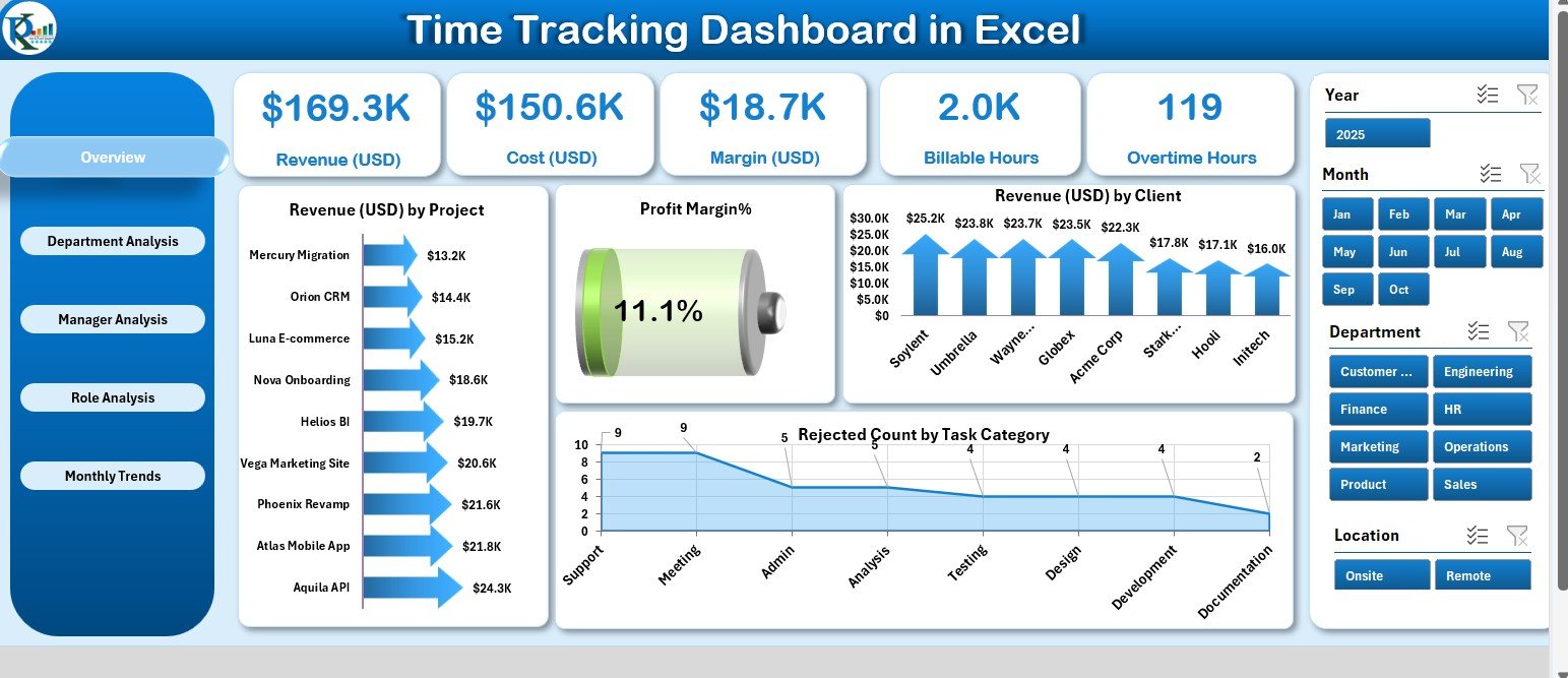
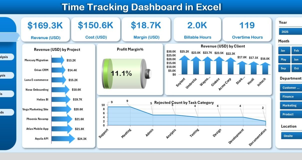
The Overview Page acts as the main dashboard, offering a complete snapshot of business and time performance.
Key Elements:
-
Right-Side Slicer Panel: Filter data easily by project, client, or month.
-
Five KPI Cards: Highlight key metrics like Total Revenue, Billable Hours, Margin %, Rejected Tasks, and Productivity Rate.
-
Visual Charts:
-
Revenue (USD) by Project
-
Profit Margin %
-
Revenue (USD) by Client
-
Rejected Count by Task Category
-
This page gives leadership and managers a real-time understanding of project and client performance.
2. 🏢 Department Analysis Page – Evaluating Team Efficiency
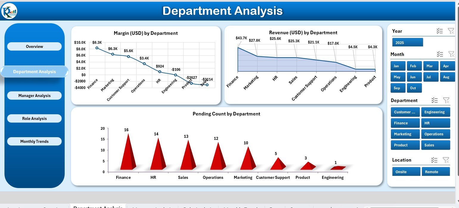
This page focuses on performance by department.
Charts Included:
-
Margin (USD) by Department
-
Revenue (USD) by Department
-
Pending Count by Department
These visuals help identify which departments are the most efficient and which require better time allocation or process optimization.
3. 👨💼 Manager Analysis Page – Leadership-Level Insights
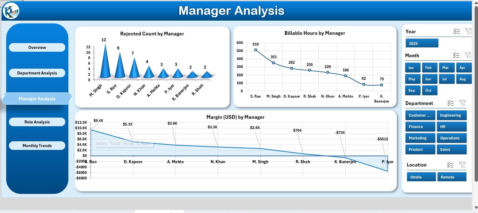
This page helps track the contribution and workload of managers.
Charts Available:
-
Rejected Count by Manager
-
Billable Hours by Manager
-
Margin (USD) by Manager
By comparing these KPIs, companies can assess managerial efficiency and resource utilization across multiple projects.
4. 👩🔧 Role Analysis Page – Time Utilization by Role
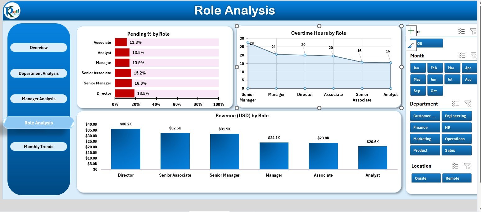
The Role Analysis Page focuses on how different job roles contribute to overall performance.
Key Visuals:
-
Pending % by Role
-
Overtime Hours by Role
-
Revenue (USD) by Role
This analysis highlights which roles deliver the highest output, which face bottlenecks, and where training or process changes could enhance productivity.
5. 📆 Monthly Trends Page – Time and Revenue Over Time
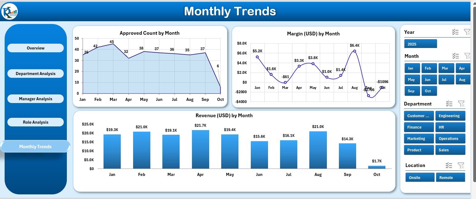
The Monthly Trends Page provides a time-series view of key performance indicators.
Charts Displayed:
-
Approved Counts by Month
-
Margin (USD) by Month
-
Revenue (USD) by Month
This view helps managers spot trends, seasonal patterns, and fluctuations in workload or profitability across months.
🔧 Supporting Sheets – The Backbone of Data
-
Support Sheet: Houses dropdown lists, slicer values, and reference data for consistency.
-
Data Sheet: Contains the actual records of hours worked, project names, clients, tasks, and financial data that feed all the charts and KPIs.
💼 Why Use a Time Tracking Dashboard in Excel?
Excel remains one of the most flexible and accessible tools for managing time and performance data.
Benefits include:
-
No need for expensive software: The dashboard runs entirely in Excel.
-
Customizable: Adapt KPIs and charts to your specific business model.
-
Data-Driven: Instantly visualize where time is being utilized.
-
Integrative: Combine with Power BI or Google Sheets for advanced insights.
-
Automated: Uses formulas and slicers to calculate metrics dynamically.
This dashboard bridges the gap between raw data and decision-making without requiring complex systems.
Click to Purchases Time Tracking Dashboard in Excel
🌟 Advantages of Using the Time Tracking Dashboard in Excel
✅ 1. Centralized Time Management
View all time-related data — from projects to roles — in a single, well-structured file.
✅ 2. Improved Productivity Tracking
Visualize performance at every level: project, department, and employee.
✅ 3. Enhanced Profitability Insights
Compare revenue and margin data to identify the most profitable clients and tasks.
✅ 4. Accurate Decision-Making
Identify where resources are overused or underutilized to optimize time allocation.
✅ 5. Easy-to-Use and Affordable
No advanced tools or coding required — everything runs in Excel.
✅ 6. Supports Continuous Improvement
Spot trends, analyze deviations, and plan better for future time utilization.
🧠 Best Practices for Using the Dashboard
To get the best results, follow these best practices:
-
Update Data Weekly or Monthly: Keep your Data Sheet fresh.
-
Validate Accuracy: Double-check time entries before updating visuals.
-
Define Clear KPIs: Ensure each metric has a well-documented definition.
-
Compare MTD vs YTD: Use both views to balance short- and long-term insights.
-
Leverage Conditional Formatting: Use color cues for quick interpretation.
-
Protect Sheets: Lock formula cells to maintain integrity.
-
Share Insights: Use the Overview page in meetings to visualize time and cost performance.
-
Integrate with Other Tools: Export results to Power BI or project management platforms.
-
Regularly Review Trends: Spot bottlenecks and resource imbalances early.
-
Back Up Files: Always maintain historical versions of your data.
- ⚠️ Common Mistakes to Avoid
Avoid these issues to ensure smooth dashboard performance:
-
Failing to update data regularly.
-
Using inconsistent time formats (hours vs. decimals).
-
Entering incomplete task or client details.
-
Overcomplicating KPI formulas.
-
Ignoring validation or version tracking.
📘 Example Use Case: Project Management Firm
A consulting firm implemented the Time Tracking Dashboard in Excel to manage over 20 client projects.
Within three months, they achieved:
-
15% improvement in billable utilization.
-
20% reduction in unapproved hours.
-
Higher profitability through improved project margin tracking.
-
Streamlined reporting that reduced manual analysis time by 75%.
This demonstrates the real-world value of adopting a structured time tracking system.
Click to Purchases Time Tracking Dashboard in Excel
🧮 Customization Options
You can easily adapt this dashboard for your unique workflow:
-
Add KPIs like “Average Task Duration” or “Idle Hours.”
-
Insert slicers for location, team, or project type.
-
Modify color themes or chart styles.
-
Add financial calculations like billing rate or cost per hour.
-
Expand data sheets for multi-year tracking.
The dashboard is fully editable, allowing you to build an advanced time analytics tool within Excel.
🏁 Conclusion
The Time Tracking Dashboard in Excel is a powerful tool for organizations seeking transparency, efficiency, and accountability in time management.
It transforms how you track billable hours, manage workloads, and evaluate project profitability — all through an easy-to-use Excel interface.
By combining automation, visualization, and flexibility, this dashboard ensures every minute counts toward productivity and profit.
Start using it today and make time tracking a data-driven advantage for your business.
Click to Purchases Time Tracking Dashboard in Excel
❓ Frequently Asked Questions (FAQs)
1. What is the main purpose of the Time Tracking Dashboard?
It helps track, analyze, and visualize time spent on tasks, projects, and roles to improve efficiency and profitability.
2. How many KPIs can I track?
You can start with 10–12 KPIs and add more as needed.
3. Is this template suitable for small teams?
Yes. It works perfectly for freelancers, small businesses, and large enterprises alike.
4. Can I integrate it with Power BI?
Yes. You can export the Excel data to Power BI for deeper visualization.
5. How do I update data each month?
Enter new time logs in the Data Sheet, and all visuals update automatically.
6. What is the role of slicers?
Slicers help filter data quickly by project, client, department, or role.
7. Does it require coding or macros?
No. The entire dashboard runs on Excel formulas and pivot charts.
8. Can I add financial metrics?
Yes. You can include billing rates, costs, and margins for advanced profitability tracking.
9. How often should I review the dashboard?
Weekly or monthly reviews are ideal to maintain real-time insights.
10. What makes this Excel dashboard better than online tools?
It’s offline, customizable, and cost-effective — no subscriptions required.
Click to Purchases Time Tracking Dashboard in Excel
Visit our YouTube channel to learn step-by-step video tutorials
