Urban transportation systems continue to expand rapidly as cities grow and populations increase. Because millions of people rely on metro systems every day, transportation authorities must manage complex metro development projects efficiently. These projects involve infrastructure construction, passenger management, safety monitoring, operational efficiency, and budget control.
However, many metro authorities still rely on scattered spreadsheets, manual reports, and disconnected data sources. As a result, decision-makers struggle to monitor project performance, evaluate operational efficiency, and identify potential issues quickly.
Therefore, organizations need a centralized analytics system that tracks key performance indicators in one place. A well-structured Urban Metro Development KPI Dashboard in Power BI helps managers monitor metro project progress, evaluate performance trends, and make informed strategic decisions.
In this comprehensive guide, you will learn everything about the Urban Metro Development KPI Dashboard in Power BI, including its features, advantages, best practices, and implementation strategies.
Click to buy Urban Metro Development KPI Dashboard in Power BI
What Is an Urban Metro Development KPI Dashboard in Power BI?
An Urban Metro Development KPI Dashboard in Power BI is an interactive analytics solution that monitors key performance indicators related to metro infrastructure development and operations.
This dashboard consolidates metro project data into visual reports, charts, and KPI indicators. Consequently, transportation authorities can monitor performance metrics, track project milestones, and analyze operational efficiency in real time.
Power BI enables metro organizations to connect Excel data sources, build interactive dashboards, and generate automated performance insights.
As a result, metro management teams can easily:
- Track metro infrastructure development KPIs
- Monitor operational efficiency and project progress
- Compare performance with targets and previous years
- Identify delays or performance gaps quickly
Because the dashboard uses interactive visuals and automated calculations, it transforms raw data into meaningful insights.
Why Do Metro Authorities Need KPI Dashboards?
Metro infrastructure projects involve multiple departments, stakeholders, and performance indicators. Therefore, managing all these metrics manually becomes extremely difficult.
Without a proper analytics system, organizations face several challenges.
For example:
- Project teams cannot monitor metro construction progress effectively.
- Management cannot evaluate operational performance quickly.
- Decision-makers struggle to identify delays or inefficiencies.
However, a Power BI KPI Dashboard solves these problems.
It provides a centralized monitoring system that allows authorities to analyze metro project performance instantly.
Additionally, dashboards provide real-time insights that help organizations improve planning and operational efficiency.
Key Features of the Urban Metro Development KPI Dashboard in Power BI
The Urban Metro Development KPI Dashboard in Power BI includes multiple analytical components that help organizations monitor metro infrastructure development efficiently.
This dashboard contains three major pages inside the Power BI desktop application.
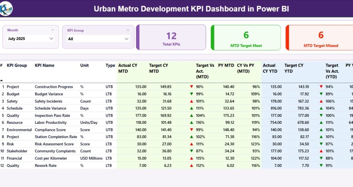
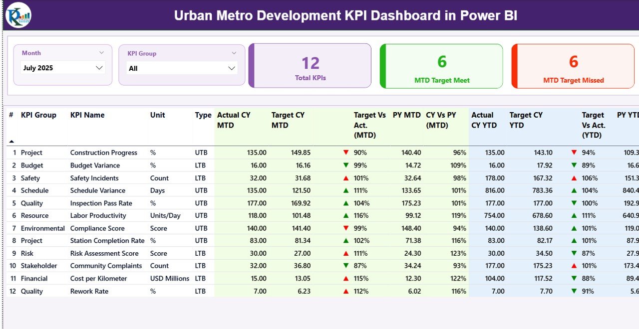
Summary Page – The Main Performance Overview
The Summary Page serves as the primary dashboard that displays metro development KPIs in a structured format.
This page helps decision-makers quickly evaluate overall performance.
Key Elements of the Summary Page
KPI Filters and Slicers
At the top of the dashboard, users can filter data using:
- Month slicer
- KPI Group slicer
These filters allow users to analyze specific time periods or KPI categories easily.
KPI Performance Cards
The dashboard also displays three important KPI cards, including:
- Total KPIs Count – Total number of KPIs tracked in the dashboard
- MTD Target Meet Count – Number of KPIs that achieved targets
- MTD Target Missed Count – Number of KPIs that did not meet targets
These cards provide a quick snapshot of performance.
Detailed KPI Performance Table
Below the KPI cards, the dashboard displays a detailed table that includes several KPI metrics.
These fields include:
KPI Number
- Represents the sequence number assigned to each KPI.
KPI Group
- Indicates the category of the KPI such as infrastructure, safety, operations, or financial performance.
KPI Name
- Displays the name of the performance indicator.
Unit
- Shows the measurement unit of the KPI.
KPI Type (LTB or UTB)
- LTB means Lower the Better.
- UTB means Upper the Better.
This classification helps users interpret KPI results correctly.
Month-to-Date KPI Metrics
The dashboard also displays several Month-to-Date (MTD) performance indicators.
These include:
Actual CY MTD
Shows the actual KPI value for the current year.
Target CY MTD
Displays the expected target value for the current year.
MTD Performance Icon
The dashboard uses icons to indicate KPI status:
- ▲ Green icon = Target achieved
- ▼ Red icon = Target missed
Therefore, users can quickly identify KPI performance.
Target vs Actual (MTD)
This value calculates the percentage comparison using the formula:
Actual MTD / Target MTD
Previous Year MTD (PY MTD)
Displays the KPI value from the same period in the previous year.
CY vs PY (MTD)
Compares current year performance with the previous year.
Year-to-Date KPI Metrics
The dashboard also analyzes Year-to-Date (YTD) performance metrics.
These include:
Actual CY YTD
Current year cumulative KPI value.
Target CY YTD
Target KPI value for the year.
YTD Icon
Similar to the MTD section, icons highlight KPI performance:
- Green ▲ indicates good performance
- Red ▼ indicates underperformance
Target vs Actual (YTD)
Calculated using:
Actual YTD / Target YTD
Previous Year YTD (PY YTD)
Shows the KPI value from the previous year.
CY vs PY (YTD)
Compares current performance with last year’s results.
These insights help metro authorities track long-term progress.
Click to buy Urban Metro Development KPI Dashboard in Power BI
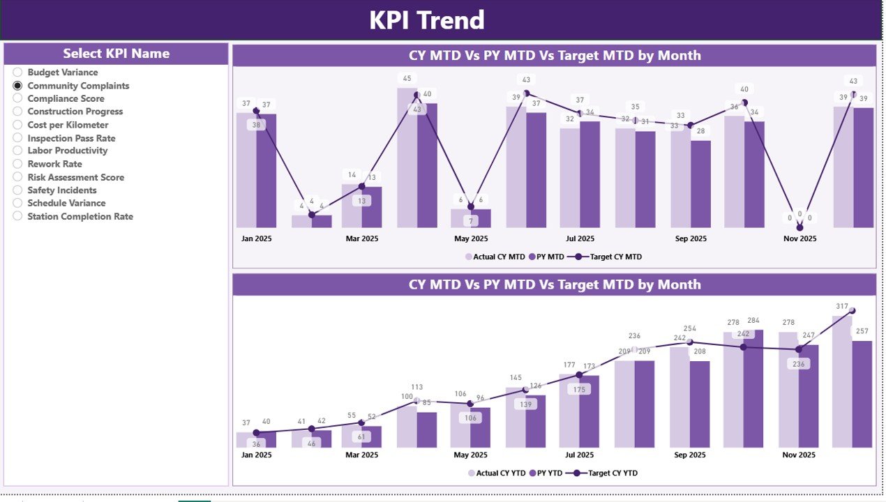
KPI Trend Page – Performance Trend Analysis
The KPI Trend Page helps users analyze performance trends over time.
Because metro development projects span multiple months or years, trend analysis plays a crucial role in performance monitoring.
Key Features of the Trend Page
This page includes two combo charts.
These charts display:
- Current Year Actual values
- Previous Year values
- Target values
The charts analyze both:
- MTD Performance Trends
- YTD Performance Trends
KPI Selection Filter
Users can select any KPI using a slicer on the left side of the dashboard.
Once selected, the charts update automatically.
Therefore, managers can analyze trends for specific KPIs quickly.
This feature improves data exploration and performance evaluation.
Click to buy Urban Metro Development KPI Dashboard in Power BI
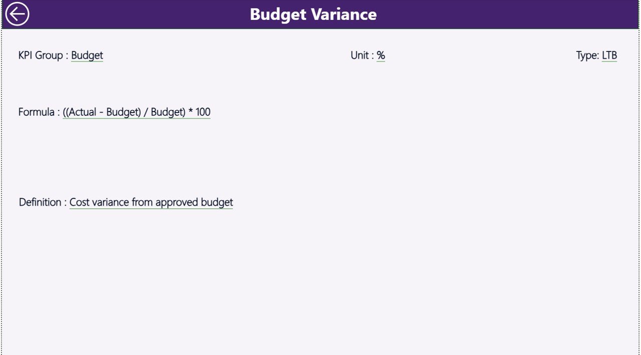
KPI Definition Page – Detailed KPI Information
The KPI Definition Page provides additional information about each KPI.
This page remains hidden in the dashboard.
However, users can access it using the drill-through feature.
Information Available on This Page
The KPI definition page includes:
- KPI formula
- KPI description
- KPI unit
- KPI category
Because this page explains KPI calculation methods, users can understand metrics clearly.
Additionally, the dashboard includes a back button on the top left corner so users can easily return to the main page.
Click to buy Urban Metro Development KPI Dashboard in Power BI
Excel Data Source Used in the Dashboard
The Urban Metro Development KPI Dashboard uses an Excel file as the primary data source.
This Excel file contains three worksheets where users enter data.
Input_Actual Worksheet
This sheet stores actual KPI performance data.
Users must enter:
- KPI Name
- Month (first date of the month)
- MTD value
- YTD value
This data feeds directly into the Power BI dashboard.
Click to buy Urban Metro Development KPI Dashboard in Power BI
Input_Target Worksheet
This sheet stores target KPI values.
Users must enter:
- KPI Name
- Month
- Target MTD values
- Target YTD values
Power BI compares these targets with actual performance.
KPI Definition Worksheet
This sheet stores KPI metadata and definitions.
Users must enter:
- KPI Number
- KPI Group
- KPI Name
- Unit
- Formula
- KPI Definition
- KPI Type (LTB or UTB)
This sheet helps Power BI generate detailed KPI reports.
Advantages of the Urban Metro Development KPI Dashboard in Power BI
Using a Power BI metro KPI dashboard offers several advantages for metro authorities and transportation organizations.
- Centralized Performance Monitoring
The dashboard consolidates all metro KPIs into a single analytics platform.
Therefore, managers can easily track project performance.
- Faster Decision-Making
Interactive reports allow management to analyze performance instantly.
Consequently, decision-makers can respond quickly to operational issues.
- Improved Project Transparency
The dashboard provides clear visibility into metro project progress.
As a result, stakeholders can monitor performance effectively.
- Real-Time KPI Monitoring
Power BI automatically updates reports when Excel data changes.
Therefore, organizations always access the latest performance insights.
- Better Resource Management
By analyzing KPI trends, managers can allocate resources more efficiently.
Consequently, organizations improve operational efficiency.
Best Practices for the Urban Metro Development KPI Dashboard
To maximize the benefits of a Power BI metro dashboard, organizations should follow several best practices.
Define Clear KPIs
Organizations must identify the most relevant KPIs for metro development.
For example:
- Construction progress
- Operational efficiency
- Passenger satisfaction
- Maintenance performance
Maintain Accurate Data
Accurate data ensures reliable dashboard insights.
Therefore, teams should update Excel data regularly.
Use Consistent KPI Definitions
Every KPI should have a clear definition and formula.
This approach ensures consistency across departments.
Monitor KPI Trends Regularly
Trend analysis helps identify performance changes early.
Therefore, managers should review dashboard reports frequently.
Train Teams to Use the Dashboard
Employees must understand how to interpret dashboard insights.
Training sessions improve dashboard adoption.
Who Can Use the Urban Metro Development KPI Dashboard?
Many organizations can benefit from this dashboard.
For example:
- Metro rail corporations
- Urban transportation authorities
- Infrastructure development agencies
- Government transport departments
- Smart city development organizations
Additionally, consultants and project managers can use this dashboard for performance monitoring.
How Does Power BI Improve Metro Project Management?
Power BI offers several advanced analytics capabilities that improve metro project monitoring.
For example:
Interactive Visualizations
Power BI provides charts, graphs, and KPI indicators that simplify data interpretation.
Automated Reporting
Organizations can automate metro performance reports using Power BI.
This feature reduces manual reporting effort.
Drill-Through Analysis
Users can explore detailed KPI information using drill-through features.
This functionality improves data analysis.
Integration with Excel
Power BI easily connects with Excel data sources.
Therefore, organizations can manage data efficiently.
Future of Metro Infrastructure Analytics
Urban transportation systems will continue expanding worldwide.
Therefore, data analytics will play a crucial role in metro project management.
Modern analytics platforms like Power BI will enable organizations to:
- Predict project delays
- Optimize metro operations
- Improve passenger services
- Monitor infrastructure health
Consequently, metro authorities will rely heavily on data-driven decision-making.
Conclusion
Urban metro systems play a vital role in modern cities. However, managing metro infrastructure development and operations requires efficient performance monitoring systems.
The Urban Metro Development KPI Dashboard in Power BI provides a powerful analytics solution that helps organizations track metro KPIs, analyze trends, and evaluate performance.
Because this dashboard combines Excel data with interactive Power BI visualizations, transportation authorities can monitor project progress easily.
Additionally, the dashboard improves decision-making, enhances operational transparency, and supports strategic planning.
Therefore, metro authorities should adopt modern KPI dashboards to improve infrastructure development and operational efficiency.
Frequently Asked Questions (FAQs)
What is a KPI dashboard in Power BI?
A KPI dashboard in Power BI is an interactive analytics tool that monitors key performance indicators using visual reports and charts.
Why do metro authorities need KPI dashboards?
Metro authorities need dashboards to monitor project performance, evaluate operational efficiency, and make data-driven decisions.
What data sources does the dashboard use?
The dashboard uses Excel files as the primary data source.
What are MTD and YTD metrics?
MTD means Month-to-Date performance, while YTD means Year-to-Date performance.
Can organizations customize this dashboard?
Yes. Organizations can modify KPIs, charts, and data sources according to their operational requirements.
Visit our YouTube channel to learn step-by-step video tutorials
Watch the step-by-step video tutorial:
Click to buy Urban Metro Development KPI Dashboard in Power BI