Managing vacation rentals has become more competitive than ever. Guest expectations continue to rise. Pricing changes frequently. Platforms like Airbnb and Booking.com increase competition daily. Therefore, property managers must track performance carefully.
However, many owners still depend on scattered Excel sheets and manual reports. As a result, they lose visibility. They miss trends. They react late to problems.
That is exactly why a Vacation Rentals KPI Dashboard in Power BI becomes essential.
This ready-to-use Power BI dashboard transforms raw rental data into powerful insights. Moreover, it allows you to monitor Month-to-Date (MTD), Year-to-Date (YTD), Target vs Actual, and Previous Year comparisons in one structured system.
In this detailed guide, you will learn:
- What a Vacation Rentals KPI Dashboard in Power BI is
- Why property managers need it
- Dashboard pages and features
- Data structure and Excel integration
- Advantages of using it
- Best practices for implementation
- Frequently Asked Questions
Click to buy Vacation Rentals KPI Dashboard in Power BI
What Is a Vacation Rentals KPI Dashboard in Power BI?
A Vacation Rentals KPI Dashboard in Power BI is an interactive analytics solution designed to track and monitor key performance indicators for short-term rental properties.
Instead of reviewing multiple spreadsheets, you can:
- Track occupancy rate
- Monitor revenue and ADR
- Compare actual performance against targets
- Analyze MTD and YTD trends
- Compare current year with previous year
Therefore, you make faster and smarter business decisions.
Power BI connects directly to an Excel data source. Then, it transforms numbers into interactive visuals, slicers, and KPI indicators.
Why Do Vacation Rental Businesses Need a KPI Dashboard?
Vacation rental businesses operate in a dynamic market. Prices change weekly. Booking patterns fluctuate seasonally. Guest demand varies by location and events.
Because of this, you must monitor performance continuously.
Without a dashboard:
- You cannot see performance gaps quickly
- You struggle to identify underperforming properties
- You react late to declining occupancy
- You miss revenue growth opportunities
However, with a structured KPI dashboard:
- You detect issues early
- You compare targets instantly
- You improve pricing strategy
- You increase profitability
Therefore, this dashboard becomes a decision-making tool, not just a reporting file.
What Are the Key Features of the Vacation Rentals KPI Dashboard in Power BI?
This ready-to-use solution includes three powerful pages inside the Power BI Desktop file.
Summary Page – The Main Control Panel
The Summary Page acts as the central command center. Here, you can monitor all KPIs at a glance.
What Do You See on the Summary Page?
Month Slicer
You can select any month from the slicer. As soon as you change the month, the entire dashboard updates instantly.
KPI Group Slicer
You can filter KPIs by category. Therefore, you can focus only on Revenue, Occupancy, Cost, or Guest Experience KPIs.
KPI Cards at the Top
At the top section, you see three powerful KPI cards:
- Total KPIs Count
- MTD Target Meet Count
- MTD Target Missed Count
These cards provide a quick performance summary. Therefore, management can understand overall KPI health within seconds.
Detailed KPI Performance Table
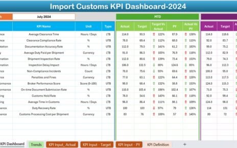
Below the cards, you see a structured KPI table. This table shows complete performance information.
Columns Explained:
- KPI Number – Sequential number of each KPI
- KPI Group – KPI category
- KPI Name – Performance indicator name
- Unit – Measurement unit (%, $, Days, etc.)
- Type – LTB (Lower the Better) or UTB (Upper the Better)
MTD Section (Month-to-Date)
- Actual CY MTD – Current year actual MTD value
- Target CY MTD – Current year target MTD value
- MTD Icon – ▲ Green (Good) / ▼ Red (Needs Attention)
- Target vs Actual (MTD) – Actual ÷ Target
- PY MTD – Previous year MTD value
- CY vs PY (MTD) – Current Year ÷ Previous Year
Therefore, you instantly know whether performance improves or declines.
YTD Section (Year-to-Date)
- Actual CY YTD
- Target CY YTD
- YTD Icon – Visual indicator
- Target vs Actual (YTD)
- PY YTD
- CY vs PY (YTD)
As a result, you track long-term performance trends clearly.

Click to buy Vacation Rentals KPI Dashboard in Power BI
KPI Trend Page – Performance Over Time
While the Summary page gives a snapshot, the KPI Trend page provides historical insight.
What Does This Page Show?
Two combo charts:
MTD Chart
YTD Chart
Comparison between:
Current Year Actual
Previous Year
Targets
Additionally, a KPI Name slicer allows you to select any KPI.
Therefore, you can analyze:
- Revenue growth trends
- Occupancy fluctuations
- Seasonal performance patterns
- Target achievement consistency
Trend analysis helps you plan future strategies.

Click to buy Vacation Rentals KPI Dashboard in Power BI
KPI Definition Page – Drill-Through Details
This page remains hidden by default. However, you can drill through from the Summary page.
What Information Does It Show?
- KPI Formula
- KPI Definition
- KPI Group
- Unit
- KPI Type (LTB / UTB)
Therefore, managers understand how each KPI works.
A back button at the top left helps users return easily to the main page.

Click to buy Vacation Rentals KPI Dashboard in Power BI
How Does the Excel Data Source Work?
The dashboard connects to an Excel file. Therefore, you only need to update Excel data regularly.
The Excel file contains three worksheets.
Input_Actual Sheet
You must fill:
- KPI Name
- Month (First date of month)
- MTD Value
- YTD Value
This sheet stores actual performance data.

Click to buy Vacation Rentals KPI Dashboard in Power BI
Input_Target Sheet
You must fill:
- KPI Name
- Month
- Target MTD
- Target YTD
This sheet stores planned targets.
KPI Definition Sheet
You must fill:
- KPI Number
- KPI Group
- KPI Name
- Unit
- Formula
- Definition
- Type (LTB or UTB)
After updating Excel, simply refresh Power BI. The dashboard updates automatically.
Therefore, maintenance becomes simple and efficient.
What KPIs Should You Track in Vacation Rentals?
Although businesses may vary, common KPIs include:
- Occupancy Rate
- Average Daily Rate (ADR)
- Revenue Per Available Room (RevPAR)
- Booking Conversion Rate
- Cancellation Rate
- Guest Satisfaction Score
- Cleaning Cost per Booking
- Maintenance Cost Ratio
- Average Length of Stay
- Repeat Guest Rate
Tracking these KPIs improves strategic decisions.
Advantages of Vacation Rentals KPI Dashboard in Power BI
Now let us understand the real benefits.
Centralized Data Visibility
You see all KPIs in one dashboard. Therefore, you eliminate confusion.
Faster Decision Making
Since visuals update instantly, you respond quickly to performance changes.
Target Monitoring
You compare actual performance against targets easily. Consequently, you stay aligned with goals.
Historical Comparison
You compare current performance with previous year. Therefore, you measure growth accurately.
Visual Indicators
Green ▲ and Red ▼ icons simplify understanding. Even non-technical users can interpret data.
Easy Data Maintenance
You only update Excel. Then, you refresh Power BI.
Scalability
You can add more KPIs anytime without redesigning the dashboard.
Best Practices for the Vacation Rentals KPI Dashboard in Power BI
To maximize dashboard performance, follow these best practices.
Define Clear KPI Goals
Before tracking KPIs, define measurable targets. Otherwise, you cannot evaluate success.
Maintain Monthly Data Discipline
Update Excel monthly using consistent date formats. Always use the first date of the month.
Classify KPIs Properly
Clearly define LTB and UTB. For example:
- Cancellation Rate → LTB
- Occupancy Rate → UTB
Proper classification ensures accurate icons.
Review Performance Monthly
Schedule monthly KPI review meetings. Use the Summary page as discussion support.
Use Trend Analysis for Forecasting
Study KPI Trend charts carefully. Identify seasonality patterns.
Keep KPI Definitions Updated
Whenever you change formulas, update the KPI Definition sheet immediately.
Train Your Team
Ensure managers understand icons, percentages, and drill-through options.
How Does This Dashboard Improve Profitability?
Profitability increases when you act based on insights.
For example:
- If occupancy declines, you adjust pricing.
- If cleaning costs rise, you negotiate vendor contracts.
- If cancellation rates increase, you revise booking policies.
Therefore, this dashboard directly supports revenue growth and cost control.
Who Should Use This Dashboard?
This solution suits:
- Airbnb Hosts
- Vacation Rental Managers
- Property Management Companies
- Hospitality Consultants
- Revenue Managers
- Portfolio Owners
Because it offers clarity, both small and large businesses benefit.
How Is This Different from Traditional Excel Reports?
Traditional Excel reports:
- Require manual formulas
- Create version confusion
- Offer limited visuals
- Do not provide interactive slicers
However, Power BI dashboards:
- Offer interactive filters
- Provide dynamic visuals
- Enable drill-through analysis
- Support better presentation
Therefore, Power BI improves professional reporting.
How Often Should You Update the Dashboard?
Ideally:
- Update Actual data monthly
- Update Target data annually or quarterly
- Review KPIs weekly during peak seasons
Consistent updates improve decision quality.
What Makes This Dashboard Ready-to-Use?
This dashboard already includes:
- Structured KPI table
- MTD and YTD calculations
- Target comparison formulas
- Previous year comparisons
- Visual performance icons
- Drill-through functionality
Therefore, you do not need to build everything from scratch.
You simply:
- Fill Excel data
- Open Power BI
- Click Refresh
And your dashboard becomes fully updated.
Conclusion: Why Should You Implement This Dashboard Today?
Vacation rental markets grow rapidly. Competition intensifies daily. Therefore, relying on manual tracking no longer works.
A Vacation Rentals KPI Dashboard in Power BI gives you clarity, control, and confidence.
It helps you:
- Monitor KPIs accurately
- Compare targets instantly
- Identify performance gaps
- Improve profitability
- Make data-driven decisions
If you want structured, professional, and scalable reporting, this dashboard provides the perfect solution.
Now, let’s answer some common questions.
Frequently Asked Questions (FAQs)
What is MTD and YTD in the dashboard?
MTD means Month-to-Date performance.
YTD means Year-to-Date cumulative performance.
What does LTB and UTB mean?
LTB means Lower the Better (e.g., Cancellation Rate).
UTB means Upper the Better (e.g., Occupancy Rate).
Can I add more KPIs?
Yes. You can add more KPIs in the Excel file. Then refresh Power BI.
Do I need advanced Power BI knowledge to use this dashboard?
No. You only need basic refresh knowledge. The dashboard remains ready-to-use.
How frequently should I update the data?
You should update data monthly. However, high-volume businesses may update weekly.
Can this dashboard handle multiple properties?
Yes. You can include property-level filters in Excel data. Then create additional slicers.
Is this dashboard suitable for small Airbnb hosts?
Yes. Even single-property owners benefit from structured KPI tracking.
Visit our YouTube channel to learn step-by-step video tutorials
Watch the step-by-step video tutorial:
Click to buy Vacation Rentals KPI Dashboard in Power BI


