Running a veterinary clinic involves far more than treating pets. You manage appointments, medications, service costs, customer satisfaction, and monthly performance at the same time. However, when this data stays scattered across Excel sheets or billing systems, decision-making becomes slow and unclear. That is exactly why a Veterinary Services Dashboard in Power BI becomes essential for modern veterinary practices.
In this in-depth guide, you will learn what a Veterinary Services Dashboard in Power BI is, how it works, why clinics need it, and how each dashboard page delivers actionable insights. Moreover, this article explains the advantages, best practices, and frequently asked questions related to veterinary dashboards, using clear language and real-world logic.
Click to Purchases Veterinary Services Dashboard in Power BI
What Is a Veterinary Services Dashboard in Power BI?
A Veterinary Services Dashboard in Power BI is a centralized visual reporting solution that helps veterinary clinics track operational, financial, and service-related performance in one place. Instead of reviewing multiple reports, clinic owners and managers can instantly view key metrics through interactive charts, cards, and filters.
Because Power BI connects easily with Excel and clinic data sources, this dashboard transforms raw veterinary data into meaningful insights. As a result, clinics gain full visibility into medication costs, service costs, billing amounts, and customer satisfaction across pet types, services, veterinarians, and months.
Most importantly, the dashboard allows users to filter data dynamically using slicers. Therefore, you can analyze performance by pet type, service category, service name, or month within seconds.
Why Do Veterinary Clinics Need a Power BI Dashboard?
Veterinary clinics face rising costs, growing competition, and increasing client expectations. Therefore, data-driven decisions matter more than ever. A Veterinary Services Dashboard in Power BI helps clinics overcome common operational challenges.
Here is why clinics actively adopt this dashboard:
-
Clinics need real-time visibility into service and medication costs
-
Managers want to identify high-performing services and veterinarians
-
Owners aim to improve customer satisfaction scores
-
Finance teams require monthly and category-wise cost tracking
-
Leadership wants clear insights without manual reporting
Because Power BI dashboards refresh data quickly, clinics can react faster and plan better. Moreover, teams can focus on patient care instead of spending hours preparing reports.
How Does a Veterinary Services Dashboard in Power BI Work?
The Veterinary Services Dashboard works by connecting structured data, usually stored in Excel or a clinic management system, to Power BI. Once connected, Power BI models the data and creates interactive visuals.
The workflow usually follows these steps:
-
Collect veterinary data such as visits, services, medications, billing, and satisfaction scores
-
Clean and structure the data in Excel or a database
-
Load the data into Power BI Desktop
-
Create calculated measures for costs and satisfaction
-
Design dashboard pages with slicers and visuals
-
Publish the dashboard for secure sharing
Because Power BI supports slicers, charts, and cards, users can explore data from multiple angles without technical knowledge.
What Are the Key Features of a Veterinary Services Dashboard in Power BI?
This Veterinary Services Dashboard includes five structured pages, each designed to answer specific business questions. Every page contains slicers that allow users to filter and analyze data interactively.
Let us explore each page in detail.
Overview Page: How Is Overall Veterinary Performance Measured?

The Overview Page serves as the entry point of the dashboard. It provides a high-level summary of clinic performance across services, locations, and veterinarians.
Key Insights on the Overview Page
The Overview Page includes interactive slicers, which allow users to filter data by time period, clinic, or other dimensions. Additionally, this page displays key performance cards and charts.
Important Cards on the Overview Page
-
Medication Cost by Visit Type
This card shows how medication costs vary across different visit types, such as routine checkups or emergency visits. Therefore, clinics can control unnecessary medication expenses. -
Service Cost by Clinic Location
This card compares service costs across clinic locations. As a result, management can identify cost-heavy locations and improve efficiency. -
Customer Satisfaction Score by Veterinarian Name
This card highlights satisfaction scores for each veterinarian. Hence, clinics can recognize top performers and support underperforming staff. -
Service Cost by Service Category
This card shows which service categories generate higher costs. Therefore, clinics can revise pricing or improve processes.
Because this page summarizes performance instantly, decision-makers gain clarity within seconds.
Pet Type Analysis Page: How Do Costs and Satisfaction Vary by Pet Type?
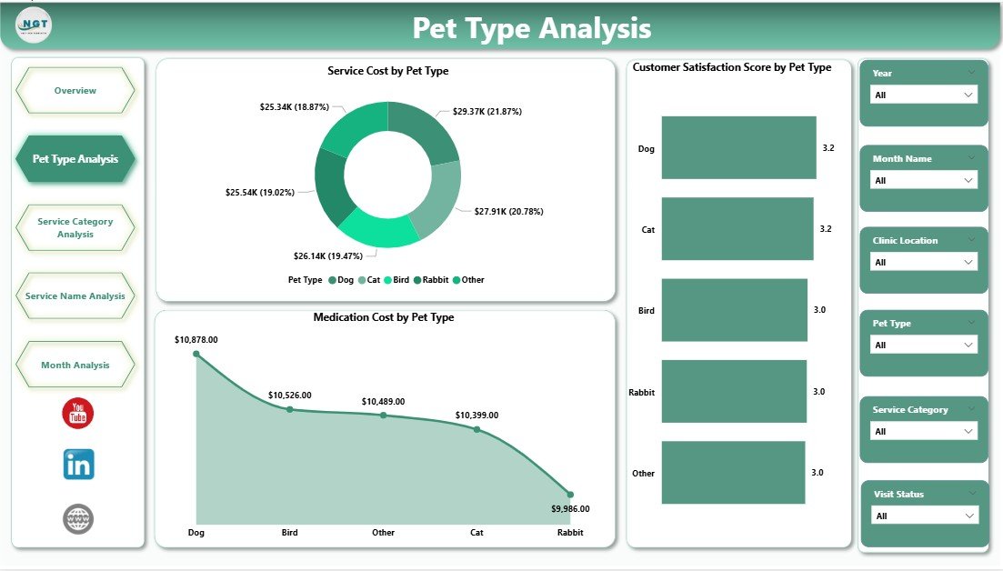
The Pet Type Analysis Page focuses on understanding performance across different pet categories, such as dogs, cats, birds, or exotic animals.
Why Pet Type Analysis Matters
Different pet types require different medications, services, and care intensity. Therefore, analyzing data by pet type helps clinics allocate resources wisely.
Key Charts on the Pet Type Analysis Page
-
Medication Cost by Pet Type
This chart shows how medication expenses differ across pet types. As a result, clinics can manage inventory and pricing more effectively. -
Service Cost by Pet Type
This chart highlights service-related expenses for each pet category. Therefore, managers can assess profitability by pet type. -
Customer Satisfaction Score by Pet Type
This chart reveals how satisfied pet owners feel based on pet type. Hence, clinics can improve service quality for specific segments.
Because slicers allow quick filtering, clinics can instantly drill into specific pet categories.
Click to Purchases Veterinary Services Dashboard in Power BI
Service Category Analysis Page: Which Service Categories Drive Revenue and Cost?

The Service Category Analysis Page helps clinics understand performance across different service categories, such as diagnostics, surgery, grooming, or vaccinations.
Importance of Service Category Analysis
Each service category contributes differently to revenue and cost. Therefore, analyzing service categories supports better pricing and service planning.
Key Charts on the Service Category Analysis Page
-
Medication Cost by Service Category
This chart shows medication spending across service categories. Thus, clinics can identify high-cost services. -
Total Bill Amount by Service Category
This chart highlights revenue contribution by each service category. As a result, clinics can focus on profitable services. -
Customer Satisfaction Score by Service Category
This chart tracks satisfaction levels by service category. Therefore, clinics can improve service quality where needed.
This page helps clinics balance cost control and customer experience.
Service Name Analysis Page: Which Individual Services Perform Best?

The Service Name Analysis Page provides deeper insights at the individual service level.
Why Service Name Analysis Is Critical
While categories offer a broad view, individual services reveal precise performance details. Therefore, clinics can fine-tune offerings.
Key Charts on the Service Name Analysis Page
-
Medication Cost by Service Name
This chart shows medication expenses for each service. Hence, clinics can optimize treatment protocols. -
Total Bill Amount by Service Name
This chart displays revenue generated by individual services. As a result, clinics can promote high-performing services. -
Customer Satisfaction Score by Service Name
This chart reveals client satisfaction for each service. Therefore, clinics can improve low-scoring services.
This page supports service-level decision-making with clarity.
Click to Purchases Veterinary Services Dashboard in Power BI
Month Analysis Page: How Does Veterinary Performance Change Over Time?
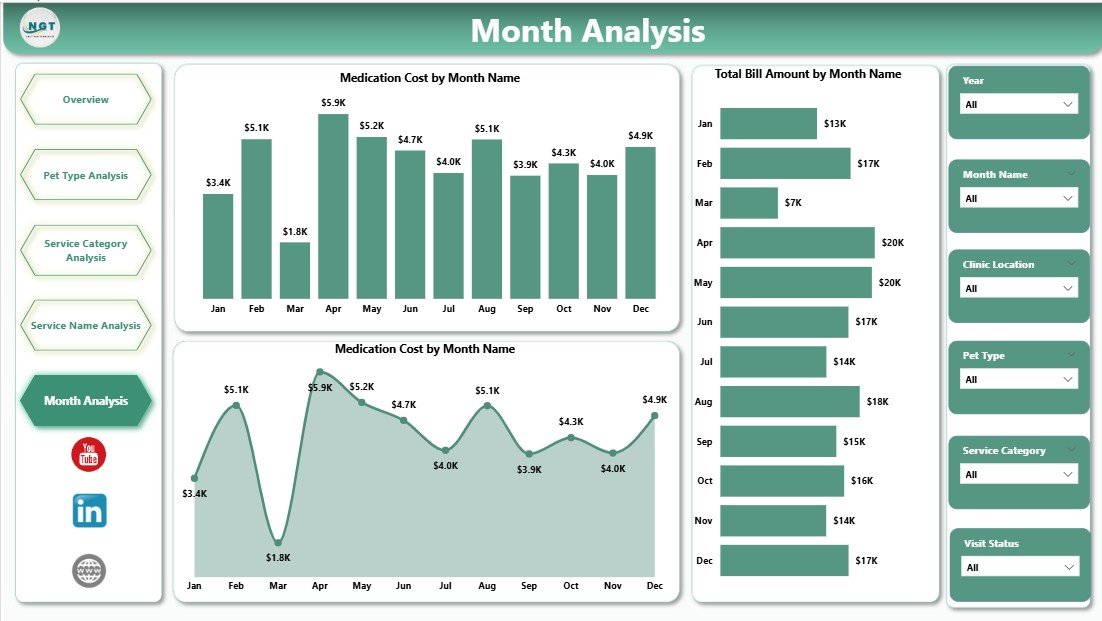
The Month Analysis Page tracks trends over time and highlights seasonal patterns.
Why Monthly Analysis Matters
Veterinary clinics often experience seasonal demand. Therefore, monthly analysis helps clinics prepare for fluctuations.
Key Charts on the Month Analysis Page
-
Medication Cost by Month
This chart shows monthly medication spending trends. Thus, clinics can forecast inventory needs. -
Total Bill Amount by Month
This chart tracks monthly revenue trends. As a result, clinics can plan cash flow better. -
Service Cost by Month
This chart highlights service cost variations by month. Therefore, clinics can identify inefficiencies.
This page supports long-term planning and budgeting.
Advantages of a Veterinary Services Dashboard in Power BI
Using a Veterinary Services Dashboard in Power BI delivers several powerful benefits.
Key Advantages
-
Centralized view of veterinary operations
-
Faster decision-making through real-time visuals
-
Improved cost control across medications and services
-
Better customer satisfaction tracking
-
Clear insights without complex reports
-
Easy filtering with slicers
-
Scalable solution for growing clinics
Because Power BI dashboards update easily, clinics stay informed at all times.
Best Practices for the Veterinary Services Dashboard in Power BI
To get maximum value from your dashboard, follow these proven best practices.
Data Preparation Best Practices
-
Maintain clean and consistent data
-
Use standardized service and pet type names
-
Validate satisfaction score inputs
Dashboard Design Best Practices
-
Keep visuals simple and readable
-
Limit the number of charts per page
-
Use consistent color themes
-
Place slicers at the top for easy access
Usage Best Practices
-
Review dashboards weekly or monthly
-
Train staff to interpret visuals
-
Use insights to adjust pricing and staffing
-
Combine dashboard insights with clinical expertise
By following these practices, clinics achieve better results from their dashboards.
Click to Purchases Veterinary Services Dashboard in Power BI
Who Can Benefit from a Veterinary Services Dashboard in Power BI?
Many stakeholders gain value from this dashboard.
-
Veterinary clinic owners
-
Practice managers
-
Finance and billing teams
-
Veterinarians and senior staff
-
Multi-location clinic operators
Because the dashboard supports different analysis levels, every role benefits.
Conclusion: Why Should You Use a Veterinary Services Dashboard in Power BI?
A Veterinary Services Dashboard in Power BI transforms complex clinic data into clear, actionable insights. Instead of guessing, clinics make confident decisions based on real numbers. Moreover, the dashboard improves cost control, service quality, and customer satisfaction.
By using structured pages such as Overview, Pet Type Analysis, Service Category Analysis, Service Name Analysis, and Month Analysis, veterinary clinics gain full operational visibility. As a result, clinics grow sustainably while delivering better care to pets and owners.
Frequently Asked Questions (FAQs)
What data do I need for a Veterinary Services Dashboard in Power BI?
You need service details, medication costs, billing amounts, pet types, service categories, service names, dates, and customer satisfaction scores.
Can small veterinary clinics use Power BI dashboards?
Yes, small clinics can easily use Power BI dashboards. Because Power BI works well with Excel, even small datasets deliver valuable insights.
How often should I update the dashboard?
You should update the dashboard monthly or weekly. However, frequent updates provide better visibility and faster decisions.
Does this dashboard require advanced Power BI skills?
No, end users do not need advanced skills. Once built, the dashboard works through simple slicers and visuals.
Can I customize the Veterinary Services Dashboard?
Yes, you can fully customize visuals, measures, and pages based on clinic needs.
How does this dashboard improve customer satisfaction?
The dashboard highlights satisfaction scores by veterinarian, service, and pet type. Therefore, clinics can quickly improve weak areas.
Visit our YouTube channel to learn step-by-step video tutorials