Managing water utilities demands accuracy, speed, and complete visibility. Teams monitor water production, distribution, losses, energy usage, quality, billing, and operational efficiency every day. When the data stays in different files, manual reports take time, delays happen, and teams miss early warning signs.
A Water Utilities KPI Dashboard in Power BI solves these problems. It brings all important KPIs into one place, helps you compare performance month-wise and year-wise, and gives you instant insights with clean visuals. Because Power BI is user-friendly and powerful, you get a smart decision-making tool with no complex setup.
In this detailed guide, you will explore what this dashboard is, how it works, its full structure, the benefits, best practices, and answers to common questions. You will also learn about its pages, slicers, cards, tables, charts, and the Excel-based data structure behind it.
Let’s begin.
Click to Purchases Water Utilities KPI Dashboard in Power BI
What Is a Water Utilities KPI Dashboard in Power BI?
A Water Utilities KPI Dashboard in Power BI is a ready-to-use reporting system that helps water utility teams track their operational KPIs in one place. It captures the KPI details, monthly actuals, monthly targets, and year-to-date performance using Excel as the input file. The dashboard uses slicers, cards, tables, icons, combos charts, and drill-through features to show complete performance insights.
This dashboard becomes very useful for:
-
Water distribution departments
-
Water treatment plants
-
Utility management teams
-
Performance monitoring units
-
Operational excellence teams
-
Public water boards
-
Private water utility companies
Because the dashboard runs in Power BI Desktop, teams can update the Excel file every month and refresh the Power BI dashboard without any manual formatting.
Why Do Water Utilities Need KPI Dashboards?
Water systems handle large responsibilities such as supply, quality control, operations, billing, and customer service. Without the right KPIs, teams work in the dark. A KPI dashboard ensures full visibility, continuous improvement, and data-driven decisions.
Here are the most common challenges in water utilities that a KPI dashboard solves:
-
Difficulty in tracking month-wise and year-wise performance
-
No consolidated view of KPI achievements
-
Delayed reporting due to manual Excel-based reports
-
No visual comparison of actuals vs. targets
-
Hard to identify problem areas early
-
Lack of standard KPI definitions
-
No automated comparison with previous year performance
A Power BI-based dashboard removes these challenges completely.
Click to Purchases Water Utilities KPI Dashboard in Power BI
How the Water Utilities KPI Dashboard in Power BI Works
This dashboard captures data from an Excel file. All actual numbers, target numbers, and KPI definitions stay inside structured worksheets. Power BI reads these sheets and displays interactive visuals.
The dashboard contains three main pages:
-
Summary Page
-
KPI Trend Page
-
KPI Definition Page (Drill-through)
Each page plays a specific role in the analysis process.
1.Summary Page: The Main Analysis Center

The Summary Page is the first and most important page of the dashboard. It shows all major KPIs, monthly values, year-to-date numbers, comparisons, and indicator icons.
Top Section: Slicers and Cards
At the top of the page, you see:
-
Month Slicer
-
KPI Group Slicer
These slicers help you filter the dashboard quickly.
Below this, the Summary Page shows three key cards:
-
Total KPIs Count
-
MTD Target Met Count
-
MTD Target Missed Count
These cards show how well your KPIs perform in the current month.
Click to Purchases Water Utilities KPI Dashboard in Power BI
Detailed KPI Table in the Summary Page
Below the cards, the dashboard shows a detailed KPI performance table. Every row represents one KPI. Each column explains a performance dimension. The table includes:
1. KPI Number
This is the unique identifier or sequence number of each KPI.
2. KPI Group
The functional category of the KPI—for example, Water Quality, Production, Distribution Loss, Customer Service, or Billing.
3. KPI Name
The title of the KPI.
4. Unit
The measurement unit such as liters, %, cubic meters, or hours.
5. Type (UTB/ LTB)
-
UTB (Upper the Better)
-
LTB (Lower the Better)
This helps Power BI show correct icons for performance.
6. Actual CY MTD
The Actual Value for Current Year Month-to-Date.
7. Target CY MTD
The set Target Value for Current Year Month-to-Date.
8. MTD Icon
The arrow icon (▲ or ▼) in green or red indicates whether the KPI meets or misses the target.
9. Target vs Actual (MTD)
A percentage showing Actual ÷ Target.
Formula:
10. PY MTD
Previous Year’s Month-to-Date value.
11. CY vs PY (MTD)
Comparison percentage between Current MTD and Previous MTD.
Formula:
12. Actual CY YTD
Current Year’s Year-to-Date actual number.
13. Target CY YTD
Current Year’s Year-to-Date target number.
14. YTD Icon
The arrow icon reflects target performance for YTD KPIs.
15. Target vs Actual (YTD)
Percentage of Actual vs Target for YTD.
Formula:
16. PY YTD
Previous Year’s Year-to-Date number.
17. CY vs PY (YTD)
Comparison between Current YTD and Previous YTD.
Formula:
This table gives a complete view of monthly and yearly performance at once.
Click to Purchases Water Utilities KPI Dashboard in Power BI
2. KPI Trend Page: How KPI Performance Changes Over Time
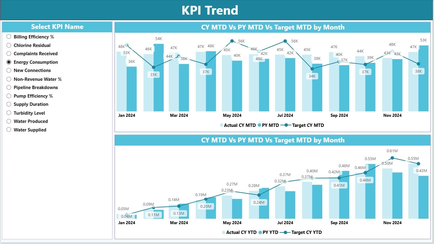
The KPI Trend Page shows the behavior of KPIs over different months. It helps you answer:
-
How does the KPI grow month by month?
-
Does the KPI improve or decline?
-
How did the KPI perform last year vs this year?
-
Are we meeting our monthly and yearly targets regularly?
Left-Side Slicer
You can select any KPI Name. The charts update instantly.
Charts Section
The page displays two combo charts:
1. MTD Trend Chart
Shows:
-
Actuals (Current Year)
-
Actuals (Previous Year)
-
Target (Current Year)
2. YTD Trend Chart
Shows:
-
YTD Actuals (Current Year)
-
YTD Actuals (Previous Year)
-
YTD Targets
These combo charts help teams track long-term progress.
3. KPI Definition Page (Drill-Through Page)
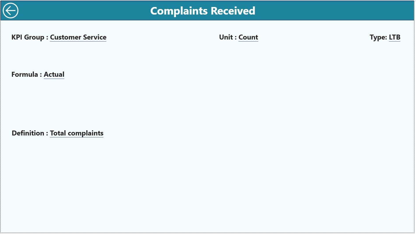
The KPI Definition page remains hidden. You reach it through drill-through from the Summary Page.
This page displays essential KPI details such as:
-
KPI Number
-
KPI Group
-
KPI Name
-
Unit
-
Formula
-
KPI Definition
-
KPI Type (UTB/LTB)
This ensures every team understands the meaning of each KPI.
Back Button
You can return to the Summary Page by clicking the back button on the top-left corner.
Click to Purchases Water Utilities KPI Dashboard in Power BI
Excel Data Structure Behind the Dashboard
The dashboard uses an Excel file with three worksheets:
1. Input_Actual Sheet
You fill:
-
KPI Name
-
Month (use the first date of the month)
-
MTD Actual
-
YTD Actual
2. Input_Target Sheet
You fill:
-
KPI Name
-
Month
-
MTD Target
-
YTD Target
3. KPI Definition Sheet
You fill:
-
KPI Number
-
KPI Group
-
KPI Name
-
Unit
-
Formula
-
Definition
-
Type (UTB or LTB)
This structure keeps the dashboard clean and accurate.
Advantages of a Water Utilities KPI Dashboard in Power BI
A Power BI dashboard gives many operational benefits. Here are the top ones:
1. Real-Time Insights
Teams get instant visibility into KPI performance.
2. Better Decision Making
Leaders identify problems quickly and act early.
3. Accurate Target Tracking
MTD and YTD comparisons help measure achievements.
4. Easy Drill-Through
Users understand KPI details without opening Excel.
5. Trend Analysis
Charts reveal long-term behavior patterns.
6. Faster Reporting
Teams eliminate manual Excel reports.
7. Error-Free Data Processing
Excel data automatically refreshes in Power BI.
8. High Transparency
Everyone understands KPI definitions clearly.
9. Enhanced Performance Tracking
Comparisons with previous year show growth or decline.
10. Time Saving
A single dashboard replaces multiple files.
Click to Purchases Water Utilities KPI Dashboard in Power BI
Best Practices for Using the Water Utilities KPI Dashboard in Power BI
To get maximum value, follow these best practices:
1. Update the Excel File Monthly
Always enter the first date of the month to avoid data mapping errors.
2. Keep KPI Names Consistent
Never change KPI spellings; Power BI will treat it as a new KPI.
3. Use Correct Units
Make sure Actuals and Targets use the same measurement.
4. Review Target Values Regularly
Update realistic targets based on operational goals.
5. Track Trends Instead of One-Time Values
Trend charts give deeper insights than single numbers.
6. Validate MTD and YTD Calculations
Small errors in YTD values impact long-term charts.
7. Train Users on Drill-Through
It helps teams understand the KPI formula instantly.
8. Refresh Power BI Every Time You Update Excel
It loads new numbers into visuals.
9. Keep KPI Groups Structured
Correct grouping improves slicer-based filtering.
10. Avoid Irregular Date Entries
Always use the first date of the month.
Conclusion
The Water Utilities KPI Dashboard in Power BI is a powerful, ready-to-use monitoring tool that simplifies utility performance tracking. It collects all KPIs in a structured Excel file, uses smart visuals, and provides real-time insights. With its Summary Page, Trend Page, and Drill-Through Definition Page, it becomes a complete reporting engine for any water utility.
Teams improve decision-making, track targets, and understand month-wise and year-wise progress effortlessly. When every KPI stays visual, accurate, and easy to compare, operational efficiency rises naturally.
Click to Purchases Water Utilities KPI Dashboard in Power BI
Frequently Asked Questions (FAQ)
1. What is a Water Utilities KPI Dashboard in Power BI?
It is a ready-made dashboard that helps utility teams track KPI numbers, targets, trends, and definitions using interactive visuals.
2. Can I update the dashboard manually?
Yes. You only update the Excel file. Then refresh Power BI.
3. Can I add or remove KPIs?
Yes, but you must update the KPI Definition sheet properly.
4. Does the dashboard support MTD and YTD analysis?
Yes. It shows MTD and YTD Actuals, Targets, and comparisons.
5. Does it show trends over months?
Yes. The Trend Page contains combo charts for MTD and YTD trends.
6. Can I use this dashboard for weekly KPIs?
Yes, but you must restructure the data source.
7. Which files does the dashboard use?
It uses one Excel file with three sheets:
Input_Actual, Input_Target, and KPI Definition.
8. Can I customize the visuals?
Yes. You can change themes, charts, colors, and slicers in Power BI.
Click to Purchases Water Utilities KPI Dashboard in Power BI
Visit our YouTube channel to learn step-by-step video tutorials