In today’s data-driven financial world, investment decisions depend on analytics, not assumptions. Whether you are a wealth manager, financial consultant, or independent investor, understanding your investment performance in real-time makes a significant difference in achieving financial goals.
That’s where the Wealth Tech Dashboard in Excel from NextGenTemplates.com comes in — a ready-to-use, visually interactive, and analytical tool designed to simplify wealth management, monitor investment trends, and improve decision-making through data visualization.
Click to Purchases Wealth Tech Dashboard in Excel
What Is a Wealth Tech Dashboard in Excel?
A Wealth Tech Dashboard in Excel is a modern, analytical solution that combines financial data visualization and reporting in a single interactive Excel file. It tracks investment portfolios, evaluates ROI percentages, monitors risk categories, and presents actionable insights for wealth managers and investors.
Using Excel’s advanced capabilities like Pivot Tables, Slicers, Conditional Formatting, and Dynamic Charts, this dashboard offers a complete financial overview — from investment channels and product categories to ROI trends and regional performance.
It helps users:
-
Track portfolio distribution and performance
-
Identify underperforming investment channels
-
Analyze regional investment behavior
-
Optimize ROI based on risk categories
-
Review monthly investment and satisfaction trends
This dashboard acts as a one-stop analytical hub, giving you the clarity and confidence needed to make smarter financial moves.
Click to Purchases Wealth Tech Dashboard in Excel
Key Features of the Wealth Tech Dashboard in Excel
The Wealth Tech Dashboard in Excel includes a user-friendly design with five analytical pages and an interactive page navigator on the left side. Each page focuses on a specific dimension of wealth management, allowing users to explore investment insights from multiple perspectives.
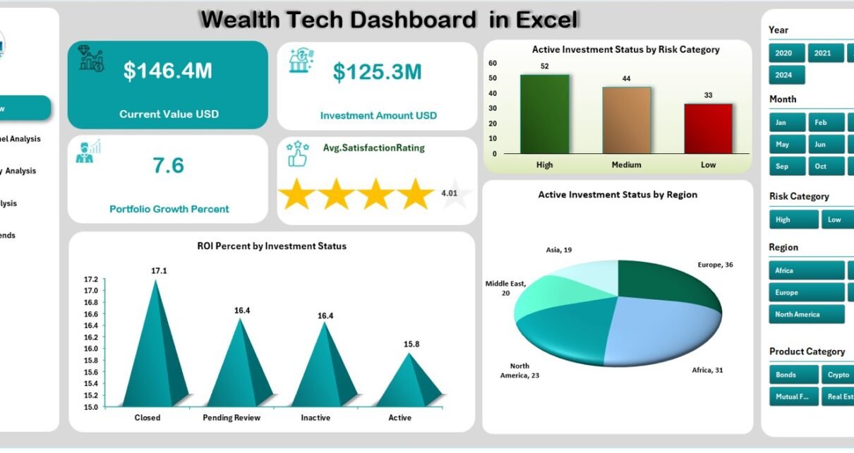
1. Overview Page
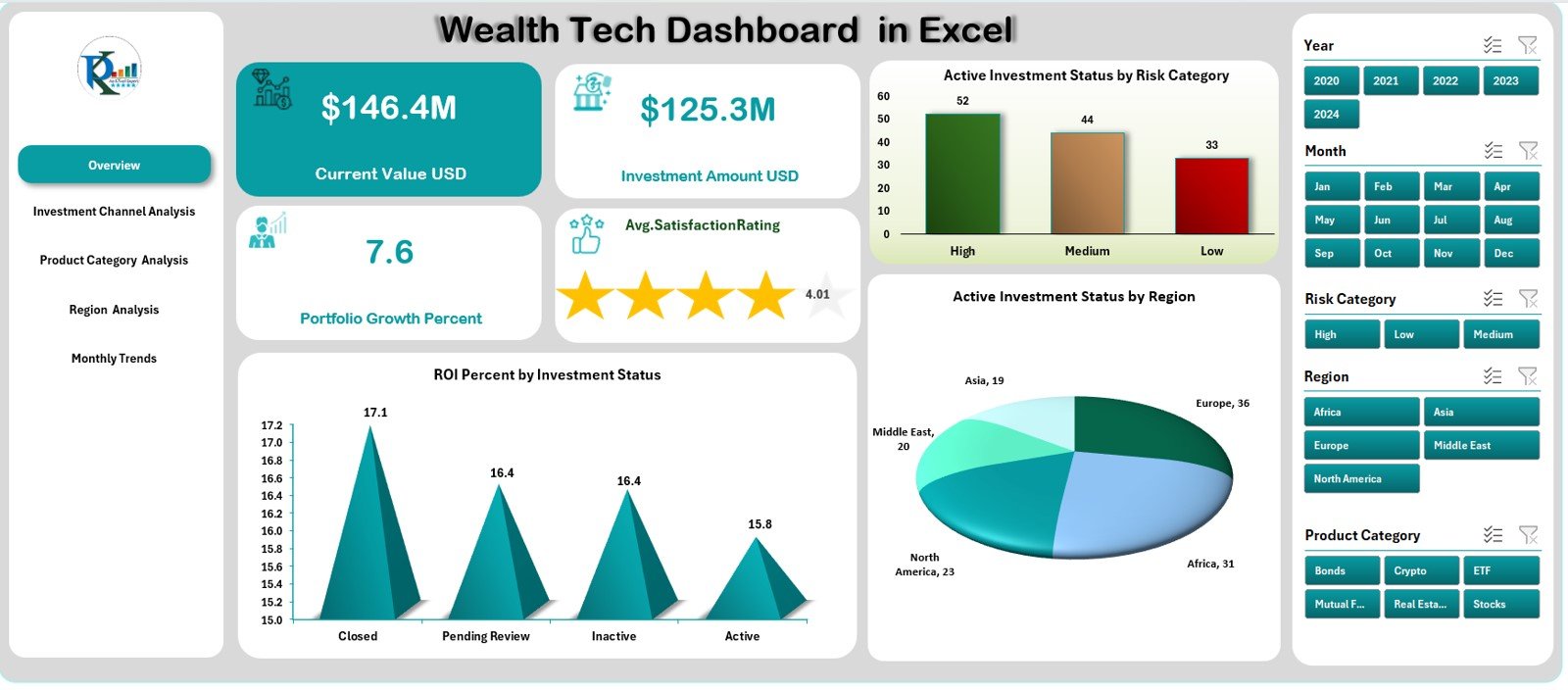
This is the main page of the dashboard and serves as the control center. On the right side, it includes interactive slicers for selecting time frames or categories.
You’ll find:
-
4 KPI Cards: Total Investment Amount, Active Investment %, ROI %, and Satisfaction Rating
-
Charts Displayed:
-
Active Investment Status by Risk Category
-
ROI % by Investment Status
-
Active Investment Status by Region
-
These visuals give an instant understanding of overall portfolio performance and risk distribution.
2. Investment Channel Analysis Page
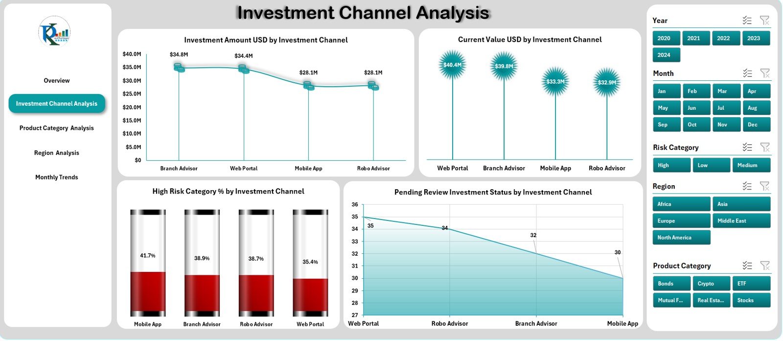
This page provides a clear picture of how various investment channels (like mutual funds, stocks, bonds, or real estate) perform over time.
Charts Displayed:
-
Investment Amount (USD) by Investment Channel
-
Current Value (USD) by Investment Channel
-
High-Risk Category % by Investment Channel
-
Pending Review Investment Status by Channel
This analysis helps financial advisors and investors identify which channels drive higher ROI and which ones require strategic realignment.
3. Product Category Analysis Page
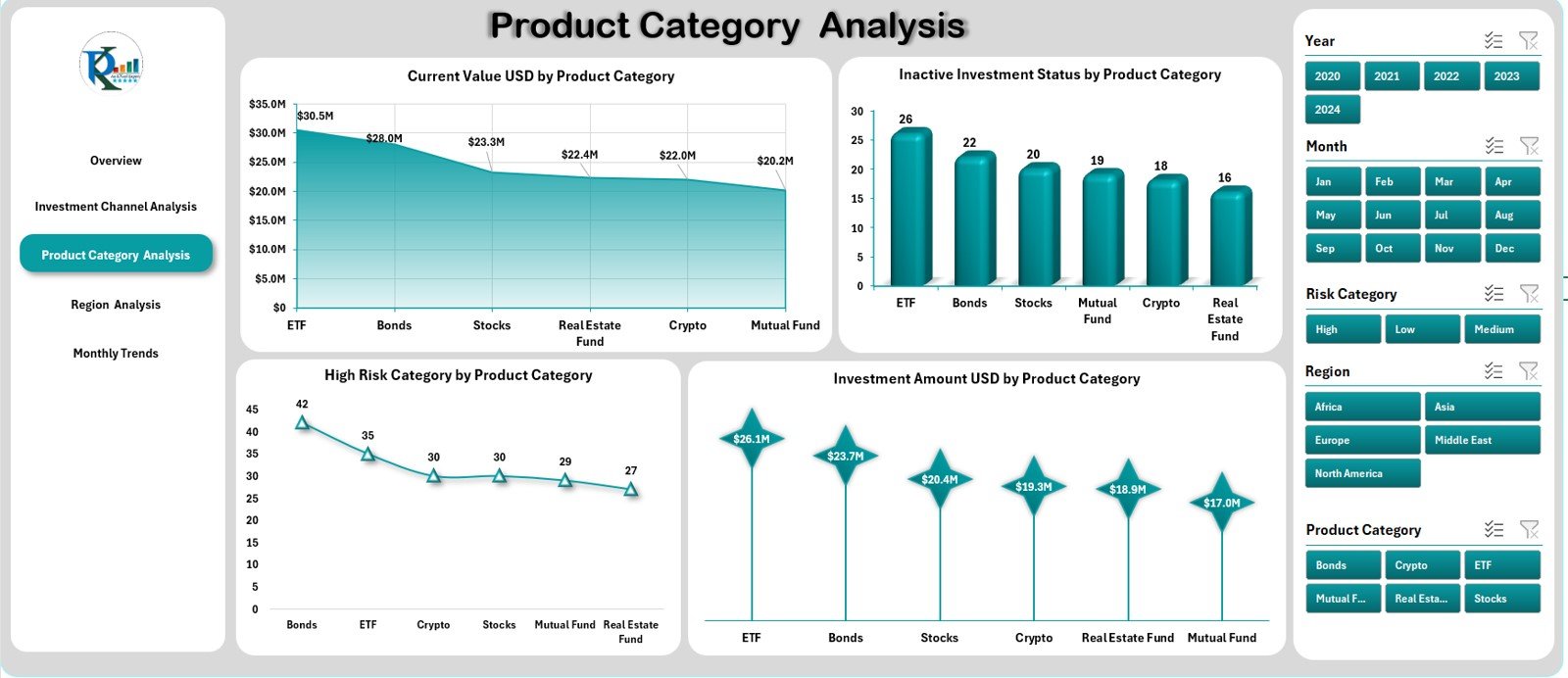
This page helps categorize investments based on product types such as equity, debt, derivatives, insurance, or ETFs.
Charts Displayed:
-
Current Value (USD) by Product Category
-
Inactive Investment Status by Product Category
-
High-Risk Category % by Product Category
-
Investment Amount (USD) by Product Category
It gives a clear comparative understanding of how each financial product contributes to the total wealth portfolio and risk exposure.
4. Region Analysis Page
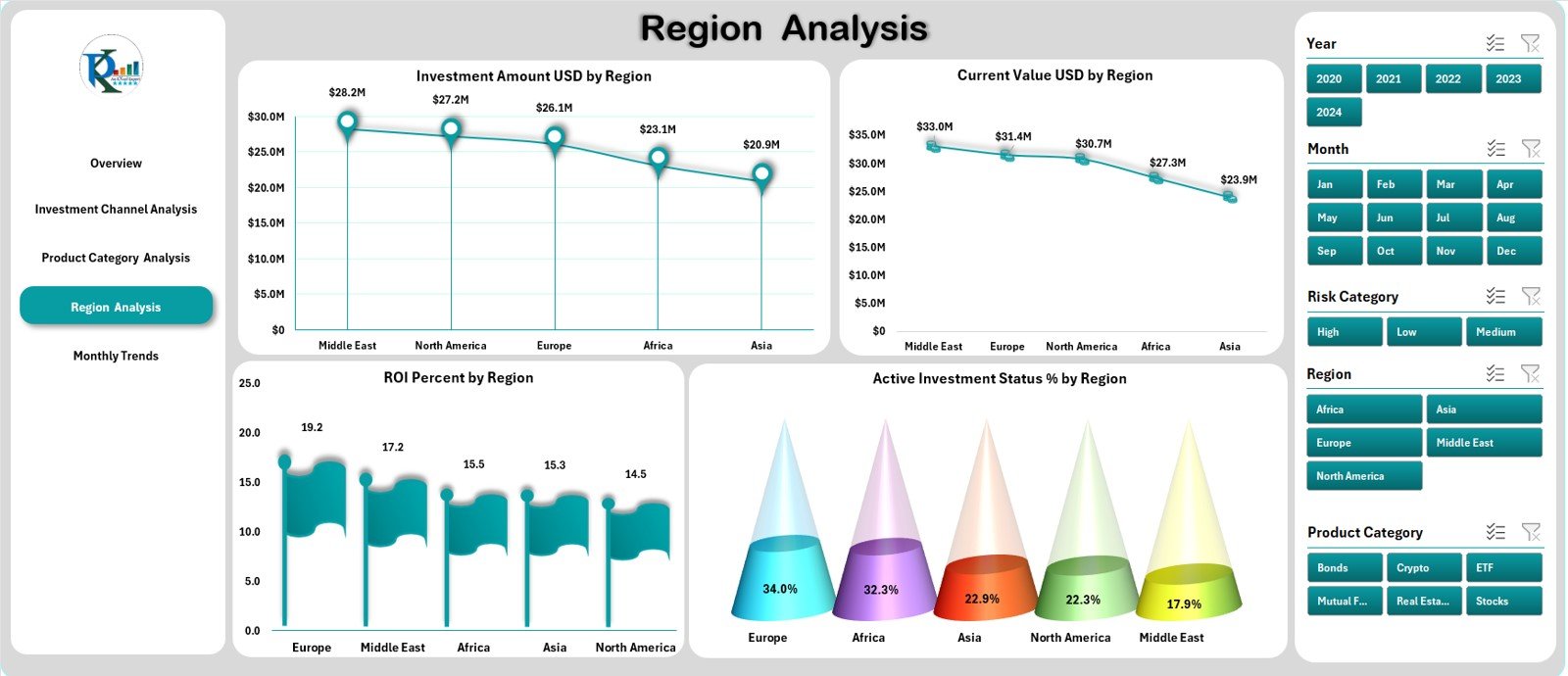
Regional performance often influences investment decisions — especially for global investors and multinational firms.
Charts Displayed:
-
Investment Amount (USD) by Region
-
Current Value (USD) by Region
-
ROI % by Region
-
Active Investment Status % by Region
This page helps investors recognize high-performing geographic areas and allocate resources efficiently.
5. Monthly Trends Page
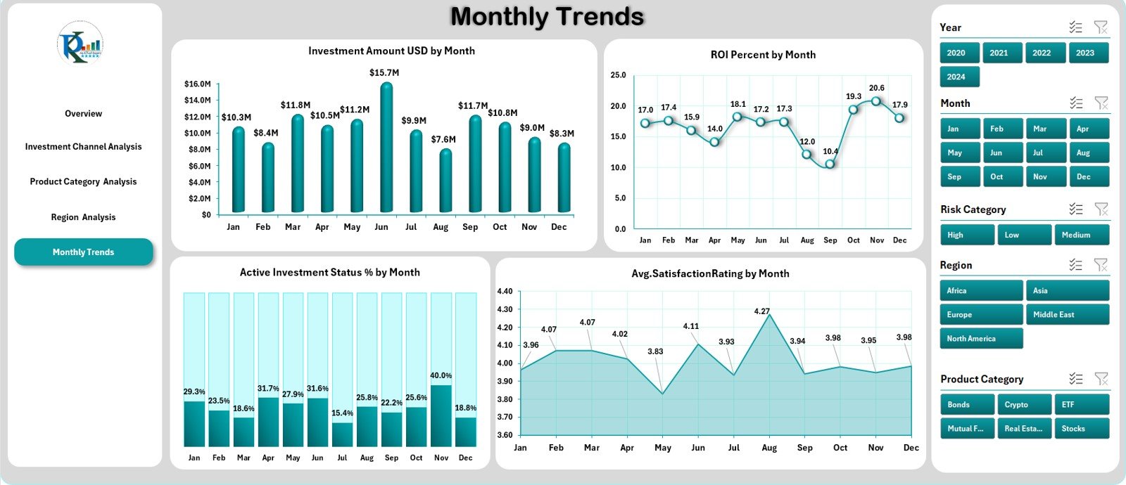
This page brings time-based analysis to life. You can identify patterns, trends, and seasonality in investments.
Charts Displayed:
-
Investment Amount (USD) by Month
-
ROI % by Month
-
Active Investment Status % by Month
-
Average Satisfaction Rating by Month
These visuals highlight monthly performance, making it easy to forecast future trends and adjust investment strategies accordingly.
Supporting Sheets
In addition to the main analytical pages, the Wealth Tech Dashboard in Excel includes supportive sheets that make it functional and reliable.
-
Data Sheet: Stores all raw and structured data including investment transactions, channels, ROI details, and risk categories.
-
Support Sheet: Contains lookup tables, slicer data, and category definitions that feed into the dashboard dynamically.
These backend sheets ensure the dashboard updates automatically as new data gets added.
How the Wealth Tech Dashboard in Excel Works
The Wealth Tech Dashboard works through structured data and Excel automation.
Here’s how it functions step-by-step:
-
Data Input:
All investment data — such as channel, region, product type, ROI, risk category, and satisfaction rating — is entered or imported into the Data Sheet. -
Automatic Data Refresh:
Using dynamic named ranges and pivot tables, the dashboard automatically recalculates totals, averages, and KPIs. -
Interactive Analysis:
Slicers allow users to filter data by time period, category, or investment type without affecting the underlying data. -
Visual Insights:
Pivot charts convert the data into meaningful visuals, highlighting the best and worst performing investment areas instantly.
This automation reduces manual work and provides accurate, real-time insights — all within Excel.
Click to Purchases Wealth Tech Dashboard in Excel
Why Choose Excel for Wealth Tech Analytics?
Many professionals still trust Excel because it’s familiar, flexible, and powerful. When configured properly, Excel can act as a complete Wealth Tech solution without the cost of enterprise-level tools.
Here’s why Excel remains the perfect foundation for Wealth Tech dashboards:
-
Universal Accessibility: Everyone from analysts to executives can use Excel.
-
Customizable Layout: Modify charts, slicers, or KPIs as per business needs.
-
Integration Ready: Easily imports data from accounting tools, CRMs, or financial APIs.
-
Secure and Offline: Keeps sensitive investment data protected within local systems.
-
No Subscription Costs: One-time setup; no recurring SaaS expenses.
Advantages of Wealth Tech Dashboard in Excel
The Wealth Tech Dashboard in Excel brings numerous advantages to both individuals and organizations:
1. Centralized Investment Overview
See all your investment data — from stocks to real estate — in one place without switching between multiple files or systems.
2. Real-Time Decision Making
With automated calculations and live data visualization, you can make timely investment adjustments.
3. Risk Category Insights
The dashboard highlights investment exposure by risk type, helping reduce losses and rebalance portfolios effectively.
4. Performance Comparison
Compare ROI across channels, products, and regions to spot profitable areas quickly.
5. Time Efficiency
Automated analytics save hours of manual computation every month.
6. Professional Presentation
The dashboard is ideal for financial presentations, investor meetings, and management reporting.
7. Cost-Effective Solution
It eliminates the need for expensive financial analytics tools while delivering the same depth of insights.
How Wealth Tech Dashboards Support Decision-Making
Decision-making in wealth management depends on data quality, visibility, and speed. This dashboard bridges that gap by transforming raw data into actionable insights.
-
Portfolio Allocation: Easily identify where to allocate or withdraw funds.
-
ROI Tracking: Measure performance by region, channel, or product.
-
Customer Insights: Track satisfaction and engagement metrics.
-
Risk Optimization: Identify and control high-risk investment clusters.
-
Goal Achievement: Align investments with financial goals based on trend analytics.
Who Can Use the Wealth Tech Dashboard in Excel?
This dashboard is designed for:
-
Wealth management firms
-
Financial planners and advisors
-
Investment bankers
-
Corporate finance departments
-
Independent investors and traders
-
Mutual fund analysts
Whether for internal monitoring or client reporting, this tool simplifies financial intelligence across industries.
Click to Purchases Wealth Tech Dashboard in Excel
Customization Options
Every organization has different investment structures and KPIs. The dashboard can be easily customized to include:
-
Different risk scoring systems
-
Multiple currency support
-
Additional KPIs like Sharpe Ratio, Annualized ROI, or Net Profit Margin
-
Data entry forms using Excel VBA
-
Custom slicers for time periods, fund managers, or regions
This flexibility makes it suitable for startups as well as large enterprises.
How to Use the Dashboard Effectively
Follow these steps for the best experience:
-
Input or Import Data: Add all investment details into the Data Sheet.
-
Refresh Dashboard: Use the Refresh All option to update calculations.
-
Use Slicers: Filter data by investment type, region, or channel for deep analysis.
-
Interpret KPIs: Analyze changes in ROI %, satisfaction, and active investment ratios.
-
Present Insights: Use the Overview and Analysis pages for reports or stakeholder presentations.
Best Practices for the Wealth Tech Dashboard in Excel
To get the most from your Wealth Tech Dashboard, follow these best practices:
✅ Maintain Data Consistency: Use standardized naming conventions for investment channels and categories.
✅ Update Data Regularly: Refresh the dashboard monthly or quarterly.
✅ Protect Data Sheets: Lock backend sheets to prevent accidental edits.
✅ Use Conditional Formatting: Highlight underperforming investments for quick action.
✅ Leverage Dynamic Charts: Let visuals tell the performance story.
✅ Automate with Macros: Use Excel VBA for automated data import and cleaning.
✅ Backup Regularly: Save multiple versions for security and reference.
✅ Integrate External Data: Link to accounting or CRM systems to keep data live.
Following these practices ensures accuracy, security, and high performance of your Excel dashboard.
Conclusion
The Wealth Tech Dashboard in Excel is a complete, intelligent, and cost-effective solution for managing and analyzing investments. It combines Excel’s simplicity with analytical power, helping financial professionals and investors make better, faster, and more confident decisions.
With its interactive pages, KPIs, and trend analysis, it turns complex financial data into simple visuals — empowering you to stay ahead in the competitive world of wealth management.
Whether you manage individual portfolios or corporate investments, this dashboard from NextGenTemplates.com is your gateway to data-driven financial success.
Click to Purchases Wealth Tech Dashboard in Excel
Frequently Asked Questions (FAQs)
1. What is a Wealth Tech Dashboard in Excel?
It’s an Excel-based analytical tool that tracks and visualizes investment performance, ROI, risk categories, and satisfaction metrics in one place.
2. Who should use this dashboard?
Wealth managers, financial advisors, investors, and corporate finance professionals who need actionable investment insights.
3. Can I customize the dashboard?
Yes. You can add your own KPIs, categories, and charts as per your requirements. The Excel format offers full flexibility.
4. Does it support automation?
Yes. You can automate data imports and refresh processes using Excel macros or Power Query.
5. Is any coding required to use it?
No. The dashboard is ready-to-use with all formulas, charts, and slicers prebuilt.
6. How often should I update the data?
For accurate insights, it’s recommended to refresh the data monthly or quarterly.
7. Can I share this dashboard with clients?
Absolutely. You can export reports as PDF or share the Excel file directly with clients or management teams.
8. Where can I get this dashboard?
You can download the Wealth Tech Dashboard in Excel directly from NextGenTemplates.com.
Click to Purchases Wealth Tech Dashboard in Excel
Visit our YouTube channel to learn step-by-step video tutorials