The Web3 ecosystem is growing faster than ever. Blockchain platforms, DeFi protocols, NFT marketplaces, DAO services, and Web3 consulting firms generate massive amounts of data every day. However, without a structured way to track performance, even the most innovative Web3 businesses struggle to make data-driven decisions.
That is exactly why a Web3 Services KPI Dashboard in Excel plays a critical role.
In this detailed guide, you will learn what a Web3 Services KPI Dashboard in Excel is, why it matters, how it works, its advantages, and best practices to use it effectively. In addition, this article explains the structure of a ready-to-use Excel-based KPI dashboard designed specifically for Web3 services.
If you manage Web3 projects, blockchain services, or crypto-based platforms, this guide will help you gain full control over your KPIs using Excel.
Click to buy Web3 Services KPI Dashboard in Excel
What Is a Web3 Services KPI Dashboard in Excel?
A Web3 Services KPI Dashboard in Excel is a centralized reporting and analytics tool that tracks key performance indicators related to Web3 operations. It converts raw Web3 data into meaningful insights using Excel formulas, pivot-ready logic, trend analysis, and visual indicators.
Instead of working with scattered spreadsheets, Web3 teams can monitor all KPIs from one interactive dashboard.
Moreover, Excel offers flexibility, familiarity, and powerful analytical capabilities without complex tools or heavy investments.
Why Do Web3 Businesses Need a KPI Dashboard?
Web3 projects operate in a fast-moving and volatile environment. Therefore, decision-makers need real-time clarity.
A Web3 KPI dashboard helps you:
- Track operational performance consistently
- Compare actual results against targets
- Monitor growth trends month-to-date (MTD) and year-to-date (YTD)
- Identify underperforming KPIs early
- Improve transparency across teams
As a result, teams make faster and more confident decisions.
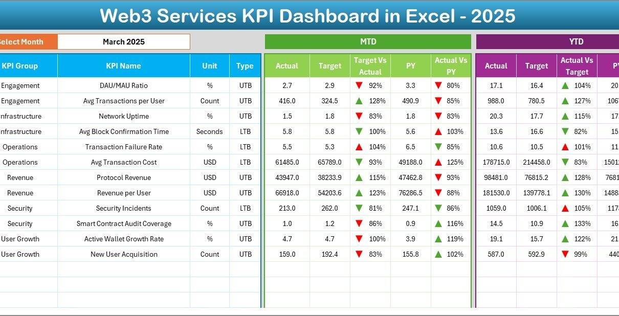
What KPIs Are Commonly Tracked in Web3 Services?
Although KPIs vary by business model, most Web3 services track indicators such as:
- Active Wallets
- Transaction Volume
- Smart Contract Deployments
- Network Fees Generated
- Customer Acquisition Cost (CAC)
- Project Delivery Timelines
- Platform Uptime
- Revenue Growth
- User Retention Rate
- Support Resolution Time
With an Excel-based dashboard, you can easily customize KPIs as your Web3 business evolves.
How Does the Web3 Services KPI Dashboard in Excel Work?
This dashboard follows a structured, multi-sheet approach that separates data entry, definitions, and analytics. As a result, the model stays clean, scalable, and easy to maintain.
Let’s explore each worksheet in detail.
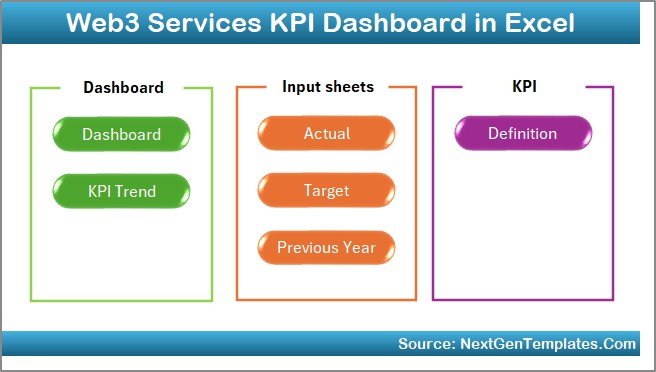
What Are the 7 Worksheets in the Web3 Services KPI Dashboard in Excel?
Summary Page – How Can You Navigate the Dashboard Easily?
The Summary Page acts as an index or home screen.
Key highlights include:
- Six interactive navigation buttons
- Quick access to all major dashboard sections
- Clean and user-friendly layout
Because of this design, users move across the dashboard without confusion.
Click to buy Web3 Services KPI Dashboard in Excel
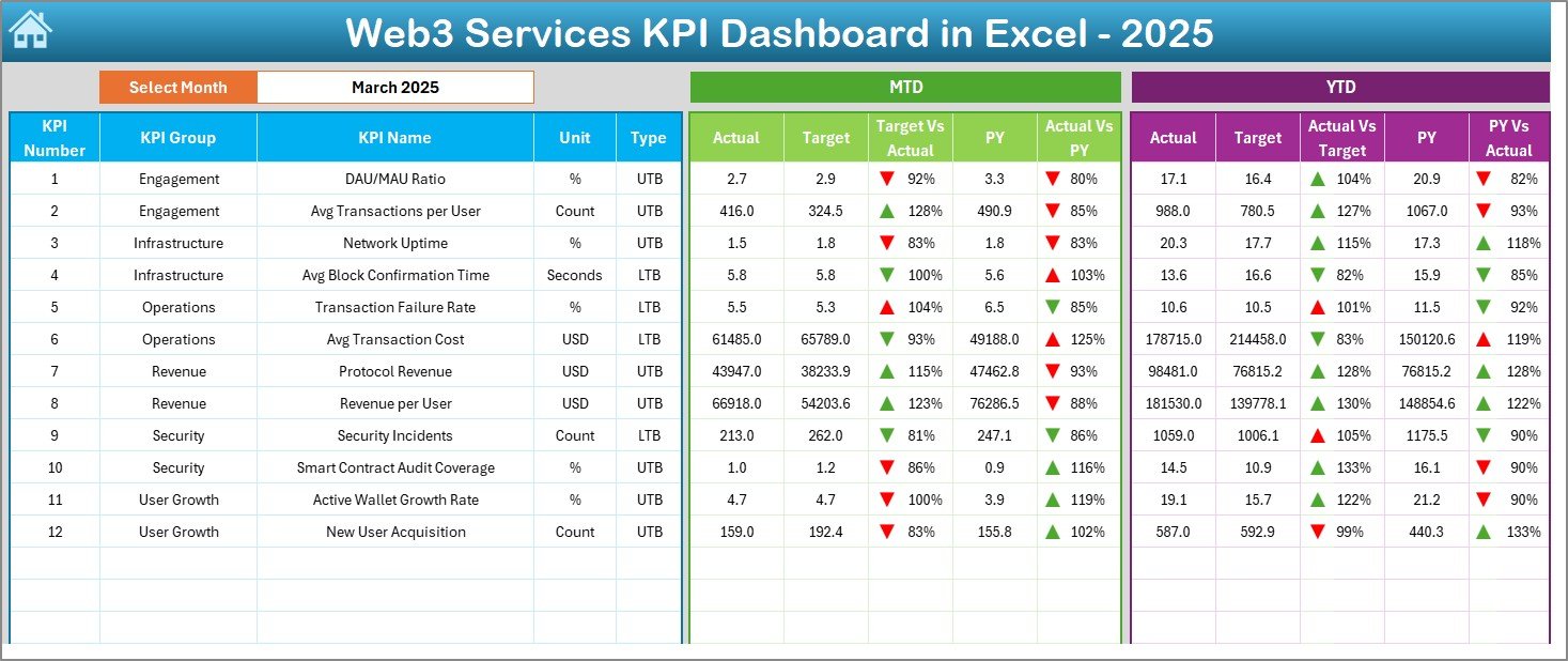
Dashboard Sheet – How Can You Monitor All KPIs at a Glance?
The Dashboard Sheet is the heart of the KPI dashboard.
Key features include:
- Month selector available in cell D3
- Dynamic KPI calculations based on the selected month
- Clear visibility of:
MTD Actual
MTD Target
Previous Year (PY)
YTD Actual
YTD Target
YTD Previous Year
Additionally, the dashboard uses conditional formatting arrows:
- Green up arrow for positive performance
- Red down arrow for negative performance
As a result, performance gaps become visible instantly.
Click to buy Web3 Services KPI Dashboard in Excel
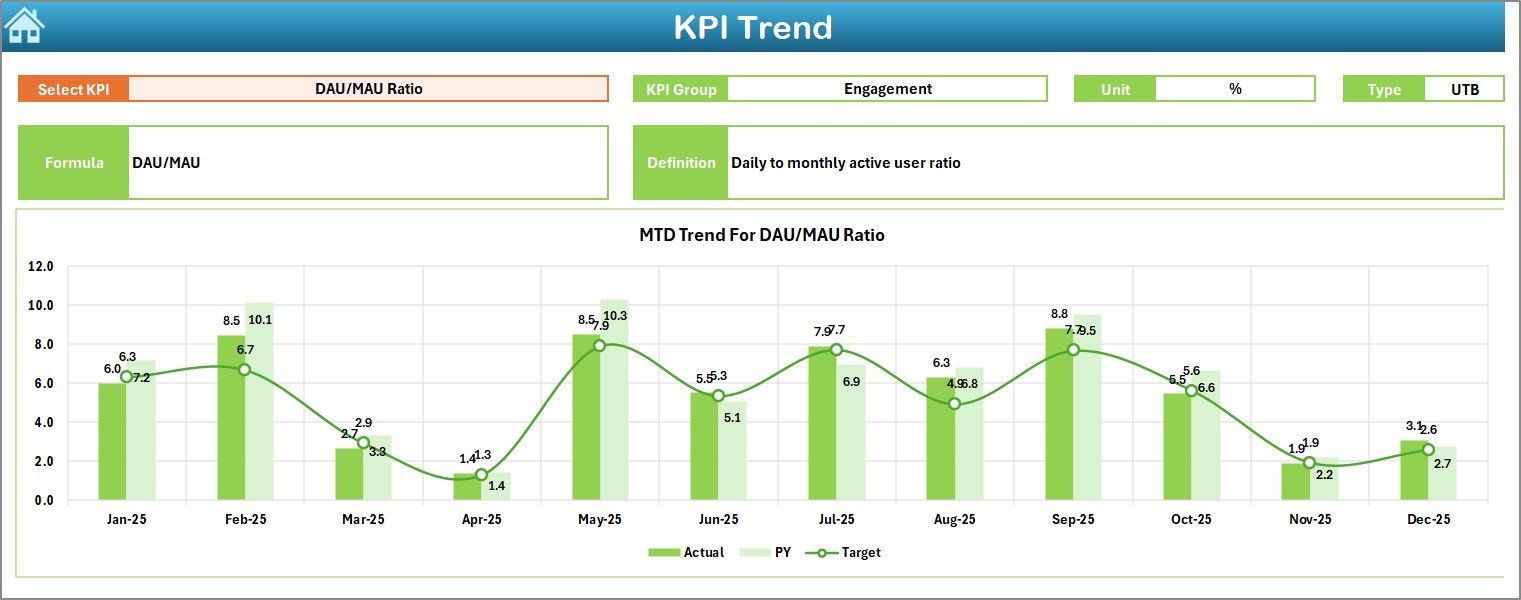
Trend Sheet – How Can You Analyze KPI Performance Over Time?
The Trend Sheet helps you understand performance patterns.
Key capabilities include:
- KPI selection drop-down in cell C3
Automatic display of:
KPI Group
KPI Unit
KPI Type (LTB or UTB)
KPI Formula
KPI Definition
Furthermore, this sheet shows MTD and YTD trend charts for:
- Actual values
- Target values
- Previous Year values
Therefore, you can quickly identify growth, stagnation, or decline trends.
Click to buy Web3 Services KPI Dashboard in Excel
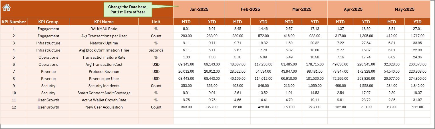
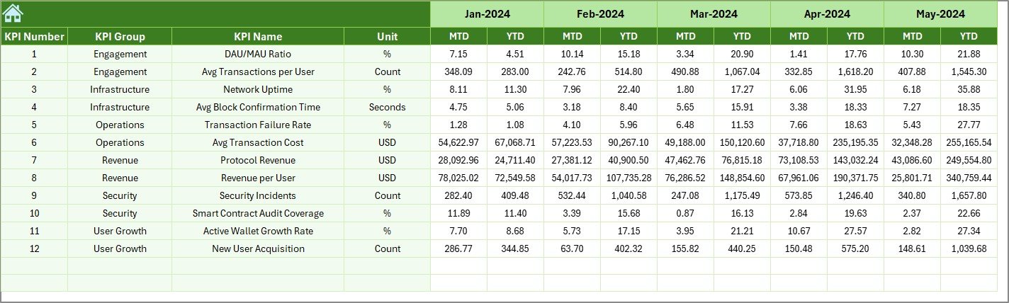
Actual Numbers Input Sheet – How Do You Enter Monthly Performance Data?
The Actual Numbers Input Sheet stores real performance data.
Important elements include:
- Month selection in cell E1
- Input fields for:
MTD Actual values
YTD Actual values
By entering data in one place, the entire dashboard updates automatically.
Click to buy Web3 Services KPI Dashboard in Excel
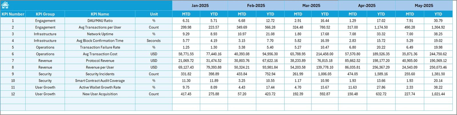
Target Sheet – How Can You Define Performance Goals?
The Target Sheet allows teams to define expected performance.
In this sheet, you enter:
- Monthly MTD target values
- Monthly YTD target values
Since targets drive accountability, this sheet plays a critical role in performance management.
Click to buy Web3 Services KPI Dashboard in Excel
Previous Year Numbers Sheet – Why Is Historical Comparison Important?
The Previous Year Numbers Sheet captures last year’s performance.
You enter data using the same structure as current-year values.
This setup enables:
- Year-over-year comparison
- Growth analysis
- Performance benchmarking
As a result, leadership gains historical context for decisions.
Click to buy Web3 Services KPI Dashboard in Excel
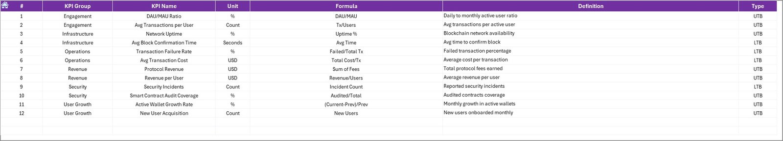
KPI Definition Sheet – How Do You Standardize KPIs?
The KPI Definition Sheet defines each metric clearly.
Fields include:
- KPI Name
- KPI Group
- Unit of Measurement
- KPI Formula
- KPI Definition
Because of this sheet, all stakeholders understand what each KPI means.
Click to buy Web3 Services KPI Dashboard in Excel
What Types of Analysis Can You Perform Using This Dashboard?
This Excel dashboard supports multiple levels of analysis.
Performance Analysis
- Target vs Actual
- Previous Year vs Current Year
Trend Analysis
- MTD trends
- YTD trends
KPI-Level Analysis
- Individual KPI deep dives
- LTB vs UTB classification
Management Reporting
- Executive-level summaries
- Monthly review reports
As a result, the dashboard supports both strategic and operational analysis.
Advantages of Web3 Services KPI Dashboard in Excel
Why Should You Use Excel for Web3 KPI Tracking?
Using Excel for Web3 KPI dashboards offers several advantages.
Easy to Use
Most teams already know Excel. Therefore, training time stays minimal.
Fully Customizable
You can add, remove, or modify KPIs anytime.
Cost-Effective
Excel eliminates the need for expensive BI tools.
Scalable Design
The structured sheet-based approach supports future growth.
Clear Visibility
Conditional formatting and trend charts highlight insights instantly.
How Does This Dashboard Improve Web3 Decision-Making?
This dashboard improves decision-making because:
- It provides real-time KPI visibility
- It highlights performance gaps early
- It enables data-driven discussions
- It improves accountability across teams
As a result, leadership takes proactive actions instead of reactive steps.
Opportunities for Improvement in Web3 KPI Dashboards
Although this dashboard delivers strong insights, you can enhance it further.
Possible improvements include:
- Adding automated data imports
- Including slicers for KPI groups
- Creating role-based views
- Integrating Power Query for advanced data handling
Over time, these enhancements increase dashboard maturity.
Best Practices for the Web3 Services KPI Dashboard in Excel
How Can You Use This Dashboard Effectively?
Follow these best practices to maximize value.
Keep KPIs Relevant
Track only KPIs that align with Web3 business goals.
Update Data Regularly
Enter actuals monthly to maintain accuracy.
Maintain KPI Definitions
Keep formulas and definitions consistent.
Review Trends Monthly
Use trend charts during review meetings.
Validate Targets
Ensure targets remain realistic and achievable.
By following these practices, teams maintain dashboard reliability.
Who Can Benefit from a Web3 Services KPI Dashboard in Excel?
This dashboard suits multiple roles:
- Web3 founders
- Blockchain service providers
- DAO operations teams
- Web3 consultants
- Product managers
- Strategy and analytics teams
Therefore, any Web3-focused organization can benefit.
Why Choose a Ready-to-Use Web3 KPI Dashboard Template?
Building dashboards from scratch consumes time. However, a ready-made template offers:
- Faster implementation
- Proven structure
- Business-ready analytics
- Consistent KPI tracking
As a result, teams focus more on insights and less on design.
Conclusion: Is a Web3 Services KPI Dashboard in Excel Worth It?
Absolutely.
A Web3 Services KPI Dashboard in Excel provides clarity, control, and confidence. It transforms raw Web3 data into actionable insights. Moreover, it supports strategic planning, performance tracking, and continuous improvement.
If you want a simple yet powerful way to monitor Web3 performance, this Excel dashboard delivers everything you need.
Frequently Asked Questions (FAQs)
What is a Web3 Services KPI Dashboard in Excel?
It is an Excel-based tool that tracks and analyzes Web3 performance metrics using MTD, YTD, and trend analysis.
Can I customize KPIs in this dashboard?
Yes, you can easily add or modify KPIs using the KPI Definition sheet.
Does this dashboard support year-over-year comparison?
Yes, it includes a dedicated Previous Year Numbers sheet.
Is Excel suitable for Web3 analytics?
Yes, Excel works well for structured KPI tracking and management reporting.
Who should use this dashboard?
Web3 founders, consultants, DAO teams, and blockchain service providers can all benefit.
Can beginners use this dashboard?
Yes, the dashboard follows a simple and intuitive design.
Visit our YouTube channel to learn step-by-step video tutorials
Watch the step-by-step video tutorial: