The Web3 ecosystem grows faster every year. New blockchain platforms, decentralized applications, NFT marketplaces, and crypto-based services enter the market daily. However, growth alone does not guarantee success. Teams must track performance, measure progress, and act on real data. That is exactly where a Web3 Services KPI Dashboard in Power BI becomes essential.
This article explains what a Web3 Services KPI Dashboard in Power BI is, why it matters, how it works, and how businesses can use it to drive smarter decisions. Moreover, you will learn about its features, advantages, best practices, and real-world use cases. Finally, you will find answers to the most frequently asked questions.
Click to buy Web3 Services KPI Dashboard in Power BI
What Is a Web3 Services KPI Dashboard in Power BI?
A Web3 Services KPI Dashboard in Power BI is a ready-to-use analytical solution that tracks and visualizes key performance indicators (KPIs) for Web3-focused businesses. These businesses include blockchain service providers, Web3 development agencies, DeFi platforms, NFT marketplaces, crypto consulting firms, and decentralized infrastructure providers.
Instead of relying on scattered spreadsheets or manual reports, this dashboard centralizes all KPI data in one place. As a result, stakeholders gain real-time visibility into performance trends, targets, and gaps.
Most importantly, the dashboard uses Excel as a data source and Power BI for visualization, which makes it both flexible and scalable.
Why Do Web3 Businesses Need KPI Dashboards?
Web3 businesses operate in a highly dynamic environment. Market conditions change rapidly, user adoption fluctuates, and regulatory factors evolve constantly. Therefore, leaders need accurate and timely insights.
Here is why a KPI dashboard becomes critical:
- Web3 metrics often span multiple domains such as technology, finance, operations, and community growth
- Manual tracking increases errors and delays decision-making
- Investors and partners expect data-backed performance reporting
- Teams must compare current performance against targets and previous periods
Because of these challenges, a Web3 Services KPI Dashboard in Power BI provides clarity, speed, and confidence.
How Does the Web3 Services KPI Dashboard in Power BI Work?
The dashboard follows a simple yet powerful structure. You enter data in Excel, and Power BI automatically transforms it into interactive visuals.
Data Source: Excel-Based Architecture
The dashboard connects to an Excel file that contains three structured worksheets:
Input_Actual Sheet
This sheet captures the actual performance data.
You enter:
- KPI Name
- Month (use the first date of the month)
- MTD (Month-to-Date) value
- YTD (Year-to-Date) value
This approach ensures consistency and accurate time-based analysis.
Click to buy Web3 Services KPI Dashboard in Power BI
Input_Target Sheet
This sheet stores the target values for each KPI.
You enter:
- KPI Name
- Month (first date of the month)
- Target MTD value
- Target YTD value
As a result, Power BI can compare actuals against targets automatically.
KPI Definition Sheet
This sheet defines each KPI clearly.
You enter:
- KPI Number
- KPI Group
- KPI Name
- Unit
- Formula
- Definition
- Type (LTB or UTB)
Because of this structure, users understand not only the numbers but also the logic behind them.
What Are the Key Pages in the Web3 Services KPI Dashboard?
The dashboard contains three powerful pages, each designed for a specific analytical purpose.
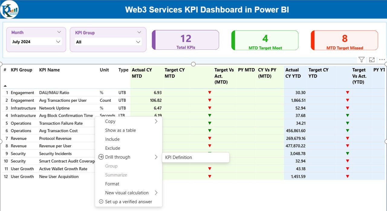
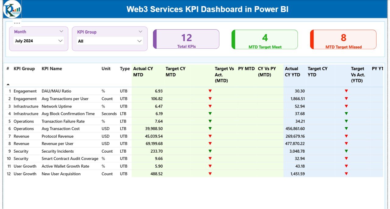
Summary Page
The Summary Page serves as the main landing page of the dashboard. It provides a high-level view of overall KPI performance.
Key Elements of the Summary Page
Interactive Slicers
- Month slicer
- KPI Group slicer
These slicers allow users to filter data dynamically. Therefore, decision-makers can focus on specific time periods or KPI categories instantly.
Performance Cards
- Total KPIs count
- MTD Target Met count
- MTD Target Missed count
These cards deliver an immediate performance snapshot.
Detailed KPI Table Explained
The summary page also includes a comprehensive KPI table with the following columns:
- KPI Number – Sequence number of the KPI
- KPI Group – Category or functional area
- KPI Name – Name of the metric
- Unit – Measurement unit
- Type (LTB/UTB) – Indicates whether lower or higher values are better
MTD Analysis Columns
- Actual CY MTD – Current year actual MTD value
- Target CY MTD – Current year target MTD value
- MTD Icon – Green ▲ or red ▼ icons indicating target status
- Target vs Actual (MTD) – Actual ÷ Target percentage
- PY MTD – Previous year MTD value
- CY vs PY (MTD) – Current MTD ÷ Previous MTD percentage
YTD Analysis Columns
- Actual CY YTD – Current year actual YTD value
- Target CY YTD – Current year target YTD value
- YTD Icon – Performance indicator against target
- Target vs Actual (YTD) – Actual ÷ Target percentage
- PY YTD – Previous year YTD value
- CY vs PY (YTD) – Current YTD ÷ Previous YTD percentage
Because of this layout, users can analyze performance from every angle without leaving the page.
Click to buy Web3 Services KPI Dashboard in Power BI
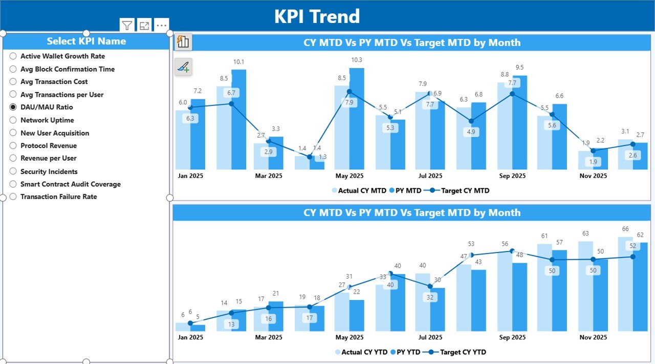
KPI Trend Page
The KPI Trend Page focuses on trend analysis. Instead of static numbers, it shows how performance evolves over time.
Key Features of the KPI Trend Page
- Two combo charts
- Actual values for current year
- Actual values for previous year
- Target values for comparison
Additionally, a KPI Name slicer appears on the left. Users select a KPI, and the charts update instantly.
As a result, teams can:
- Identify growth or decline patterns
- Compare actuals with targets visually
- Spot seasonal trends
- Detect performance volatility early
This page supports proactive decision-making rather than reactive responses.
Click to buy Web3 Services KPI Dashboard in Power BI
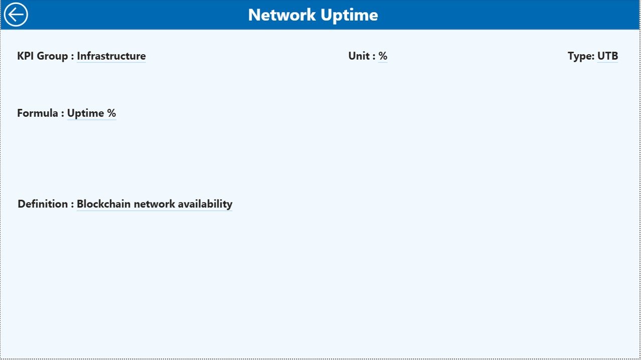
KPI Definition Page
The KPI Definition Page acts as a knowledge hub. It remains hidden and works as a drill-through page.
From the summary page, users can drill through any KPI to view:
- KPI Formula
- KPI Definition
- Measurement logic
Because of this feature:
- New users understand KPIs quickly
- Reporting stays consistent
- Misinterpretation risks decrease
The page also includes a back button at the top-left corner for smooth navigation.
Click to buy Web3 Services KPI Dashboard in Power BI
What KPIs Can Web3 Businesses Track Using This Dashboard?
Web3 services cover multiple operational areas. Therefore, the dashboard supports a wide range of KPIs, such as:
- Blockchain transaction success rate
- Smart contract deployment efficiency
- Platform uptime percentage
- User onboarding growth
- Wallet integration success rate
- Revenue per active user
- Development sprint velocity
- Security incident frequency
- Customer support response time
- Partner integration success rate
Because the KPI Definition sheet remains flexible, teams can customize metrics easily.
Advantages of Web3 Services KPI Dashboard in Power BI
A KPI dashboard offers many advantages. However, a Web3-focused Power BI dashboard delivers even more value.
- Centralized Performance Monitoring
All KPIs appear in one unified dashboard. Therefore, teams no longer chase multiple reports.
- Faster Decision-Making
Real-time visuals replace manual calculations. As a result, leaders act quickly and confidently.
- Clear Target Tracking
MTD and YTD comparisons highlight gaps instantly. Consequently, teams adjust strategies sooner.
- Improved Accountability
Each KPI links to targets and trends. Therefore, ownership and responsibility become clearer.
- Scalable and Customizable
Because the data comes from Excel, businesses can add new KPIs without redesigning the dashboard.
- Investor-Ready Reporting
Professional visuals build trust with investors, partners, and stakeholders.
What Challenges Can This Dashboard Help Solve?
Web3 organizations often face recurring challenges:
- Inconsistent KPI definitions
- Lack of historical comparison
- Manual reporting delays
- Poor visibility into target achievement
This dashboard addresses these issues by standardizing definitions, automating calculations, and improving visibility.
Best Practices for the Web3 Services KPI Dashboard in Power BI
To maximize value, teams should follow proven best practices.
- Define KPIs Clearly
Always document formulas and definitions in the KPI Definition sheet. This practice avoids confusion later.
- Update Data Regularly
Schedule monthly updates for actual and target data. Consistency improves trend accuracy.
- Use Meaningful KPI Groups
Group KPIs logically, such as Operations, Technology, Finance, and Community Growth.
- Monitor Both MTD and YTD
MTD shows short-term performance, while YTD reveals long-term progress. Always analyze both.
- Review Trends, Not Just Numbers
Trends often reveal risks before numbers do. Therefore, use the KPI Trend page actively.
- Limit KPI Overload
Focus on high-impact KPIs. Too many metrics dilute attention.
- Train Stakeholders
Ensure users understand how to interpret icons, percentages, and comparisons.
How Does This Dashboard Support Strategic Planning?
Strategic planning relies on facts, not assumptions. This dashboard supports planning by:
- Showing historical performance patterns
- Highlighting strengths and weaknesses
- Aligning targets with actual outcomes
- Supporting quarterly and annual reviews
As a result, leadership teams can plan roadmap priorities with confidence.
Who Can Benefit from a Web3 Services KPI Dashboard?
This dashboard benefits a wide range of users:
- Web3 founders and co-founders
- Blockchain project managers
- Product and engineering leaders
- Finance and operations teams
- Investors and advisors
- Web3 consulting firms
Because the dashboard remains flexible, it adapts to various Web3 business models.
Conclusion: Why a Web3 Services KPI Dashboard in Power BI Is a Smart Investment
The Web3 industry rewards speed, transparency, and data-driven execution. A Web3 Services KPI Dashboard in Power BI empowers teams to monitor performance, compare results, and make better decisions.
By combining Excel-based data entry with powerful Power BI visuals, this dashboard simplifies complex Web3 metrics. Moreover, it improves accountability, strategic alignment, and operational efficiency.
If you want clarity, control, and confidence in your Web3 operations, this dashboard offers a practical and scalable solution.
Frequently Asked Questions (FAQs)
What is a Web3 Services KPI Dashboard in Power BI?
It is an interactive Power BI dashboard that tracks and visualizes key performance indicators for Web3-focused businesses using Excel as a data source.
Can I customize KPIs in this dashboard?
Yes. You can add, remove, or modify KPIs easily through the KPI Definition and input sheets.
Does this dashboard support MTD and YTD analysis?
Yes. The dashboard calculates and displays both Month-to-Date and Year-to-Date performance automatically.
Do I need advanced Power BI skills to use this dashboard?
No. You only need basic Excel data entry skills. The dashboard handles all calculations and visuals.
Is this dashboard suitable for investors and reporting?
Yes. The professional layout and clear metrics make it ideal for investor updates and executive reviews.
Can this dashboard grow with my Web3 business?
Absolutely. The flexible Excel-based structure allows seamless scaling as your business expands.
Watch the step-by-step video tutorial:
Visit our YouTube channel to learn step-by-step video tutorials
Click to buy Web3 Services KPI Dashboard in Power BI