In today’s fast-moving wholesale business environment, tracking performance in real-time is no longer a luxury—it’s a necessity. Whether you’re managing inventory turnover, sales margins, or delivery performance, having an intelligent KPI dashboard gives you a clear competitive edge. That’s where the Wholesale KPI Dashboard in Power BI steps in as a powerful solution.
This ready-to-use Power BI dashboard connects seamlessly with Excel data and allows wholesale managers to monitor, analyze, and improve their operational efficiency. In this guide, we will explore everything you need to know—from key features to best practices and FAQs—to help you leverage the full potential of this tool.
Click to Purchases Wholesale KPI Dashboard in Power BI
What is the Wholesale KPI Dashboard in Power BI?
The Wholesale KPI Dashboard in Power BI is a visual analytics tool designed for tracking wholesale business performance using key performance indicators (KPIs). It draws data from an Excel source and showcases vital business metrics across monthly and yearly views.
The dashboard includes interactive visuals, intuitive slicers, comparison charts, and icon-based indicators to give managers and decision-makers immediate insights into how the business is performing.
Key Features of the Wholesale KPI Dashboard
Let’s break down the key components of this dashboard. It comprises three powerful pages within the Power BI file:
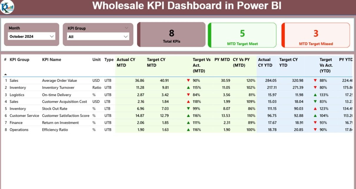
Summary Page

This is the heart of the dashboard. It presents a consolidated view of all KPIs, making it ideal for executive-level decision-making. Key features of the summary page include:
-
Month and KPI Group Slicers: Filter data by time and category for focused analysis.
Cards Section:
- Total KPI Count
- MTD Target Met
- MTD Target Missed
KPI Table with Metrics:
Each KPI is analyzed using the following metrics:
- KPI Number, Group, and Name
- Unit of Measurement
- Type: LTB (Lower the Better) or UTB (Upper the Better)
- MTD and YTD Actual vs Target
- Conditional icons (▲ / ▼ in red and green) for quick visual cue
- Percentage comparisons with previous year values
🎯 Example: A “Delivery Accuracy” KPI marked as UTB will show a green upward arrow if it meets or exceeds the target for MTD or YTD.
KPI Trend Page

The KPI Trend Page provides a time-series analysis of selected KPIs:
2 Combo Charts:
- One for MTD data (Actual vs Target vs Previous Year)
- One for YTD data (Actual vs Target vs Previous Year)
-
KPI Name Slicer:
Select a KPI and instantly see its performance trend across months.
This is especially useful for spotting improvement areas and evaluating the effectiveness of process changes.
KPI Definition Page

This hidden drill-through page allows users to view:
-
KPI Formula
-
KPI Definition
-
Measurement Unit
-
Type (UTB / LTB)
You can access this page by right-clicking a KPI in the summary page and selecting “Drill Through.” To return, simply click the back button on the top-left corner.
Excel-Based Data Integration
This dashboard is tightly integrated with Excel data, making it flexible and user-friendly. The data is managed in three worksheet tabs:
1. Input_Actual Sheet
-
Fields: KPI Name, Month, MTD Actual, YTD Actual
-
Tip: Use the first day of the month as the date input for consistency.
2. Input_Target Sheet
-
Fields: KPI Name, Month, MTD Target, YTD Target
3. KPI Definition Sheet
-
Fields: KPI Number, Group, Name, Unit, Formula, Definition, Type
This structure allows users to maintain and update their KPI data in a controlled environment before loading it into Power BI.
Advantages of Using the Wholesale KPI Dashboard in Power BI
Let’s explore some of the key benefits of implementing this tool in your organization:
📈 Real-Time Performance Monitoring
Track how each KPI is performing compared to monthly and yearly targets in real time.
🧠 Data-Driven Decision Making
With clearly visible trends and comparisons, you can make informed business decisions.
🚀 Faster Target Tracking
Slicers and interactive visuals make it easy to zoom into specific groups, months, or KPIs.
📉 Identify Bottlenecks Quickly
Conditional formatting icons immediately show underperforming areas.
📦 Excel-Powered Flexibility
The underlying data lives in Excel—making it familiar, editable, and easy to update.
Best Practices for the Wholesale KPI Dashboard
To get the most out of your dashboard, follow these proven practices:
1. Use Consistent Date Formats
Always use the first date of the month (e.g., 01/01/2024) for uniformity.
2. Define KPIs Clearly
Ensure that each KPI in the KPI Definition sheet includes:
-
A clear name
-
A relevant unit
-
A short yet meaningful formula
3. Refresh Data Regularly
Update the Excel data every month to keep your reports current.
4. Monitor Both MTD and YTD
Don’t rely on just MTD numbers—analyze YTD to understand long-term trends.
5. Train Users on Drill Through
Educate users on how to explore the hidden definition page using the drill-through feature.
6. Automate Data Input
Use Excel formulas or external connectors to populate your Actual and Target sheets faster.
How to Set Up and Use the Dashboard
Click to Purchases Wholesale KPI Dashboard in Power BI
Here’s a simple step-by-step guide to get started:
-
Open the Power BI File provided with the dashboard.
-
Load the Excel File that includes your data (Actuals, Targets, KPI Definitions).
-
Go to the Home tab in Power BI and click Refresh to load the latest numbers.
-
Use the slicers on the Summary Page to filter KPIs by Month or Category.
-
Drill into specific KPIs using the right-click Drill Through option.
-
Click the Back button to return to the summary page.
Why Every Wholesale Business Needs This Dashboard
Wholesale businesses face constant pressure to optimize performance across:
-
Inventory management
-
Sales targets
-
Order fulfillment
-
Supplier efficiency
-
Customer retention
A dashboard that visualizes these KPIs clearly and interactively can be a game-changer. By using the Wholesale KPI Dashboard in Power BI, companies can:
-
Track goals effortlessly
-
Detect issues before they escalate
-
Make informed strategic moves
It’s not just a dashboard—it’s your performance control tower.
Use Cases of the Wholesale KPI Dashboard
Here are some real-world scenarios where this tool proves invaluable:
-
Sales Managers: Monitor revenue vs targets across different product groups.
-
Supply Chain Teams: Track delivery times and fulfillment accuracy.
-
Finance Teams: Watch over cost-related KPIs and margins.
-
Executives: Get a bird’s eye view of how the business is performing each month.
Monthly Review with Your Team: A Pro Tip
Use this dashboard as the center of your monthly team review meeting.
-
Filter the dashboard by current month
-
Discuss underperforming KPIs
-
Drill into the KPI Definition page to align understanding
-
Decide action points for the next month
This practice not only fosters transparency but also drives accountability and collaboration.
Conclusion
The Wholesale KPI Dashboard in Power BI is more than just a reporting tool. It is a robust decision-support system that aligns data, performance, and strategy. Powered by Excel and built on Power BI, it empowers wholesale teams to monitor, analyze, and improve KPIs that truly matter.
By adopting this dashboard, you embrace a smarter way to lead your wholesale operations—backed by data and focused on results.
Frequently Asked Questions (FAQs)
1. Can I customize the KPIs in the dashboard?
Yes, you can modify the KPI list and definitions in the Excel file. Just update the “KPI Definition” sheet and refresh Power BI.
2. Is this dashboard compatible with Power BI Service (online)?
Yes, after publishing to Power BI Service, you can access and interact with it online.
3. How often should I update the data?
Ideally, update the Actual and Target Excel sheets monthly before refreshing the dashboard.
4. What does LTB and UTB mean?
-
LTB (Lower the Better): KPIs like defect rates, costs, or delivery time
-
UTB (Upper the Better): KPIs like revenue, customer satisfaction, or on-time delivery
5. Can I add more pages or charts to the dashboard?
Absolutely! You can extend the Power BI file to add more visuals, charts, or custom pages based on your business needs.
6. Do I need advanced Power BI skills to use this dashboard?
No, it’s designed for users with basic Power BI knowledge. Excel familiarity is a bonus.
7. How can I compare current year and previous year performance?
Use the “CY Vs PY” columns for both MTD and YTD to analyze performance over time.
Visit our YouTube channel to learn step-by-step video tutorials