Running a yoga centre successfully requires much more than passion and skilled instructors. You must also track performance, revenue, attendance, instructor efficiency, and customer satisfaction. However, manual Excel reports often hide trends and delays decision-making. Because of this, yoga centre owners and managers increasingly rely on dashboards for real-time insights.
That is exactly where a Yoga Centres KPI Dashboard in Power BI becomes a powerful solution.
In this detailed article, you will clearly understand what a Yoga Centres KPI Dashboard in Power BI is, how it works, why it is important, and how each dashboard page helps improve operational, financial, and strategic decisions. Moreover, you will also learn about its advantages, best practices, Excel data structure, and frequently asked questions—explained in a simple and easy-to-understand way.
Click to Purchases Yoga Centres KPI Dashboard in Power BI
What Is a Yoga Centres KPI Dashboard in Power BI?
A Yoga Centres KPI Dashboard in Power BI is an interactive data visualization tool designed to monitor and analyze key performance indicators (KPIs) related to yoga studio operations.
Instead of working with scattered Excel sheets or static reports, this dashboard converts raw data into meaningful charts, tables, indicators, and comparisons. As a result, yoga centre owners can quickly evaluate monthly and yearly performance.
Most importantly, Power BI allows users to:
-
Track actual versus target performance
-
Compare current year performance with the previous year
-
Identify KPIs that meet targets and KPIs that miss targets
-
Filter data by month and KPI group
-
Drill through KPIs to understand definitions and formulas
Because of this, the Yoga Centres KPI Dashboard in Power BI improves transparency, accuracy, and decision-making.
Why Do Yoga Centres Need a KPI Dashboard?
Yoga centres operate in a competitive and service-driven environment. Therefore, tracking performance becomes essential for growth and sustainability.
Without a structured KPI dashboard:
-
You may not know which KPIs perform well.
-
You may miss early warning signs of declining performance.
-
You may struggle to compare actual results with targets.
-
You may take decisions based on assumptions instead of data.
However, a KPI dashboard solves these problems by providing:
-
Clear performance visibility
-
Faster decision-making
-
Better target control
-
Improved accountability
As a result, yoga centre managers gain complete control over their business metrics.
Overview of Yoga Centres KPI Dashboard in Power BI
The Yoga Centres KPI Dashboard in Power BI is a ready-to-use dashboard that uses Excel as a data source. You only need to update Excel data, and Power BI automatically refreshes the visuals.
This dashboard contains three main pages:
-
Summary Page
-
KPI Trend Page
-
KPI Definition Page (Drill-through)
Let us now explore each page in detail.
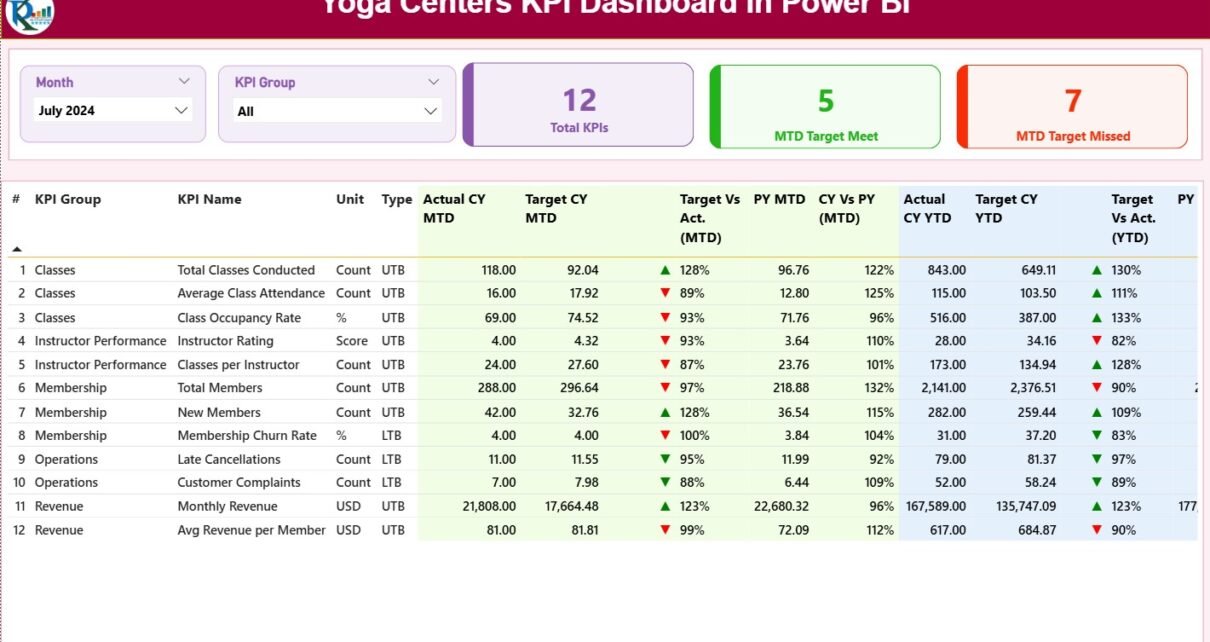
What Does the Summary Page Show?
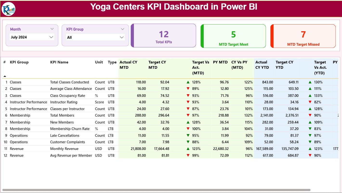
The Summary Page works as the main landing page of the dashboard. It provides a high-level overview of all KPIs in one place.
At the top of this page, you will see:
-
Month slicer – Select any month to update the dashboard
-
KPI Group slicer – Filter KPIs based on category
KPI Cards on Summary Page
At the top of the summary page, you will also see three important cards:
-
Total KPIs Count
-
MTD Target Meet Count
-
MTD Target Missed Count
These cards instantly show how many KPIs perform well and how many need attention.
What Does the Detailed KPI Table Include?
Below the KPI cards, the dashboard displays a detailed KPI table with multiple performance metrics.
KPI Table Columns Explained
-
KPI Number
Shows the sequence number of the KPI. -
KPI Group
Groups KPIs based on category such as Operations, Finance, Training, or Customer Engagement. -
KPI Name
Displays the name of the KPI. -
Unit
Defines the measurement unit, such as %, hours, count, or revenue. -
Type (LTB / UTB)
-
LTB: Lower the Better
-
UTB: Upper the Better
-
-
Actual CY MTD
Shows the actual value for the current year month-to-date. -
Target CY MTD
Displays the target value for the current year month-to-date. -
MTD Icon
Uses ▲ (green) and ▼ (red) icons to show whether the KPI meets or misses the monthly target. -
Target vs Actual (MTD%)
Calculates performance using the formula:Actual MTD / Target MTD -
PY MTD
Displays the previous year’s MTD value for the same period. -
CY vs PY (MTD%)
Compares current year MTD performance with the previous year using:Current Year MTD / Previous Year MTD -
Actual CY YTD
Shows the actual value for the current year year-to-date. -
Target CY YTD
Displays the target value for the current year year-to-date. -
YTD Icon
Uses icons to highlight whether YTD targets are met or missed. -
Target vs Actual (YTD%)
Calculates YTD performance using:Actual YTD / Target YTD -
PY YTD
Shows previous year YTD values. -
CY vs PY (YTD%)
Compares current year YTD values with the previous year.
Because of this detailed structure, users can analyze performance from every possible angle.
Click to Purchases Yoga Centres KPI Dashboard in Power BI
What Is the KPI Trend Page?
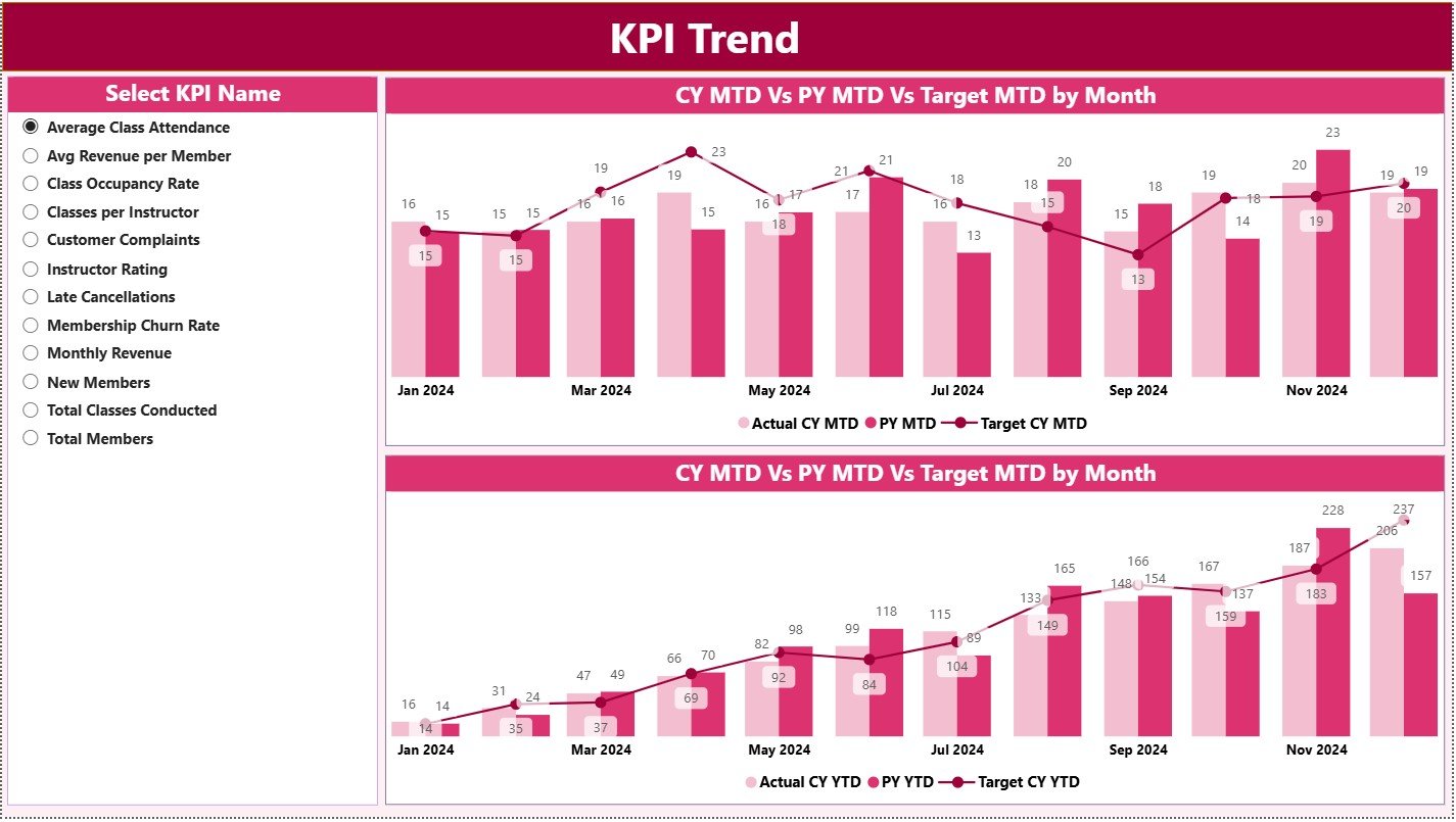
The KPI Trend Page focuses on performance patterns over time.
On this page:
-
You can select a KPI name using a slicer.
-
The dashboard displays two combo charts for:
-
MTD performance
-
YTD performance
-
What Do These Charts Show?
Each combo chart displays:
-
Current Year Actual
-
Previous Year Actual
-
Targets
This format makes trend analysis simple and intuitive. Therefore, users can quickly understand growth patterns, seasonal trends, and performance gaps.
What Is the KPI Definition Page?
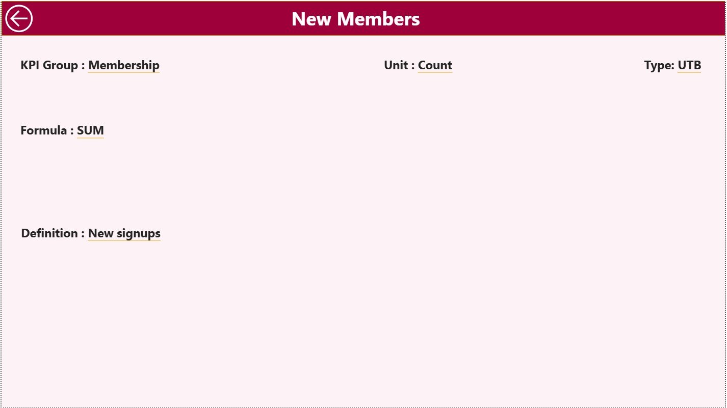
The KPI Definition Page acts as a drill-through page and remains hidden by default.
From the Summary Page:
-
You can right-click on a KPI.
-
You can drill through to this page.
On this page, you will see:
-
KPI Formula
-
KPI Definition
-
KPI Unit
-
KPI Type
This feature improves transparency and consistency because all users understand each KPI clearly.
To return to the main page, you simply click the Back button at the top-left corner.
How Does the Excel Data Structure Work?
The Yoga Centres KPI Dashboard in Power BI uses Excel as a data source. You must fill three worksheets correctly to ensure accurate analysis.
Input_Actual Sheet Explained
This sheet stores actual KPI values.
You must fill:
-
KPI Name
-
Month (use the first date of the month)
-
MTD Actual Value
-
YTD Actual Value
As soon as you update this sheet, the dashboard refreshes automatically.
Input_Target Sheet Explained
This sheet stores target values.
You must fill:
-
KPI Name
-
Month (use the first date of the month)
-
Target MTD Value
-
Target YTD Value
This structure allows easy comparison between actual and target values.
KPI Definition Sheet Explained
This sheet stores master KPI information.
You must fill:
-
KPI Number
-
KPI Group
-
KPI Name
-
Unit
-
Formula
-
Definition
-
Type (LTB or UTB)
Because of this sheet, the dashboard maintains clarity, accuracy, and standardization.
Click to Purchases Yoga Centres KPI Dashboard in Power BI
Advantages of Yoga Centres KPI Dashboard in Power BI
Using a Yoga Centres KPI Dashboard in Power BI offers several benefits.
Key Advantages
✅ Provides clear and real-time performance visibility
✅ Helps managers identify underperforming KPIs quickly
✅ Improves target monitoring for MTD and YTD
✅ Supports data-driven decision-making
✅ Reduces dependency on manual reporting
✅ Enables trend analysis and year-over-year comparison
✅ Improves accountability and performance control
✅ Saves time and effort in report preparation
Because of these advantages, yoga centres gain a competitive edge.
Click to Purchases Yoga Centres KPI Dashboard in Power BI
Best Practices for the Yoga Centres KPI Dashboard in Power BI
To get maximum value from the dashboard, you should follow some best practices.
Best Practices
✅ Update Excel data regularly and accurately
✅ Use consistent KPI names across sheets
✅ Maintain proper KPI definitions
✅ Review target values periodically
✅ Analyze both MTD and YTD performance
✅ Focus on KPIs that miss targets
✅ Train staff to understand KPI meanings
✅ Use trend pages for long-term planning
Following these best practices ensures accurate insights and reliable decisions.
How Does This Dashboard Improve Yoga Centre Management?
This dashboard helps yoga centres:
-
Monitor class utilization
-
Track instructor performance
-
Analyze revenue trends
-
Improve customer engagement
-
Control operational efficiency
As a result, owners and managers can make proactive decisions instead of reactive ones.
Conclusion
The Yoga Centres KPI Dashboard in Power BI transforms raw operational data into meaningful insights. Instead of working with scattered files and static reports, yoga centres can now manage performance from one centralized dashboard.
Because this dashboard offers MTD, YTD, target comparisons, trend analysis, and drill-through explanations, it supports smarter and faster decision-making. Moreover, its Excel-based data structure makes it flexible and easy to maintain.
If you want to improve performance visibility, accountability, and growth for your yoga centre, this KPI dashboard becomes an essential management tool.
Click to Purchases Yoga Centres KPI Dashboard in Power BI
Frequently Asked Questions (FAQs)
What is the main purpose of a Yoga Centres KPI Dashboard in Power BI?
The main purpose is to track, analyze, and compare yoga centre KPIs in real time using interactive visuals.
Can beginners use this dashboard easily?
Yes. Because the dashboard uses Excel as a data source and provides clear visuals, beginners can use it comfortably.
Do I need coding knowledge to use this dashboard?
No. You only need to update data in Excel. Power BI handles calculations and visuals automatically.
How often should I update the data?
You should update the data monthly or whenever new KPI values become available.
Can I add new KPIs to this dashboard?
Yes. You can easily add new KPIs by updating the KPI Definition and input sheets.
Does this dashboard support year-over-year comparison?
Yes. The dashboard compares current year performance with previous year values for both MTD and YTD.
Is this dashboard suitable for multi-location yoga centres?
Yes. With proper KPI grouping and filtering, you can extend this dashboard for multiple locations.
Click to Purchases Yoga Centres KPI Dashboard in Power BI
Visit our YouTube channel to learn step-by-step video tutorials