Part of the free Module 8: Basic Charts · Lesson 9 of 12 · Full Excel course
Updated on 5 September 2026 · Works in Excel 365, 2021, 2019 and 2016 unless noted. The one-click Insert Combo Chart command needs Excel 2013 or later; the manual method works in Excel 2010 too.
A combo chart in Excel plots two or more measures on one chart using different chart types, and usually gives the second measure its own secondary axis. The classic combo chart is clustered columns for a volume such as sales plus a line for a rate such as conversion percentage, so both are readable even though their scales are nothing alike.
What a combo chart is and why the secondary axis matters
When two measures share one axis, the smaller one is flattened. Sales of 120 and a conversion rate of 0.35 cannot share a scale: the rate collapses into a flat line along the bottom of the plot area. A combo chart solves this in two moves. It gives each series its own chart type, so the reader can tell them apart at a glance, and it moves the second series to a secondary value axis drawn on the right, so the rate gets a scale that suits it.
Excel 2013 introduced a dedicated Insert Combo Chart button with a Create Custom Combo Chart dialog where you set a chart type and a Secondary Axis tick box per series. Excel 2010 has no such dialog, so you build the same chart by changing one series type and ticking Secondary Axis in Format Data Series. Both routes are covered below, and both produce an identical chart.
Sample data
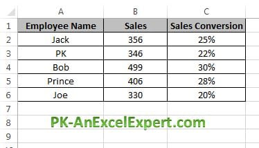
This lesson uses employee-wise sales with a sales conversion percentage, laid out in A1:C6. Column B is a count of units in the hundreds, column C is a percentage between 0 and 1. That gap in scale is exactly what a combo chart is for.
| Employee (A) | Sales (B) | Sale Conversion (C) |
|---|---|---|
| Amit | 120 | 35% |
| Bhavna | 96 | 41% |
| Chirag | 145 | 28% |
| Deepa | 108 | 47% |
| Ehsan | 132 | 33% |
Type the conversion figures as real percentages, not as the numbers 35 and 41. Enter the underlying ratio, for example =B2/1000 or whatever divides sales by opportunities in your own data, then apply the percentage number format so Excel knows the values are fractions of one. The practice file below uses the same three-column layout.
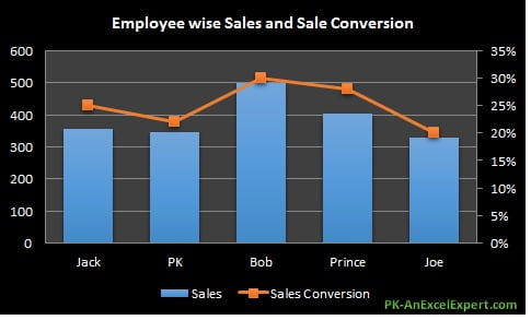
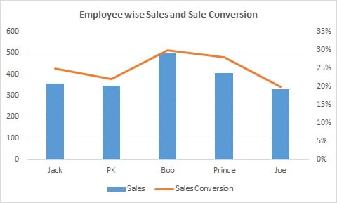
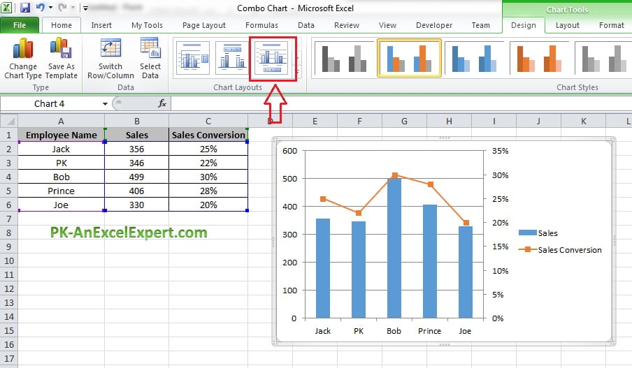
Here is the finished result. Sales are clustered columns on the primary axis and conversion is a line with markers on the secondary axis.
Method 1: Insert Combo Chart in Excel 2013 and later
- Select the whole range including the headers, A1:C6. Headers matter: they become the legend entries and the series names in the dialog.
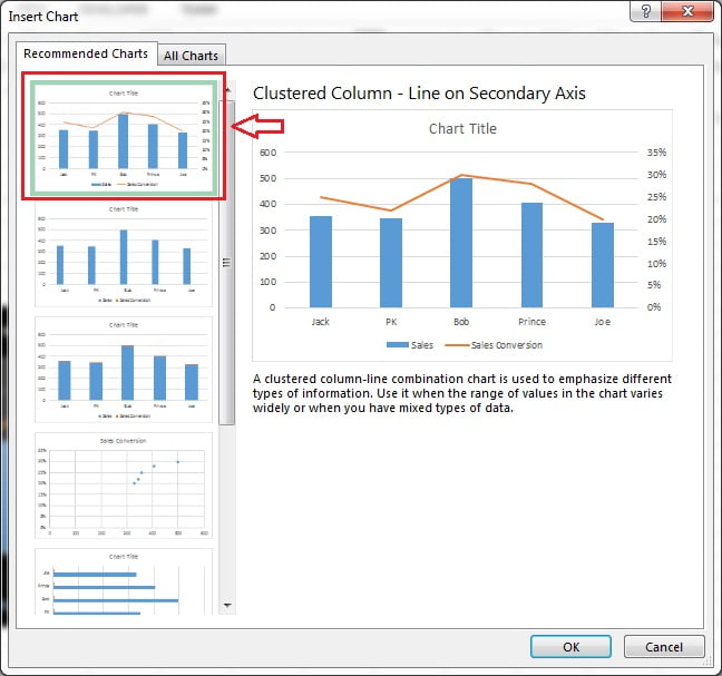
- Go to Insert > Charts > Recommended Charts. For data shaped like this, Excel normally offers a clustered column and line on secondary axis as its first suggestion.
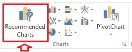
- Accept the recommendation, or take full control: on the Insert tab click Insert Combo Chart (the icon showing a column and a line) and choose Clustered Column – Line on Secondary Axis. That preset assigns the last series to a line on the secondary axis automatically.
- For anything more than two series, choose Create Custom Combo Chart at the bottom of the same menu. The Insert Chart dialog opens on the All Charts tab with Combo selected, listing every series with two controls each: a chart type drop-down and a Secondary Axis tick box.
- Set Sales to Clustered Column with Secondary Axis clear, and Sale Conversion to Line with Markers with Secondary Axis ticked. Click OK.
- Click the chart title and type Employee wise Sales and Sale Conversion. The combo chart is done.
Method 2: build the combo chart manually
This route works in every version from Excel 2010 onwards and shows what the Combo dialog does behind the scenes. It is also the fastest way to fix a chart that is already on the sheet.
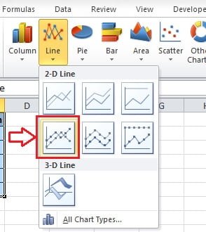
- Select A1:C6 and go to Insert > Charts > Insert Line or Area Chart > Line with Markers. Both series come in as lines, and the conversion line lies flat along the bottom because its values are tiny next to sales.
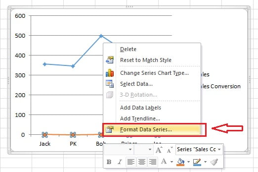
- Right-click the flat Sale Conversion line and choose Format Data Series. If the line is too small to click, select it from the drop-down in Format > Current Selection instead.
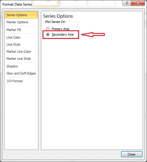
- In the Series Options section select Secondary Axis. A second value axis appears on the right and the conversion line lifts into the plot area.
- Right-click the Sales line and choose Change Series Chart Type.
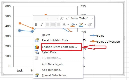
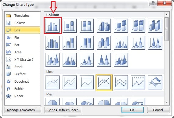
- Set the Sales series to Clustered Column and click OK. In Excel 2013 and later this opens the same Combo pane described in method 1, so you can confirm both the type and the axis of every series in one place.
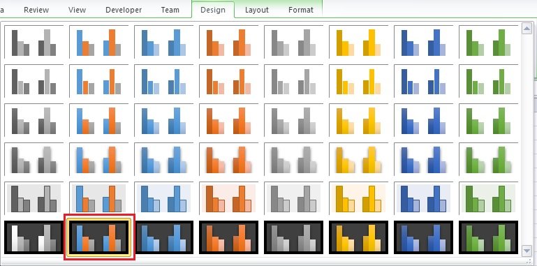
- On the Chart Design tab pick a Quick Layout that includes a legend and data labels, then a Chart Style. Layout 3 and Style 42 were used in the screenshots; the galleries differ between versions, so choose the nearest equivalent.
- Click the title and type Employee wise Sales and Sale Conversion.
Turn an existing chart into a combo chart
You do not have to start again. Click any chart already on the sheet, then use Chart Design > Change Chart Type > Combo (or right-click the chart area and choose Change Chart Type). The Combo pane lists every series with its own type drop-down and Secondary Axis tick box, so you can convert a plain column chart into a column and line combo in two clicks. Nothing else about the chart changes: the source range, titles, colours and size all survive.
The same pane is the safest place to check what an inherited chart is really doing. If two series look oddly similar in size, open Combo and see whether one of them is quietly sitting on the secondary axis.
Format the chart so it does not mislead
A combo chart is only honest when both axes are labelled and scaled deliberately. Excel picks secondary axis bounds automatically from the data, and those bounds change every time the data changes, which can make a stable rate look violently variable. Fix them.
| What to format | Where | Setting to use |
|---|---|---|
| Secondary axis scale | Double-click the right axis > Axis Options > Bounds | Set Minimum 0 and Maximum 1 (0% to 100%) so the line cannot exaggerate a small movement |
| Secondary axis number format | Axis Options > Number > Category | Percentage with 0 decimal places |
| Primary axis scale | Double-click the left axis > Axis Options > Bounds | Minimum 0. Never start a column axis above zero |
| Line markers | Format Data Series > Fill and Line > Marker | Built-in circle, size 6 to 8, so each point is readable |
| Data labels | Chart Elements (plus sign) > Data Labels | Add to the line only, positioned Above. Labelling both series clutters the plot |
| Legend | Chart Elements > Legend | Top or bottom, with series names that carry the unit, such as Sales (units) and Conversion (%) |
| Colours | Format Data Series > Fill and Line | Muted fill for the columns, one strong contrasting colour for the line |
| Axis titles | Chart Elements > Axis Titles > Secondary Vertical | Name both axes when the units are not obvious from the legend |
Worked example
Using the sample table above, build the chart and read it properly.
- Select A1:C6 and choose Insert > Charts > Insert Combo Chart > Clustered Column – Line on Secondary Axis.
- Double-click the right-hand axis. Under Axis Options set Minimum to 0 and Maximum to 1, then under Number choose Percentage with 0 decimal places.
- Select the conversion line, open Format Data Series > Fill and Line > Marker and apply a built-in circle marker.
- With the line still selected, add data labels above it.
- Rename the title to Employee wise Sales and Sale Conversion.
The result reads at a glance: Chirag has the tallest column at 145 units but the lowest point on the line at 28%, while Deepa sells fewer units at 108 and converts best at 47%. On a single-axis chart that whole story is invisible, because every conversion value would sit within a pixel of the axis. Cross-check the numbers with =SUM(B2:B6) for total sales and =AVERAGE(C2:C6) for the mean conversion rate before you present the chart.
When to use a combo chart, and when not to
Use a combo chart when two measures belong in the same story but not on the same scale.
- Volume and rate. Sales and conversion percentage, calls and abandonment rate, revenue and margin percentage.
- Actual against target. Actual as columns, target as a line, so the gap is visible at every point. Both stay on the primary axis when the units match.
- Different units. Units sold and average price, headcount and cost per head, visits and revenue per visit.
- Absolute and cumulative. Monthly figures as columns with a running total or moving average as a line.
Avoid a combo chart in these cases.
- Two measures on the same scale. If both series are money in the same currency and the same rough magnitude, use a clustered column chart. A secondary axis here is pure noise.
- To make a weak relationship look strong. This is the misleading secondary axis trap. Because you choose both scales, you can slide two unrelated series until they appear to track each other. A reader who does not check the bounds sees a correlation that is not in the data. Set honest bounds, label both axes and never tune a scale until the picture agrees with your argument.
- Two column series on different axes. The columns overlap and there is no way to tell which axis a bar belongs to.
- More than one line on the secondary axis. Legible in theory, unreadable in practice. Split into two charts instead.
- Comparing parts of a whole. Use a stacked column or a pie chart for composition, not a combo.
Tips and common mistakes
- Include the headers in the selection. Without row 1 the legend shows Series1 and Series2 and the Combo dialog is much harder to read.
- Store percentages as fractions. If conversion is stored as 35 rather than 0.35, the percentage number format shows 3500%. Divide by 100 first or fix the underlying formula.
- Fix the secondary axis bounds. Automatic bounds re-scale whenever the data refreshes, so the same chart tells a different story next month.
- Never start the column axis above zero. Truncating the primary axis exaggerates differences between columns.
- Give the line a marker. A bare line between five points is hard to read against gridlines, and markers show exactly where the measured values sit.
- Do not label everything. Data labels on both series double the ink for no extra meaning. Label the line, leave the columns to the axis.
- Put the unit in the series name. Renaming the header to Conversion (%) makes the legend do the work of an axis title.
Problems and how to fix them
| Problem | Cause | Fix |
|---|---|---|
| The line lies flat along the bottom | The series is still on the primary axis | Format Data Series > Series Options > Secondary Axis |
| Secondary axis shows 0.35 not 35% | The axis has the General number format | Axis Options > Number > Percentage, 0 decimals |
| Secondary axis shows 3500% | Values stored as whole numbers, not fractions | Divide the source values by 100 |
| Columns overlap and hide each other | Two column series split across two axes | Change one series to a line, or put both columns on one axis |
| Combo is greyed out in Change Chart Type | The chart is a 3-D, stock, surface or map type | Change to a 2-D column or line chart first, then apply Combo |
| The legend names series as Series1 | Headers were left out of the source range | Chart Design > Select Data > Edit and point the series name at the header cell |
| The line jumps wildly month to month | Auto bounds are re-scaling a narrow range | Set fixed Minimum and Maximum on the secondary axis |
Download the practice file
Download the Combo Chart Excel file to work through both methods with the same data as the screenshots, or click the chart below.
Practice exercise
- Open the practice file and build the combo chart twice: once with Insert Combo Chart > Clustered Column – Line on Secondary Axis, once with the manual method. Confirm the two charts are identical.
- Fix the secondary axis at 0% to 100%, then change one conversion value from 28% to 30% and check that the line barely moves. Switch the bounds back to Auto and watch the same change look dramatic.
- Add a third column called Target with a flat value such as 40%, then use Change Chart Type > Combo to plot it as a second line on the secondary axis. Decide whether the extra line helps or clutters.
- Select the finished chart and use Change Chart Type > Combo to turn the line back into a clustered column. Note how unreadable the conversion series becomes, and undo.
- Rename the headers to Sales (units) and Conversion (%), and check that the legend now carries the units without extra axis titles.
Key takeaways
- A combo chart plots two measures with different chart types, normally columns for a volume and a line for a rate.
- The secondary axis is what makes the smaller measure readable; without it the rate flattens against the axis.
- Insert > Charts > Insert Combo Chart > Clustered Column – Line on Secondary Axis is the fast route; Create Custom Combo Chart gives a type and a Secondary Axis tick box per series.
- Change Chart Type > Combo converts any existing 2-D chart without rebuilding it.
- Fix the secondary axis bounds and number format, or the chart tells a different story every time the data refreshes.
- Do not use a combo chart for two measures on the same scale, and never tune the two scales until unrelated series appear to correlate.
Related lessons
- Basic Charts course hub
- Column chart in Excel
- Line chart in Excel
- Chart elements: titles, axes, labels and legend
- How to choose the right chart type
- Excel Dashboard course
- SUM function and AVERAGE function for the totals behind the chart
- Available chart types in Office on Microsoft Support
Frequently asked questions
How do I create a combo chart in Excel?
Select your data including the headers, then go to Insert, Charts, Insert Combo Chart and pick Clustered Column – Line on Secondary Axis. For more control choose Create Custom Combo Chart at the bottom of that menu, which opens a dialog listing every series with its own chart type drop-down and a Secondary Axis tick box.
How do I add a secondary axis in Excel?
Right-click the series that needs its own scale, choose Format Data Series, and under Series Options select Secondary Axis. A second value axis appears on the right of the plot area. In Excel 2013 and later you can also tick Secondary Axis next to that series in the Change Chart Type, Combo dialog.
Why is my line flat at the bottom of the combo chart?
The line series is still plotted on the primary axis, where its values are tiny compared with the columns. A conversion rate of 0.35 next to sales of 145 has nowhere to go. Move that series to the secondary axis and it will lift into the plot area with a scale of its own.
Can a combo chart have more than two series?
Yes. The Create Custom Combo Chart dialog lists every series in the source range and lets you set a chart type and axis for each one independently. In practice keep it to one line on the secondary axis. Two or more lines sharing that axis make the chart hard to read, so split the story across two charts instead.
Is a secondary axis ever misleading?
It can be. You control the bounds of both axes, so it is possible to slide two unrelated series until they appear to move together. Guard against it by setting deliberate fixed bounds, starting the column axis at zero, labelling both axes with their units, and never adjusting a scale simply because the picture then supports your point.
Want the finished version? Ready-made Excel dashboards, trackers and KPI templates with combo charts already built in are available at NextGenTemplates.com.