Payroll teams work hard every month to process salaries on time, fix employee data issues, manage deductions, track leave balances, and verify payout approvals. However, payroll accuracy often drops when teams use scattered spreadsheets, manual tracking, or outdated systems. Small mistakes travel across departments and create payment errors, compliance risks, budget gaps, and employee dissatisfaction.
A Payroll Accuracy KPI Dashboard in Power BI gives you complete clarity. It brings all payroll KPIs into one interactive place and helps you measure accuracy, speed, compliance, and efficiency. You view real-time insights, compare trends, track targets, and improve payroll quality every month.
This complete guide explains everything about the dashboard, including key features, workflows, data structure, advantages, best practices, and FAQs.
Click to Purchases Payroll Accuracy KPI Dashboard in Power BI
What Is a Payroll Accuracy KPI Dashboard in Power BI?
A Payroll Accuracy KPI Dashboard in Power BI is a ready-to-use performance tracking solution that shows all payroll KPIs in a clean and interactive format. You monitor Month-to-Date (MTD) and Year-to-Date (YTD) accuracy, compare actual performance with targets, and review improvements or gaps against the previous year.
Payroll managers, HR teams, financial controllers, and compliance officers use the dashboard to make faster and smarter decisions.
👉 Why Do Organizations Need a Payroll Accuracy Dashboard?
Payroll accuracy is one of the most sensitive HR functions. Even a single mistake affects employees, budgets, and trust. When data lives across multiple Excel files, emails, and forms, mistakes grow.
A dashboard helps because:
-
It removes guesswork
-
It shows instant deviations
-
It highlights error-prone areas
-
It speeds up month-end reporting
-
It improves accuracy and transparency
-
It keeps historical and current data together
As a result, organizations gain full control over payroll performance.
📌 Key Features of the Payroll Accuracy KPI Dashboard in Power BI
This dashboard comes with three powerful pages, each designed to give payroll teams the right insights at the right time.
1️⃣ Summary Page: The Main Performance View
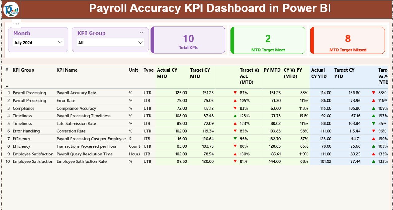
The Summary Page works as the heart of the dashboard. It offers a full overview of payroll accuracy KPIs for any selected month or KPI group.
✔ Highlights of the Summary Page
-
Month slicer for selecting reporting month
-
KPI Group slicer for filtering related metrics
-
Three performance cards showing:
-
Total KPIs Count
-
MTD Target Met Count
-
MTD Target Missed Count
-
These cards give a quick picture of how well payroll operations perform.
✔ Detailed KPI Table
Below the cards, a detailed, easy-to-read KPI table appears. It includes:
-
KPI Number – Serial number
-
KPI Group – Accuracy, compliance, timeliness, etc.
-
KPI Name – Specific payroll KPI
-
Unit – Percentage, count, hours, etc.
-
Type (LTB or UTB) – Lower The Better / Upper The Better
-
Actual CY MTD – Current Month-to-Date value
-
Target CY MTD – Expected target for the month
-
MTD Icon (▲ ▼) – Green and red indicators
-
Target vs Actual (MTD) – Actual/Target %
-
PY MTD – Same period last year
-
CY vs PY (MTD) – CY MTD ÷ PY MTD %
-
Actual CY YTD – Current Year-to-Date actual
-
Target CY YTD – Current Year-to-Date target
-
YTD Icon – Green & red indicators
-
Target vs Actual (YTD) – YTD accuracy %
-
PY YTD – Previous Year YTD
-
CY vs PY (YTD) – Current YTD ÷ Previous YTD ratio
Teams use these insights to find gaps, compare progress, and take corrective action.
Click to Purchases Payroll Accuracy KPI Dashboard in Power BI
2️⃣ KPI Trend Page: Month-Wise and Year-Wise Performance Tracking
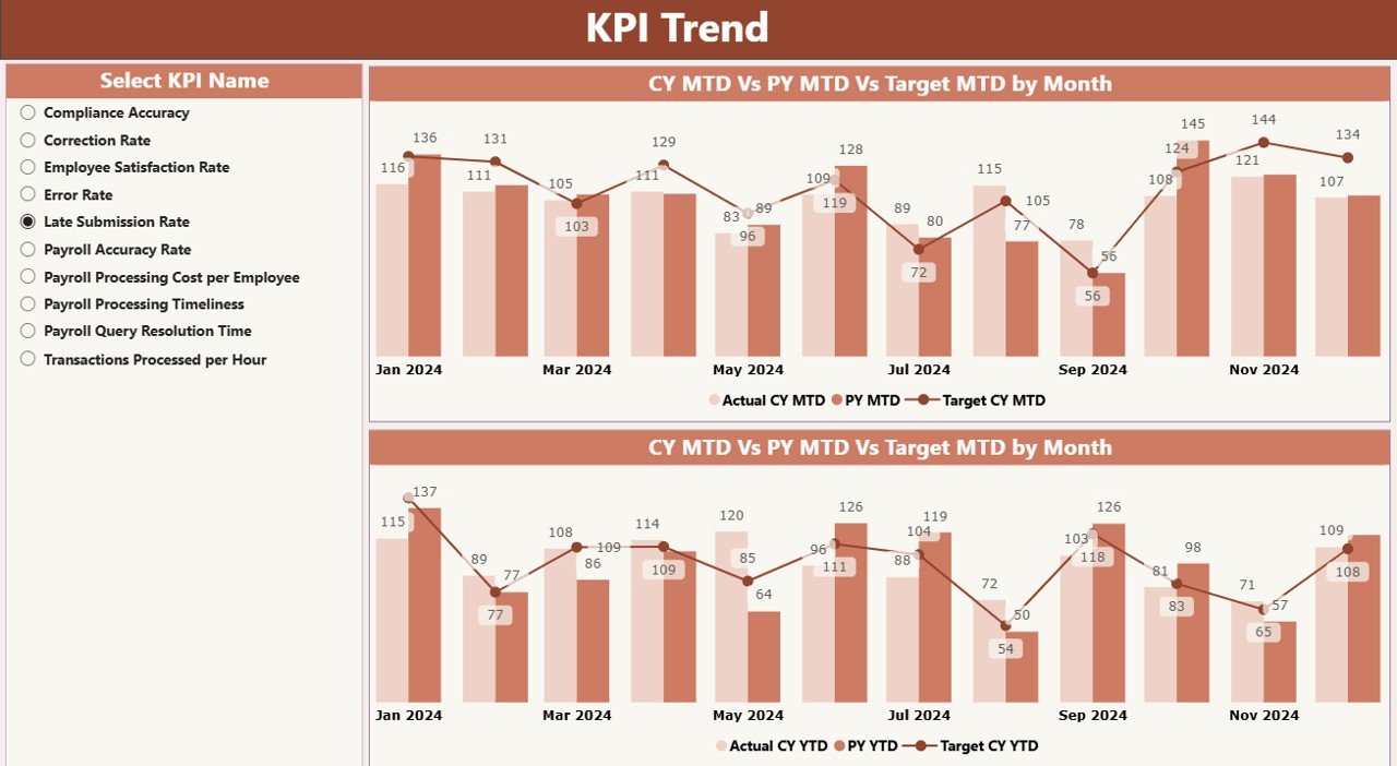
The Trend Page shows clear and easy-to-understand charts that compare Actual vs Target values.
✔ Included Visuals
-
MTD Trend Combo Chart
-
YTD Trend Combo Chart
-
Comparison lines for:
-
Current Year Actual
-
Previous Year Actual
-
Current Year Target
-
✔ Slicer for KPI Selection
A KPI name slicer allows users to click any KPI and instantly see how it changes month over month and year over year.
This helps payroll teams:
-
Identify improvement trends
-
Monitor error-prone processes
-
Track long-term performance stability
3️⃣ KPI Definition Page (Drill-Through)
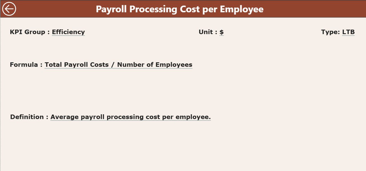
The KPI Definition Page contains:
-
KPI Number
-
KPI Group
-
KPI Name
-
Unit
-
Formula
-
KPI Definition
-
KPI Type (LTB / UTB)
Users can right-click any KPI on the Summary Page and drill through to this page for complete details.
A Back button lets users return to the Summary Page.
📂 Excel Data Structure for the Dashboard
The dashboard uses an Excel file as the data source. You need to fill three worksheets.
1️⃣ Input_Actual Sheet
Here, you enter:
-
KPI Name
-
Month (first date of the month)
-
Actual MTD
-
Actual YTD
This keeps monthly and yearly actuals accurate.
2️⃣ Input_Target Sheet
Here, you fill:
-
KPI Name
-
Month
-
Target MTD
-
Target YTD
These values help calculate achievement percentages.
3️⃣ KPI Definition Sheet
This sheet includes:
-
KPI Number
-
KPI Group
-
KPI Name
-
Unit
-
Formula
-
Definition
-
Type (LTB or UTB)
This ensures every KPI remains clearly defined and standardized.
👉 What KPIs Should a Payroll Accuracy Dashboard Track?
Organizations usually track KPIs such as:
-
Payroll Error Rate (%)
-
Validation Completion Rate
-
On-Time Approval %
-
Incorrect Deductions Count
-
Correct Tax Calculation %
-
Salary Revision Accuracy
-
Leave & Attendance Accuracy
-
Payment Reconciliation Accuracy
-
Manual Adjustment Count
-
Overpayment/Underpayment Incidents
Tracking these KPIs ensures accurate and compliant payroll operations.
🔍 How Does This Dashboard Improve Payroll Accuracy?
This dashboard improves payroll performance because it:
-
Shows errors early
-
Highlights inconsistent patterns
-
Tracks improvement trends
-
Offers color-coded indicators for easy decisions
-
Eliminates complex spreadsheet work
-
Centralizes all KPI data
-
Improves accountability
When teams monitor KPIs regularly, they correct issues before they affect employee payouts.
🔥 Advantages of Payroll Accuracy KPI Dashboard in Power BI
Click to Purchases Payroll Accuracy KPI Dashboard in Power BI
1. Faster Decision Making
Managers take action immediately because they see real-time payroll trends.
2. Higher Accuracy
Teams track more KPIs with fewer mistakes.
3. Better Transparency
Everyone understands what works and what needs improvement.
4. Stronger Compliance
The dashboard shows any deviation in statutory calculations, tax deductions, and rules.
5. Improved Employee Trust
Accurate salary processing increases employee confidence.
6. Time Savings
Teams avoid manual reporting and use automated Power BI visuals.
7. Clear Performance Monitoring
You track MTD, YTD, PY comparisons, and targets in one place.
🧭 Best Practices for Using the Payroll Accuracy Dashboard
1. Update the Excel Source Monthly
Always maintain fresh data for accurate reporting.
2. Use Standard KPI Definitions
Make sure every payroll KPI follows the same formula.
3. Review MTD and YTD Trends Weekly
Regular tracking prevents last-minute surprises.
4. Check UTB and LTB KPIs Carefully
Understand whether higher or lower is better before decision-making.
5. Train Payroll and HR Teams
Educate teams on how to use the dashboard effectively.
6. Validate Data Before Uploading
Fix errors in Excel before refreshing Power BI.
7. Use Drill-Through Often
Deep insights help find the root cause behind each KPI.
💡 Who Should Use This Dashboard?
-
Payroll managers
-
HR executives
-
Finance teams
-
Compliance officers
-
Auditors
-
Senior management
It supports daily monitoring, monthly processing reviews, quarterly audits, and strategic decision-making.
📊 How Power BI Enhances Payroll Monitoring
Power BI offers several benefits:
-
Interactive visuals
-
Automatic refresh
-
Strong comparison charts
-
Quick drill-through
-
Slicers for better filtering
-
Accurate data modeling
-
Easy sharing
Because of these advantages, companies use Power BI to upgrade their payroll reporting.
📝 Conclusion
A Payroll Accuracy KPI Dashboard in Power BI gives organizations a reliable way to track payroll performance, control errors, and improve compliance. It replaces manual reports with automated insights and empowers payroll teams to work with confidence. With clear MTD, YTD, and trend visuals, managers understand the entire payroll flow and make better decisions every month.
When companies use this dashboard regularly, they achieve accurate payouts, reduce mistakes, and build trust among employees.
❓ Frequently Asked Questions (FAQs)
1. What is a Payroll Accuracy KPI Dashboard?
It is a Power BI dashboard that shows payroll accuracy metrics such as error rates, validation trends, approval times, and data accuracy.
2. Why should HR teams use this dashboard?
It helps HR teams reduce payroll mistakes, track trends, and ensure timely and accurate salary processing.
3. What data source does the dashboard use?
It uses an Excel file with three sheets: Actuals, Targets, and KPI Definitions.
4. Can management track monthly and yearly comparisons?
Yes. The dashboard shows MTD, YTD, and previous year comparisons for every KPI.
5. Does the dashboard support drill-through?
Yes. Users can drill down to the KPI Definition Page for formulas and details.
6. Can small businesses use this dashboard?
Yes. Power BI works for businesses of all sizes.
7. How often should the data be updated?
You should refresh data every month or according to your payroll cycle.
Visit our YouTube channel to learn step-by-step video tutorials