Managing shipping and cargo operations requires fast decisions, real-time visibility, and continuous performance tracking. Every delay, incorrect delivery, or missing document impacts customer satisfaction and increases costs. Because logistics teams handle large volumes of data, they often struggle to track all operational KPIs manually.
A Shipping & Cargo KPI Dashboard in Power BI solves this problem. It organizes complex logistics data, transforms it into clear visuals, and helps businesses measure performance with confidence. In this article, you will explore how the dashboard works, what each page includes, and how it supports improvement across the entire shipping and cargo workflow.
This guide uses simple language, meaningful insights, and a clear structure to help you understand every part of the dashboard.
Click to Purchases Shipping & Cargo KPI Dashboard in Power BI
What Is a Shipping & Cargo KPI Dashboard in Power BI?
A Shipping & Cargo KPI Dashboard in Power BI is a ready-to-use analytics solution that helps logistics teams measure efficiency, safety, delivery speed, costs, and operational performance. It pulls data from Excel files and converts it into dynamic charts, KPI cards, trend visuals, and drill-through pages.
You can track Month-to-Date (MTD), Year-to-Date (YTD), Previous Year (PY), and Target values for every KPI. You also see clear icons that show if the KPI meets its target or if it requires attention.
Because Power BI updates the visuals instantly, managers can make faster decisions, reduce errors, and improve overall shipping performance.
Why Do Shipping & Cargo Companies Need a KPI Dashboard?
Logistics teams manage several daily tasks—fleet management, loading and unloading, documentation, customs, tracking, storage, container capacity, employee safety, and more. Without organized dashboards, teams spend hours preparing reports.
However, the dashboard makes daily work easier because:
-
It shows performance issues instantly.
-
It highlights areas that need improvement.
-
It increases visibility across departments.
-
It helps leaders compare current and previous results.
-
It saves time spent on manual reporting.
Since Power BI is fast, visual, and interactive, it becomes the perfect tool to manage complex logistics data.
Click to Purchases Shipping & Cargo KPI Dashboard in Power BI
What Does This Dashboard Include?
This Power BI dashboard contains the following pages:
-
Summary Page
-
KPI Trend Page
-
KPI Definition Page (Drill-through Page)
Each page is designed to give clear insights and help the logistics team monitor performance in real time.
Let’s understand each page in detail.
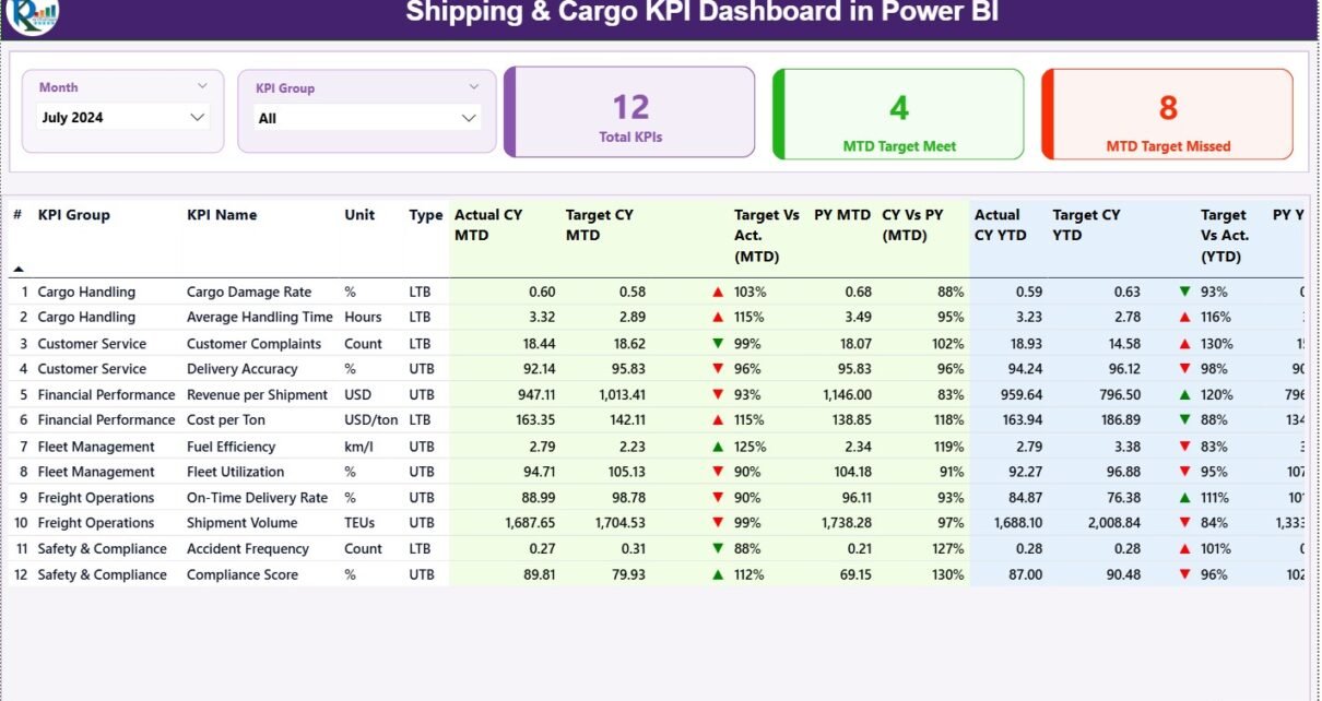
1. Summary Page
The Summary Page is the main page of the Shipping & Cargo KPI Dashboard. It gives a complete overview of all key performance indicators in one place. Teams use this page every day to check progress and identify issues.
Summary Page Features
🔹 Month Slicer
You can choose the month to update all KPIs immediately.
🔹 KPI Group Slicer
You can filter KPIs based on groups, such as:
-
Shipping Time
-
Cargo Handling
-
Container Operations
-
Fleet Efficiency
-
On-Time Delivery
-
Customer Complaints
-
Safety Metrics
🔹 KPI Cards on Top
The top section has three important KPI cards:
-
Total KPIs – The total number of metrics tracked.
-
MTD Target Met – How many KPIs meet their Month-to-Date target.
-
MTD Target Missed – How many KPIs do not meet their Month-to-Date target.
These cards help you check performance at a glance.
Detailed KPI Table on the Summary Page
The lower section displays a fully detailed KPI table. This table is the heart of the dashboard because it shows all important KPI fields such as:
KPI Number
This is the sequence number of each KPI.
KPI Group
This shows the category or group of the KPI.
KPI Name
The name of the KPI, for example:
-
Average Shipping Time
-
Cargo Damage Percentage
-
Container Utilization
-
Delivery Accuracy
-
Safety Incidents
-
Cost per Shipment
Unit
The measurement unit, such as:
-
Hours
-
Days
-
Percentage (%)
-
USD
-
Count
Type
Each KPI has a type:
-
UTB (Upper the Better) – Higher values are better.
-
LTB (Lower the Better) – Lower values are better.
Actual CY MTD
Current Year Month-to-Date actual value.
Target CY MTD
Current Year Month-to-Date target value.
MTD Icon
A green ▲ or red ▼ icon shows the KPI status:
-
▲ (Green) – KPI meets the target
-
▼ (Red) – KPI misses the target
Target vs Actual (MTD)
Percentage value using the formula:
Actual MTD / Target MTD
This shows if performance is higher or lower than the target.
PY MTD
Previous Year Month-to-Date value.
CY vs PY (MTD)
Percentage comparison between current and previous year MTD values.
Formula:
Current MTD / Previous MTD
Actual CY YTD
Current Year Year-to-Date actual performance.
Target CY YTD
Current Year Year-to-Date target value.
YTD Icon
Just like the MTD icon, this shows the performance status for YTD.
Target vs Actual (YTD)
Percentage using:
Actual YTD / Target YTD
PY YTD
Previous Year Year-to-Date number.
CY vs PY (YTD)
Percentage comparison between current and previous year YTD values.
Click to Purchases Shipping & Cargo KPI Dashboard in Power BI
2. KPI Trend Page
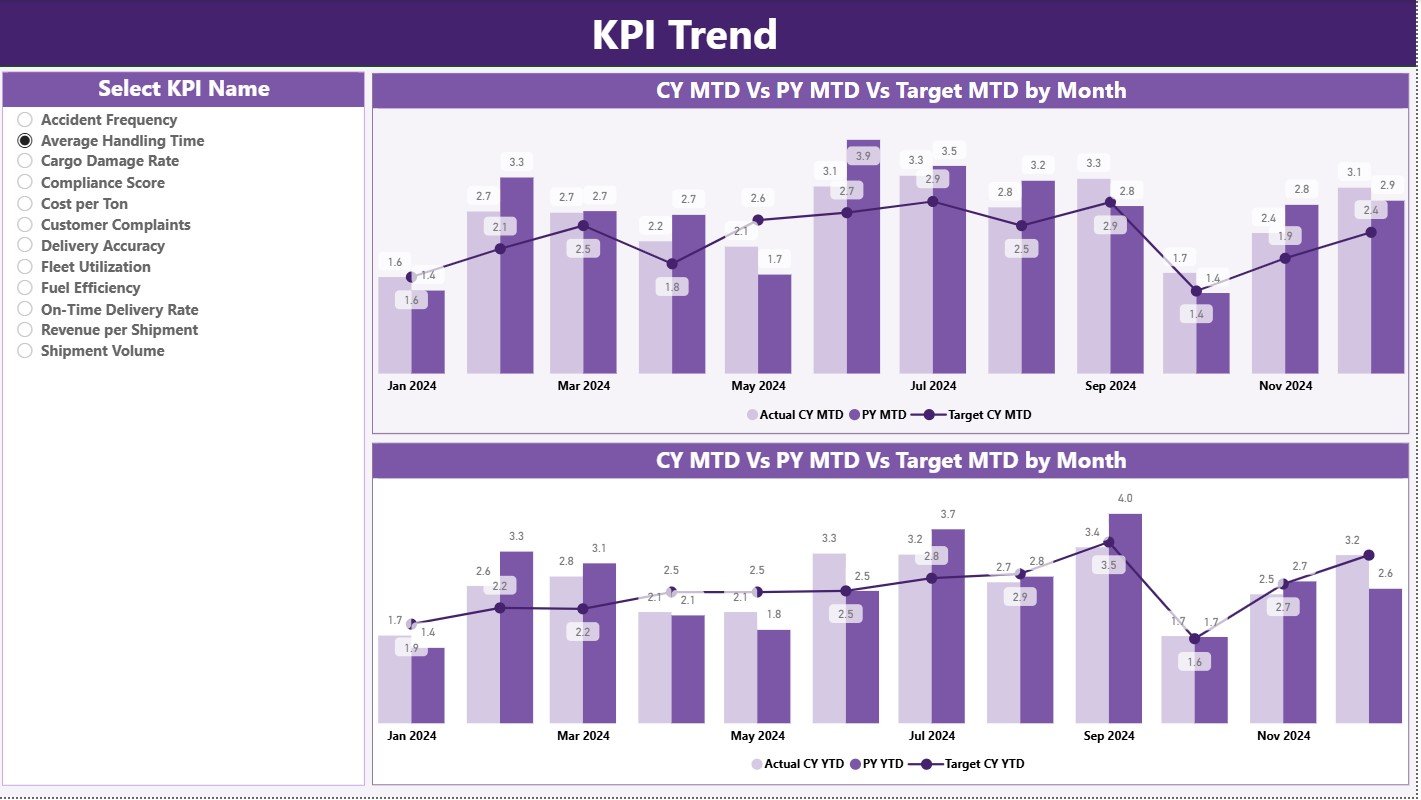
The KPI Trend Page is ideal for analyzing performance over time. It shows the month-wise trend for the selected KPI.
This page helps identify patterns like:
-
Is performance improving?
-
Is the KPI falling behind?
-
Are we meeting targets regularly?
-
How does the current year compare with the previous year?
Key Elements of the KPI Trend Page
🔹 KPI Name Slicer (Left Side)
You can select any KPI to view its monthly trend.
🔹 Two Combo Charts
These charts show:
-
Actual Current Year Values
-
Actual Previous Year Values
-
Target Values
Charts are divided into two sections:
-
MTD Trend Chart
-
YTD Trend Chart
These visuals help the team see the exact movement of KPIs and make faster decisions.
3. KPI Definition Page
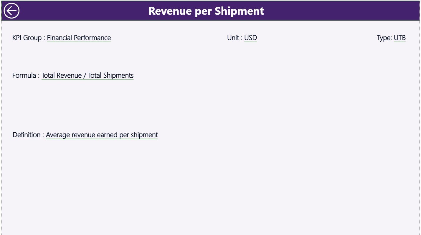
The KPI Definition Page is a hidden drill-through page. You cannot go to this page directly. Instead, you right-click on any KPI in the Summary Page and drill through to view details.
KPI Definition Page Shows:
-
KPI Number
-
KPI Group
-
KPI Name
-
Unit
-
Formula
-
Definition
-
KPI Type (LTB or UTB)
This page helps new team members understand each KPI clearly.
You can go back to the main page using the Back Button in the top-left corner.
How Does the Excel Data Source Work?
This dashboard uses an Excel file as the data source. You must fill three worksheets to load the data into Power BI.
📌 1. Input_Actual Sheet
This sheet contains:
-
KPI Name
-
Month (use first day of the month)
-
MTD Actual
-
YTD Actual
Example:
| KPI Name | Month | MTD Value | YTD Value |
|---|
📌 2. Input_Target Sheet
This sheet contains target values:
-
KPI Name
-
Month
-
MTD Target
-
YTD Target
📌 3. KPI Definition Sheet
This sheet stores the KPI information:
-
KPI Number
-
KPI Group
-
KPI Name
-
Unit
-
Formula
-
Definition
-
Type
Once filled, Power BI imports this data and updates all visuals.
Click to Purchases Shipping & Cargo KPI Dashboard in Power BI
Advantages of Shipping & Cargo KPI Dashboard in Power BI
A Shipping & Cargo KPI Dashboard offers many benefits:
✔ Real-Time Performance Tracking
You see updated KPI results instantly when you refresh the data.
✔ Better Decision-Making
Charts and KPI cards highlight trends and issues clearly.
✔ Improved Shipment Speed
Teams monitor delivery times daily and act fast on delays.
✔ Higher Cargo Handling Accuracy
KPIs help reduce errors, damage, and operational risks.
✔ Better Resource Management
Managers track fleet efficiency, fuel usage, and capacity management.
✔ Accurate Month-End Reporting
Automated visuals reduce manual work and save hours of analysis.
✔ Improved Customer Satisfaction
When KPIs improve, customers receive faster and safer shipping services.
Click to Purchases Shipping & Cargo KPI Dashboard in Power BI
Best Practices for Using the Shipping & Cargo KPI Dashboard
Follow these best practices to get maximum value:
1. Update Data Regularly
Refresh the Excel sheets weekly or daily for better accuracy.
2. Use Clear KPI Definitions
Make sure every KPI has a short and simple description.
3. Set Realistic Targets
Use historical data to set achievable MTD and YTD targets.
4. Monitor Trends Daily
Use the trend page to identify early warnings.
5. Improve KPIs With Continuous Tracking
Review KPIs weekly and update strategies whenever performance changes.
6. Train Teams to Use Power BI
Everyone should understand slicers, drill-through, and visuals.
7. Keep the Dashboard Clean
Avoid unnecessary visuals and keep only meaningful KPIs.
Conclusion
The Shipping & Cargo KPI Dashboard in Power BI transforms complex logistics data into meaningful insights. It helps teams track performance, identify delays, improve cargo operations, and increase customer satisfaction. With its three powerful pages—Summary, KPI Trend, and KPI Definition—businesses gain complete visibility of operational performance.
This ready-to-use dashboard reduces reporting time, increases accuracy, and supports effective decision-making. When logistics leaders use this dashboard consistently, they achieve faster deliveries, lower risks, and better operational outcomes.
Click to Purchases Shipping & Cargo KPI Dashboard in Power BI
Frequently Asked Questions (FAQs)
1. What is a Shipping & Cargo KPI Dashboard in Power BI?
It is a performance management tool that tracks logistics KPIs such as delivery speed, cargo handling accuracy, fleet efficiency, and cost metrics using dynamic Power BI visuals.
2. Why should logistics teams use a KPI dashboard?
It helps teams make faster decisions, view real-time performance, and reduce manual reporting tasks.
3. Can I customize the KPIs in the dashboard?
Yes, you can add or modify KPIs easily by updating the Excel data source.
4. Does the dashboard work with Excel data?
Yes, this dashboard uses three Excel sheets—Actuals, Targets, and KPI Definitions.
5. What visualizations are included in the dashboard?
It includes slicers, KPI cards, detailed KPI tables, combo charts, trend lines, and drill-through pages.
6. Is the dashboard suitable for all shipping companies?
Yes, it works for logistics companies, cargo handlers, shipping lines, warehouses, and freight operators.
Click to Purchases Shipping & Cargo KPI Dashboard in Power BI
Visit our YouTube channel to learn step-by-step video tutorials