Urban mobility changes every day, and people look for faster, cleaner, and more flexible travel options. Because of this, bike and scooter sharing services grow rapidly across major cities. However, operators deal with thousands of trips, multiple cities, different weather conditions, promotional plans, and various vehicle types. When teams depend on manual spreadsheets, they lose time and make mistakes. Therefore, a smart dashboard becomes the perfect solution.
A Bike & Scooter Sharing Dashboard in Excel solves all reporting challenges. It brings real-time insights, easy navigation, and automated analytics in one place. You do not need technical knowledge because the template works inside Microsoft Excel. In this guide, you will learn everything about this dashboard—how it works, what each page shows, advantages, best practices, and frequently asked questions.
What Is a Bike & Scooter Sharing Dashboard in Excel?
Click to Purchases Bike & Scooter Sharing Dashboard in Excel
A Bike & Scooter Sharing Dashboard in Excel is a ready-to-use analytics template that helps mobility startups, city planners, and fleet managers understand their daily operations. It turns raw trip data into clear charts, cards, and tables, so teams can monitor performance at a glance. The dashboard shows gross fare, net fare, ongoing trips, cancelled trips, discount amounts, and city-level trends.
Because the dashboard uses automation and slicers, you can filter and analyze the data from different angles such as:
-
Weather
-
Vehicle type
-
City
-
Promo type
-
Month
-
Membership type
This way, the dashboard becomes a complete mobility analytics system.
Why Do You Need a Bike & Scooter Sharing Dashboard?
Bike and scooter sharing platforms grow fast, and data becomes more complex. Therefore, businesses need one single source of truth that pulls all insights together. When teams use this dashboard, they understand customer behavior, revenue patterns, and operational gaps without switching between multiple Excel files.
A well-designed dashboard helps you:
-
Improve fleet availability
-
Track revenue growth
-
Monitor ride cancellations
-
Understand customer preferences
-
Optimize promotions
-
Plan city expansion
-
Identify weather trends
-
Improve rider satisfaction
This dashboard works as a daily performance tracker and a strategic decision-making tool.
Key Features of the Bike & Scooter Sharing Dashboard in Excel
Your dashboard includes five major analytical pages, each designed to highlight a different business area. In addition, it includes a page navigator and a data sheet for smooth tracking and data entry.
Let’s explore each section in detail.
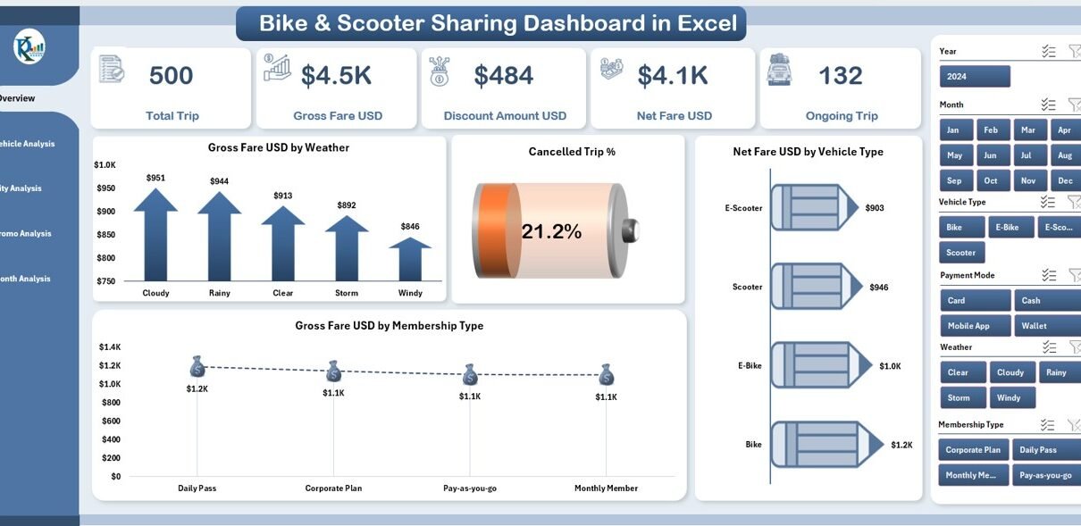
1. Overview Page: A Snapshot of Your Entire Operation

The Overview Page works as the main control center. You see the most important numbers and charts on a single screen, which helps you understand the business performance instantly.
Key Highlights of the Overview Page
✔ Page Navigator
The page navigator sits on the left side and helps you move quickly between all five analytical pages. It saves time and improves the user experience.
✔ KPI Cards (5 Cards)
On the right-side silencer, you get five KPI cards that show essential trip insights. These cards give you quick answers without detailed filtering.
✔ Four Insightful Charts
The overview page includes the following charts:
-
Gross Fare USD by Weather
-
Cancelled Trip %
-
Net Fare USD by Vehicle Type
-
Gross Fare USD by Membership Type
These insights help you understand how weather impacts revenue, how users behave across different memberships, and how cancellations change over time.
2. Vehicle Analysis Page: Understand Vehicle-Level Performance
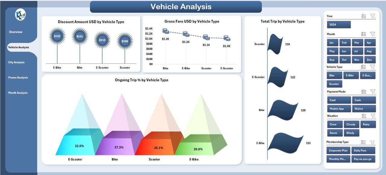
Vehicle types play a major role in bike and scooter sharing businesses. Therefore, this page gives you complete insights into each vehicle category.
Key Charts in Vehicle Analysis
The right-side silencer contains four powerful analytics charts:
-
Discount Amount USD by Vehicle Type
-
Gross Fare USD by Vehicle Type
-
Total Trip by Vehicle Type
-
Ongoing Trip % by Vehicle Type
With these charts, you can quickly see which vehicles generate high revenue, attract more trips, and require operational improvements.
Why This Page Matters
-
You improve fleet allocation
-
You identify high-demand vehicle types
-
You optimize vehicle procurement
-
You understand discount impact by vehicle category
This page becomes extremely useful for fleet managers and operational teams.
Click to Purchases Bike & Scooter Sharing Dashboard in Excel
3. City Analysis Page: Compare Performance Across Cities

When you operate in multiple cities, you need city-wise insights. Therefore, the City Analysis Page shows performance differences across all locations.
Key Charts on City Analysis Page
On the right-side silencer, you get four city-focused charts:
-
Discount Amount USD by City
-
Gross Fare USD by City
-
Ongoing Trip % by City
-
Net Fare USD by City
These charts help you:
-
Spot high-performing cities
-
Understand city-specific demand patterns
-
Compare revenue performance
-
Analyze city-level operational issues
Why This Page Matters
This page supports expansion planning, city marketing strategies, fleet distribution strategies, and pricing optimization.
4. Promo Analysis Page: Track Promotion Effectiveness
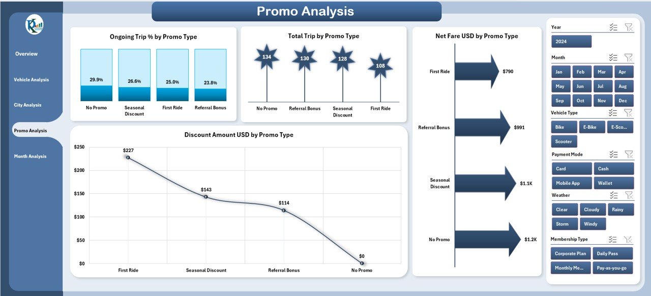
Promotional campaigns bring new customers and increase bookings. However, without proper analysis teams cannot measure the results. This page gives you a complete promo-level comparison.
Key Charts on Promo Analysis Page
On the right-side silencer, you get:
-
Discount Amount USD by Promo Type
-
Ongoing Trip % by Promo Type
-
Net Fare USD by Promo Type
-
Total Trip by Promo Type
Why This Page Matters
With these charts, you understand:
-
Which promotions drive maximum trips
-
Which promos increase revenue
-
How discounting affects ongoing trips
-
Which promo types need improvement
This page helps growth teams and marketing teams track the impact of each campaign.
5. Month Analysis Page: Understand Monthly Trends
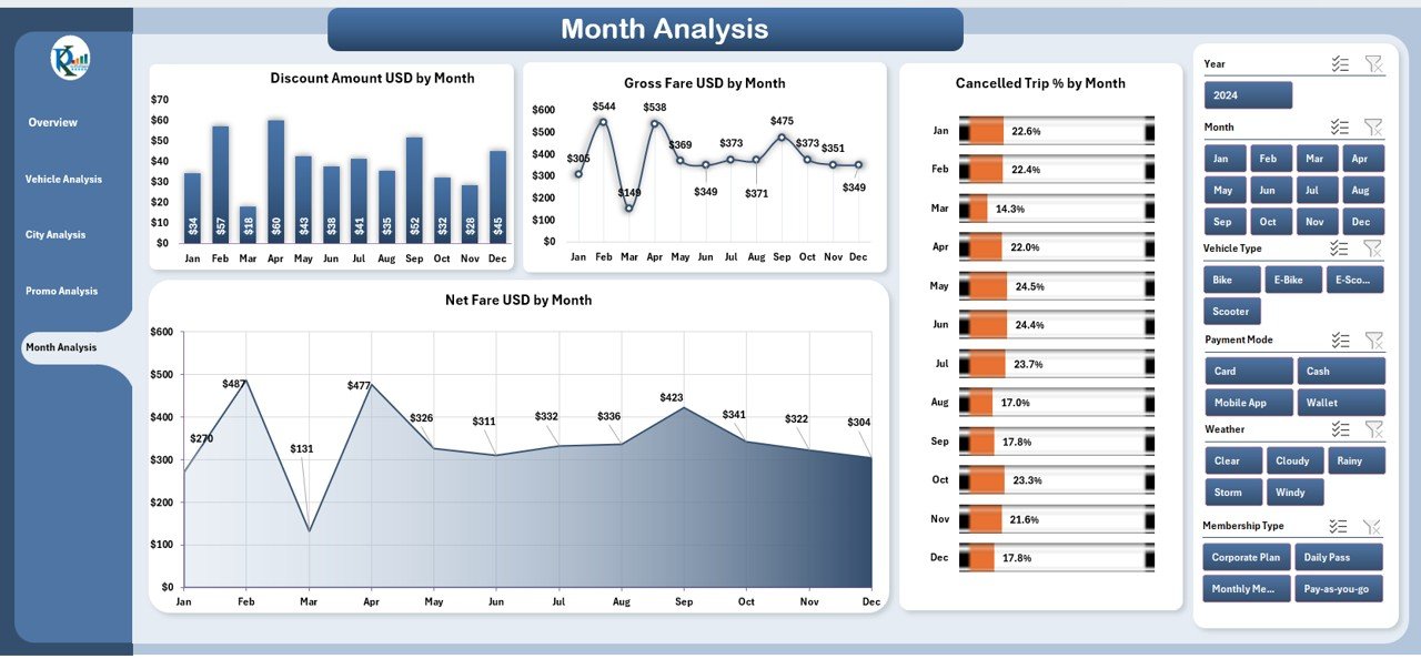
Every month brings different travel patterns. Therefore, month-level analysis is extremely important for forecasting and planning.
Key Charts in Month Analysis Page
On the right-side silencer, you get:
-
Discount Amount USD by Month
-
Net Fare USD by Month
-
Gross Fare USD by Month
-
Cancelled Trip % by Month
Why This Page Matters
With monthly insights, you understand:
-
Peak ride months
-
Seasonal travel patterns
-
Monthly revenue growth
-
Cancellation trends
-
Promo and discount impact
This page supports budgeting, pricing decisions, and operational planning.
Support Sheet: Smooth Data Structure
The dashboard includes a Data Sheet where you store all raw data. When you update this sheet, the entire dashboard updates automatically. This structure keeps your reporting system clean, organized, and easy to use.
Advantages of a Bike & Scooter Sharing Dashboard in Excel
A bike and scooter sharing business runs on data. Therefore, a well-structured dashboard creates huge advantages.
✔ 1. Better Decision Making
You see all insights in one place, so you take faster and more accurate decisions.
✔ 2. Increased Revenue Visibility
You understand revenue trends, peak hours, high-performing cities, and profitable vehicle types.
✔ 3. Improved Fleet Management
You track ongoing trips, total trips, and vehicle performance for better maintenance planning.
✔ 4. Clear Customer Insights
You analyze membership behavior, weather impact, and promo response easily.
✔ 5. Error-Free Reporting
You update data in one sheet and get instant visual reports without any mistakes.
✔ 6. No Technical Knowledge Required
You use Excel functions and built-in automation, so anyone can work with the dashboard.
✔ 7. Perfect for Startups & Growing Mobility Brands
Small teams can use it as a complete analytics system without buying expensive tools.
Best Practices for Using the Bike & Scooter Sharing Dashboard
Click to Purchases Bike & Scooter Sharing Dashboard in Excel
To get maximum value from this dashboard, follow these simple practices:
✔ Keep the Data Updated Daily
Daily updates help you track real-time performance.
✔ Use Filters to Compare Trends
Weather, city, promo, and vehicle filters help you see deeper insights.
✔ Track High & Low Performing Cities
This helps in expansion planning and fleet distribution.
✔ Evaluate Every Promotion Carefully
Promo analysis helps you stop expensive and ineffective campaigns.
✔ Study Monthly Trends for Better Forecasting
Understand seasonal changes and plan your fleet size accordingly.
✔ Review Cancellation Rates Frequently
A high cancellation rate signals service issues, poor app experience, or pricing concerns.
✔ Share the Dashboard with Teams
Everyone gets clarity and works with the same data source.
Conclusion
A Bike & Scooter Sharing Dashboard in Excel gives you a complete understanding of your mobility business. It helps you track revenue, trips, cancellations, promotions, weather impact, and monthly patterns with ease. Because the dashboard uses slicers, cards, and automated charts, you get accurate insights without any technical skills. When you follow best practices and keep your data updated, this dashboard becomes a powerful tool for daily operations and long-term planning.
Frequently Asked Questions (FAQs)
1. What data do I need to use this dashboard?
You need trip records, vehicle type, city, fare details, membership type, month, promo data, and weather details.
2. Can I use this dashboard for multiple cities?
Yes, the dashboard includes a full City Analysis Page that helps you compare city-wise performance.
3. Do I need advanced Excel skills?
No, you only need basic knowledge. The dashboard includes built-in navigation, charts, and automation.
4. Can I add more vehicle types?
Yes, you can add new vehicle types in the data sheet and the dashboard updates automatically.
5. Does the dashboard help with revenue forecasting?
Yes, the monthly and vehicle-level insights support long-term revenue planning.
6. Can I use this dashboard for a bike-only or scooter-only business?
Yes, the dashboard works perfectly for both. You can track any vehicle category.
7. How often should I update the data sheet?
Daily updates give the best insights, but you can update it weekly if needed.
Visit our YouTube channel to learn step-by-step video tutorials