Businesses process thousands of digital transactions every day. Because of this, leaders want a clear and fast way to understand payment performance, transaction trends, gateway fees, success rates, and customer satisfaction. As digital payments grow across industries, companies now rely on data-driven dashboards for deeper insights. One of the most effective and user-friendly tools to achieve this is the Payment Gateways Dashboard in Power BI.
In this article, you will learn everything about a Payment Gateways Dashboard, including its structure, features, advantages, best practices, and real-world usage. You will also explore how each dashboard page works and how it helps you take better decisions in your payment operations.
Click to Purchases Payment Gateways Dashboard in Power BI
What Is a Payment Gateways Dashboard in Power BI?
A Payment Gateways Dashboard in Power BI is an interactive reporting solution that shows transaction amounts, fees, gateway performance, industry trends, country-wise insights, monthly patterns, and customer satisfaction. It organizes your payment data into simple charts and cards so you understand how well your payment channels perform.
You can track:
-
Total revenue collected
-
Fees charged by each gateway
-
Failed vs. successful transactions
-
Performance by industry and region
-
Monthly growth trends
-
Satisfaction ratings
Since Power BI allows dynamic filtering, you can slice the data by month, gateway name, industry, country, and more. As a result, you make quick and confident decisions.
Why Do You Need a Payment Gateways Dashboard?
Digital payments grow daily, and every gateway behaves differently. Some gateways offer lower fees. Others provide smoother processing. Some perform better in specific countries.
Without a dashboard, you deal with:
-
Scattered payment reports
-
Delayed decision-making
-
No clarity on failed transactions
-
High fees without understanding the reason
-
No visibility on customer satisfaction
However, with a Payment Gateways Dashboard in Power BI, you bring all payment insights into one place. Therefore, you save time, reduce financial loss, and improve service quality.
Click to Purchases Payment Gateways Dashboard in Power BI
Overview of the Payment Gateways Dashboard Structure
This dashboard contains five powerful pages, each focusing on different insights:
-
Overview Page
-
Gateway Name Analysis
-
Industry Analysis
-
Country Analysis
-
Monthly Trends
Each page includes slicers, KPI cards, and charts to help you navigate easily.
Let’s look at all pages in detail.
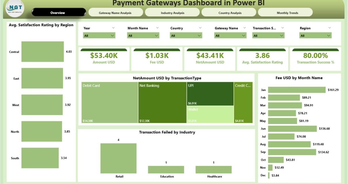
1. Overview Page – What Does It Show?
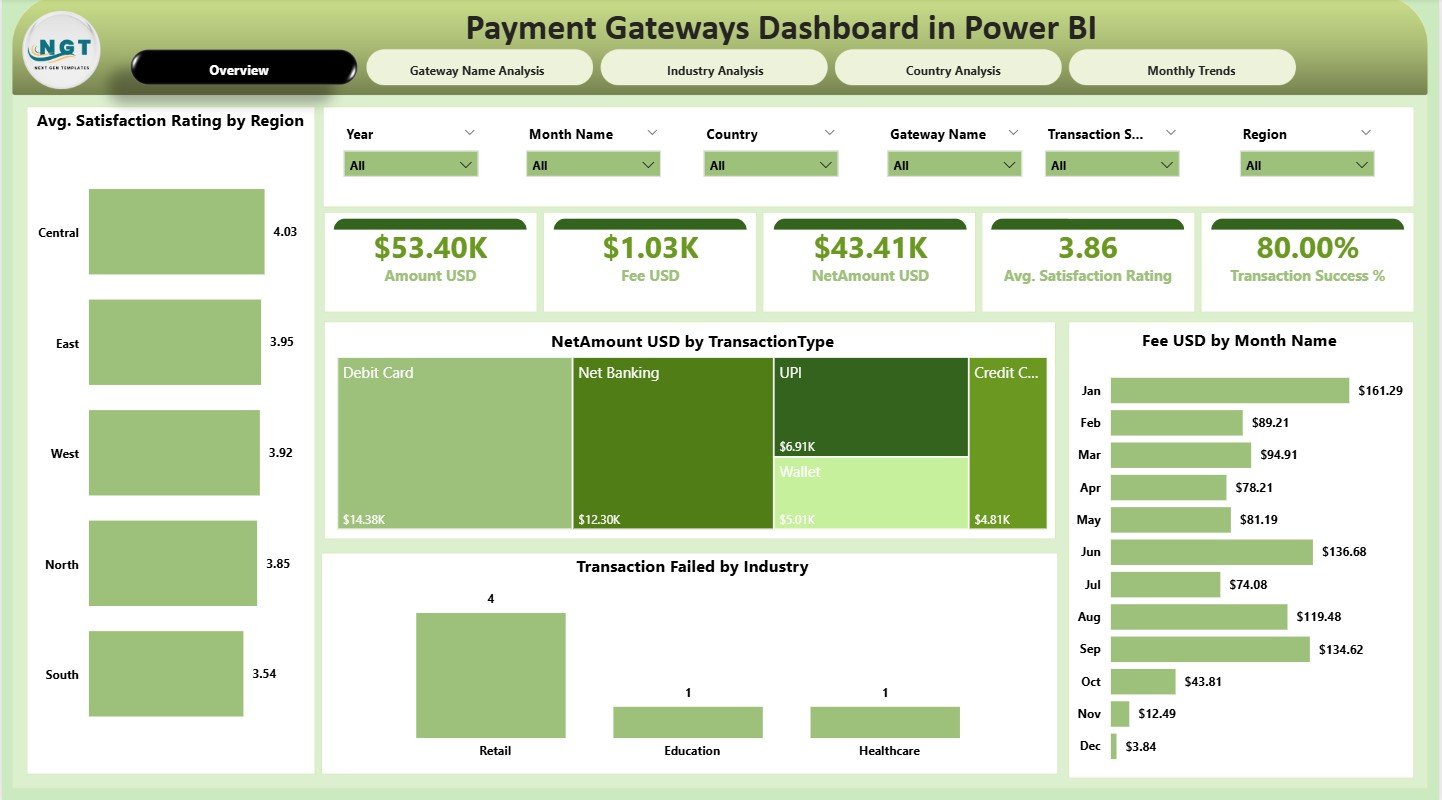
The Overview Page works as the main landing page of the dashboard. It gives a clean snapshot of your payment performance.
Components of the Overview Page
-
Slicers: Quickly filter data based on month, gateway, industry, country, or any important field.
-
Cards:
-
Total Net Amount (USD)
-
Total Fee Amount (USD)
-
Number of Transactions
-
Failed Transactions Count
-
Average Customer Satisfaction Score
-
Charts on the Overview Page
-
Net Amount (USD) by Transaction Type
-
Fee Amount (USD) by Month
-
Transaction Failed by Industry
-
Average Satisfaction Rating by Region
These visuals help you identify revenue flow, seasonal fee patterns, industry-level issues, and customer experience by region. As you adjust slicers, all visuals update instantly.
2. Gateway Name Analysis – Why Is This Important?
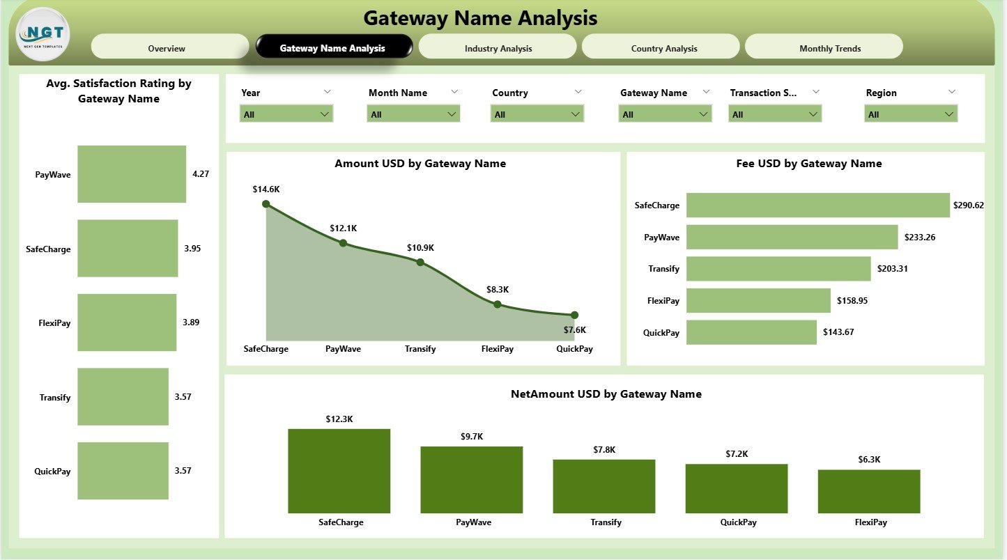
Every gateway has different strengths. Some gateways charge higher fees but offer higher success rates. Others work well for international payments.
The Gateway Name Analysis page helps you study each payment gateway closely.
Charts Included
-
Amount (USD) by Gateway Name
-
Fee (USD) by Gateway Name
-
Net Amount (USD) by Gateway Name
-
Average Satisfaction Rating by Gateway Name
With these visuals, you can:
-
Compare gateway performance
-
Identify costly gateways
-
Analyze revenue contribution
-
Understand user experience differences
This page helps you choose the best payment gateways for your business.
3. Industry Analysis – How Does Each Industry Behave?
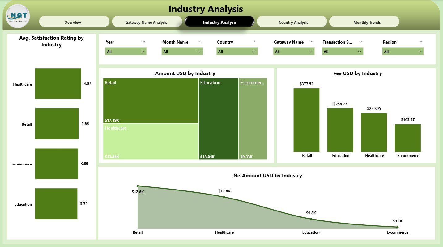
Different industries show different payment patterns. E-commerce may have high transaction volume, while services may have higher fees.
The Industry Analysis page shows these patterns clearly.
Visuals Included
-
Amount (USD) by Industry
-
Fee (USD) by Industry
-
Net Amount (USD) by Industry
-
Average Satisfaction Rating by Industry
You can compare industries and identify:
-
High-earning industries
-
Industries with high payment fees
-
Industries facing high failure rates
-
Customer satisfaction trends
This helps your sales and finance team understand where growth opportunities exist.
Click to Purchases Payment Gateways Dashboard in Power BI
4. Country Analysis – What Are the Regional Insights?
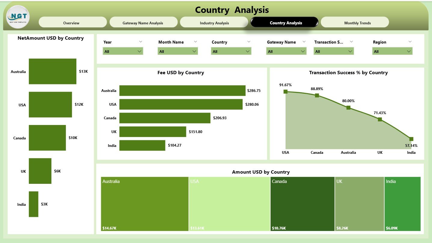
Payment performance varies from country to country. Some countries have higher processing fees. Others may struggle with transaction failures.
The Country Analysis page helps you understand these geographical trends.
Charts on Country Analysis Page
-
Fee (USD) by Country
-
Transaction Success % by Country
-
Amount (USD) by Country
-
Net Amount (USD) by Country
This page helps you answer questions like:
-
Which countries bring the most revenue?
-
Which regions need better gateway support?
-
Which countries have higher success rates?
These insights help global businesses optimize their payment strategies.
5. Monthly Trends – How Do Payments Change Over Time?
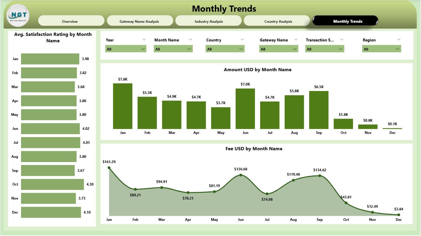
Seasonal trends play a huge role in payment behavior. Payment activity rises during festivals, sales seasons, and holidays.
The Monthly Trends page highlights these patterns.
Charts Included
-
Amount (USD) by Month
-
Fee (USD) by Month
-
Average Satisfaction Rating by Month
Since this page focuses on time-based analysis, you can easily identify growth months, drop months, fee spikes, and customer satisfaction shifts.
Click to Purchases Payment Gateways Dashboard in Power BI
Advantages of a Payment Gateways Dashboard in Power BI
A Payment Gateways Dashboard offers several benefits. Here are the most important ones:
1. Quick and Clear Payment Insights
You get all payment information in one dashboard. You no longer wait for manual reports.
2. Better Decision-Making
With real-time visuals, you identify issues faster and make confident decisions.
3. Gateway Performance Comparison
You compare revenue, fees, net amount, and satisfaction across multiple gateways.
4. Reduced Payment Failures
You identify problem industries, countries, or gateways and resolve them quickly.
5. Improved Financial Planning
You track fee patterns, net earnings, and transaction growth to plan better.
6. Enhanced Customer Satisfaction
You understand how customers feel across regions and gateways.
7. Easy Reporting for Teams
Teams across finance, operations, sales, and leadership can use the dashboard.
Click to Purchases Payment Gateways Dashboard in Power BI
Best Practices for the Payment Gateways Dashboard in Power BI
Follow these best practices to get maximum value from your dashboard:
1. Clean and Prepare Your Data
Remove duplicates, fix inconsistencies, and ensure accurate formatting.
2. Use Clear KPI Definitions
Define net amount, fee amount, success rate, and satisfaction rating clearly so teams understand them easily.
3. Maintain User-Friendly Layouts
Place slicers at the top, KPIs at the center, and charts in a logical order.
4. Keep Charts Simple
Use fewer colors and avoid unnecessary visuals.
5. Refresh Data Regularly
Daily or weekly refresh improves decision-making.
6. Include Drill-Down Features
Drill-through helps users explore deeper insights without cluttering the dashboard.
7. Test Dashboard on Multiple Devices
Ensure it looks good on laptops, tablets, and mobiles.
How Does This Dashboard Help Different Teams?
Finance Team
Tracks revenue, fees, net earnings, and cost optimization.
Operations Team
Monitors transaction failures and identifies operational issues.
Sales Team
Understands industry performance and customer regions.
Customer Support Team
Analyzes satisfaction ratings and improves service quality.
Leadership Team
Gets a complete picture of payment performance anytime.
Real-World Use Cases of a Payment Gateways Dashboard
This dashboard helps companies from multiple sectors:
E-Commerce
Track online payments, success rates, and refund patterns.
Travel & Hospitality
Monitor international payments and country-wise fees.
SaaS Companies
Understand subscription payments and recurring revenue.
Retail
Analyze store-wise and month-wise payment performance.
Service Providers
Measure customer satisfaction along with payment success.
Conclusion
A Payment Gateways Dashboard in Power BI helps you simplify payment insights, reduce manual work, and make fast business decisions. It organizes all your payment data into meaningful visuals that help you track revenue, fees, failures, and customer satisfaction. When you combine clean data with the powerful features of Power BI, you get a complete payment intelligence solution that supports your financial and operational growth.
Frequently Asked Questions (FAQs)
1. What is a Payment Gateways Dashboard?
A Payment Gateways Dashboard is a visual report that tracks transaction amounts, fees, success rates, industry trends, and customer satisfaction.
2. Why should businesses use this dashboard?
It helps businesses monitor revenue, reduce errors, identify high fees, and improve decision-making.
3. Can this dashboard work with multiple payment gateways?
Yes. You can connect PayPal, Stripe, Razorpay, Payoneer, and others in one dashboard.
4. Does Power BI support real-time payment updates?
Yes. With scheduled refresh or streaming data sources, you can see near real-time insights.
5. Who should use this dashboard?
Finance, sales, operations, customer support, and leadership teams benefit from it.
6. Can I add more pages to this dashboard?
Yes. You can add pages like refund analysis, dispute trends, or customer segmentation.
Click to Purchases Payment Gateways Dashboard in Power BI
Visit our YouTube channel to learn step-by-step video tutorials