Running a sales team without the right insights feels like driving a car with no dashboard. You move forward, but you never know how fast you are going, when you need to stop, or which way to turn next.
That is exactly why businesses rely on Upselling KPI Dashboards in Power BI. These dashboards bring clarity, improve decision-making, and help every sales leader, sales manager, and business owner monitor upsell performance in real time.
In this detailed guide, we will explore everything you need to know about the Upselling KPI Dashboard in Power BI, including its pages, design, features, benefits, best practices, and the most common questions users ask.
Moreover, you will understand why a Power BI-based dashboard outperforms traditional Excel tracking systems and how you can use it to increase revenue with confidence.
Click to Purchases Upselling KPI Dashboard in Power BI
What Is an Upselling KPI Dashboard in Power BI?
An Upselling KPI Dashboard in Power BI is a ready-to-use reporting system built to track monthly and yearly upselling performance. The dashboard connects with data stored in an Excel file and visualizes the key performance indicators (KPIs) that matter the most to sales teams.
You can monitor Actual values, Targets, MTD performance, YTD trends, and Previous Year comparisons with ease. The dashboard updates automatically when you refresh the data source.
Since Power BI offers interactive visualizations, slicers, drill-through actions, and dynamic charts, this dashboard turns raw upsell data into clear business insights.
Why Your Business Needs an Upselling KPI Dashboard
Modern businesses depend on continuous revenue growth. While new customer acquisition helps, upselling has a lower cost and a higher impact.
The challenge appears when leaders try to track upsell numbers using spreadsheets. Numbers stay scattered, trends stay hidden, and opportunities stay lost.
A robust Power BI Upselling Dashboard solves that. It:
-
Brings all upsell KPIs into one place
-
Helps you spot trends early
-
Helps the team act faster
-
Keeps everyone aligned with targets
-
Makes reporting easier and more accurate
Because of this, many companies now use Power BI dashboards to measure upselling performance month after month.
Key Features of the Upselling KPI Dashboard in Power BI
This dashboard includes three powerful pages, each designed to give clarity and quick insights.
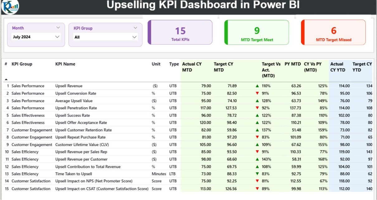
1. Summary Page – The Heart of the Dashboard
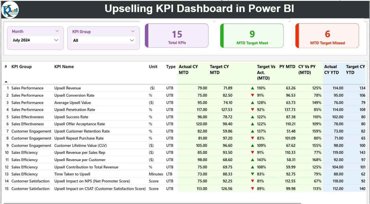
The Summary Page is the main view where decision-makers spend most of their time. It presents a complete snapshot of monthly and yearly upsell performance.
Top-Section Slicers
You can filter insights using two slicers:
-
Month Slicer
-
KPI Group Slicer
These slicers help you analyze performance for specific months or KPI categories.
Key Performance Cards
Click to Purchases Upselling KPI Dashboard in Power BI
At the top, you will find three important cards:
-
Total KPIs Count
-
MTD Target Met Count
-
MTD Target Missed Count
These cards give a quick summary of how your upselling performance looks for the selected month.
Detailed KPI Table
The main table shows all the KPI insights in a single view. It includes:
-
KPI Number – The serial number of the KPI
-
KPI Group – Category for grouping KPIs
-
KPI Name – The name of the KPI
-
Unit – Measurement unit
-
Type – LTB (Lower the Better) or UTB (Upper the Better)
-
Actual CY MTD – Current Year Month-to-Date Actual
-
Target CY MTD – Month-to-Date Target
-
MTD Icon – ▲ or ▼ with Green or Red colors showing status
-
Target vs Actual (MTD) – Actual/Target percentage
-
PY MTD – Last Year MTD value
-
CY vs PY (MTD) – Comparison percentage
-
Actual CY YTD – Current Year Year-to-Date Actual
-
Target CY YTD – Year-to-Date Target
-
YTD Icon – ▲ or ▼ indicators
-
Target vs Actual (YTD) – Percentage of Actual to Target
-
PY YTD – Previous Year YTD
-
CY vs PY (YTD) – Percentage comparison
This view helps you track upselling KPIs at both MTD and YTD levels with accuracy.
2. KPI Trend Page – Visual Performance Tracking
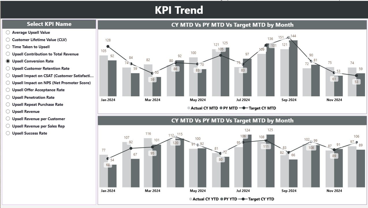
The KPI Trend Page helps you spot patterns and movement in performance.
Here you will find:
-
Two combo charts for trend analysis
-
Comparison of Actual vs Previous Year vs Target
-
Separate displays for MTD and YTD trends
A KPI Name slicer on the left allows you to choose any KPI and analyze its trend.
This interactive page helps managers identify whether upselling is improving, stable, or falling behind.
3. KPI Definition Page – Drill-Through Insights
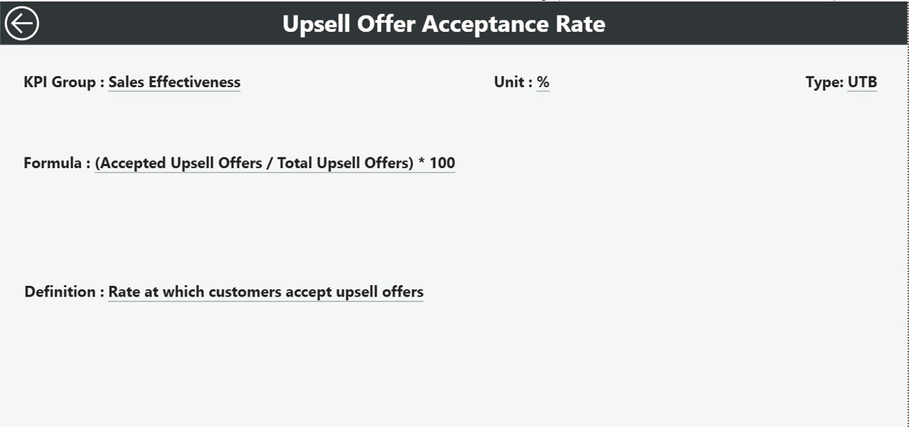
This is a hidden drill-through page, but it is extremely useful.
When you click any KPI on the Summary Page, Power BI takes you to this page where you can see:
-
KPI Number
-
KPI Group
-
KPI Name
-
Unit
-
Formula
-
KPI Definition
-
KPI Type (LTB or UTB)
There is also a Back button in the top-left corner to return to the Summary Page.
This page helps anyone understand the logic behind each KPI without searching through documents.
Excel Data Input Structure for the Dashboard
The dashboard uses an Excel file as the data source. It includes three sheets:
1. Input_Actual Sheet
In this sheet, you enter:
-
KPI Name
-
Month (first date of month)
-
MTD Actual values
-
YTD Actual values
You must update this sheet every month to keep the dashboard current.
2. Input_Target Sheet
Here you maintain the target numbers for each KPI:
-
KPI Name
-
Month (first date of month)
-
MTD Target
-
YTD Target
These targets help the dashboard measure progress clearly.
3. KPI Definition Sheet
This sheet includes master data:
-
KPI Number
-
KPI Group
-
KPI Name
-
Unit
-
Formula
-
Definition
-
Type (UTB or LTB)
Power BI uses this sheet for reference, drill-through, and KPI grouping.
How the Dashboard Helps Sales Teams Improve Upselling Performance
This Power BI dashboard goes beyond reporting. It helps sales teams improve performance because it:
-
Shows where upselling works well
-
Highlights KPIs below target
-
Helps teams understand monthly vs yearly patterns
-
Allows quick drill-downs to find what needs attention
Because teams get instant visibility, they act faster and drive better outcomes.
Advantages of Using an Upselling KPI Dashboard in Power BI
Every business wants better upsell revenue. This dashboard makes it easier. Here are the biggest advantages:
1. Real-Time Upsell Tracking
You get updated numbers the moment you refresh the file.
2. Clear MTD and YTD Status
Sales managers track seasonal cycles better by comparing current progress with targets and previous year numbers.
3. Easy Drill-Through
You understand KPIs better with quick access to formulas, definitions, and categories.
4. Accurate Comparisons
Charts and tables allow easy comparison between Actual, Target, and Previous Year values.
5. Better Decision-Making
The dashboard helps leaders improve strategy, allocate resources, and support teams faster.
6. Simple Data Input
Since data comes from Excel, anyone can update it without learning complex tools.
7. Reduced Reporting Time
You stop creating reports manually because Power BI updates everything automatically.
Best Practices for Using an Upselling KPI Dashboard in Power BI
If you want consistent and accurate insights, follow these best practices:
1. Update Data Every Month
Always update Actual and Target sheets before reviewing numbers.
2. Maintain the KPI Definition Sheet
Review KPI formulas and definitions regularly so the dashboard stays aligned with business priorities.
3. Use Slicers Smartly
Slicers help you isolate KPIs, months, and categories. Use them to perform deep analysis.
4. Compare With Previous Year Often
Previous year trend analysis helps you understand seasonality and natural upsell cycles.
5. Train Sales Teams to Read the Dashboard
When your team understands the insights, they perform better.
6. Focus on Red Icons First
Indicators showing ▼ or red color help you identify where improvement is most needed.
7. Refresh the Data Source
Always refresh the dashboard after updating Excel sheets.
How This Dashboard Transforms Upselling Strategy
This dashboard gives your team clarity. It guides salespeople to focus on high-value upsell opportunities.
Moreover, it builds a habit of performance monitoring, which improves results throughout the year.
With actionable insights, companies make smarter decisions about:
-
Customer retention
-
Upsell planning
-
Pricing strategy
-
Resource allocation
-
Sales team coaching
The ability to compare Actual vs Target vs Previous Year numbers makes growth easier to visualize and achieve.
Conclusion
The Upselling KPI Dashboard in Power BI is a complete solution for businesses that want to improve upselling performance. It gives clarity, speed, and accuracy to sales reporting.
With interactive charts, drill-through actions, and structured Excel-based input, this dashboard becomes the single source of truth for upsell KPIs.
If you update the data consistently and follow best practices, this dashboard becomes a powerful tool that helps your sales team grow revenue month after month.
Frequently Asked Questions (FAQs)
1. What is an Upselling KPI Dashboard in Power BI?
It is a ready-to-use dashboard that tracks monthly and yearly upselling KPIs using interactive charts, comparisons, and drill-through pages.
2. Can I update the dashboard manually?
Yes. You only need to update the Excel sheets for Actual, Target, and KPI Definition. Then refresh in Power BI.
3. Do I need Power BI Pro to use this dashboard?
You need Power BI Desktop to edit it. If you want to publish it to Power BI Service and share it, you may need Power BI Pro.
4. Can I add more KPIs?
Yes. Just add them in the KPI Definition sheet and then update Actual and Target sheets for those KPIs.
5. Can multiple users work on the data?
Yes. Teams can share the Excel file and update KPIs every month.
6. Does the dashboard support forecasting?
You can add forecasting visuals through Power BI, but the default version tracks Actual vs Target vs Previous Year.
7. How often should I update the data?
You should update the Actual and Target data monthly to keep MTD and YTD numbers accurate.
Visit our YouTube channel to learn step-by-step video tutorials