The footwear and accessories market grows every year. Customers want stylish shoes, durable bags, trendy belts, and many other fashion items. Because of this, retailers need the right insights to track performance, understand demand, and improve customer experience. A Footwear & Accessories Dashboard in Power BI helps retailers manage their entire business with real-time analytics, clear visuals, and fast insights.
In this detailed guide, you will learn everything about this dashboard. You will explore its features, understand each page, and learn how retailers use it to improve store performance. You will also find practical best practices and answers to the most common questions about this dashboard.
Click to Purchases Footwear & Accessories Dashboard in Power BI
What Is a Footwear & Accessories Dashboard in Power BI?
A Footwear & Accessories Dashboard in Power BI is an interactive reporting tool that provides a full view of your footwear and accessory business. It shows real-time data about sales, profit, customer ratings, store performance, categories, subcategories, returns, margins, and monthly trends. Because of Power BI, users can analyze this information instantly and take quick decisions.
This dashboard works with data entered in Excel or any database. Once you refresh the data, the dashboard shows updated charts, KPI cards, and visuals.
Retailers use this dashboard because it offers:
-
Faster decision-making
-
Better demand forecasting
-
Clear store-level visibility
-
Strong customer insights
-
Instant monthly and yearly comparison
Why Do Retailers Need a Footwear & Accessories Dashboard?
Retailers face many challenges:
-
High SKU count
-
Inventory mismatch
-
Seasonal demand changes
-
High product returns
-
Pricing fluctuations
-
Customer preference shifts
Without a dashboard, teams work with raw spreadsheets and scattered data. This slows down analysis and leads to poor decisions.
The Footwear & Accessories Dashboard in Power BI solves these problems because it organizes all the data in one place. You can switch between brands, subcategories, stores, categories, and regions using slicers.
As a result, you understand your performance clearly and take better decisions.
How Does the Footwear & Accessories Dashboard Work?
The dashboard contains five powerful pages, and each page shows a different part of your business. Let’s explore each one in detail.
1. Overview Page: Complete Business Summary
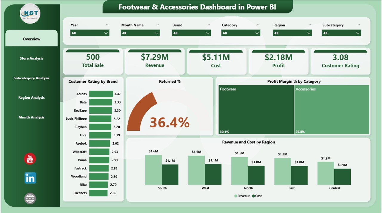
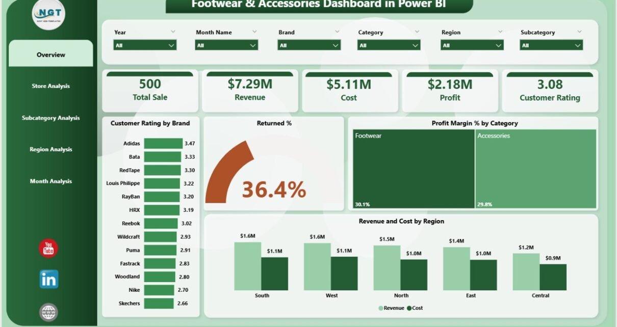
The Overview Page works as the main dashboard page. It shows the overall performance of your footwear and accessories business. You can use slicers on this page to filter by month, brand, category, or region.
Key Highlights on the Overview Page
✔ Four KPI Cards
These cards help you view the most important business metrics at a glance. They usually include:
-
Total Sales
-
Total Revenue
-
Total Profit
-
Customer Rating Summary
The cards help you track your business performance instantly without going deeper into reports.
✔ Customer Rating by Brand
Customers share feedback in various ways. This chart helps you check which brands customers love the most. You can compare multiple brands and see which brand needs improvement.
✔ Returned % by Category
Returns directly impact profit. This chart helps you learn:
-
Which categories have higher return rates
-
Which products perform well
-
Where quality issues start
You can then take action to reduce returns.
✔ Profit Margin % by Category
This visual helps you understand which categories generate maximum profit. You can use this insight to focus on the high-margin categories and optimize low-performing ones.
✔ Revenue and Cost by Region
Retailers operate across multiple regions. Because of this, they need clear regional insights. This chart shows:
-
Regional revenue
-
Regional cost
-
Regions with the highest margins
You can use this information to plan promotions, manage stock, and control expenses.
2. Store Analysis Page: Which Store Performs the Best?
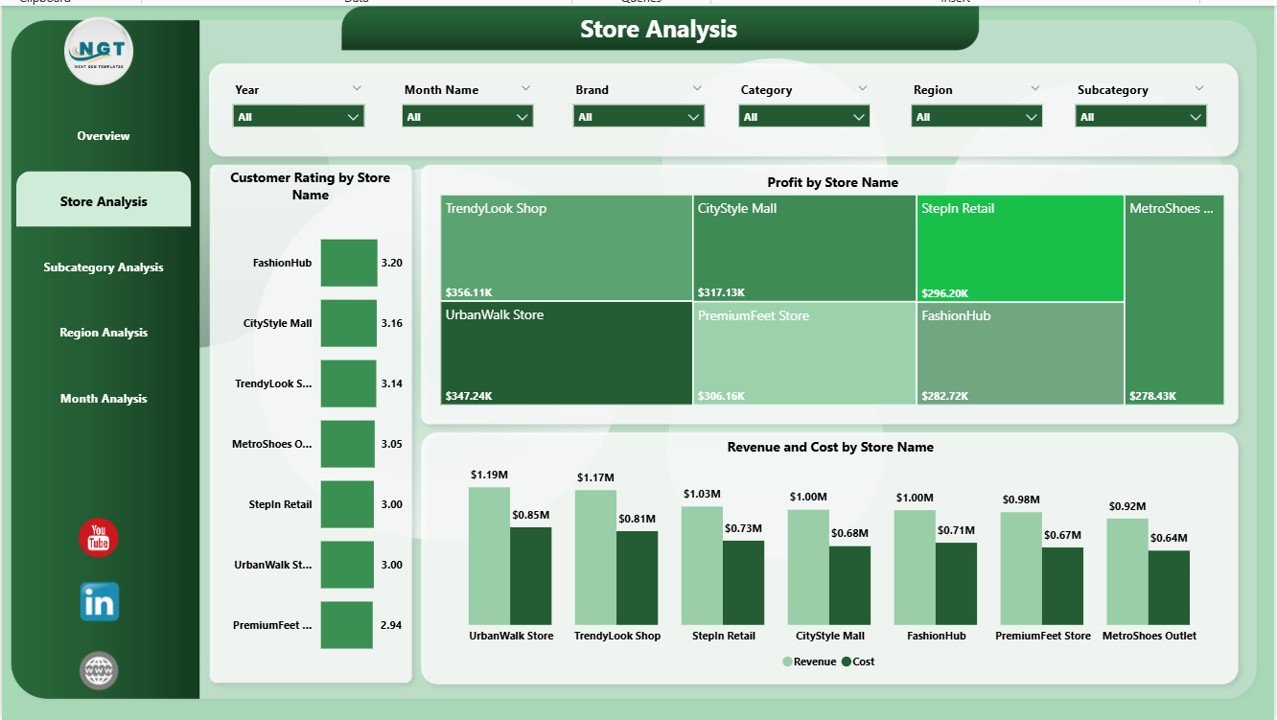
The Store Analysis Page helps retailers evaluate store-level performance. This is one of the most important pages because each store performs differently based on location, competition, and customer behavior.
Key Charts on the Store Analysis Page
✔ Customer Rating by Store Name
This chart helps you understand:
-
Which store delivers the best customer experience
-
Which store needs training or management support
-
How customer behavior changes from store to store
✔ Profit by Store Name
Store-wise profit helps you identify:
-
Top-performing stores
-
Low-performing stores
-
Stores that need stock optimization
-
Stores that need operational improvements
✔ Revenue and Cost by Store Name
This chart compares store revenue with store operating costs. You can use this to learn:
-
Which stores operate efficiently
-
Which stores overspend
-
Where you can cut unnecessary costs
3. Subcategory Analysis Page: Deep Dive into Product Performance
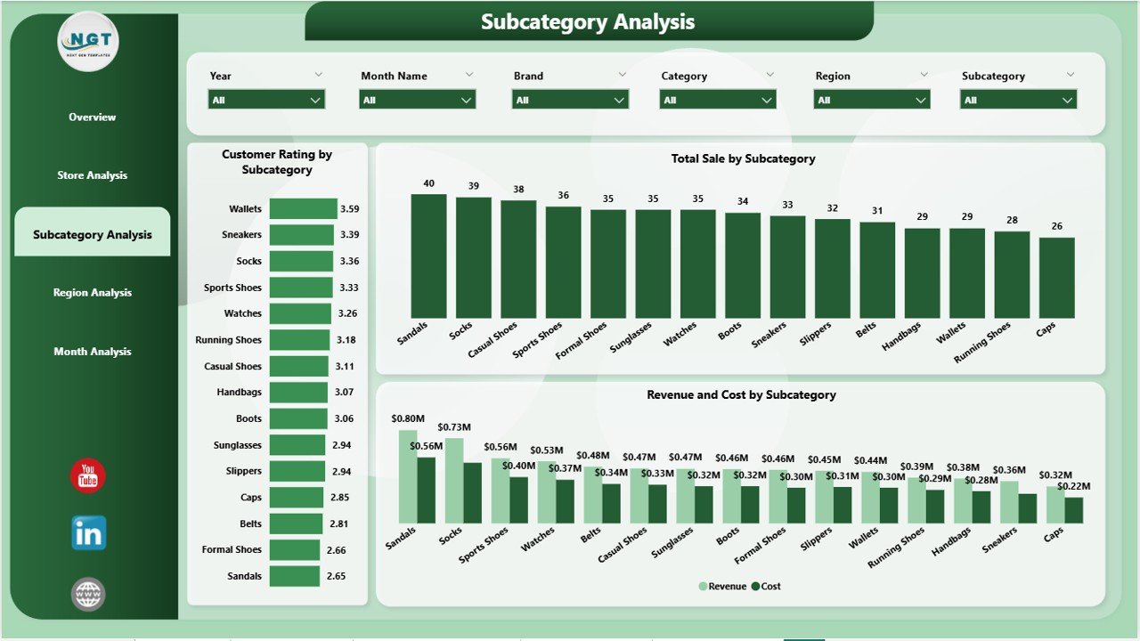
The Subcategory Analysis Page shows detailed insights for every footwear and accessory subcategory. This includes:
-
Sneakers
-
Formal shoes
-
Boots
-
Sandals
-
Wallets
-
Belts
-
Backpacks
-
Handbags
Charts on the Subcategory Analysis Page
✔ Customer Rating by Subcategory
This visual helps you see which product types customers prefer. You can quickly identify customer favorites.
✔ Total Sales by Subcategory
This chart highlights your best-selling product groups. You can use this information to increase inventory for high-performance subcategories.
✔ Revenue and Cost by Subcategory
This chart helps you compare revenue and cost. Because of this, you understand which subcategories earn more profit and which ones need improvement.
4. Region Analysis Page: Regional Business Insights
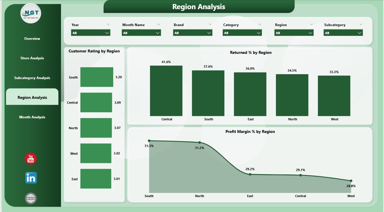
The Region Analysis Page helps you compare performance across multiple regions. Footwear and accessories often perform differently across states, zones, or countries.
Charts on the Region Analysis Page
✔ Customer Rating by Region
This chart helps you check how customers feel in each region.
✔ Returned % by Region
Some regions may have higher return rates due to climate, customer preference, or product type. You can use this data to improve product selection.
✔ Profit Margin % by Region
This chart highlights regions with strong profitability. You can adjust pricing or marketing to align with performance.
Click to Purchases Footwear & Accessories Dashboard in Power BI
5. Monthly Trends Page: Track Performance Month by Month
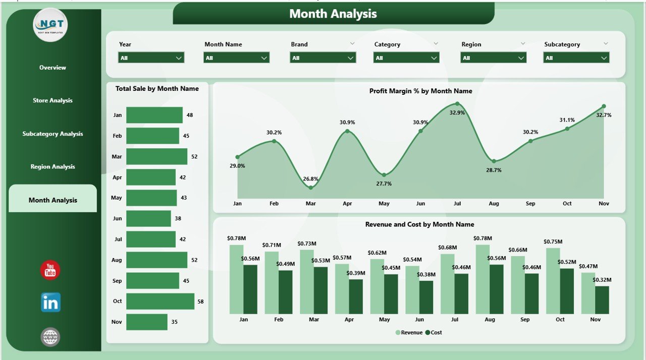
The Monthly Trends Page focuses on time-based analysis. It helps you track performance across months and seasons.
Charts on the Monthly Trends Page
✔ Total Sales by Month
You can view seasonal sales behavior. For example:
-
Winter boots perform well in December
-
Sandals perform well in summer
✔ Profit Margin % by Month
This chart helps you track how margins change every month.
✔ Revenue and Cost by Month
This visual compares monthly revenue with monthly costs. It helps you understand whether your expenses stay under control throughout the year.
Advantages of Using a Footwear & Accessories Dashboard in Power BI
Retailers get many benefits when they use this dashboard. Here are the most important ones:
✔ Faster Decision-Making
The dashboard provides instant insights. You do not waste time searching through multiple spreadsheets.
✔ Improved Customer Experience
You can track ratings by brand, region, and store. Because of this, you improve service quality.
✔ Higher Profitability
The dashboard helps you find low-margin and high-margin categories. You can focus on profitable product groups.
✔ Reduced Operational Costs
Store-level and regional-level cost analysis helps you reduce unnecessary expenses.
✔ Stronger Inventory Planning
You understand demand trends better. This helps you stock the right products at the right time.
✔ Better Sales Forecasting
Monthly and category-based trends help you forecast future performance.
✔ Easy to Use
Power BI makes data easier to understand with charts, visuals, and slicers.
Best Practices for Using the Footwear & Accessories Dashboard
To get maximum value from this dashboard, follow these best practices.
1. Refresh Data Daily
Daily refresh helps you take decisions based on the latest information.
2. Use Slicers Smartly
Filter the data by:
-
Brand
-
Region
-
Store
-
Category
-
Subcategory
-
Month
Slicers help you narrow down insights quickly.
3. Monitor Return Rate Regularly
High returns reduce profit. Always monitor the Returned % charts.
4. Compare Revenue with Cost
This tells you which areas consume more expenses.
5. Track Monthly Trends
Seasonal behavior plays a huge role in footwear sales. The monthly trend page helps you understand seasonal demand.
6. Review Customer Ratings Frequently
Customer rating tells you whether customers love your products or not. Use this insight to update your inventory strategy.
7. Align Marketing with Performance
If a brand or subcategory performs well, promote it more.
Conclusion
The Footwear & Accessories Dashboard in Power BI gives retailers a complete view of their business. It brings data from multiple sources and converts it into meaningful insights. Because of this, retailers take faster decisions, improve customer experience, and grow their business with confidence.
The dashboard’s five pages—Overview, Store Analysis, Subcategory Analysis, Region Analysis, and Monthly Trends—cover every important part of your footwear and accessories operations. When you use this dashboard correctly, you get clarity, accuracy, and strong business performance.
Frequently Asked Questions (FAQ)
1. What does the Footwear & Accessories Dashboard track?
It tracks sales, revenue, profit, customer ratings, returns, store performance, regional performance, and monthly trends.
2. Who can use this dashboard?
Retailers, store managers, business analysts, and category heads use this dashboard.
3. Is Power BI difficult to use?
No. Power BI is user-friendly and simple for retail teams.
4. Can I customize this dashboard?
Yes. You can add new KPIs, visuals, filters, and categories based on your needs.
5. Does the dashboard work with Excel?
Yes. It works perfectly with Excel as a data source.
6. How often should I update the data?
You should refresh the data daily for the best insights.
7. Can I track seasonal demand?
Yes. The Monthly Trends Page helps you track season-wise performance.
8. Why is customer rating important?
Customer rating tells you whether customers like your products. It helps you make better product decisions.
Visit our YouTube channel to learn step-by-step video tutorials
Click to Purchases Footwear & Accessories Dashboard in Power BI
