Customer Experience (CX) plays an important role in every business. When customers feel valued, they stay longer, spend more, and recommend your brand to others. Because of this, companies now depend on CX analytics to measure satisfaction, improve services, and solve issues quickly. One of the best tools for doing this is the Customer Experience (CX) KPI Dashboard in Power BI.
Customer Experience (CX) KPI Dashboard in Power BI This dashboard offers a clear and structured view of CX performance using KPIs, charts, and comparisons. It uses an Excel data source and updates visuals with a single refresh. In this guide, you will learn everything about this dashboard, how it works, why it helps, and how you can use it to improve customer experience.
Let’s explore it step-by-step.
Click to Purchases Customer Experience (CX) KPI Dashboard in Power BI
What Is a Customer Experience (CX) KPI Dashboard in Power BI?
A CX KPI Dashboard in Power BI is a ready-to-use analytical dashboard that helps companies measure customer satisfaction, support performance, service quality, and customer sentiment. It collects data from an Excel file and displays it through cards, tables, trend charts, and slicers. Because of this, you get real-time insights into customer performance.
The dashboard highlights important KPIs like:
-
Service response time
-
Customer satisfaction score (CSAT)
-
Net Promoter Score (NPS)
-
Ticket resolution time
-
Customer retention
-
Escalations
All KPIs are measured using MTD, YTD, targets, and previous-year comparisons.
Why Is Customer Experience Important?
Customer experience decides whether a customer continues with your brand or switches to another. Although many businesses offer good products, they often lose customers due to slow support, unclear communication, or poor service. Therefore, CX measurement becomes essential.
A strong CX system helps you:
-
Understand customer behavior
-
Resolve issues faster
-
Reduce churn
-
Improve satisfaction levels
-
Build long-term loyalty
-
Increase revenue through repeat business
Since these benefits support growth, companies invest in powerful CX dashboards like Power BI dashboards.
How Does the CX KPI Dashboard in Power BI Work?
This dashboard uses a simple Excel file as the data source. It includes three worksheets:
1. Input_Actual Sheet
This sheet collects the performance numbers for:
-
KPI Name
-
Month (first day of the month)
-
MTD (Month-to-Date) Actual
-
YTD (Year-to-Date) Actual
2. Input_Target Sheet
This sheet stores the target values for:
-
KPI Name
-
Month
-
MTD Target
-
YTD Target
3. KPI Definition Sheet
This sheet defines each KPI with:
-
KPI Number
-
KPI Group
-
KPI Name
-
Unit
-
Formula
-
Definition
-
Type (LTB – Lower the Better / UTB – Upper the Better)
When you refresh the Power BI file, it updates all visuals instantly.
Click to Purchases Customer Experience (CX) KPI Dashboard in Power BI
Pages of the Customer Experience KPI Dashboard
This dashboard includes three analytical pages, each designed to show CX performance from a different angle.
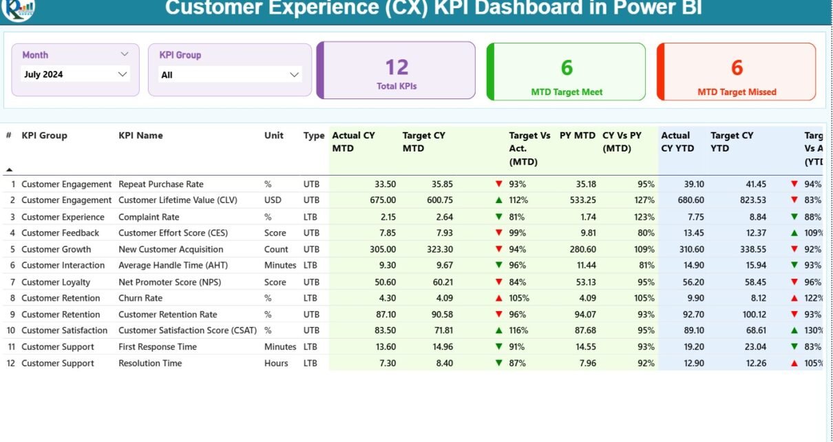
1. Summary Page – The Main Dashboard for CX Insights
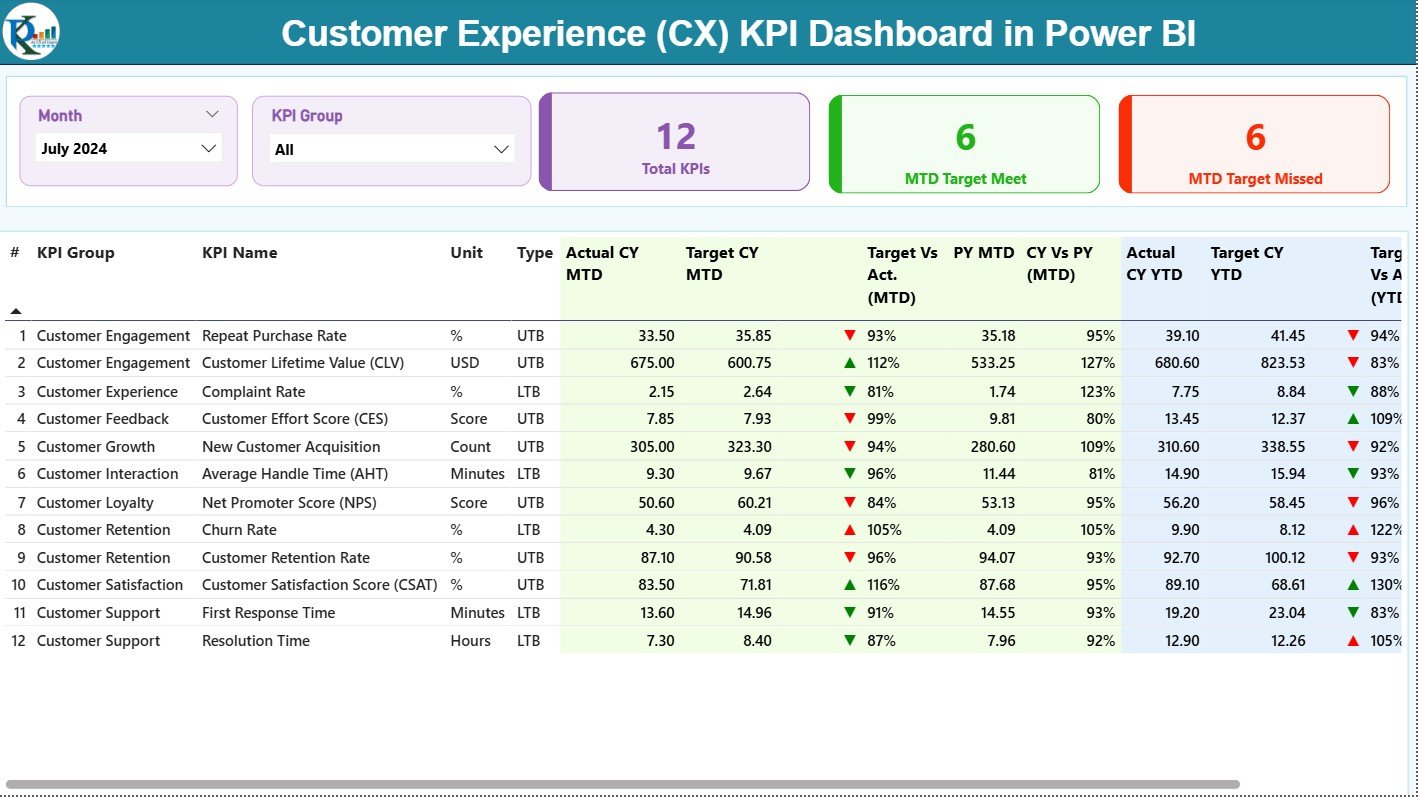
The Summary Page gives a complete overview of CX performance.
Key Components of the Summary Page
✔ Month & KPI Group Slicer
Users select the month or KPI category to filter the entire dashboard.
✔ KPI Summary Cards
At the top, three cards show:
-
Total KPIs Count
-
MTD Target Met
-
MTD Target Missed
These cards give a quick snapshot of overall CX performance.
✔ Detailed KPI Table
The main table includes:
-
KPI Number – Sequence of KPI
-
KPI Group – Category (Support, Satisfaction, Quality, etc.)
-
KPI Name – Name of the KPI
-
Unit – Measurement unit
-
Type – KPI type (LTB/UTB)
-
Actual CY MTD
-
Target CY MTD
-
MTD Status Icon (▲ or ▼ in green/red)
-
Target vs Actual % (MTD)
-
PY MTD – Previous Year MTD
-
CY vs PY MTD %
-
Actual CY YTD
-
Target CY YTD
-
YTD Status Icon
-
Target vs Actual % (YTD)
-
PY YTD – Previous Year YTD
-
CY vs PY YTD %
This table helps users track performance gaps and improvement areas quickly.
Click to Purchases Customer Experience (CX) KPI Dashboard in Power BI
2. KPI Trend Page – Track the CX Journey Over Time
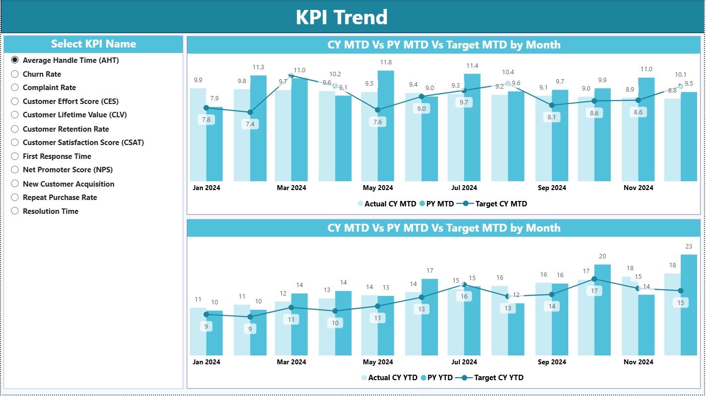
This page shows performance patterns clearly.
Two Combo Charts Are Used:
⭐ MTD Trend Chart
Shows:
-
Current Year Actual MTD
-
Previous Year MTD
-
MTD Target
⭐ YTD Trend Chart
Shows:
-
Current Year Actual YTD
-
Previous Year YTD
-
YTD Target
A KPI Name slicer lets users select any KPI to view its monthly pattern. This helps identify:
-
Spikes
-
Drops
-
Seasonal trends
-
Performance consistency
3. KPI Definition Page – Deep Insights into KPI Meaning
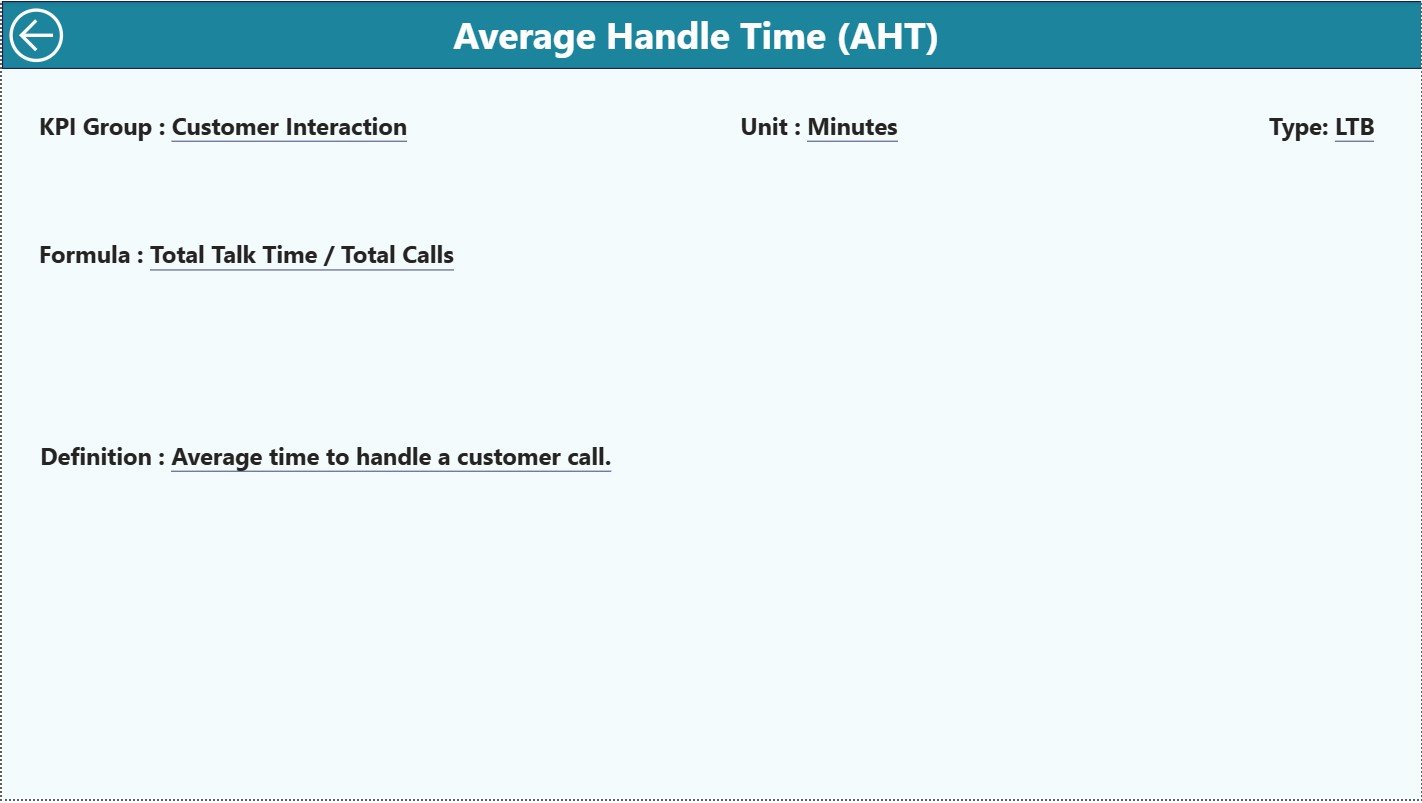
This hidden drill-through page helps users understand:
-
KPI formula
-
KPI definition
-
KPI group
-
Unit
-
Type (LTB or UTB)
When you click on any KPI on the Summary Page, you can drill through to this page. To go back, simply hit the Back button on the top-left corner.
Why Should Businesses Use a CX KPI Dashboard in Power BI?
You receive many benefits when you track CX metrics using Power BI. Let’s explore the most important ones.
Click to Purchases Customer Experience (CX) KPI Dashboard in Power BI
Advantages of the Customer Experience KPI Dashboard in Power BI
1. Real-Time Customer Insights
Power BI provides instant updates. Because of this, CX teams understand performance without waiting for manual reports.
2. Strong Focus on Customer Satisfaction
The dashboard highlights KPIs like CSAT, NPS, retention, and support quality. These KPIs directly impact customer happiness.
3. Faster Decision-Making
Clear visuals help managers make quick improvements in service and support.
4. Easy Comparison of Current and Previous Year
The dashboard shows both CY and PY data. Therefore, teams can compare performance across years with ease.
5. Accurate Tracking of Targets
MTD and YTD comparisons highlight whether the team meets the expected targets.
6. Smooth Monitoring of Support and Service Quality
Support KPIs show how fast and how effectively your team solves customer issues.
7. Easy to Maintain and Update
You only fill the Excel data file. Power BI handles the rest automatically.
Best Practices for Using the CX KPI Dashboard in Power BI
Follow these practices to receive the best results.
1. Keep KPI Definitions Clear
Simple definitions help everyone understand the purpose of each KPI.
2. Update Actual and Target Sheets Regularly
Update monthly data on time. This ensures accurate visuals.
3. Maintain Data Accuracy
Incorrect Excel entries lead to incorrect results. Therefore, double-check your inputs.
4. Review MTD and YTD Trends Frequently
Regular trend analysis helps teams detect early-warning signals.
5. Use Slicers to Analyze Specific Groups
Slicers help you filter CX data quickly for better decision-making.
6. Review Targets Every Year
Targets need adjustment based on business growth and seasonality.
7. Train Your CX Team to Read Dashboard Insights
When teams understand the visuals, they respond faster to customer issues.
How to Use This Dashboard Effectively?
You can follow these steps to gain the maximum value:
-
Enter updated actual and target numbers into the Excel sheets.
-
Use the first day of each month as the date.
-
Refresh the Power BI file.
-
Check the Summary Page for overall performance.
-
Use the KPI Group slicer to focus on specific areas.
-
Review the Trend Page for performance patterns.
-
Drill through to the KPI Definition Page for clarity on any KPI.
Conclusion
The Customer Experience (CX) KPI Dashboard in Power BI gives businesses the tools they need to measure service quality, track customer satisfaction, and analyze performance in real time. Its combination of MTD/YTD metrics, trend charts, KPI details, and simple Excel integration makes it both powerful and easy to use. When companies use this dashboard consistently, they improve customer satisfaction, strengthen loyalty, and make faster decisions based on clear insights.
Click to Purchases Customer Experience (CX) KPI Dashboard in Power BI
Frequently Asked Questions (FAQs)
1. What is a CX KPI Dashboard in Power BI?
It is a visual dashboard that tracks customer experience KPIs using charts, tables, and trend visuals.
2. Does this dashboard support year-over-year comparison?
Yes, the dashboard shows PY MTD and PY YTD values.
3. Can I add more KPIs?
Yes, you can update the KPI Definition sheet and refresh the dashboard.
4. Do I need advanced skills to use this dashboard?
No. You only update the Excel sheets and click refresh.
5. Can I analyze trends using this dashboard?
Yes. The KPI Trend page shows both MTD and YTD patterns.
6. How many pages does this dashboard include?
It includes three pages: Summary, KPI Trend, and KPI Definition.
7. Does the dashboard show KPI status indicators?
Yes. It uses green and red ▲▼ icons to show KPI performance.
Click to Purchases Customer Experience (CX) KPI Dashboard in Power BI
Visit our YouTube channel to learn step-by-step video tutorials
