Science and Technology Parks (STPs) play a major role in innovation, research, incubation, industry collaboration, and economic development. These parks support startups, research projects, technology transfer, and industrial growth. Because STPs handle multiple programs, operations, and performance indicators at the same time, they need smart monitoring tools. When information stays scattered across reports, spreadsheets, and emails, transparency drops and decision-making slows down.
A Science and Technology Parks KPI Dashboard in Excel solves this problem by giving leaders a complete view of performance on a single page. It tracks monthly, yearly, and trend-based KPIs that help administrators, managers, researchers, and development teams measure performance accurately. This dashboard works as a ready-to-use system that converts raw numbers into meaningful insights.
In this detailed article, you will learn everything about the Science and Technology Parks KPI Dashboard in Excel, including its structure, features, advantages, best practices, and frequently asked questions.
Click to Purchases Science and Technology Parks KPI Dashboard in Excel
What Is a Science and Technology Parks KPI Dashboard in Excel?
A Science and Technology Parks KPI Dashboard in Excel is a performance monitoring tool that helps departments track KPIs related to research output, incubator performance, industry partnerships, innovation growth, financial metrics, and operational efficiency. Since STPs manage multiple functions, they need real-time visibility to understand what works well and what needs improvement.
This dashboard uses Excel as its data source, formulas for calculation, conditional formatting for indicators, and charts for easy visualization. The dashboard refreshes instantly when you update the input sheets, so users never wait for manual reports.
You can track Month-to-Date (MTD), Year-to-Date (YTD), and Previous Year (PY) values, compare actual numbers against targets, view trend charts, analyze progress, and read KPI definitions — all in one structured file.
Click to Purchases Science and Technology Parks KPI Dashboard in Excel
Why Do Science and Technology Parks Need a KPI Dashboard?
Science and Technology Parks support many activities:
-
Startup incubation
-
Research development
-
Industry–academia partnerships
-
Technology transfer projects
-
Lab utilization
-
Patent filing
-
Innovation programs
-
Funding & financial planning
-
Training sessions and events
-
Community outreach
Because each activity has unique KPIs, manual tracking becomes difficult. The Excel-based KPI dashboard improves accuracy, speed, and visibility. It creates one centralized data platform that helps every team stay aligned.
Some key problems it solves:
-
Reports take too long to prepare
-
Data gets lost across different files
-
Teams lack real-time insight
-
Performance fluctuations remain hidden
-
KPI definitions stay unclear
-
Strategic planning becomes difficult
A KPI dashboard transforms data into clear decisions.
Click to Purchases Science and Technology Parks KPI Dashboard in Excel
Key Features of the Science and Technology Parks KPI Dashboard in Excel
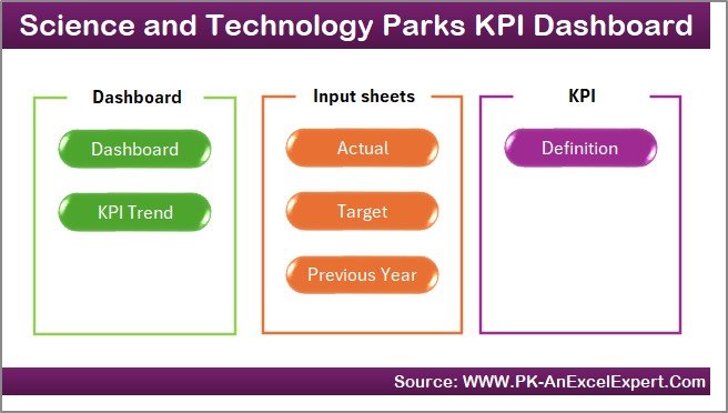
This dashboard contains seven powerful worksheets, each serving a specific purpose. Together, they create a complete performance-monitoring system.
1. Home Sheet – Easy Navigation for Everyone
The Home sheet acts like a control panel. It contains six navigation buttons that take the user directly to important dashboard pages.
This improves usability and removes confusion. Users jump to Dashboard, KPI Trend, Input Sheets, or Definition Sheet with one click.
Because of this structure, even non-technical users track KPIs effortlessly.
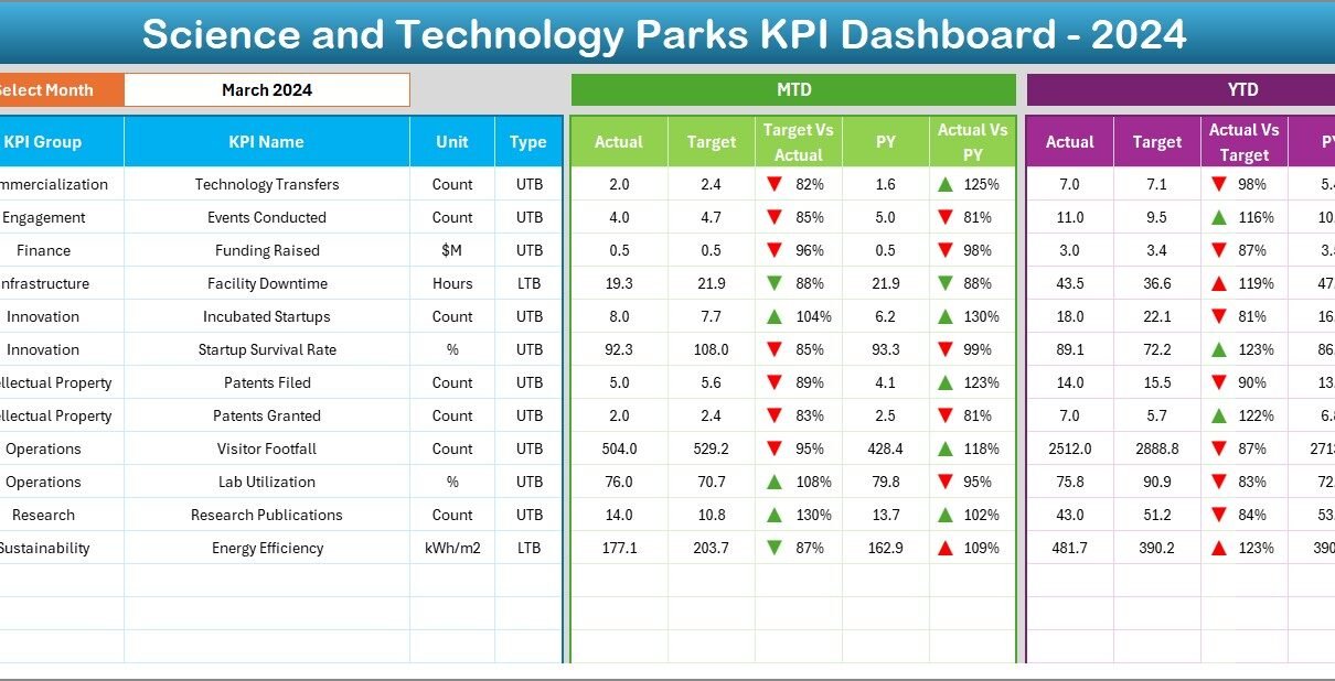
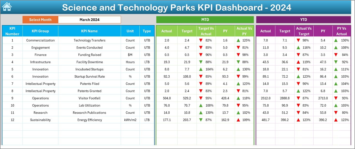
2. Dashboard Sheet – Complete View of All KPIs
This is the main sheet where all performance data appears in a clean and organized way.
Month Selector (Range D3)
You select any month from the drop-down list. The entire dashboard updates instantly for that selected month.
MTD Performance Section
For each KPI, the dashboard shows:
-
MTD Actual
-
MTD Target
-
Previous Year MTD
-
MTD Target vs Actual (%)
-
MTD Actual vs PY (%)
-
Conditional formatting with UP/DOWN arrows
Because of the visual indicators, users understand performance status immediately.
YTD Performance Section
The dashboard shows:
-
YTD Actual
-
YTD Target
-
Previous Year YTD
-
YTD Target vs Actual (%)
-
YTD Actual vs PY (%)
-
Up/Down arrows for visual clarity
This section helps managers track yearly progress and long-term performance.
The Dashboard sheet gives a complete 360-degree view of how Science and Technology Parks perform in any selected month.
Click to Purchases Science and Technology Parks KPI Dashboard in Excel
3. KPI Trend Sheet – Trend Tracking for Smarter Decisions
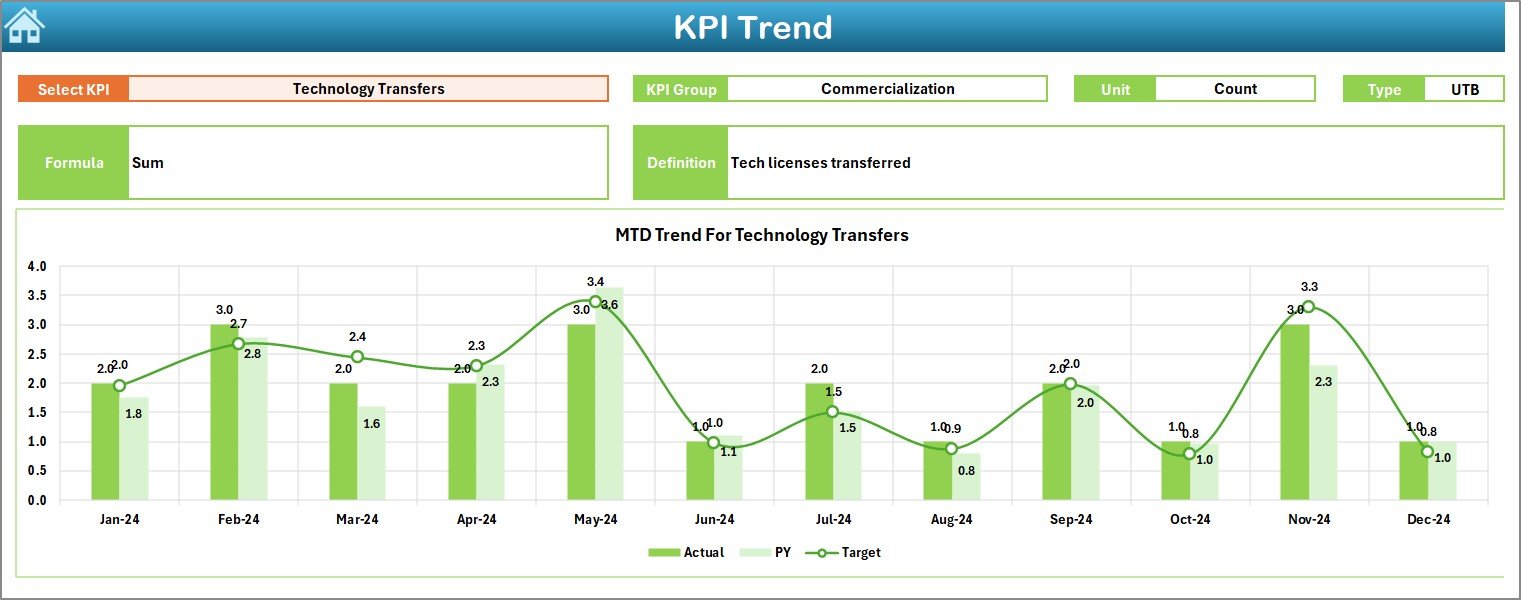
Trend analysis reveals more insights than raw numbers. This sheet helps users study the performance pattern of each KPI.
KPI Selection Drop-down (Range C3)
Users select any KPI from the drop-down.
After selecting the KPI, the sheet displays:
-
KPI Group
-
Unit of measurement
-
KPI Type (UTB or LTB)
-
KPI Formula
-
KPI Definition
Below this information, two trend charts appear:
MTD Trend Chart
Shows MTD Actual, MTD Target, and PY MTD values.
YTD Trend Chart
Shows YTD Actual, YTD Target, and PY YTD values.
Trend charts help allocate resources, plan improvements, and understand seasonal variations.
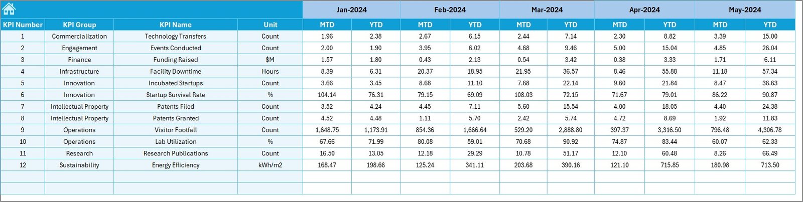
4. Actual Numbers Input Sheet – Enter Actual MTD and YTD Data
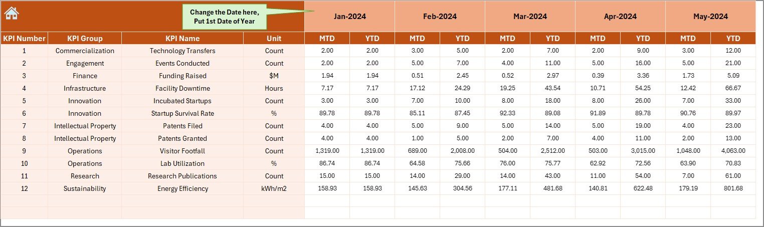
Users enter the actual KPI data for each month.
Key Inputs:
-
Actual MTD
-
Actual YTD
-
First month of the year (entered in Cell E1)
This sheet is very simple to understand. It uses clean formatting so users do not get confused.
Click to Purchases Science and Technology Parks KPI Dashboard in Excel
5. Target Sheet – Enter Monthly Targets
This sheet contains monthly target numbers for every KPI.
Users enter:
-
MTD Target
-
YTD Target
These numbers fuel the dashboard’s comparison logic.
6. Previous Year Numbers Sheet – Input Historical Data
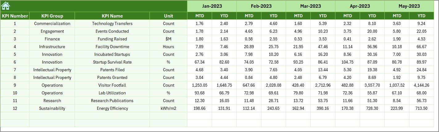
This sheet stores the previous year’s KPI values in the same structure as the current year.
It contains:
-
PY MTD
-
PY YTD
This sheet helps the dashboard compare current performance with last year’s performance.
7. KPI Definition Sheet – Clear Explanation for Every KPI
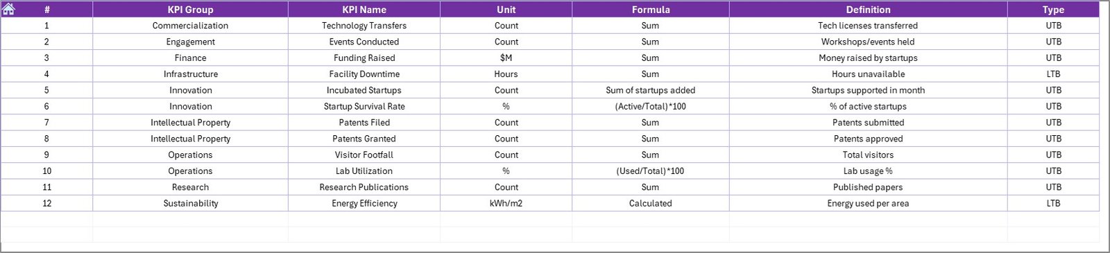
This sheet includes:
-
KPI Name
-
KPI Group
-
KPI Unit
-
KPI Formula
-
KPI Definition
-
KPI Type
This ensures all departments clearly understand how every KPI works.
Examples of KPI Types:
-
UTB → Upper the Better (e.g., Number of Startups Supported)
-
LTB → Lower the Better (e.g., Energy Consumption per Facility)
The definition sheet improves transparency and reduces confusion across teams.
Click to Purchases Science and Technology Parks KPI Dashboard in Excel
What KPIs Should Science and Technology Parks Track?
Since STPs deal with research, innovation, incubation, and administration, their KPIs fall under multiple categories.
1. Innovation & Research KPIs
-
Number of Research Projects
-
Patents Filed
-
Patents Granted
-
Technology Transfer Deals
-
Research Publication Count
2. Startup & Incubation KPIs
-
Number of Startups Incubated
-
Startup Success Rate
-
Funding Raised by Startups
-
Mentor Hours Delivered
-
Incubation Occupancy Rate
3. Collaboration & Industry Partnership KPIs
-
Industry MoUs Signed
-
Joint Research Projects
-
Events Conducted
-
Training Programs Organized
4. Financial KPIs
-
Revenue Generated
-
Operating Cost
-
Funding Allocated
-
Project Budget Utilization
5. Facility & Operations KPIs
-
Lab Utilization Rate
-
Energy Consumption
-
Maintenance Requests
-
Asset Uptime (%)
6. Community & Outreach KPIs
-
Visitors Count
-
Workshops Conducted
-
Community Program Participation
This dashboard supports all categories and makes KPI tracking simple.
Click to Purchases Science and Technology Parks KPI Dashboard in Excel
Advantages of Science and Technology Parks KPI Dashboard in Excel
A KPI dashboard delivers major benefits that improve clarity, speed, performance, and planning.
1. You Get a Centralized View of All KPIs
The dashboard unifies all KPIs in one place. Instead of switching between multiple reports, users get the complete overview instantly.
2. You Reduce Manual Workload
Excel automates:
-
Calculations
-
Comparisons
-
Conditional formatting
-
Charts
-
Monthly and yearly totals
Because of this automation, teams save hours of reporting time.
3. You Improve Data Accuracy
The dashboard uses formulas and structured data input. This reduces human error and increases reliability.
4. You Track Trends and Patterns Easily
Trend charts reveal performance patterns so teams make data-driven decisions. This helps STPs plan their research, incubation, and industry programs better.
5. You Improve Resource Allocation
KPIs highlight:
-
Which programs show positive results
-
Which areas require more support
-
Which initiatives impact innovation
Because of this clarity, teams allocate resources smarter.
6. You Strengthen Operational Efficiency
The dashboard monitors:
-
Lab usage
-
Maintenance
-
Facility management
-
Energy consumption
This helps optimize STP operations.
7. You Strengthen Strategic Planning
Leaders see what grew and what slowed down. With real data, they create stronger strategies.
Click to Purchases Science and Technology Parks KPI Dashboard in Excel
How This Dashboard Improves the Workflow of Science and Technology Parks
1. Administrators
Track overall performance across programs, operations, and finances.
2. Research Teams
Monitor research output, project progress, and innovation metrics.
3. Incubation Team
Track startups, mentorship, funding, and graduation success rate.
4. Operations Team
Monitor lab utilization, maintenance, and energy efficiency.
5. Management
Take better decisions based on real-time KPI insights.
This dashboard ensures everyone works with the same data, improving collaboration.
Best Practices for Using the Science and Technology Parks KPI Dashboard in Excel
Follow these best practices to achieve maximum benefits:
1. Keep KPI Definitions Clear
Write formulas and definitions in simple language to avoid confusion.
2. Update Actual, Target, and PY Sheets Regularly
Monthly updates ensure performance stays transparent.
3. Use Consistent Units Across KPIs
Uniform units improve clarity during comparison.
4. Use Color Coding for Quick Understanding
Green = Good
Red = Attention Required
Blue = Target
Clear colors improve readability.
5. Focus on the Most Important KPIs
Avoid adding too many KPIs. Prioritize high-impact metrics.
6. Review Trend Charts Before Making Decisions
Trends show real truth, not just one-month fluctuations.
7. Train the Team to Use the Dashboard
Educated users make smarter decisions.
Conclusion
A Science and Technology Parks KPI Dashboard in Excel creates one unified platform to monitor performance across research, incubation, finance, operations, community outreach, and industry partnerships. It converts complex data into actionable insights and supports informed decisions.
With trend analysis, MTD/YTD tracking, visual indicators, and structured data input, this dashboard becomes the perfect tool for any STP. It increases transparency, improves efficiency, reduces manual reporting, and strengthens strategic planning.
Click to Purchases Science and Technology Parks KPI Dashboard in Excel
Frequently Asked Questions (FAQs)
1. Can this dashboard track both research and incubation KPIs?
Yes, you can track KPIs for research, incubation, industry partnerships, and more.
2. Do users need advanced Excel skills?
No, the dashboard is simple. Users only update data in input sheets.
3. Can we add or remove KPIs?
Yes, KPIs can be customized based on the STP’s requirements.
4. How often should we update data?
Most parks update monthly, but weekly updates are also possible.
5. Does this dashboard help in strategic planning?
Yes, trend charts and year-to-year comparisons support better planning.
Click to Purchases Science and Technology Parks KPI Dashboard in Excel
Visit our YouTube channel to learn step-by-step video tutorials