The ride-hailing and mobility industry grows at a fast pace, and companies need accurate insights to make smart decisions. When data spreads across different systems—such as trip logs, customer feedback, promo usage, and fare details—teams fail to get a clear picture of operational performance. Because of this, decision-makers struggle with delays, revenue leaks, longer wait times, and poor customer experience.
A Ride Hailing & Mobility Apps Dashboard in Power BI solves these challenges. It brings essential KPIs together and displays them on one clean, interactive dashboard. Teams understand trends faster, measure business growth better, and respond to issues on time. In this detailed article, you will learn what this dashboard includes, how it works, and why every mobility business should use it. You will also explore advantages, best practices, and frequently asked questions.
Click to Purchases Ride Hailing & Mobility Apps Dashboard in Power BI
What Is a Ride Hailing & Mobility Apps Dashboard in Power BI?
A Ride Hailing & Mobility Apps Dashboard in Power BI is a ready-to-use analytical dashboard that helps ride-hailing companies track trips, fares, vehicles, customers, and promotional activities. It transforms raw operational data into clear visual insights. Businesses use this dashboard to understand their performance across different dimensions such as ride type, promo type, vehicle type, and monthly trends.
This dashboard supports all mobility businesses, including:
-
Ride-hailing apps
-
Taxi services
-
Shuttle services
-
Bike and scooter rentals
-
Carpooling and fleet services
As Power BI is a visual tool, you interact with live charts and dynamic slicers. You can click, compare, filter, and drill down into the data within seconds. As a result, your team stays aligned and makes smarter decisions faster.
Key Components of Ride Hailing & Mobility Apps Dashboard in Power BI
This dashboard includes five powerful pages, each offering unique insights. Below is a complete breakdown of each page along with its importance.
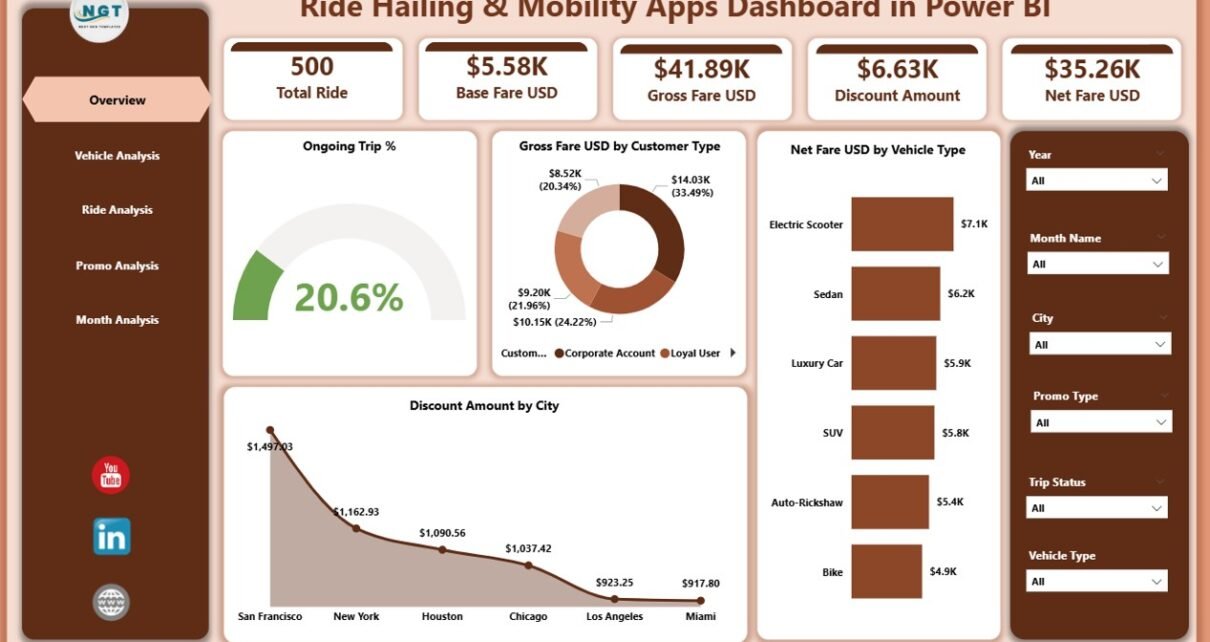
1. Overview Page – Your Central Control Panel
The Overview Page is the most important page in the dashboard. It gives you a quick snapshot of business performance. You find everything that matters in one place, and you can understand the status of your operations instantly.
What You See on the Overview Page
✔ Ongoing Trip %
✔ Gross Fare (USD) by Customer Type
✔ Net Fare (USD) by Vehicle Type
✔ Discount Amount by City
You also get slicers to filter the dashboard by:
-
Month
-
Vehicle type
-
Ride type
-
Promo type
-
City or customer segment
These filters help you narrow down insights and understand root causes within seconds. For example, if you see a drop in Net Fare, you can check if the issue relates to a particular city, customer category, or ride type.
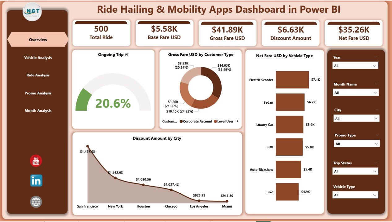
2. Vehicle Analysis Page – Insights by Category of Vehicles
Vehicle performance plays a major role in a mobility business. Some vehicle types generate higher gross fares, while others attract more discounts. Some bring consistent business, while others perform better only during peak hours. Because of this, the Vehicle Analysis page becomes one of the most valuable parts of this dashboard.
What You See on the Vehicle Analysis Page
✔ Gross Fare USD by Vehicle Type
✔ Base Fare USD by Vehicle Type
✔ Surge Multiplier by Vehicle Type
These insights help you:
-
Identify top-performing vehicle types
-
Understand which vehicles attract the highest surge
-
Optimize pricing strategies
-
Balance fleet distribution
-
Improve customer satisfaction
For example, a sedan category might show higher gross fare during weekdays, while SUVs might perform better during weekends. The dashboard displays these trends visually and instantly.
3. Ride Analysis Page – Detailed Breakdown by Ride Category
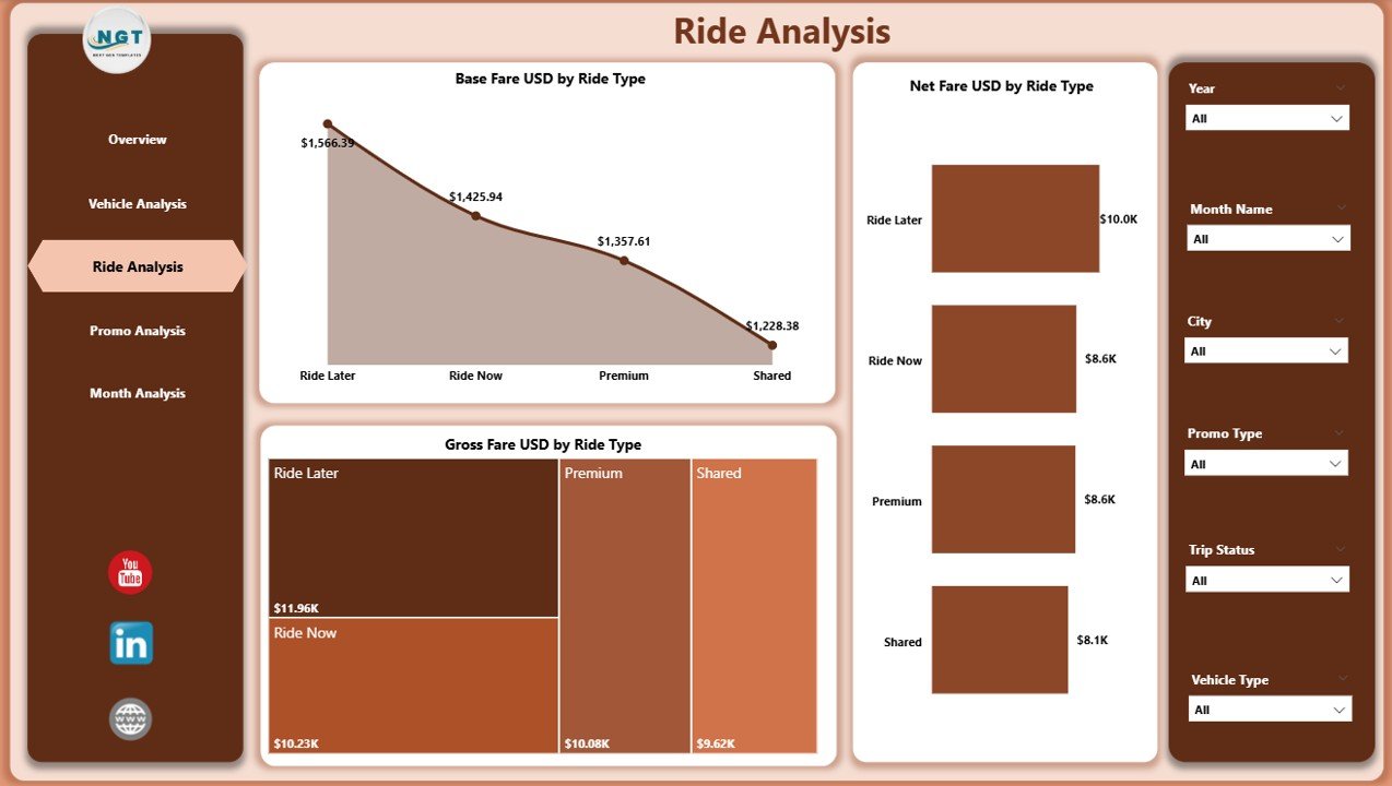
Every ride type performs differently—standard rides, shared rides, premium rides, airport rides, and more. The Ride Analysis page helps you understand these differences and track performance for each category.
Click to Purchases Ride Hailing & Mobility Apps Dashboard in Power BI
Charts You See on the Ride Analysis Page
✔ Gross Fare USD by Ride Type
✔ Base Fare USD by Ride Type
✔ Net Fare USD by Ride Type
This analysis helps you:
-
Identify which ride types generate maximum revenue
-
Compare actual fare vs base fare
-
Check the impact of ride categories on customer satisfaction
-
Understand demand patterns for ride categories
-
Improve your ride pricing model
For example, premium rides may have lower trip volume but higher fare margins. Shared rides may have high demand but lower net fare. These insights help you improve profitability.
4. Promo Analysis Page – Understand the Impact of Discounts
Every mobility business uses promotions to attract customers. However, promotions reduce the net fare and impact the revenue model. Hence, you need to track the performance of each promo type carefully.
Charts on the Promo Analysis Page
✔ Gross Fare USD by Promo Type
✔ Base Fare USD by Promo Type
✔ Ongoing Trip % by Promo Type
These insights help you answer important questions:
-
Which promotional offers attract maximum users?
-
Which promo types reduce revenue?
-
Do promo users repeat trips?
-
Which cities respond well to promos?
Promo analysis helps you decide whether you should increase, reduce, or completely stop certain promotional campaigns.
5. Monthly Trends Page – Understand Seasonality and Growth
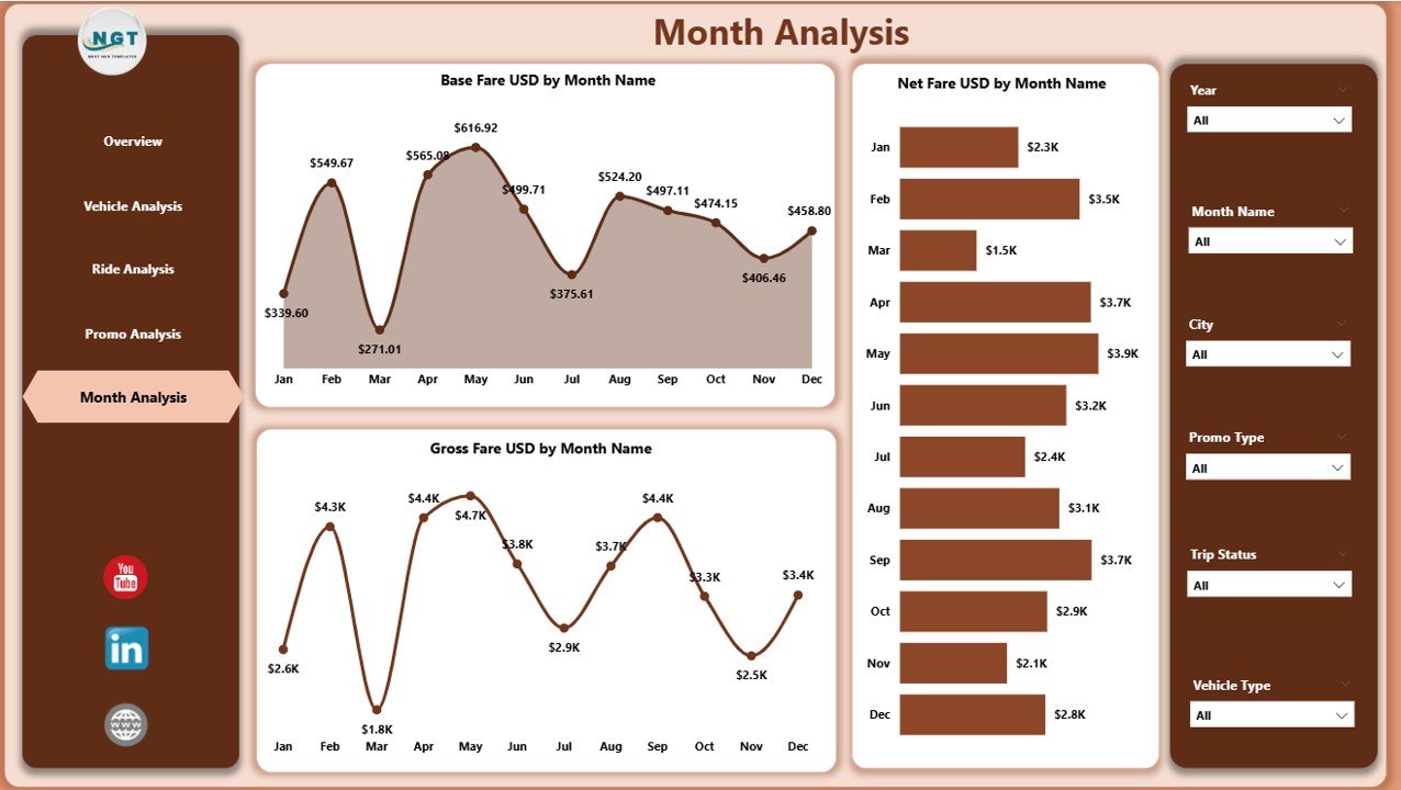
The Monthly Trends page shows how your business performs across months. This is extremely important because mobility demand changes based on seasons, weather, festivals, holidays, and local events.
Charts on the Monthly Trends Page
✔ Gross Fare USD by Month
✔ Base Fare USD by Month
✔ Net Fare USD by Month
You can quickly identify:
-
Peak months for ride activity
-
Seasonal slowdowns
-
Revenue growth over time
-
Impact of promotions on monthly numbers
-
Performance differences between months
This helps your business plan resource allocation, promo strategies, and pricing strategies with confidence.
Why Businesses Need a Ride Hailing & Mobility Apps Dashboard
Mobility companies deal with huge amounts of data every day. Without a proper system, data becomes hard to understand and almost impossible to analyze. A structured dashboard helps remove confusion and supports fast decision-making.
Advantages of Using a Ride Hailing & Mobility Apps Dashboard in Power BI
Below are the major advantages of using this dashboard.
1. Real-Time Insights
You understand performance the moment the data gets updated. This helps you make quick decisions and reduces delays.
2. Better Revenue Tracking
The dashboard shows gross fare, base fare, net fare, and discount amounts in a clean format. You understand leaked revenue and lost opportunities instantly.
3. Improved Operational Control
You track vehicle performance, trip status, surge pricing, and customer categories. This helps you improve fleet management.
4. Smart Promo Optimization
You understand which promotions work and which promotions fail. This helps you reduce discount waste and increase profit.
5. Enhanced Customer Experience
You see what your customers prefer—vehicle type, ride type, city, and ride frequency. This helps you improve service quality.
6. Actionable Monthly Trends
You understand seasonality and create better planning strategies. This leads to better pricing, optimized promotions, and higher revenue.
7. Easy to Use for All Teams
Power BI makes the dashboard interactive. Teams without technical knowledge also read and understand the data easily.
Best Practices for Using the Ride Hailing & Mobility Apps Dashboard
Follow these best practices to get maximum value:
1. Update the Data Regularly
Always load new data on time. This keeps the dashboard accurate.
2. Use Filters to Drill Down into Insights
Filters help you understand performance differences by:
-
Ride type
-
Promo type
-
Month
-
Vehicle category
-
City
This helps you solve problems quickly.
3. Track Surge Effects Carefully
Surge pricing creates revenue spikes. However, it may affect customer satisfaction. Use the Surge Multiplier chart to analyze the impact.
4. Compare Promo Users and Non-Promo Users
Promo users behave differently. Track their repeat trip patterns. This helps you create smarter promotional strategies.
5. Study Monthly Trends Before Planning Campaigns
Never plan promotions blindly. Always check the monthly performance patterns before deciding.
6. Improve Vehicle Allocation Based on Performance
If a particular vehicle type generates high fare, allocate more vehicles in that category.
7. Monitor Differences Between Gross Fare and Net Fare
Large differences mean heavy discount usage. Adjust your pricing model if required.
Conclusion
The Ride Hailing & Mobility Apps Dashboard in Power BI helps ride-hailing companies make better decisions, improve customer experience, and grow faster. It organizes every important KPI into a clean, structured format. With pages like Overview, Vehicle Analysis, Ride Analysis, Promo Analysis, and Monthly Trends, you get a complete understanding of your business performance.
Whether your company manages taxis, bikes, scooters, shuttles, or carpools, this dashboard helps you stay ahead of the competition. When you use the best practices mentioned above, you extract maximum value from your data and build a stronger mobility business.
Frequently Asked Questions (FAQs)
Click to Purchases Ride Hailing & Mobility Apps Dashboard in Power BI
1. What is a Ride Hailing & Mobility Apps Dashboard?
It is a Power BI dashboard that displays important performance metrics for mobility businesses such as fares, rides, vehicles, and promotions.
2. Who can use this dashboard?
Ride-hailing apps, taxi services, scooter rentals, carpooling companies, shuttle services, and fleet operators can use this dashboard.
3. What KPIs does this dashboard cover?
It covers Gross Fare, Base Fare, Net Fare, Ongoing Trip %, Surge Multiplier, Promo Performance, Ride Type Performance, and Monthly Trends.
4. How often should I update the data?
You should update the data daily or weekly depending on your operational volume.
5. Can non-technical users understand this dashboard?
Yes. Power BI visuals are simple, interactive, and easy for everyone to understand.
6. Does this dashboard improve revenue?
Yes. It helps you optimize pricing, promotions, and vehicle allocation. As a result, you improve revenue and customer experience.
Visit our YouTube channel to learn step-by-step video tutorials
Click to Purchases Ride Hailing & Mobility Apps Dashboard in Power BI