Plastics manufacturing plants run fast, complex, and highly repetitive operations every day. Teams must track production output, machine hours, energy usage, rework quantities, scrap, resin performance, shift-wise efficiency, and customer segment demand. Because so many numbers move rapidly, managers often struggle to monitor everything in real time. As a result, delays increase, wastage rises, and decision-making becomes slow.
To solve this problem, a Plastics Manufacturing Dashboard in Excel becomes a powerful and easy solution. It collects all production data, organizes it, and displays it through clear charts and KPIs. Anyone can understand the complete performance picture within seconds. In this guide, you will learn everything about this dashboard, including how it works, its structure, benefits, best practices, and what every page tells you.
Click to Purchases Plastics Manufacturing Dashboard in Excel
What Is a Plastics Manufacturing Dashboard in Excel?
A Plastics Manufacturing Dashboard in Excel is a ready-to-use reporting system that tracks all key performance indicators (KPIs) of a plastics production environment. It helps plant managers, supervisors, shift leaders, and quality teams monitor production efficiency, machine health, energy consumption, and output trends.
Instead of going through scattered spreadsheets, manual reports, or handwritten logs, the dashboard brings everything together in one interactive Excel file. You select a month, shift, product family, or plant, and the entire dashboard updates instantly. Because it highlights the current status using charts, cards, and slicers, anyone can make better decisions without delay.
Why Does a Plastics Manufacturing Plant Need a Dashboard?
Plastics manufacturing involves many moving parts—machines, molds, resins, shifts, customer orders, and long production cycles. When these elements grow, manual reporting becomes slow and error-prone. A dashboard solves these issues because it:
-
Shows real-time trends
-
Reduces manual reporting time
-
Highlights problems before they grow
-
Helps everyone stay aligned with targets
-
Supports strategic planning
This is why modern manufacturing units rely on dashboards to keep operations fast, accurate, and data-driven.
Key Features of the Plastics Manufacturing Dashboard in Excel
The dashboard is designed to give a complete overview of production performance while staying easy to use. The key features include:
✔ Page Navigator
Located on the left side, the page navigator helps users switch quickly between different analysis pages. Because of this, you don’t need to scroll or search through sheets manually.
✔ Five Fully Interactive Analysis Pages
The dashboard includes the following analytical pages:
-
Overview
-
Product Family Analysis
-
Customer Segment Analysis
-
Resin Supplier Analysis
-
Month Analysis
Each page shows relevant KPIs, charts, and performance metrics.
✔ Support Sheet
This sheet stores all lookup values that make the dashboard dynamic.
✔ Data Sheet
This is where you enter or import your production numbers. The dashboard reads automatically from this sheet.
Click to Purchases Plastics Manufacturing Dashboard in Excel
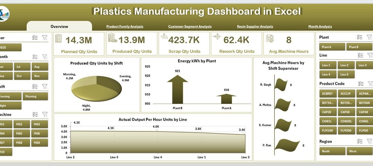
Overview Page: What Does It Show?
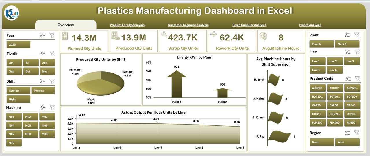
The Overview Page is the heart of the dashboard. Managers use it daily because it provides a quick understanding of the plant’s performance. You also get a slicer on the right side for easy filtering.
KPIs and Cards
The page displays five main KPI cards, such as:
-
Total Produced Quantity
-
Total Energy Consumption
-
Average Machine Hours
-
Total Actual Output Per Hour
-
Scrap or Rework Summary
These cards help you see whether the plant meets daily or monthly expectations.
Key Charts on the Overview Page
Four powerful charts help you understand performance variations:
-
Produced Quantity (Units) by Shift
This chart highlights how each shift performs. It helps identify strong and weak shift patterns. -
Energy Consumption (kWh) by Plant
Energy consumption is a major cost in plastics manufacturing. This chart reveals which plant or line consumes the most energy. -
Average Machine Hours by Shift Supervisor
You can track how effectively each supervisor uses machine time. -
Actual Output Per Hour (Units) by Line
This helps identify bottlenecks in specific lines.
Because these charts update instantly, the page gives a clear view of plant productivity.
Product Family Analysis: What Can You Learn From It?
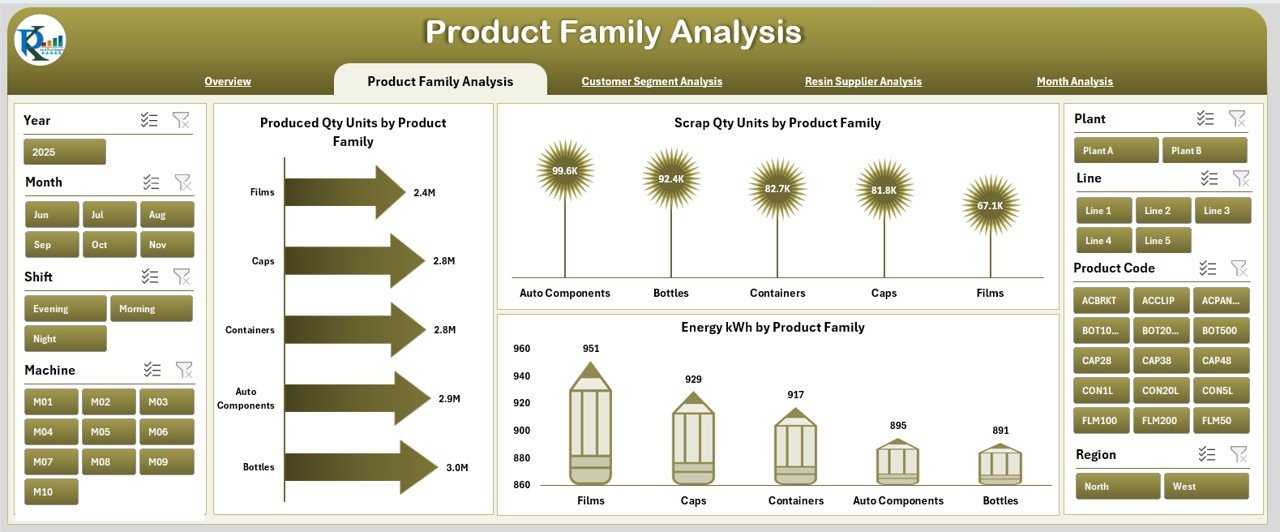
Every plastics company handles multiple product families—bottles, sheets, caps, films, containers, and more. Since their production patterns differ, this page captures performance by product family.
You also get a slicer on the right side to filter the data.
Charts on the Product Family Analysis Page
You will find three important charts:
-
Produced Quantity (Units) by Product Family
Helps understand which family contributes most to production. -
Energy Consumption (kWh) by Product Family
Tracks variations in power usage across different product types. -
Scrap Quantity (Units) by Product Family
Helps identify product families with higher scrap rates. Because scrap directly affects cost and quality, this chart becomes very helpful.
When you view these three charts together, you get a clear picture of productivity, cost, and waste.
Customer Segment Analysis: Why Is It Important?
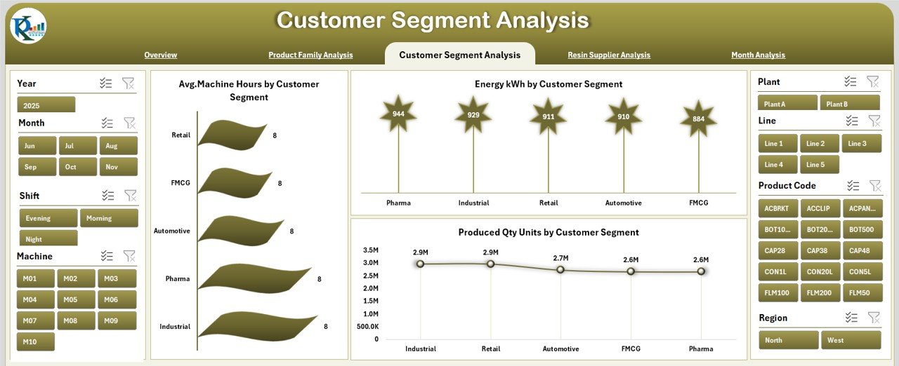
Different customer segments order different product types, volumes, and specifications. Their demand patterns affect production planning. That is why this page is extremely valuable for sales and production teams.
Like other pages, it has a slicer on the right side for quick filtering.
Three Main Charts in Customer Segment Analysis
-
Produced Quantity (Units) by Customer Segment
Shows which segments drive the highest production. Because of this, you can adjust capacity planning easily. -
Energy Consumption (kWh) by Customer Segment
Helps understand production cost differences between segments. -
Average Machine Hours by Customer Segment
Shows how much time each segment requires. This gives insight into order complexity.
This page becomes a powerful tool for both operations and sales teams.
Resin Supplier Analysis: What Insights Does It Provide?
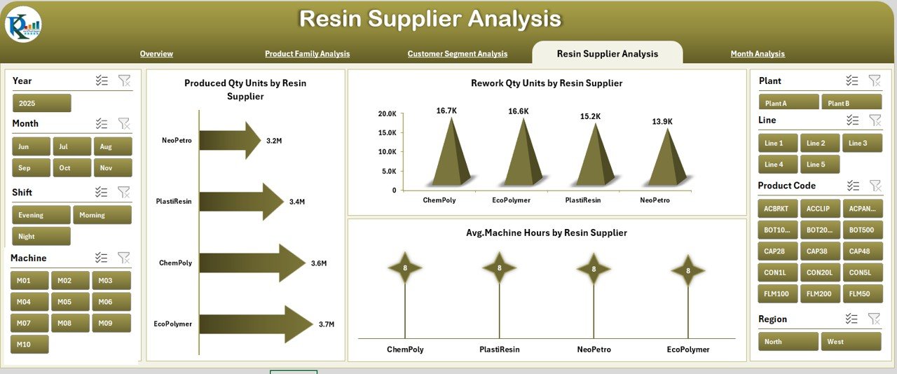
Resin quality affects machine speed, scrap quantity, output per hour, and product consistency. Because of this, analyzing resin supplier performance becomes crucial.
The Resin Supplier Analysis page shows:
Charts on This Page
-
Produced Quantity (Units) by Resin Supplier
Helps compare how each supplier supports output. -
Rework Quantity (Units) by Resin Supplier
Shows which suppliers lead to more rework and poor batch quality. -
Average Machine Hours by Resin Supplier
Helps identify resin that requires longer processing time.
This page supports procurement decisions, contract evaluation, and supplier negotiations.
Click to Purchases Plastics Manufacturing Dashboard in Excel
Month Analysis: What Trends Can You See?
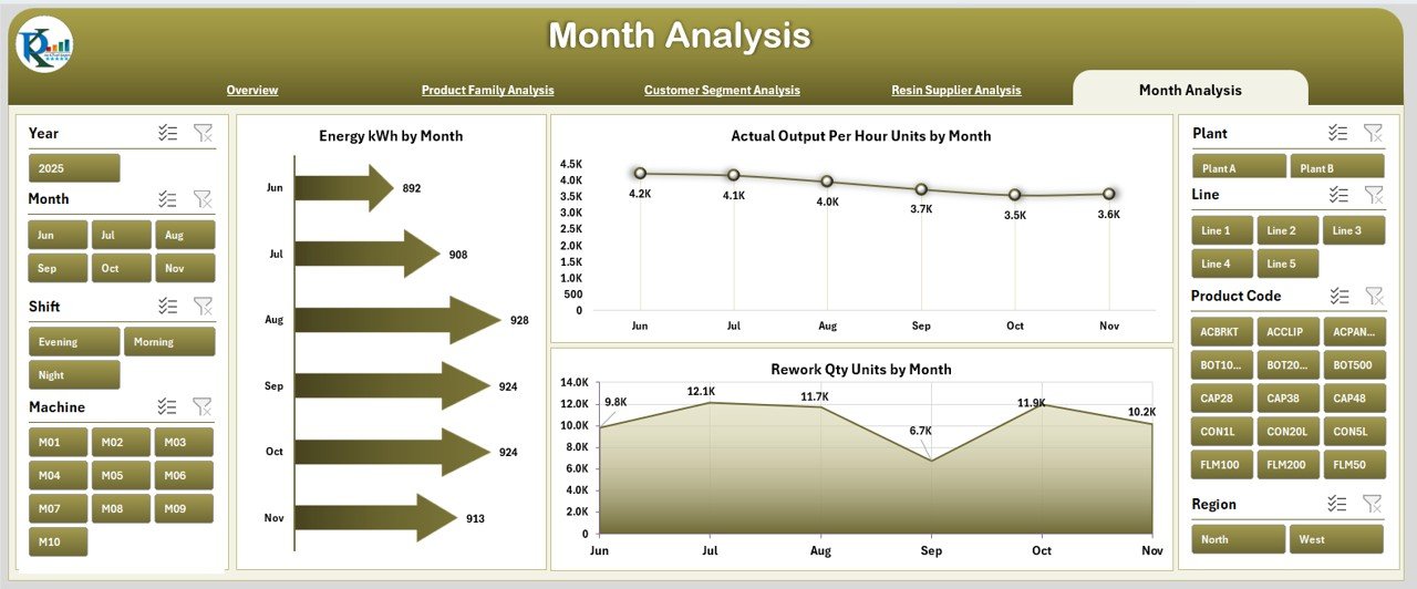
Production managers must track month-wise performance to understand seasonal changes, recurring issues, and capacity improvements. The Month Analysis page gives an easy month-to-month overview.
Key Charts
-
Energy Consumption (kWh) by Month
Helps track how energy usage rises or drops over time. -
Actual Output Per Hour (Units) by Month
Shows efficiency improvements or declines throughout the year. -
Rework Quantity (Units) by Month
Helps identify months with high quality issues.
Because these trends update instantly with data, you get a full yearly summary.
Advantages of a Plastics Manufacturing Dashboard in Excel
A plastics manufacturing dashboard brings many benefits to both small and large plants. Below are the major advantages:
1. Clear and Instant Visibility
Managers get a complete view of production, quality, and energy in seconds.
2. Faster Decision-Making
Since charts update instantly, teams react quickly to production issues.
3. Better Shift and Line Comparison
You can compare supervisors, shifts, and production lines to find improvement areas.
4. Improved Quality Management
The dashboard highlights rework and scrap trends early. This supports faster root-cause analysis.
5. Resource Optimization
By understanding energy usage, resin performance, and machine hours, you reduce unnecessary waste.
6. Easy to Use
Even non-technical users can operate the dashboard because everything is clean and visual.
7. No Need for Expensive Tools
Excel provides a cost-effective alternative to high-end manufacturing software.
8. Supports Continuous Improvement
You can track KPIs every day, week, or month. This helps teams build long-term improvement strategies.
Best Practices for Using the Plastics Manufacturing Dashboard in Excel
To get maximum value from this dashboard, follow these best practices:
1. Update the Data Sheet Regularly
Because the dashboard reads directly from the data sheet, keep it updated daily or weekly.
2. Use Clean and Accurate Data
Incorrect data leads to wrong insights. Always validate your numbers.
3. Standardize Your KPI Definitions
Ensure every team understands the meaning of KPIs like “Actual Output Per Hour” or “Avg. Machine Hours.”
4. Train Supervisors and Managers
Show them how to read charts, compare shifts, and interpret trends.
5. Review Monthly and Product Family Trends
These trends help identify long-term issues like energy spikes or rising scrap.
6. Compare Supplier Performance Regularly
Supplier-related charts reveal quality problems early.
7. Automate Data Import If Possible
If your plant uses machines with PLC systems or ERP, connect them to Excel for automatic updates.
8. Monitor Scrap and Rework Closely
These metrics directly affect profitability.
9. Create Action Plans Based on Insights
Do not only view the dashboard—use the insights to improve processes.
10. Keep the Dashboard Lightweight
Avoid unnecessary formulas or heavy visual elements.
Conclusion
A Plastics Manufacturing Dashboard in Excel gives a smart, simple, and powerful way to monitor production performance. It helps every manufacturing team—from shift supervisors to senior management—understand what happens in the plant at any moment. Because the dashboard includes multiple analysis pages, it becomes easy to track product families, customer segments, resin suppliers, months, lines, and shifts.
When your plant follows the best practices and updates the data regularly, the dashboard becomes a central tool for productivity, quality, and efficiency. As a result, you reduce waste, improve output, use energy wisely, and meet customer expectations faster.
Frequently Asked Questions (FAQs)
1. What is a Plastics Manufacturing Dashboard in Excel?
It is a ready-to-use Excel dashboard that tracks production, energy usage, machine hours, scrap, and performance trends using charts and KPIs.
2. Who can use this dashboard?
Shift supervisors, plant managers, quality teams, process engineers, procurement teams, and senior management.
3. Do I need advanced Excel skills to use it?
No. The dashboard is easy to navigate. You only need basic Excel knowledge.
4. Can I add new KPIs?
Yes. You can expand the data sheet and link new KPIs to the dashboard.
5. Can this dashboard replace ERP?
No. It does not replace an ERP system, but it complements it by giving better visual insights.
6. How often should I update the data?
Daily or weekly is ideal, depending on your production frequency.
7. Can I track energy usage through this dashboard?
Yes. Multiple pages show energy consumption by plant, month, product family, and customer segment.
8. Can I use this dashboard for multiple plants?
Yes. You can add plant names in the data sheet and analyze them using slicers.
Visit our YouTube channel to learn step-by-step video tutorials
Click to Purchases Plastics Manufacturing Dashboard in Excel