Managing water utilities requires constant attention, fast decision-making, and accurate visibility of operational and environmental indicators. Every region manages multiple water sources, treatment plants, consumer segments, and distribution networks. Because of this, teams deal with huge volumes of data on risk ratings, water demand, contamination cases, monthly output, and critical performance indicators.
However, when this information spreads across several spreadsheets or manual files, decision-making becomes slow. You spend more time collecting data and less time analyzing it. The Water Utilities Dashboard in Excel solves this challenge with clarity and speed. It brings all operational data into one smart, interactive, and ready-to-use dashboard so that every team member can understand performance trends instantly.
In this article, you will learn how this dashboard works, why it improves efficiency, and how each page provides deep insights that support safe and sustainable water management. You will also explore advantages, best practices, and frequently asked questions to help you use the tool with complete confidence.
Click to Purchases Water Utilities Dashboard in Excel
What Is a Water Utilities Dashboard in Excel?
A Water Utilities Dashboard in Excel is a pre-designed analytics tool that helps water management teams track safety indicators, operational KPIs, and performance trends on one screen. You can monitor water demand, supply, contamination cases, risk ratings, plant output, and consumer trends without switching between multiple reports. The dashboard uses simple filters, interactive charts, and automated calculations to help you take better decisions.
Because it runs on Excel, you don’t need any complex software. You load your data, update the numbers, and the dashboard updates everything in real time.
Why Do Water Utilities Need a Dashboard?
Water utilities manage critical public services. If you miss signals like rising contamination, supply gaps, or high-risk areas, you affect public health and operational continuity. Therefore, teams need a fast and accurate tool that shows performance clearly.
A dashboard helps you:
-
Understand risks quickly
-
Identify demand and supply gaps
-
Improve plant performance
-
Reduce operational inefficiencies
-
Strengthen public safety
-
Make data-driven decisions
-
Monitor seasonal trends
When you rely on one clear dashboard, you save time, reduce errors, and protect communities with faster action.
Key Features of the Water Utilities Dashboard in Excel
The dashboard contains 5 analytical pages, a data sheet, and support sections. Each page focuses on a specific area of water utilities so you can understand performance instantly.
Page Navigator – Smooth Movement Across Pages
The dashboard comes with a Page Navigator on the left side. This allows you to move between pages with one click. As a result, you view information faster and avoid manual scrolling inside large files.
1. Overview Page – The Main Performance Summary
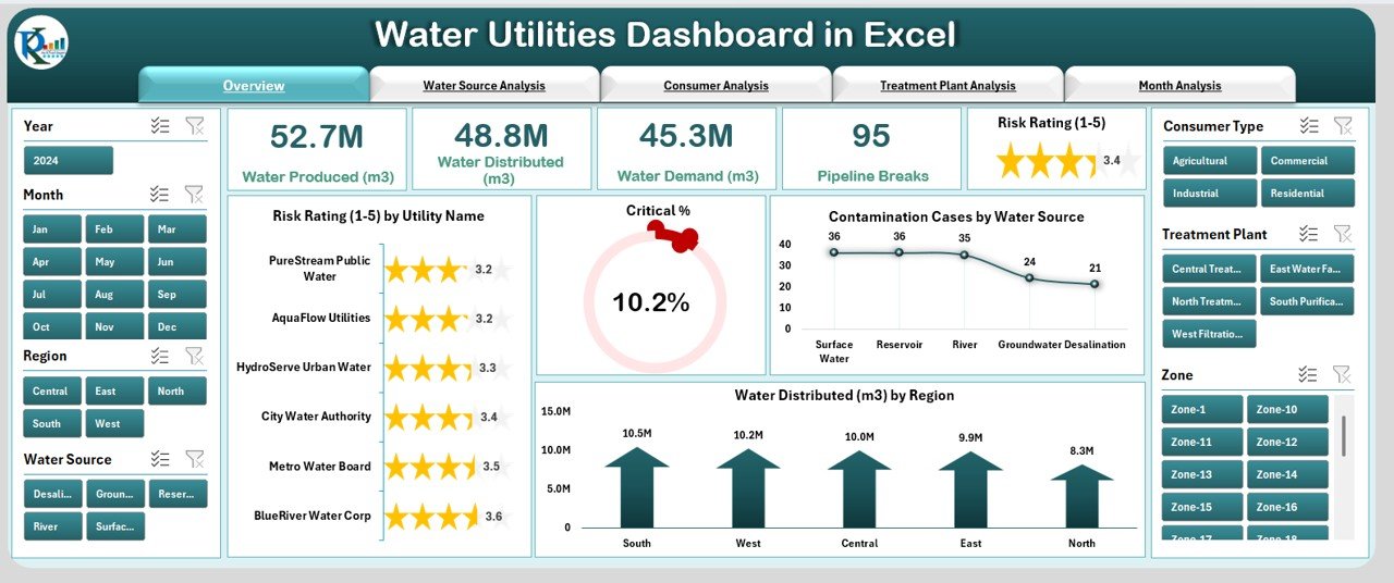
The Overview Page gives you a complete snapshot of water utility performance. It includes:
✔ Five KPI Cards
These cards help you view the most important metrics in one place, such as:
-
Total Risk Rating
-
Critical %
-
Water Demand
-
Contamination Cases
-
Water Produced or Distributed
✔ Four Insightful Charts
These charts provide instant trend visibility:
-
Risk Rating by Utility Name
-
Critical %
-
Contamination Cases by Water Source
-
Water Distributed by Region
The Overview Page shows what is working well and where immediate attention is required. This helps senior leadership and operational teams take faster decisions.
Click to Purchases Water Utilities Dashboard in Excel
2. Water Source Analysis – Understand the Source-Wise Trends
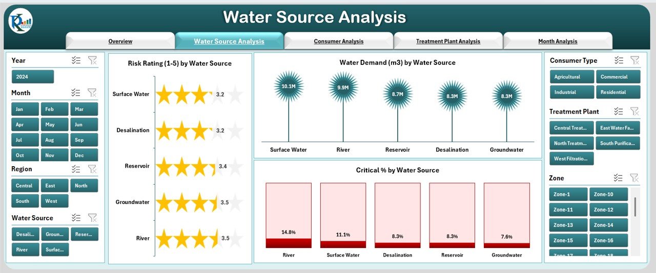
Every region relies on different water sources such as rivers, lakes, reservoirs, and groundwater. Because each source carries different risk levels, this page helps you compare them clearly.
✔ Three Key Charts
-
Risk Rating by Water Source
-
Water Demand by Water Source
-
Critical % by Water Source
These charts reveal which water source requires attention, which one generates higher demand, and where quality risks increase. As a result, you make balanced decisions about sourcing, treatment, and contingency planning.
3. Consumer Analysis – Deep Insights Into Consumption Patterns
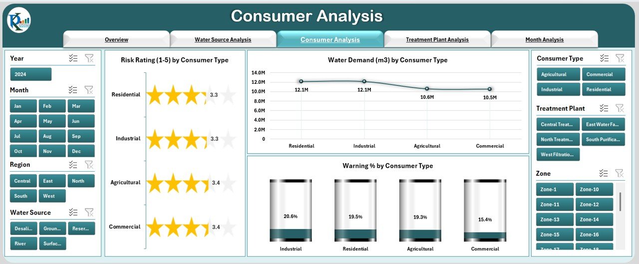
Consumers include residential, commercial, industrial, agricultural, and special users. Since consumption patterns vary, this page helps you study data segment-wise.
✔ Three Charts for Better Analysis
-
Risk Rating by Consumer Type
-
Water Demand by Consumer Type
-
Warning % by Consumer Type
You understand which consumer category demands more water, which category risks shortages, and where warning indicators rise. This also supports planning for peak seasons, new connections, and consumption behavior.
4. Treatment Plant Analysis – Improve Plant Efficiency
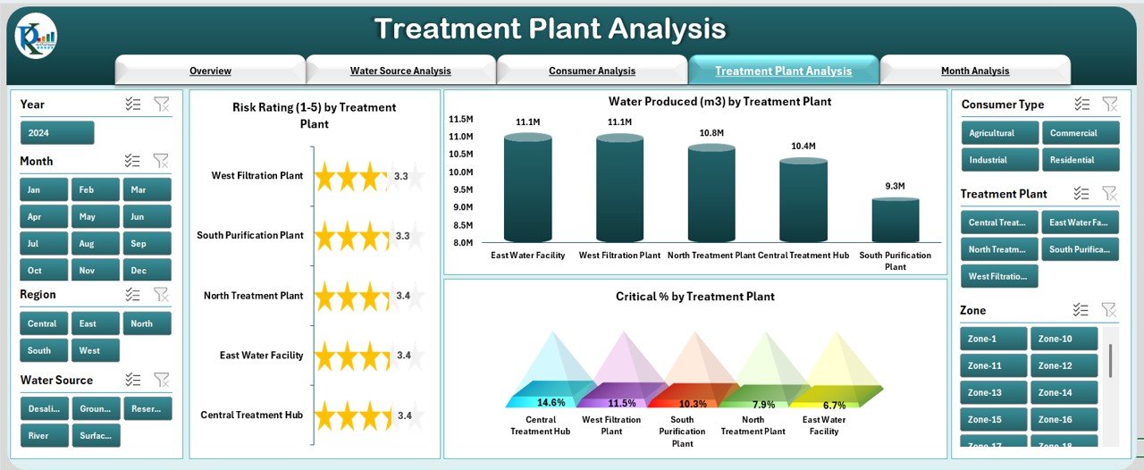
Treatment plants form the backbone of water safety and supply. This page offers insights into plant-wise performance.
✔ Three Important Charts
-
Risk Rating by Treatment Plant
-
Water Produced by Treatment Plant
-
Critical % by Treatment Plant
This helps plant managers understand performance gaps, production levels, and risk signals. You also identify underperforming units and make data-driven decisions on workforce, maintenance, and upgrades.
5. Month Analysis – Track Seasonal and Monthly Patterns
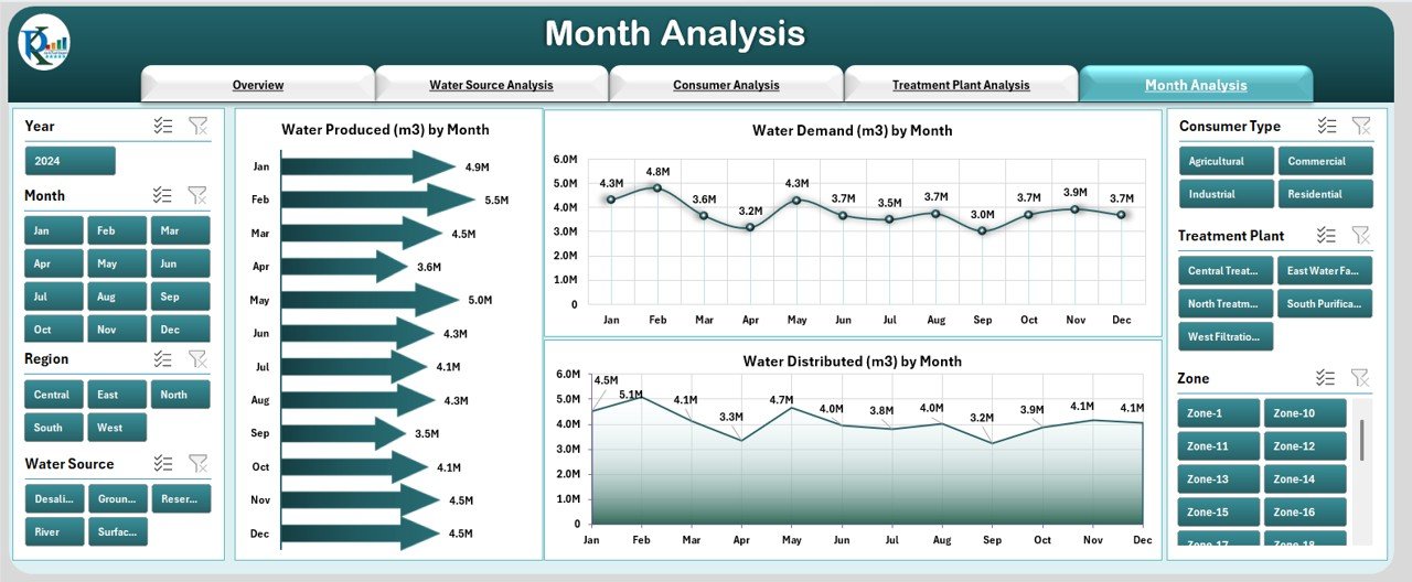
Water availability and demand vary every month due to temperature, rainfall, and consumer behavior. This page highlights all monthly trends in a simple, visual format.
✔ Three Monthly Trend Charts
-
Water Produced by Month
-
Water Demand by Month
-
Water Distributed by Month
These charts help you identify demand surges, supply shortages, and seasonal changes. You understand when to prepare for high-demand periods and when distribution smoothens.
Support Sheet
The Support Sheet includes automated formulas, reference values, and important logic that powers the dashboard. You don’t need to modify it unless you want to expand features.
Data Sheet – The Heart of the Dashboard
The Data Sheet stores all source data. Once you update the values in this sheet, the dashboard refreshes instantly.
You can add new utility names, sources, plants, or consumer types. The dashboard adapts everything automatically.
Advantages of Using a Water Utilities Dashboard in Excel
Click to Purchases Water Utilities Dashboard in Excel
Using this dashboard provides multiple advantages that improve operational control and planning:
1. Faster Decision-Making
You see risk, demand, and supply indicators in one place, so you act instantly.
2. Clear Visibility Across All Water Operations
You don’t depend on multiple spreadsheets or scattered files.
3. Better Risk and Safety Management
Early signals help you prevent contamination issues and operational failures.
4. Reduced Manual Work
Automated charts and formulas reduce calculation errors.
5. Improved Consumer Management
You understand consumption behavior and respond to demand changes.
6. Enhanced Plant Performance
Plant-level insights help teams increase efficiency and reduce downtime.
7. Seasonal Insights for Better Planning
Trends help you manage peak-season demand and water scarcity.
8. Complete Transparency for Leadership
Clear dashboards improve communication and reporting.
Best Practices for Using the Water Utilities Dashboard
To get maximum value from the dashboard, follow these best practices:
✔ 1. Update Data Regularly
Enter data monthly or weekly so the dashboard stays accurate.
✔ 2. Validate Data Before Uploading
Ensure correct units, values, and formats to avoid misleading results.
✔ 3. Use Filters to Compare Multiple Scenarios
Slice data by source, consumer, region, plant, or month for deeper analysis.
✔ 4. Track Critical % and Risk Indicators Closely
These signals support safety and compliance planning.
✔ 5. Review Monthly Trends for Planning
Use the Month Analysis page to prepare for high-demand seasons.
✔ 6. Engage Plant and Field Teams
Share insights so teams take corrective actions faster.
✔ 7. Keep the Dashboard Clean and Organized
Avoid unnecessary data clutter for better clarity.
Conclusion
The Water Utilities Dashboard in Excel is a smart, practical, and ready-to-use tool that simplifies water management. It brings all essential KPIs into one dashboard so that teams act faster, reduce risks, improve water quality, and manage supply more efficiently. With clear charts, easy navigation, and real-time updates, every water management department can use it to improve planning and operational performance.
You can use this dashboard to analyze risk, demand, plant performance, seasonal trends, and consumer behavior with complete clarity.
Frequently Asked Questions (FAQs)
1. What is a Water Utilities Dashboard in Excel?
It is a pre-built Excel dashboard that helps water utilities track KPIs such as risk rating, demand, supply, critical %, contamination cases, and plant output.
2. Who should use this dashboard?
Water management departments, treatment plants, municipal teams, environmental groups, and operational managers can use it.
3. Do I need advanced Excel skills to use it?
No. You only update the data sheet and the dashboard updates automatically.
4. Can I add more water sources or plants?
Yes. You can expand data lists and the dashboard adjusts automatically.
5. Does the dashboard support monthly analysis?
Yes. A dedicated Month Analysis page shows demand, supply, and production trends.
6. How often should I update the data?
You should update it monthly or weekly depending on the reporting cycle.
7. Can I share this dashboard with my team?
Yes. You can share the Excel file with anyone.
Visit our YouTube channel to learn step-by-step video tutorials