Managing sewage treatment operations demands accuracy, speed, and clear insights. Teams need to track total costs, operator performance, compliance levels, chemical usage, energy consumption, plant efficiency, and regional variations every month. However, many organizations still depend on scattered spreadsheets and manual reports, which slow down decisions and hide important trends.
A Sewage Treatment Dashboard in Excel solves these challenges. It brings all important KPIs onto a single, interactive, ready-to-use dashboard. As a result, plant managers, environmental teams, operators, and administrators understand the key metrics instantly and make better decisions every day.
In this complete guide, you will learn what this dashboard is, how it works, what pages it includes, and why it supports smarter sewage-treatment management. You will also explore the advantages, best practices, and answers to common questions.
Click to Purchases Sewage Treatment Dashboard in Excel
What Is a Sewage Treatment Dashboard in Excel?
A Sewage Treatment Dashboard in Excel is a smart reporting system that tracks important KPIs for sewage plants in one place. It uses simple slicers, charts, automated visuals, and page navigation buttons so teams access insights instantly. Since the dashboard runs inside Excel, anyone can use it without technical knowledge.
This dashboard helps managers monitor total operating costs, energy usage, chemical expenses, plant efficiency, violations percentage, compliance levels, shift performance, regional performance, and operator-level cost breakdowns. When you update the data sheet, all pages refresh automatically. Therefore, you get accurate and real-time insights.
The dashboard works as a complete performance-management tool for sewage treatment operations.
Key Features of the Sewage Treatment Dashboard in Excel
This Sewage Treatment Dashboard includes five analytical pages, a left-side page navigator, and a data sheet for effortless updates. Let’s explore each part in detail.
Page Navigator
The page navigator appears on the left side of the file. It helps you move across pages instantly. As a result, you switch between Overview, Plant Analysis, Region Analysis, Shift Analysis, and Month Analysis without searching through sheets.
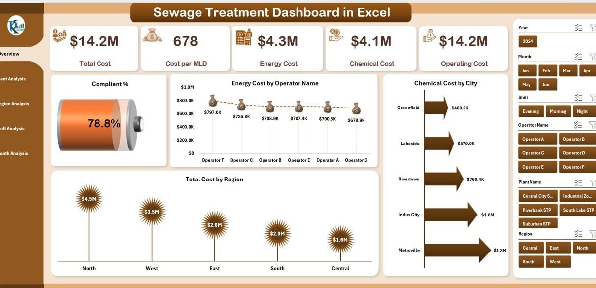
1. Overview Page: Your Complete Sewage-Operations Snapshot
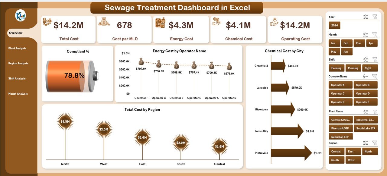
The Overview Page shows high-level KPIs in a clean and interactive layout. You get:
✔ Right-side slicer
Choose filters such as Month, Region, Operator, or Plant Type, so the whole dashboard updates instantly.
✔ KPI Cards
The page displays five KPI cards that highlight the most important numbers for the selected filters.
✔ Charts
The page includes four essential charts:
-
Compliant %
-
Energy Cost by Operator Name
-
Chemical Cost by City
-
Total Cost by Region
These visuals help teams understand the operational condition quickly. Because the insights appear instantly, leadership reacts faster to issues like high violations or rising energy costs.
2. Plant Analysis Page: Insights Across All Plants
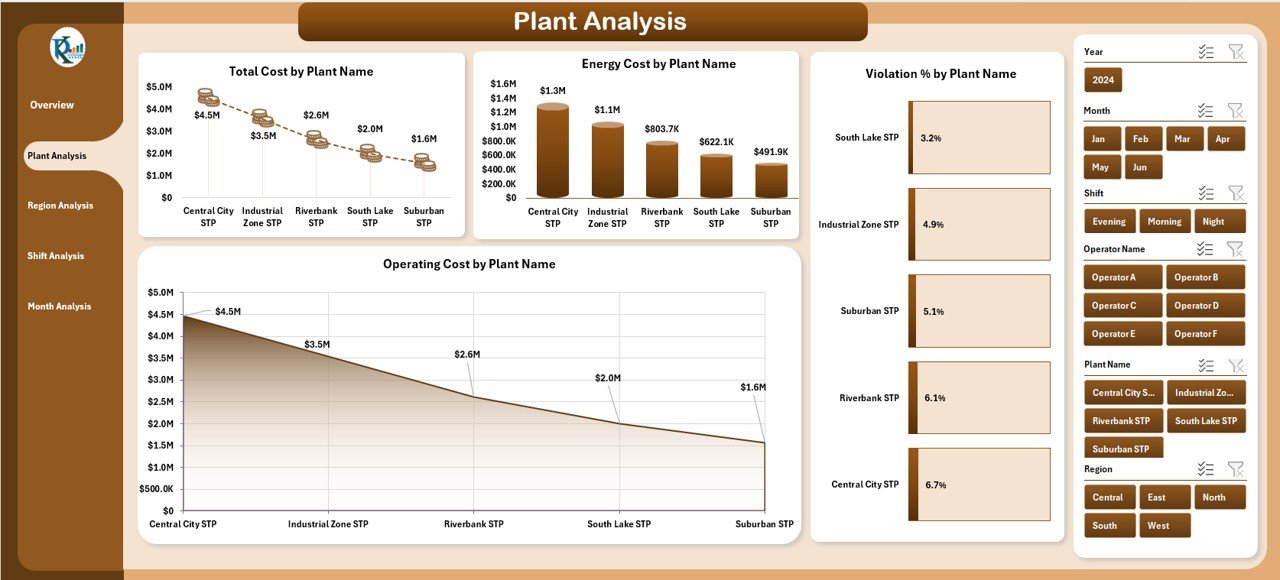
The Plant Analysis Page provides a complete view of plant-level performance. You can select a month or location from the right-side slicer and explore:
✔ Charts included:
-
Total Cost by Plant Name
-
Energy Cost by Plant Name
-
Violation % by Plant Type
-
Operating Cost by Plant Name
This page helps managers identify which plants perform well and which require immediate attention. Since the dashboard shows cost distribution clearly, teams reduce operational waste and improve plant efficiency.
3. Region Analysis Page: A Clear View of Regional Trends
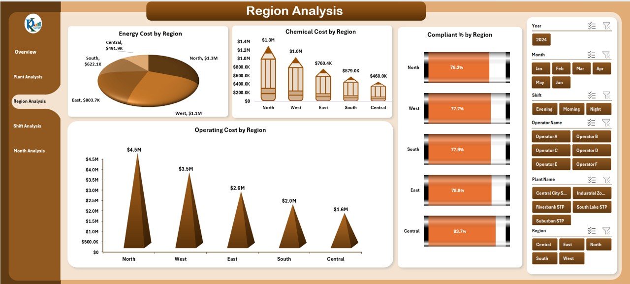
Every region works differently. Some regions maintain excellent compliance, while others face higher energy or chemical costs. This page shows all such variations clearly.
✔ Charts included:
-
Energy Cost by Region
-
Chemical Cost by Region
-
Compliant % by Region
-
Operating Cost by Region
You get full visibility into regional strengths and weaknesses, which helps leaders create better strategies for training, cost savings, and resource allocation.
Click to Purchases Sewage Treatment Dashboard in Excel
4. Shift Analysis Page: Understand Performance Across All Shifts
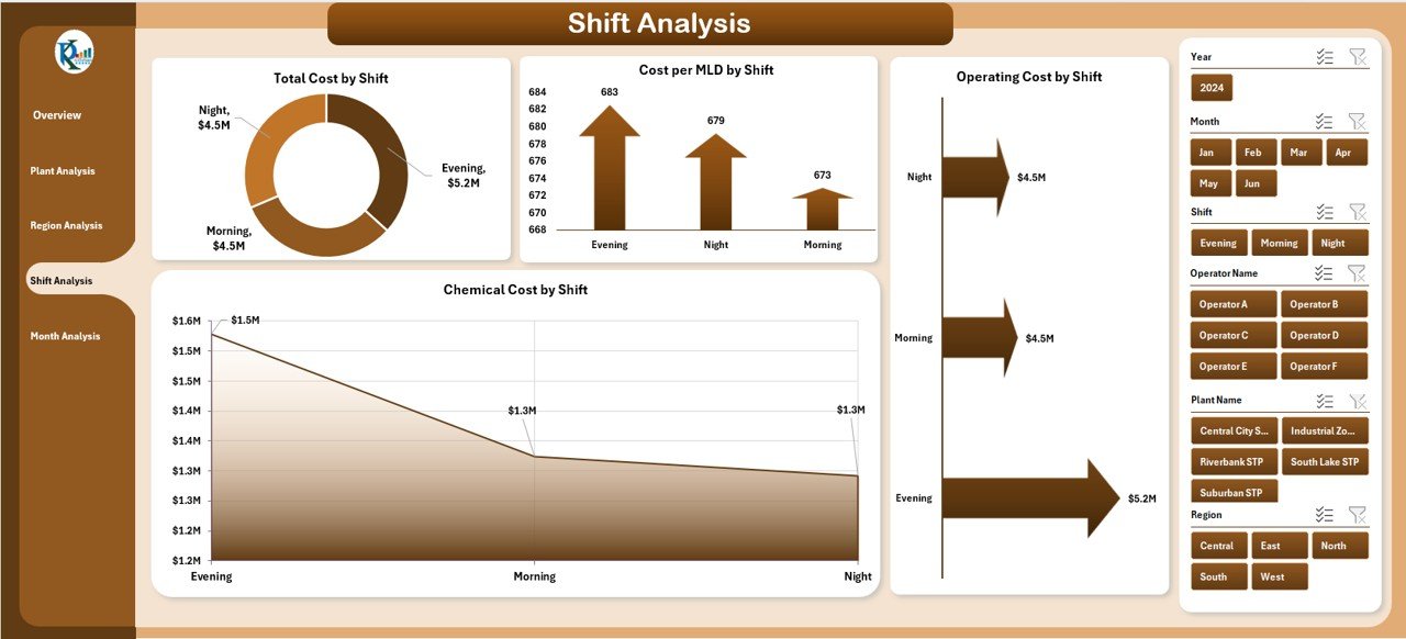
Sewage treatment plants operate 24/7. Each shift influences operating cost, chemical usage, and energy consumption. This page compares all shifts so managers improve scheduling and workforce planning.
✔ Charts included:
-
Total Cost by Shift
-
Cost Per MLD by Shift
-
Operating Cost by Shift
-
Chemical Cost by Shift
Because the dashboard shows shift-wise patterns, you find inefficiencies like high chemical usage or high energy consumption in specific time slots.
5. Month Analysis Page: Track Trends Across the Year
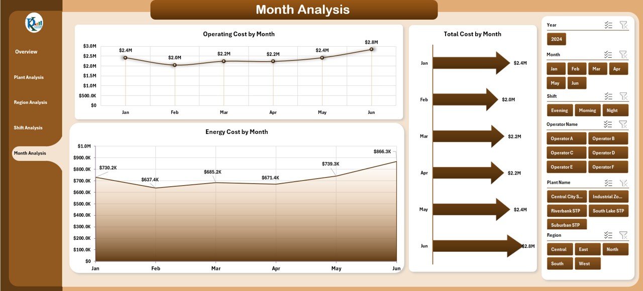
This page helps you understand how sewage-plant performance changes month by month. You can identify seasonal variations, rising costs, or improvement opportunities.
✔ Charts included:
-
Total Cost by Month
-
Operating Cost by Month
-
Energy Cost by Month
By observing monthly patterns, you plan budgets more accurately and avoid future issues.
Support Sheets
✔ Data Sheet
You update this sheet with plant information, cost values, compliance percentage, chemical usage, region details, shift data, and month-wise numbers.
Once updated, all dashboard pages refresh automatically.
Why Do You Need a Sewage Treatment Dashboard in Excel?
Sewage treatment plants generate huge volumes of data. However, raw data does not help anyone unless they understand it. A dashboard turns that data into clean visuals and meaningful insights.
Here’s why teams need this dashboard:
-
It saves time because everything appears in one place.
-
It improves decision-making because managers track the correct KPIs.
-
It reduces errors because the data flows automatically into charts.
-
It increases transparency for teams, supervisors, and leadership.
Since the dashboard uses Excel, everyone can view, edit, filter, and share it easily.
How Does the Sewage Treatment Dashboard Improve Daily Operations?
A Sewage Treatment Dashboard in Excel enhances daily operations in many ways:
✔ Tracks plant health
You monitor costs, compliance, violations, and efficiency numbers daily.
✔ Improves operator accountability
Energy and chemical cost breakdowns show which operator manages resources well.
✔ Strengthens compliance reporting
The Compliant % and Violation % charts help you take corrective action quickly.
✔ Supports budget planning
The monthly and region-wise cost charts help finance teams plan accurately.
✔ Reduces manual reporting
Since the dashboard updates automatically, teams stop wasting hours on reports.
Because of these benefits, many organizations prefer Excel dashboards for operational performance management.
Advantages of Using a Sewage Treatment Dashboard in Excel
A Sewage Treatment Dashboard provides many advantages that improve efficiency and transparency. Let’s look at the key ones:
1. Real-Time Tracking of KPIs
The dashboard updates instantly when you change filters or modify data. Therefore, managers always view the latest numbers.
2. Easy to Use for All Teams
Excel is simple and familiar. Operators, supervisors, and administrators use the dashboard without training.
3. Better Decision-Making
Charts display clear trends. Because of this, teams identify inefficiencies quickly.
4. Full Visibility Across Plants, Regions, and Shifts
Managers compare plant-wise, shift-wise, and region-wise performance in seconds.
5. Cost Optimization
The dashboard highlights high-cost plants, expensive shifts, or unusual chemical usage. Therefore, you reduce financial waste.
6. Improved Compliance and Safety
Compliance charts help teams take action before violations increase.
7. No Coding or Technical Knowledge Required
Everything works inside Excel. Users do not need Power BI, SQL, or advanced programming skills.
Best Practices for Using the Sewage Treatment Dashboard in Excel
Following the right practices makes your dashboard more powerful and reliable. Here are the best recommendations:
1. Update the Data Sheet Frequently
Enter fresh cost, compliance, shift, plant, and month-wise data regularly. This ensures that every page shows the latest insights.
2. Maintain Clean and Consistent Data
Use consistent units, names, and formats across all records. Clean data improves dashboard accuracy.
3. Review KPI Cards Daily
The KPI cards highlight important trends. Use them for fast decision-making.
4. Compare Regions, Plants, and Shifts Often
Frequent comparison helps you identify improvement opportunities.
5. Set Clear Targets for Every KPI
Define strong targets for cost, compliance, and violations. Then use the dashboard to track your progress.
6. Use Filters to Explore More Insights
Right-side slicers help you zoom into specific months, plants, and regions. Use them to find root causes.
7. Share the Dashboard with Leadership
When leadership sees clear visuals, they support your improvements quickly.
Common Mistakes to Avoid While Using Sewage Treatment Dashboards
Click to Purchases Sewage Treatment Dashboard in Excel
Avoid these mistakes to get the best results:
-
Do not use outdated data.
-
Do not skip shift-wise analysis.
-
Do not ignore the violation trends.
-
Do not use inconsistent plant or region names.
-
Do not overload the data sheet with unnecessary fields.
When teams avoid these issues, the dashboard becomes a reliable decision-making tool.
Conclusion
A Sewage Treatment Dashboard in Excel helps teams monitor costs, compliance, energy usage, chemical consumption, regional variations, plant performance, and shift trends in one place. It simplifies reporting, improves planning, and strengthens operational decisions. Because the dashboard uses Excel, everyone uses it with ease.
This dashboard transforms the way sewage treatment plants manage their operations. With fast filters, clean visuals, smart KPIs, and structured analysis pages, any organization achieves higher efficiency and better compliance.
You can use this system to bring clarity, reduce cost, and boost performance across all sewage-treatment operations.
Frequently Asked Questions (FAQs)
1. What is a Sewage Treatment Dashboard in Excel?
It is a ready-to-use reporting system that tracks KPIs such as costs, compliance, energy usage, and plant performance using interactive charts and slicers.
2. Who can use this dashboard?
Operators, plant managers, supervisors, finance teams, environmental officers, and leadership teams use this dashboard for monitoring sewage operations.
3. Do I need technical knowledge to use it?
No. The dashboard runs inside Excel, so anyone familiar with spreadsheets uses it easily.
4. How often should I update the data sheet?
You should update it daily or monthly based on your reporting needs. Frequent updates ensure accurate insights.
5. Can I add more KPIs to the dashboard?
Yes, you can expand the data sheet and charts if your reporting needs grow.
6. Why is a dashboard better than manual reporting?
Manual reports take time and often contain errors. A dashboard updates automatically and shows instant visual insights.
7. Does the dashboard compare plants and regions?
Yes, it includes plant-wise, region-wise, shift-wise, and month-wise comparison charts.
Visit our YouTube channel to learn step-by-step video tutorials
Click to Purchases Sewage Treatment Dashboard in Excel