Delivering an excellent customer experience no longer depends on guesswork. Instead, businesses must track customer interactions, measure service quality, and analyze behavior patterns in real time. Therefore, organizations across industries now rely on analytics dashboards to stay customer-centric and competitive.
That is exactly where a Customer Experience Dashboard in Power BI becomes a powerful solution.
This detailed guide explains what a Customer Experience Dashboard in Power BI is, why businesses need it, how it works, and how each dashboard page supports smarter decisions. Moreover, this article covers advantages, best practices, practical use cases, and frequently asked questions—all written in simple, clear, and actionable language.
Click to Purchases Customer Experience Dashboard in Power BI
What Is a Customer Experience Dashboard in Power BI?
A Customer Experience Dashboard in Power BI is an interactive data visualization solution designed to track, monitor, and analyze customer satisfaction, service quality, complaint trends, and churn risks.
Instead of relying on disconnected Excel reports or manual reviews, this dashboard converts customer support, service, and feedback data into clear visuals, performance indicators, and trends. As a result, teams understand customer pain points faster and act on them with confidence.
Most importantly, Power BI enables businesses to:
-
Centralize customer experience data
-
Identify service gaps quickly
-
Monitor team performance in real time
-
Improve retention and loyalty consistently
Why Is Customer Experience Tracking So Important Today?
Customer expectations evolve faster than ever. Because of that, businesses must act proactively instead of reacting after customers leave.
Key reasons why customer experience tracking matters:
-
Customers expect fast responses and accurate resolutions
-
Even one poor interaction can increase churn risk
-
Loyal customers generate higher lifetime value
-
Service quality directly impacts brand reputation
-
Data-driven experience improvements deliver measurable ROI
Therefore, a structured Customer Experience Dashboard in Power BI helps organizations measure what truly matters and fix issues before they escalate.
How Does a Customer Experience Dashboard in Power BI Work?
A Customer Experience Dashboard works by connecting structured Excel or database files with Power BI. After that, Power BI processes the data and displays it through tables, cards, slicers, and charts.
Typical data sources include:
-
Customer support ticket systems
-
CRM platforms
-
Feedback surveys and CSAT forms
-
Complaint tracking logs
-
Call center and chat response data
Because Power BI supports interactive filtering, users can drill down by region, product category, issue type, channel, time period, or customer segment easily.
What Are the Key Pages in a Customer Experience Dashboard in Power BI?
This dashboard includes five well-structured pages, each designed to answer specific business questions. Let us explore each page in detail.
1. What Does the Overview Page Show in a Customer Experience Dashboard?
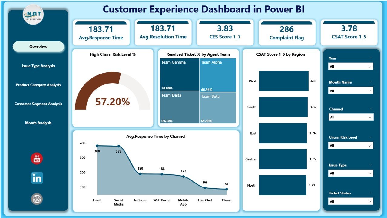
The Overview Page acts as the control center of the entire dashboard. From the very first glance, decision-makers can assess service performance and customer sentiment.
Key elements on the Overview Page:
Slicers
-
Enable filtering by time period, region, channel, or team
-
Allow instant comparison across customer groups
KPI Cards
-
High Churn Risk Level %
-
Resolved Ticket %
-
Average CSAT Score
-
Average Response Time
Charts
-
High Churn Risk Level %
-
Resolved Ticket % by Agent Team
-
CSAT Score by Region
-
Average Response Time by Channel
Because this page provides a summary view, leaders can identify issues quickly and focus on problem areas immediately.
Click to Purchases Customer Experience Dashboard in Power BI
2. How Does Issue Type Analysis Help Improve Customer Experience?
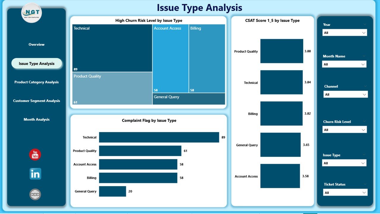
The Issue Type Analysis Page dives deeper into the reasons behind customer dissatisfaction and service delays.
Key insights provided by this page:
-
Which issue types create higher churn risks
-
How CSAT scores change by issue category
-
Which issues trigger more customer complaints
Main charts included:
-
High Churn Risk Level % by Issue Type
-
CSAT Score by Issue Type
-
Complaint Flag by Issue Type
Therefore, service managers can redesign processes, improve knowledge bases, and train teams based on real customer problems.
3. Why Is Product Category Analysis Critical in Customer Experience?
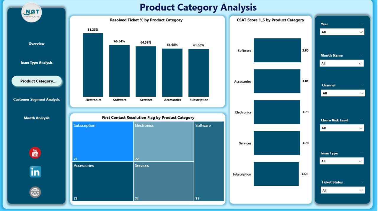
Not all products deliver the same customer experience. Hence, the Product Category Analysis Page highlights how different product lines perform from a service perspective.
This page answers questions such as:
-
Which product categories achieve faster resolutions?
-
Where do customers face more friction?
-
Which products require better support guidelines?
Key charts on this page:
-
Resolved Ticket % by Product Category
-
CSAT Score by Product Category
-
First Contact Resolution Flag by Product Category
Because first-contact resolution strongly correlates with satisfaction, this page helps product and support teams align their strategies.
4. How Does Customer Segment Analysis Improve Personalization?
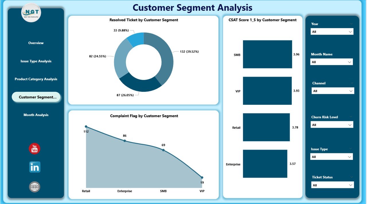
Different customer segments expect different service levels. Therefore, one-size-fits-all strategies rarely work.
The Customer Segment Analysis Page allows teams to analyze service performance by customer type.
Common customer segments include:
-
New customers
-
Repeat customers
-
High-value customers
-
Enterprise clients
Charts available:
-
Resolved Ticket % by Customer Segment
-
CSAT Score by Customer Segment
-
Complaint Flag by Customer Segment
As a result, organizations can prioritize premium segments and design personalized service models.
5. Why Should You Monitor Monthly Trends in Customer Experience?
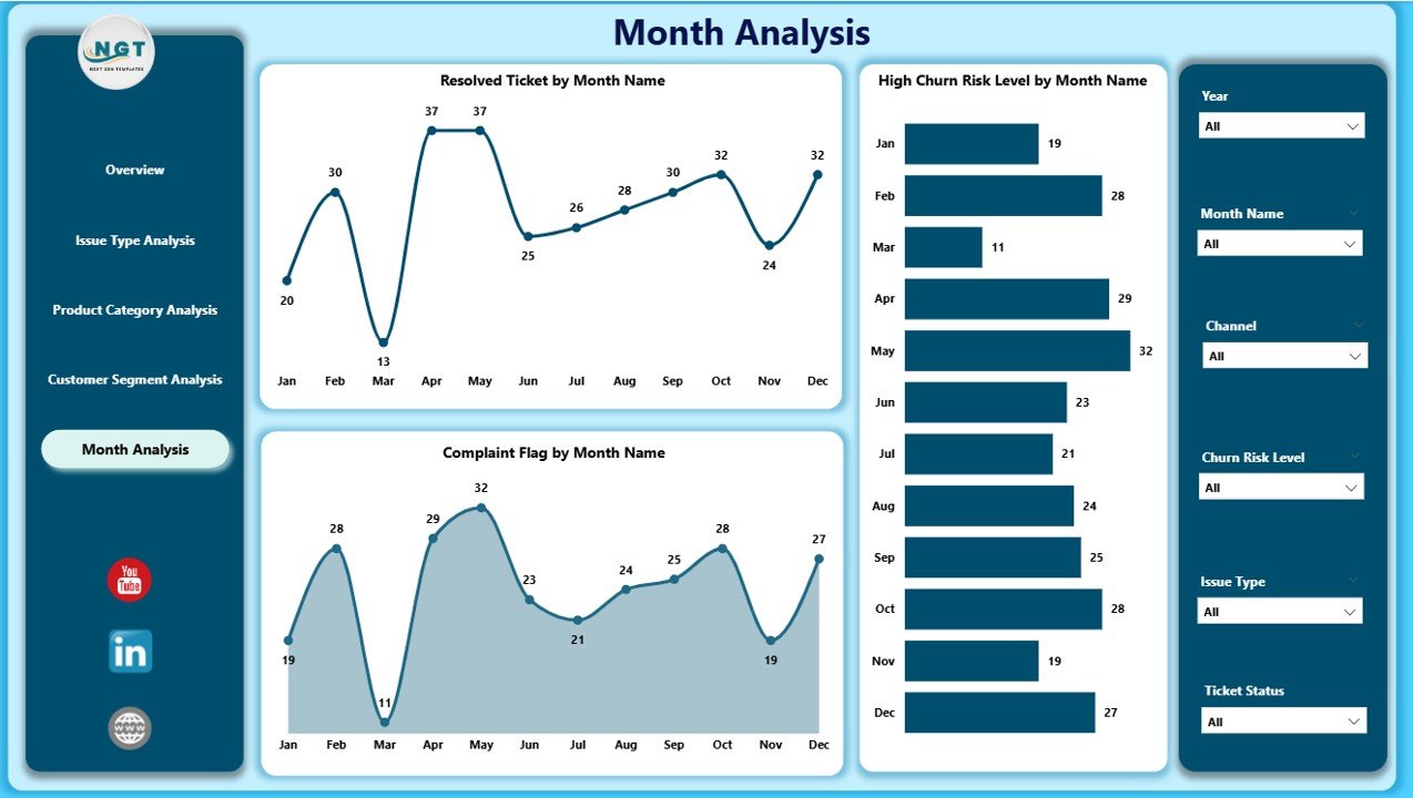
Trends provide context. While daily metrics show performance, monthly trends reveal patterns that guide strategy.
The Monthly Trends Page highlights service performance changes over time.
Key charts included:
-
Resolved Tickets by Month
-
High Churn Risk Level by Month
-
Complaint Flag by Month
Because patterns often repeat, this page empowers businesses to forecast risks and allocate resources effectively.
Click to Purchases Customer Experience Dashboard in Power BI
What KPIs Does a Customer Experience Dashboard in Power BI Track?
A well-designed dashboard tracks multiple KPIs that together define customer experience.
Core KPIs include:
-
Customer Satisfaction Score (CSAT)
-
Ticket Resolution Rate
-
High Churn Risk Percentage
-
Average Response Time
-
First Contact Resolution Rate
-
Complaint Rate
By tracking these KPIs together, businesses gain a complete view instead of isolated metrics.
Advantages of Customer Experience Dashboard in Power BI
✅ Centralized Customer Insights
Power BI brings all customer experience metrics into one interactive dashboard, which saves time and eliminates confusion.
✅ Faster Decision-Making
Since data refreshes dynamically, managers act immediately instead of waiting for reports.
✅ Improved Customer Retention
By identifying churn risks early, businesses take corrective actions before customers disengage.
✅ Better Team Performance Visibility
The dashboard clearly shows agent, region, and segment-level performance, which supports fair evaluations.
✅ Scalable and Customizable
Power BI dashboards adapt easily as data volume and business needs grow.
How Can Different Teams Use This Dashboard?
Customer Support Teams
-
Track agent productivity
-
Improve resolution quality
-
Reduce response times
Operations Managers
-
Identify bottlenecks
-
Optimize workflows
-
Improve service SLAs
Customer Experience Leaders
-
Monitor satisfaction trends
-
Reduce complaints
-
Increase loyalty
Senior Management
-
Get high-level performance visibility
-
Align strategy with customer needs
-
Improve overall brand perception
Best Practices for the Customer Experience Dashboard in Power BI
✔ Define Clear KPIs
Always align KPIs with customer satisfaction and retention goals.
✔ Keep Data Clean
Accurate dashboards require clean and consistent input data.
✔ Use Meaningful Slicers
Design slicers that support real business questions instead of unnecessary filters.
✔ Monitor Trends Regularly
Review monthly and quarterly trends to identify recurring issues.
✔ Align Teams With Insights
Share dashboard access across departments to promote collaboration.
✔ Continuously Improve Metrics
Refine KPIs as customer expectations evolve.
What Are Common Challenges While Building Customer Experience Dashboards?
Data Silos
Disconnected systems limit visibility. Therefore, data integration remains critical.
Inconsistent Metrics
Different teams often define KPIs differently. Standardization fixes this issue.
Overloaded Dashboards
Too many visuals distract users. Always focus on clarity and relevance.
How Does Power BI Improve Customer Experience Strategy?
Power BI does more than show numbers. It tells a customer story.
Because of interactive visuals, drill-downs, and real-time updates, Power BI helps organizations:
-
Act faster
-
Listen better to customers
-
Improve retention consistently
Therefore, Power BI turns customer experience from a reactive task into a proactive strategy.
Conclusion: Why Should You Use a Customer Experience Dashboard in Power BI?
A Customer Experience Dashboard in Power BI empowers organizations to understand customers, measure satisfaction, and improve service quality consistently.
Instead of relying on assumptions, teams gain clarity through real data. Moreover, the dashboard transforms complex customer interactions into actionable insights that support growth, loyalty, and operational excellence.
If your business values customers—and every successful business does—then this dashboard becomes a must-have analytics tool.
Frequently Asked Questions (FAQs)
1. What industries can use a Customer Experience Dashboard in Power BI?
Almost every industry can use it, including retail, telecom, healthcare, banking, SaaS, and e-commerce.
2. Does this dashboard require technical expertise?
No. Power BI offers an intuitive interface, and users can interact with slicers and charts easily.
3. Can this dashboard work with Excel data?
Yes. Power BI integrates smoothly with structured Excel files.
4. How often does the dashboard update?
The dashboard updates automatically based on the data refresh schedule.
5. Can I customize KPIs and visuals?
Yes. Power BI supports full customization to match business needs.
6. Does this dashboard help reduce customer churn?
Yes. By tracking churn risk indicators, businesses act proactively to retain customers.
Visit our YouTube channel to learn step-by-step video tutorials