Research and development (R&D) institutes play a critical role in innovation, scientific growth, and technological advancement. However, managing multiple projects, departments, research domains, and funding sources becomes challenging without a structured reporting system. Therefore, organizations need a clear, visual, and data-driven approach to track performance and spending.
This is where the Research & Development Institutes Dashboard in Excel becomes extremely valuable. This ready-to-use Excel dashboard helps R&D leaders, project managers, and finance teams monitor performance, control budgets, and improve decision-making with clarity and speed.
In this detailed article, you will learn what this dashboard is, why it matters, how each page works, its advantages, best practices, and answers to frequently asked questions.
Click to Purchases Research & Development Institutes Dashboard in Excel
What Is a Research & Development Institutes Dashboard in Excel?
A Research & Development Institutes Dashboard in Excel is a centralized reporting and analytics tool designed to track and visualize key R&D performance indicators. It converts raw project and financial data into interactive charts, KPI cards, and analytical views.
Instead of reviewing multiple spreadsheets, emails, and static reports, this dashboard brings everything into one structured Excel file. As a result, decision-makers can understand project status, budget utilization, variances, and research impact within minutes.
Moreover, since the dashboard works entirely in Microsoft Excel, it requires no additional software, making it accessible, flexible, and cost-effective.
Why Do Research & Development Institutes Need a Dashboard?
R&D institutes manage complex operations every day. They run multiple projects, collaborate with external partners, and track funding from various sources. However, manual tracking often causes delays and errors.
Here is why an Excel dashboard becomes essential:
-
It provides real-time visibility into project performance
-
It simplifies budget vs actual spend analysis
-
It highlights delays, variances, and risks early
-
It improves transparency across departments and domains
-
It supports data-driven strategic planning
Therefore, with the Research & Development Institutes Dashboard in Excel, organizations move from reactive reporting to proactive management.
Overview of the Research & Development Institutes Dashboard in Excel
This ready-to-use dashboard comes with a clean layout, structured navigation, and five analytical pages. Each page focuses on a specific performance area, ensuring clarity and focus.
Key Design Highlights
-
Page Navigator on the Left Side for smooth navigation
-
Right-Side Slicers for dynamic filtering
-
KPI Cards for quick performance snapshots
-
Interactive Charts for deep analysis
-
Structured Data Sheet for easy updates
Now, let us explore each page in detail.
Click to Purchases Research & Development Institutes Dashboard in Excel
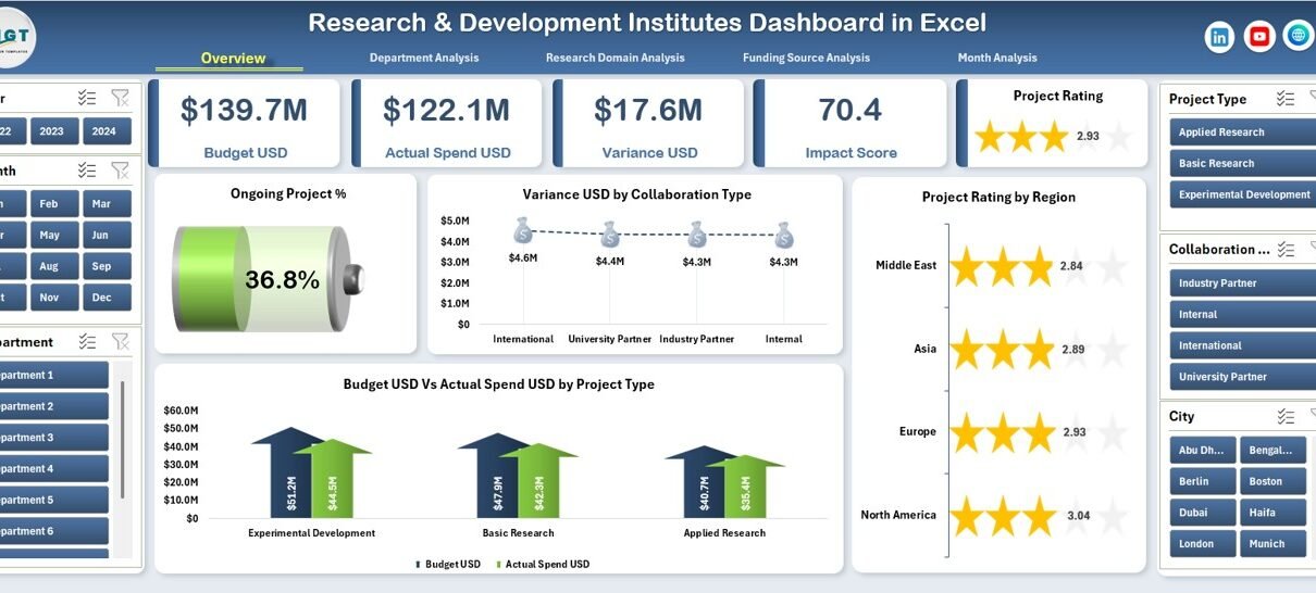
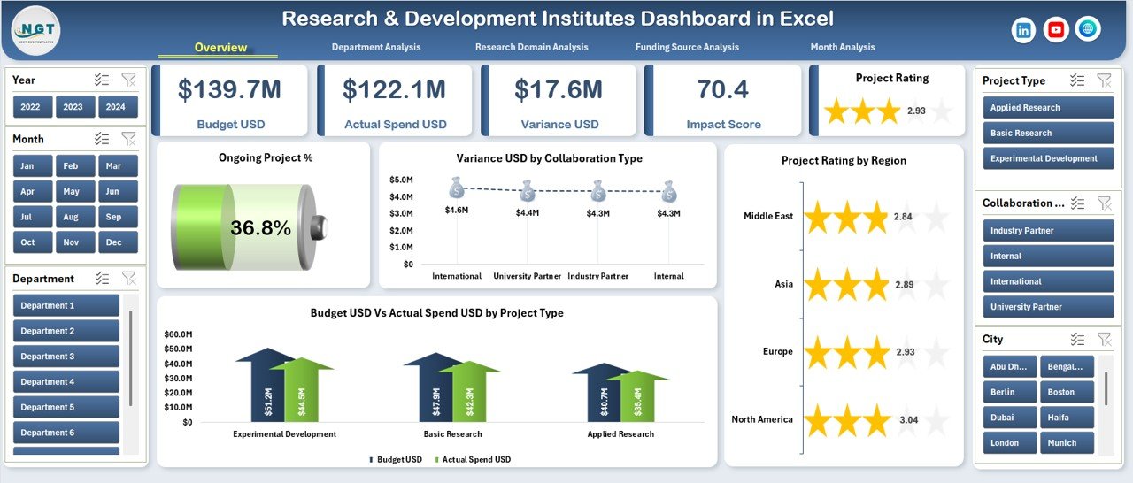
How Does the Overview Page Help R&D Leaders?
The Overview Page acts as the command center of the dashboard. It provides a high-level summary of R&D performance in one glance.
Key Elements of the Overview Page
1. Right-Side Slicers
These slicers allow users to filter data by relevant dimensions such as department, project type, funding source, or time period. As a result, analysis becomes faster and more focused.
2. KPI Cards (5 Cards)
The cards display critical metrics, such as:
-
Total number of projects
-
Ongoing project percentage
-
Budget utilization
-
Variance amounts
-
Overall project performance indicators
3. Key Charts on the Overview Page
-
Ongoing Project %
This chart shows the proportion of ongoing projects, helping management track workload and progress. -
Variance USD by Collaborating Type
This visualization highlights cost variances across different collaboration types, such as internal, academic, or industry partnerships. -
Project Rating by Region
This chart compares project performance across regions, enabling geographic performance assessment. -
Budget USD vs Actual Spend USD by Project Type
This comparison helps identify overspending or underutilization across different project categories.
Together, these insights help leaders take quick, informed actions.
What Insights Does the Department Analysis Page Provide?
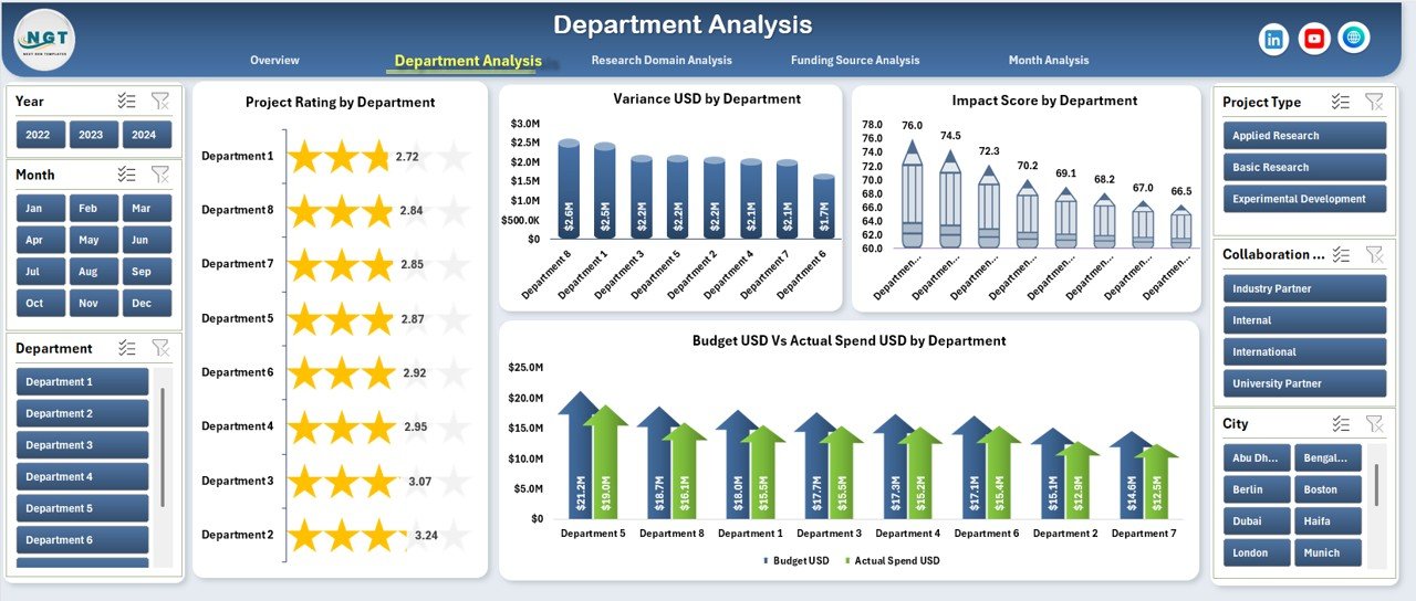
The Department Analysis Page focuses on performance across different departments within the R&D institute.
Key Features of the Department Analysis Page
-
Right-Side Slicers for dynamic filtering
-
Four Analytical Charts for department-level insights
Charts Included
-
Project Rating by Department
This chart shows how each department performs based on defined rating criteria. -
Variance USD by Department
This visualization identifies departments with budget overruns or savings. -
Impact Score by Department
This chart measures the research impact, allowing leadership to understand which departments deliver the highest value. -
Budget USD vs Actual Spend USD by Department
This comparison ensures financial discipline and accountability at the department level.
As a result, department heads can improve planning, prioritize resources, and optimize performance.
How Does the Research Domain Analysis Improve Strategic Planning?
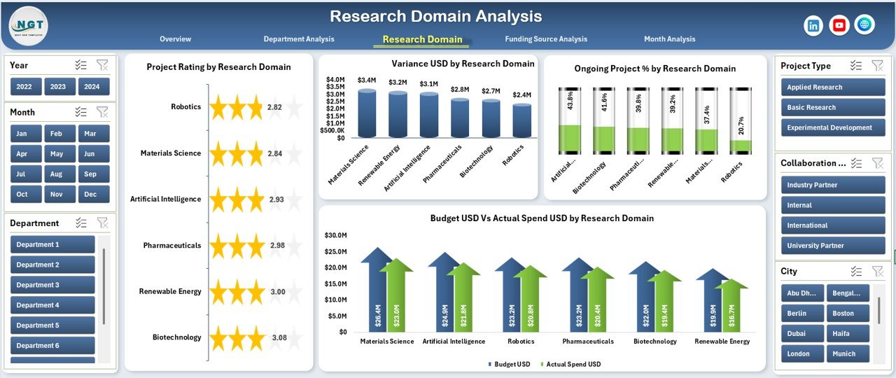
The Research Domain Analysis Page provides insights across various research areas, such as biotechnology, AI, renewable energy, or materials science.
Key Highlights
-
Right-Side Slicers for easy filtering
-
Four Domain-Focused Charts
Charts Included
-
Project Rating by Research Domain
This chart compares performance across research domains. -
Variance USD by Research Domain
This visualization highlights cost deviations by domain. -
Ongoing Project % by Research Domain
This chart shows workload distribution across domains. -
Budget USD vs Actual Spend USD by Research Domain
This comparison supports better investment decisions.
Therefore, this page helps leadership align funding and strategy with high-impact research areas.
Click to Purchases Research & Development Institutes Dashboard in Excel
Why Is Funding Source Analysis Critical for R&D Institutes?
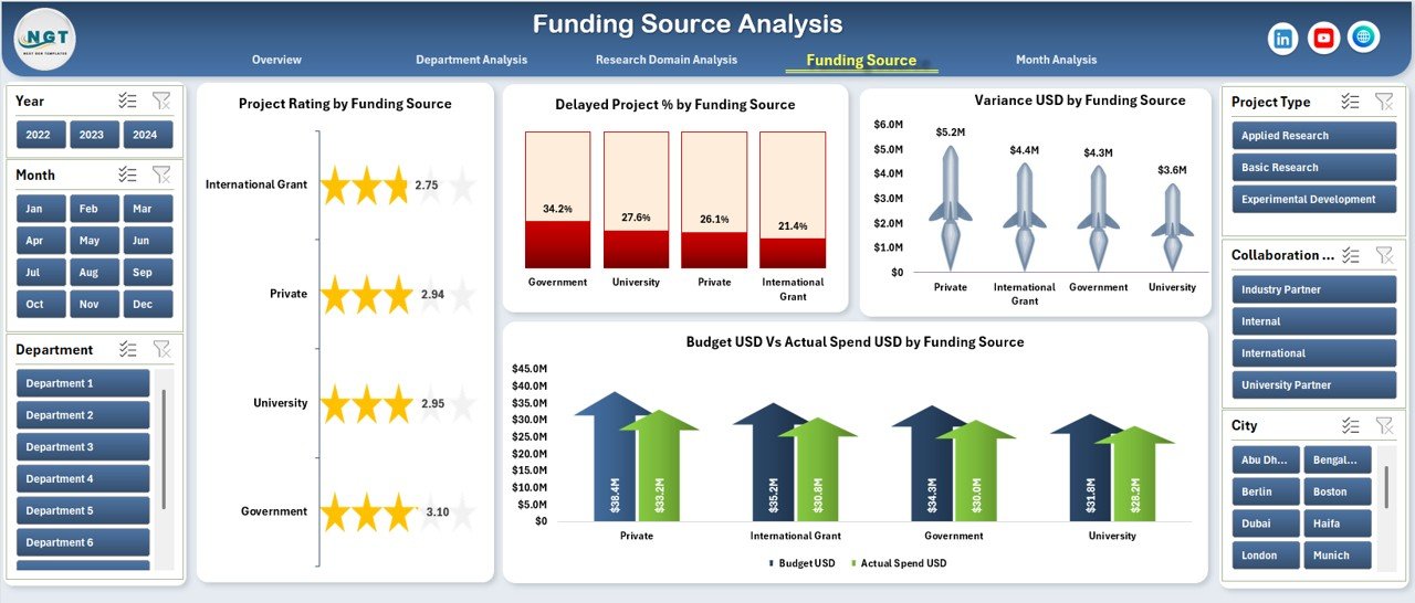
Funding often comes from multiple sources, such as government grants, private investors, universities, or internal budgets. The Funding Source Analysis Page ensures complete transparency across all funding channels.
Key Features
-
Right-Side Slicers for filtering
-
Four Financial and Performance Charts
Charts Included
-
Project Rating by Funding Source
This chart shows how projects perform under different funding sources. -
Variance USD by Funding Source
This visualization identifies funding sources with frequent cost deviations. -
Delayed Project % by Funding Source
This chart highlights delays linked to specific funding streams. -
Budget USD vs Actual Spend USD by Funding Source
This comparison ensures compliance with funding guidelines.
As a result, institutes improve trust, accountability, and financial governance.
How Does the Month Analysis Page Support Trend Tracking?
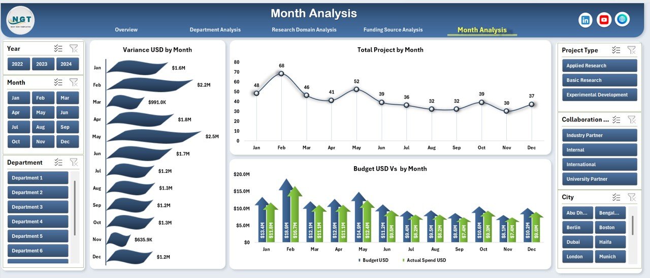
The Month Analysis Page focuses on time-based performance trends.
Key Insights from Month Analysis
-
Right-Side Slicers for time filtering
-
Three Monthly Trend Charts
Charts Included
-
Variance USD by Month
This chart highlights seasonal or recurring budget issues. -
Total Projects by Month
This visualization tracks project activity levels over time. -
Budget USD vs Actual Spend USD by Month
This comparison supports monthly financial reviews.
Consequently, management can forecast future performance more accurately.
What Role Do the Support and Data Sheets Play?
Behind every strong dashboard lies a structured data foundation.
Data Sheet
-
Stores raw project, budget, and performance data
-
Allows easy updates without breaking formulas
-
Supports pivot tables and charts
Support Sheet
-
Contains reference tables, mappings, or helper calculations
-
Improves dashboard stability and scalability
Together, these sheets ensure accuracy, flexibility, and long-term usability.
Advantages of the Research & Development Institutes Dashboard in Excel
Using this dashboard delivers multiple operational and strategic benefits.
-
✅ Centralized performance tracking
-
✅ Faster decision-making
-
✅ Improved budget control
-
✅ Clear visibility across departments and domains
-
✅ Easy customization in Excel
-
✅ No additional software required
Therefore, institutes gain both efficiency and clarity.
Best Practices for the Research & Development Institutes Dashboard in Excel
To get maximum value, follow these best practices:
-
Keep the data sheet clean and structured
-
Update data on a regular schedule
-
Use consistent definitions for KPIs
-
Avoid manual chart edits
-
Validate budget and spend figures monthly
-
Train stakeholders on slicer usage
By following these steps, you ensure accuracy and reliability.
Common Challenges and How to Overcome Them
Even the best dashboards face challenges.
Challenge 1: Inconsistent Data Entry
Solution: Use standardized templates and data validation.
Challenge 2: Overloaded Charts
Solution: Focus on key KPIs and remove clutter.
Challenge 3: Delayed Updates
Solution: Assign clear data ownership and timelines.
With proper discipline, these challenges become manageable.
Conclusion: Why Should You Use a Research & Development Institutes Dashboard in Excel?
The Research & Development Institutes Dashboard in Excel transforms complex R&D data into meaningful insights. It improves visibility, strengthens budget control, and supports smarter decisions.
Since it works entirely in Excel, teams adopt it quickly without training barriers. Moreover, its structured design supports long-term scalability.
If your institute wants clarity, control, and confidence in decision-making, this dashboard delivers exactly that.
Frequently Asked Questions (FAQs)
What is the main purpose of a Research & Development Institutes Dashboard in Excel?
The dashboard helps track project performance, budgets, variances, and research impact in one centralized view.
Who should use this dashboard?
R&D directors, project managers, finance teams, and research coordinators benefit the most.
Can I customize the dashboard?
Yes, you can easily customize KPIs, charts, and slicers in Excel.
Does this dashboard require Power BI?
No, it works completely in Microsoft Excel.
How often should data be updated?
You should update data monthly or weekly, depending on reporting needs.
Is this dashboard suitable for large institutes?
Yes, it scales well for both small research teams and large institutions.
Visit our YouTube channel to learn step-by-step video tutorials