A Volunteer Program KPI Dashboard in Power BI is a ready-to-use analytical dashboard designed to track, monitor, and analyze volunteer program performance using key performance indicators (KPIs). It visually presents volunteer metrics such as participation levels, performance against targets, monthly and yearly trends, and year-over-year comparisons.
Instead of reviewing raw data tables or lengthy reports, this dashboard converts volunteer data into interactive charts, KPI cards, slicers, and trend visuals. As a result, program managers gain instant insights into what works well and where improvement is required.
Most importantly, the dashboard uses Excel as a data source, which makes it flexible, easy to update, and suitable for organizations of all sizes.
Click to Purchases Volunteer Program KPI Dashboard in Power BI
Why Do Volunteer Programs Need a KPI Dashboard?
Volunteer programs often involve multiple teams, locations, activities, and time periods. Without proper monitoring, organizations struggle to measure outcomes and optimize volunteer efforts.
A Volunteer Program KPI Dashboard in Power BI solves these challenges effectively.
Key Reasons Why This Dashboard Is Important
-
It provides a centralized view of all volunteer KPIs.
-
It helps track targets versus actual performance.
-
It highlights month-to-date (MTD) and year-to-date (YTD) results.
-
It enables year-over-year comparisons.
-
It supports data-driven decision-making.
-
It improves transparency and accountability.
Therefore, organizations can confidently evaluate volunteer engagement, improve planning, and demonstrate impact to stakeholders.
How Does the Volunteer Program KPI Dashboard in Power BI Work?

The Volunteer Program KPI Dashboard works using a simple and structured data flow.
First, users enter actual and target data in an Excel file. Then, Power BI connects to this Excel file and transforms the data into interactive visuals. Finally, decision-makers use slicers and drill-through options to analyze performance in detail.
Data Flow Overview
-
Excel Data Input
-
Actual KPI data
-
Target KPI data
-
KPI definitions and formulas
-
-
Power BI Data Model
-
Relationships between tables
-
Time-based calculations (MTD, YTD)
-
Comparison measures
-
-
Interactive Dashboard
-
KPI cards
-
Tables with icons
-
Trend charts
-
Drill-through pages
-
As a result, the entire reporting process becomes faster, cleaner, and more reliable.
Key Features of the Volunteer Program KPI Dashboard in Power BI
Click to Purchases Volunteer Program KPI Dashboard in Power BI
This dashboard includes multiple thoughtfully designed features that support deep analysis and quick insights.
📌 Ready-to-Use Dashboard Structure
-
No complex setup required
-
Easy Excel data entry
-
Pre-built Power BI visuals
📊 Interactive KPI Monitoring
-
MTD and YTD tracking
-
Target vs Actual analysis
-
Previous year comparisons
🎯 Visual Performance Indicators
-
Green and red icons
-
Percentage variance indicators
-
Clear success or risk signals
🔍 Advanced Filtering Options
-
Month slicer
-
KPI Group slicer
-
KPI Name slicer
📈 Trend Analysis
-
Monthly and yearly trend visuals
-
Comparison across periods
Dashboard Pages Explained in Detail
The Volunteer Program KPI Dashboard in Power BI consists of three structured pages, each serving a specific purpose.
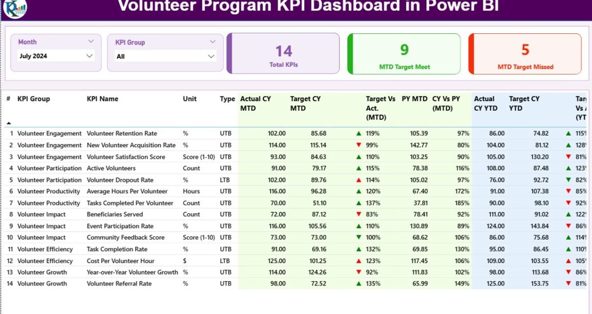
What Is the Summary Page and How Does It Help?
The Summary Page acts as the main landing page of the dashboard. It provides a consolidated overview of all volunteer KPIs in one place.
Key Elements of the Summary Page
🔹 Top Slicers
-
Month Slicer: Allows users to select a specific month.
-
KPI Group Slicer: Filters KPIs by category.
🔹 KPI Cards
-
Total KPIs Count
-
MTD Target Met Count
-
MTD Target Missed Count
These cards instantly show how many KPIs perform well and how many need attention.
🔹 Detailed KPI Table
The table displays comprehensive KPI information, including:
-
KPI Number – Unique sequence number
-
KPI Group – Category of the KPI
-
KPI Name – Name of the performance metric
-
Unit – Measurement unit
-
Type – UTB (Upper the Better) or LTB (Lower the Better)
-
Actual CY MTD – Current Year Month-to-Date actual value
-
Target CY MTD – Current Year Month-to-Date target
-
MTD Icon – Green ▲ or Red ▼ performance indicator
-
Target vs Actual (MTD) – Actual ÷ Target
-
PY MTD – Previous Year MTD value
-
CY vs PY (MTD) – Current Year vs Previous Year MTD comparison
-
Actual CY YTD – Current Year Year-to-Date actual
-
Target CY YTD – Current Year Year-to-Date target
-
YTD Icon – Performance indicator for YTD
-
Target vs Actual (YTD) – Actual ÷ Target
-
PY YTD – Previous Year YTD value
-
CY vs PY (YTD) – Year-over-Year comparison
As a result, users can evaluate performance from multiple angles without switching pages.
What Is the KPI Trend Page Used For?

The KPI Trend Page focuses on performance trends over time.
Key Features of the KPI Trend Page
-
Two combo charts:
-
MTD Actual vs Target vs Previous Year
-
YTD Actual vs Target vs Previous Year
-
-
A KPI Name slicer on the left
This design allows users to select a KPI and immediately view its historical performance. Therefore, trends, seasonality, and performance gaps become easy to identify.
Click to Purchases Volunteer Program KPI Dashboard in Power BI
Why Is the KPI Definition Page Important?
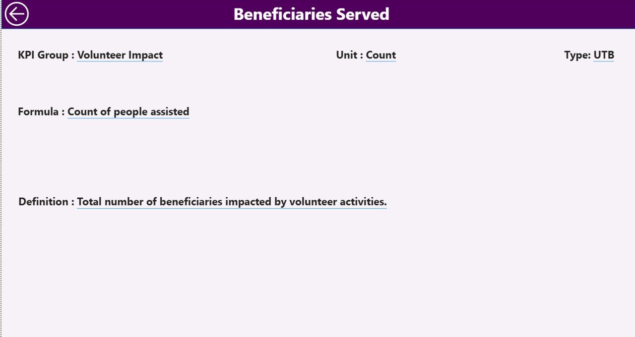
The KPI Definition Page acts as a drill-through page that explains each KPI in detail.
What Information Does This Page Show?
-
KPI Formula
-
KPI Definition
-
KPI Unit
-
KPI Type (LTB or UTB)
Users can drill through from the Summary Page to understand how a KPI is calculated and what it represents. After reviewing details, users can easily return using the back button.
Excel Data Structure Explained
The dashboard uses Excel as the data source, which makes it flexible and user-friendly.
📁 Input_Actual Sheet
This sheet captures actual performance data.
Required Columns:
-
KPI Name
-
Month (First date of the month)
-
MTD Value
-
YTD Value
📁 Input_Target Sheet
This sheet stores target values.
Required Columns:
-
KPI Name
-
Month (First date of the month)
-
MTD Target
-
YTD Target
📁 KPI Definition Sheet
This sheet defines KPIs.
Required Columns:
-
KPI Number
-
KPI Group
-
KPI Name
-
Unit
-
Formula
-
Definition
-
Type (LTB or UTB)
Because of this clear structure, users can maintain data accuracy and consistency easily.
Advantages of Volunteer Program KPI Dashboard in Power BI
Using a Volunteer Program KPI Dashboard in Power BI offers multiple benefits.
✅ Centralized Performance Tracking
All KPIs remain available in one dashboard, which reduces reporting effort.
✅ Improved Decision-Making
Clear visuals and comparisons support faster and better decisions.
✅ Time Savings
Automated calculations eliminate manual reporting tasks.
✅ Transparency and Accountability
Stakeholders clearly see performance results and trends.
✅ Scalability
The dashboard grows with the organization as more KPIs get added.
Who Can Benefit from This Dashboard?
This dashboard suits a wide range of organizations and roles.
-
Non-profit organizations
-
NGOs and community groups
-
Volunteer coordinators
-
Program managers
-
Impact assessment teams
-
Donor reporting teams
-
CSR departments
Each user gains tailored insights based on their responsibilities.
Best Practices for the Volunteer Program KPI Dashboard in Power BI
Following best practices ensures accurate insights and long-term value.
📌 Maintain Clean Data
-
Use consistent KPI names
-
Avoid duplicate records
-
Enter data monthly
📌 Define KPIs Clearly
-
Use simple definitions
-
Align KPIs with program goals
📌 Review Performance Regularly
-
Conduct monthly reviews
-
Track trends, not just numbers
📌 Use Targets Wisely
-
Set realistic targets
-
Review targets annually
📌 Train Users
-
Explain slicers and drill-through
-
Encourage data-driven discussions
How Does This Dashboard Support Impact Measurement?
Click to Purchases Volunteer Program KPI Dashboard in Power BI
Volunteer programs often need to demonstrate impact to donors and stakeholders. This dashboard simplifies that process.
-
It shows measurable progress.
-
It compares performance year over year.
-
It supports visual storytelling.
-
It enhances credibility in reports.
As a result, organizations communicate impact clearly and confidently.
Conclusion: Why Should You Use a Volunteer Program KPI Dashboard in Power BI?
The Volunteer Program KPI Dashboard in Power BI transforms volunteer data into meaningful insights. It replaces manual tracking with automation, confusion with clarity, and guesswork with data-driven decisions.
Because it uses Excel as a data source and Power BI for visualization, it remains flexible, scalable, and easy to maintain. Most importantly, it helps organizations maximize volunteer impact while improving operational efficiency.
Frequently Asked Questions (FAQs)
❓ What is a Volunteer Program KPI Dashboard in Power BI?
It is a visual reporting tool that tracks volunteer performance using KPIs in Power BI.
❓ Do I need Power BI Desktop to use this dashboard?
Yes, you need Power BI Desktop to open and interact with the dashboard file.
❓ Can I customize KPIs in this dashboard?
Yes, you can add, modify, or remove KPIs by updating the Excel data source.
❓ Is Excel mandatory as a data source?
This version uses Excel, but Power BI can connect to other data sources if needed.
❓ Does the dashboard support year-over-year analysis?
Yes, it includes both MTD and YTD comparisons with previous year data.
❓ Is this dashboard suitable for small organizations?
Absolutely. It works well for both small and large volunteer programs.
Visit our YouTube channel to learn step-by-step video tutorials