Lead nurturing plays a critical role in modern sales and marketing success. However, without the right metrics and visibility, teams struggle to understand which leads progress, which campaigns work, and where revenue leaks occur. That is exactly where a Lead Nurturing KPI Dashboard in Power BI becomes a game changer.
Instead of relying on scattered Excel files, manual reports, or guesswork, this dashboard brings all lead nurturing performance indicators into one centralized, visual, and interactive reporting solution. As a result, businesses make faster decisions, improve conversion rates, and align marketing and sales teams effectively.
In this detailed guide, you will learn what a Lead Nurturing KPI Dashboard in Power BI is, why it matters, how it works, its page-wise structure, key metrics, advantages, best practices, and frequently asked questions. Moreover, this article uses clear language and practical explanations so that anyone can understand and apply it easily.
Click to Purchases Lead Nurturing KPI Dashboard in Power BI
What Is a Lead Nurturing KPI Dashboard in Power BI?
A Lead Nurturing KPI Dashboard in Power BI is a ready-to-use analytics solution designed to monitor, measure, and improve lead nurturing performance across the sales funnel.
Instead of reviewing multiple reports, this dashboard consolidates lead engagement metrics, conversion indicators, targets, and trends into one interactive Power BI report. As a result, marketing managers, sales leaders, and business owners gain a clear view of how leads move from awareness to conversion.
Moreover, the dashboard uses Excel as the data source, which makes data entry simple and flexible. Once you update the Excel file, Power BI refreshes the visuals automatically. Therefore, teams always work with updated insights.
Why Is Lead Nurturing KPI Tracking Important?
Lead nurturing does not deliver results overnight. Instead, it requires consistent engagement, timely follow-ups, and performance tracking. Without proper KPIs, teams operate blindly.
Here is why KPI tracking matters:
-
It shows how well leads move through the funnel
-
It identifies weak stages where leads drop off
-
It compares actual performance against targets
-
It highlights trends across months and years
-
It improves alignment between marketing and sales
Therefore, a Lead Nurturing KPI Dashboard in Power BI becomes essential for data-driven growth.
How Does the Lead Nurturing KPI Dashboard in Power BI Work?
This dashboard follows a simple yet powerful workflow.
First, users enter actual and target values in a structured Excel file. Next, Power BI reads this data and converts it into visuals, tables, and trend charts. Finally, slicers allow users to filter data by month and KPI group for deeper analysis.
Because the dashboard uses MTD (Month-to-Date) and YTD (Year-to-Date) logic, teams track both short-term and long-term performance easily.
What Are the Key Pages in the Lead Nurturing KPI Dashboard in Power BI?
This dashboard includes three professionally designed pages, each serving a specific purpose.
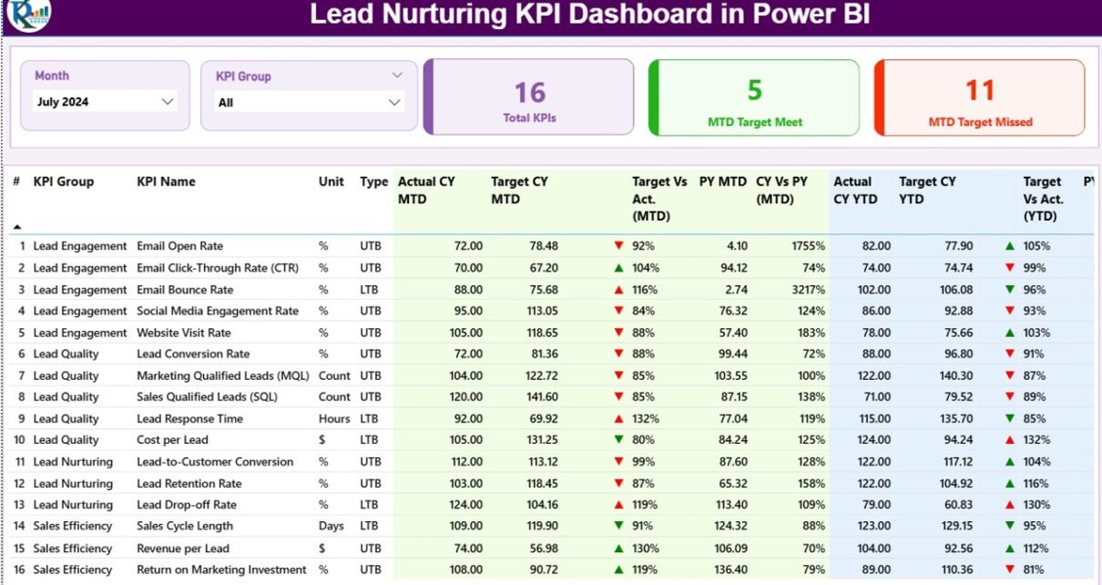
What Is Included in the Summary Page?
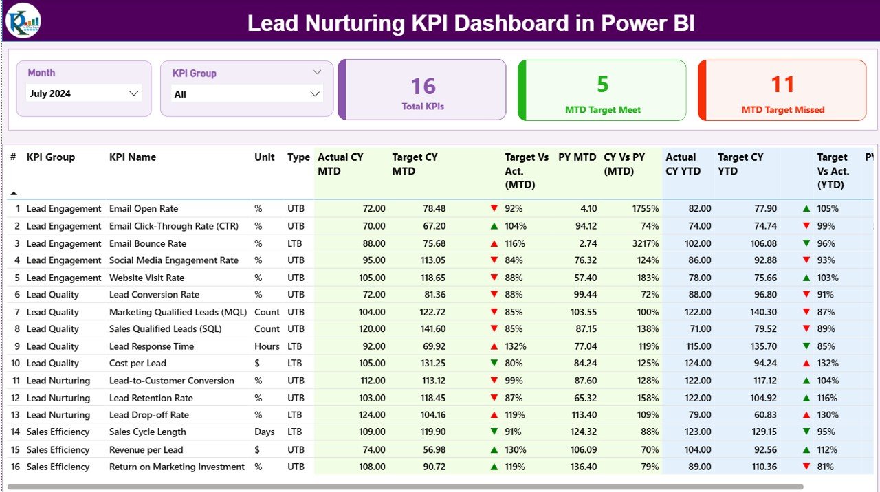
The Summary Page acts as the main control center of the dashboard.
At the top, users see two slicers:
-
Month slicer to select the reporting period
-
KPI Group slicer to filter KPIs by category
Because of these slicers, the entire dashboard updates instantly based on selections.
Key Cards on the Summary Page
At the top of the page, three KPI cards provide instant insights:
-
Total KPIs Count – Displays the total number of KPIs tracked
-
MTD Target Met Count – Shows how many KPIs achieved their MTD targets
-
MTD Target Missed Count – Highlights underperforming KPIs
These cards help decision-makers assess performance at a glance.
Click to Purchases Lead Nurturing KPI Dashboard in Power BI
What Information Does the KPI Detail Table Show?
Below the cards, a detailed KPI table provides deep insights. Each row represents one KPI.
The table includes:
-
KPI Number – Sequential number for reference
-
KPI Group – Category of the KPI
-
KPI Name – Name of the metric
-
Unit – Measurement unit
-
Type – LTB (Lower the Better) or UTB (Upper the Better)
MTD Performance Metrics
-
Actual CY MTD – Current year actual MTD value
-
Target CY MTD – Current year target MTD value
-
MTD Icon – ▲ or ▼ icon with green or red color
-
Target vs Actual (MTD) – Actual ÷ Target percentage
-
PY MTD – Previous year MTD value
-
CY vs PY (MTD) – Current MTD ÷ Previous MTD
YTD Performance Metrics
-
Actual CY YTD – Current year actual YTD value
-
Target CY YTD – Current year target YTD value
-
YTD Icon – ▲ or ▼ icon with conditional formatting
-
Target vs Actual (YTD) – Actual ÷ Target percentage
-
PY YTD – Previous year YTD value
-
CY vs PY (YTD) – Current YTD ÷ Previous YTD
Because of this structure, users quickly identify trends, gaps, and growth opportunities.
What Is the KPI Trend Page Used For?
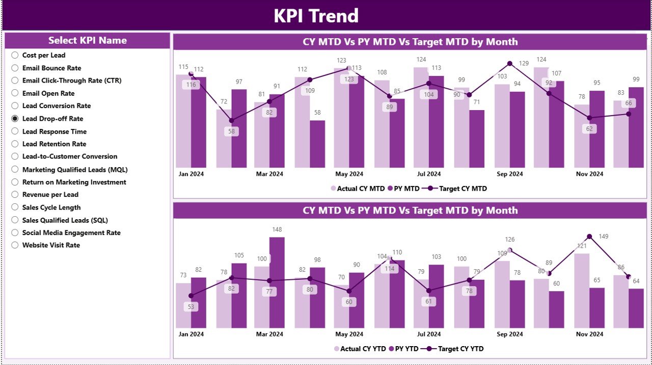
The KPI Trend Page focuses on performance over time.
On this page:
-
Users select a KPI Name using a slicer
-
Two combo charts display trends
Charts Shown on the KPI Trend Page
-
MTD Trend Chart – Actual CY, PY, and Target
-
YTD Trend Chart – Actual CY, PY, and Target
These visuals help teams understand:
-
Whether performance improves or declines
-
How current performance compares to last year
-
Whether targets remain realistic
Therefore, this page supports strategic planning and forecasting.
Click to Purchases Lead Nurturing KPI Dashboard in Power BI
What Is the KPI Definition Page?
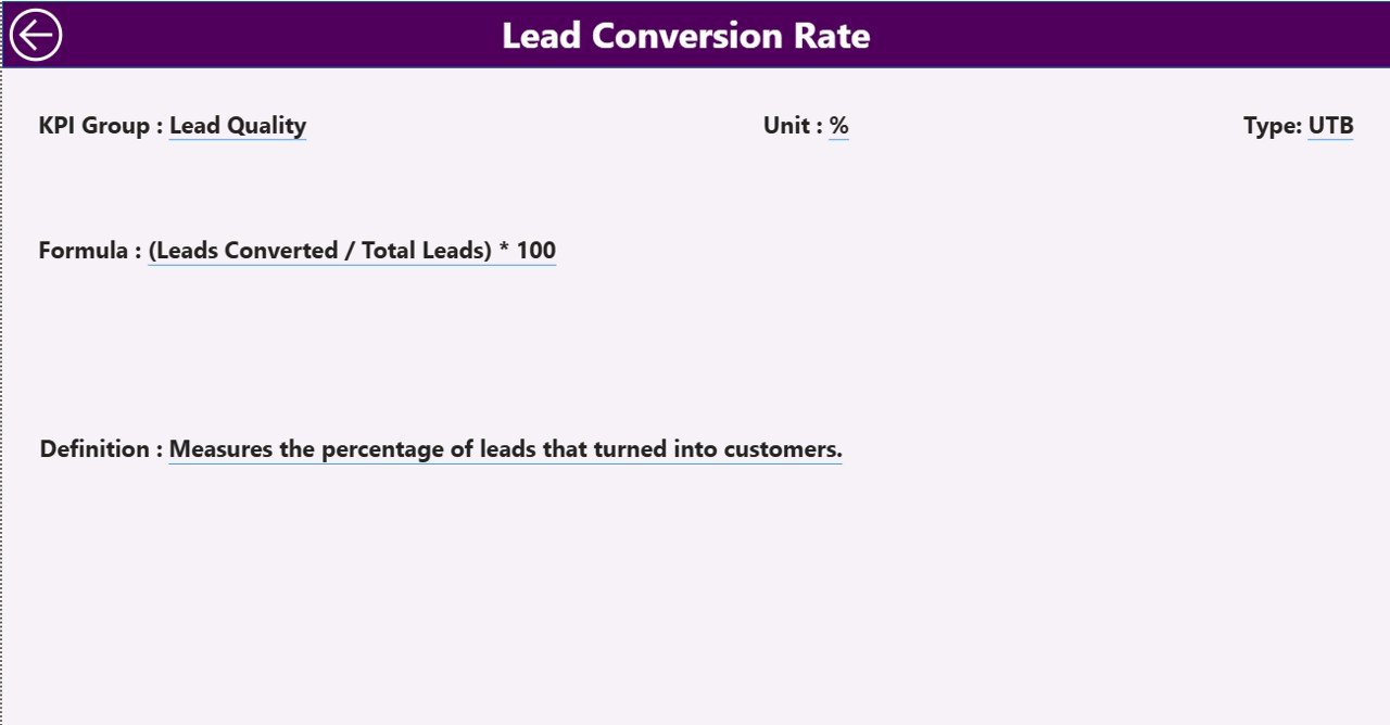
The KPI Definition Page provides detailed KPI documentation.
This page remains hidden by default and works as a drill-through page. From the Summary Page, users right-click on any KPI and drill through to view details.
Information Available on the KPI Definition Page
-
KPI Number
-
KPI Group
-
KPI Name
-
Unit
-
Formula
-
KPI Definition
-
KPI Type (LTB or UTB)
A Back button at the top left corner allows users to return to the Summary Page easily.
What Excel Data Is Required for This Dashboard?
This dashboard uses an Excel file as its data source, which makes data management simple.
The Excel file contains three worksheets.
What Is the Input_Actual Sheet?
In the Input_Actual sheet, users enter actual performance data.
Columns include:
-
KPI Name
-
Month (first date of the month)
-
MTD Actual Value
-
YTD Actual Value
Because of this structure, Power BI calculates performance automatically.
What Is the Input_Target Sheet?
In the Input_Target sheet, users enter target values.
Columns include:
-
KPI Name
-
Month (first date of the month)
-
MTD Target Value
-
YTD Target Value
This setup enables target vs actual comparisons.
What Is the KPI Definition Sheet?
The KPI Definition sheet acts as the KPI master.
Columns include:
-
KPI Number
-
KPI Group
-
KPI Name
-
Unit
-
Formula
-
Definition
-
Type (LTB or UTB)
This sheet ensures consistency and clarity across reports.
Advantages of Lead Nurturing KPI Dashboard in Power BI
A Lead Nurturing KPI Dashboard in Power BI offers several strong advantages.
🚀 Improved Visibility
Teams see all lead nurturing KPIs in one place.
🚀 Faster Decision-Making
Visual indicators highlight issues instantly.
🚀 Better Target Tracking
MTD and YTD comparisons keep teams focused.
🚀 Historical Performance Analysis
CY vs PY metrics reveal growth trends.
🚀 Easy Data Management
Excel-based inputs reduce complexity.
🚀 Professional Reporting
Power BI visuals impress stakeholders.
Best Practices for Lead Nurturing KPI Dashboard in Power BI
To maximize results, follow these best practices.
✅ Define Clear KPIs
Select KPIs that align with lead funnel stages.
✅ Keep KPI Definitions Consistent
Maintain one master KPI definition sheet.
✅ Update Data Regularly
Refresh Excel data monthly for accuracy.
✅ Review Trends, Not Just Numbers
Focus on patterns, not single values.
✅ Use Drill-Through Smartly
Encourage teams to explore KPI details.
✅ Align Sales and Marketing
Use shared dashboards for better collaboration.
Common Challenges and How to Overcome Them
Click to Purchases Lead Nurturing KPI Dashboard in Power BI
Even with a strong dashboard, challenges may arise.
❌ Inconsistent Data Entry
✔ Use standardized Excel templates.
❌ Too Many KPIs
✔ Focus on high-impact metrics.
❌ Ignoring Targets
✔ Review target vs actual weekly.
❌ Lack of Ownership
✔ Assign KPI owners clearly.
How Does This Dashboard Support Business Growth?
This dashboard supports growth by:
-
Improving lead conversion rates
-
Identifying high-performing campaigns
-
Reducing lead drop-offs
-
Optimizing marketing spend
-
Strengthening forecasting accuracy
Therefore, it becomes a strategic asset, not just a reporting tool.
Conclusion
A Lead Nurturing KPI Dashboard in Power BI transforms how businesses track and optimize lead performance. Instead of manual reporting and scattered data, teams gain a centralized, visual, and actionable view of their lead nurturing efforts.
Because the dashboard uses Excel for data entry and Power BI for visualization, it remains both powerful and easy to use. Moreover, its structured pages, trend analysis, and drill-through capabilities make it ideal for data-driven decision-making.
If your organization wants better visibility, improved conversions, and stronger alignment between sales and marketing, this dashboard delivers exactly that.
Frequently Asked Questions (FAQs)
❓ What is the main purpose of a Lead Nurturing KPI Dashboard in Power BI?
The main purpose is to track, analyze, and improve lead nurturing performance using visual KPIs.
❓ Can beginners use this dashboard?
Yes, because the data entry happens in Excel and visuals update automatically.
❓ Does the dashboard support MTD and YTD analysis?
Yes, it includes both MTD and YTD metrics with comparisons.
❓ Can I customize KPIs?
Yes, you can add or modify KPIs using the KPI Definition sheet.
❓ Is this dashboard suitable for small businesses?
Yes, it works well for startups, SMEs, and large enterprises.
❓ How often should data be updated?
Ideally, update data monthly for accurate insights.
Visit our YouTube channel to learn step-by-step video tutorials