Sewage treatment plants play a critical role in protecting public health, preserving water resources, and ensuring environmental compliance. However, managing a sewage treatment facility without clear performance visibility creates delays, inefficiencies, and compliance risks. Therefore, utilities, municipal bodies, and private operators now rely heavily on data-driven monitoring.
That is exactly where a Sewage Treatment KPI Dashboard in Power BI becomes a powerful solution.
This detailed, SEO-friendly, and easy-to-read guide explains everything you need to know about a Sewage Treatment KPI Dashboard in Power BI. You will learn what it is, why it matters, how it works, its page-wise structure, advantages, best practices, and frequently asked questions. Moreover, this article expands your provided information using practical explanations and real-world relevance, so you can confidently use or implement this dashboard in operational environments.
Click to buy Sewage Treatment KPI Dashboard in Power BI
What Is a Sewage Treatment KPI Dashboard in Power BI
A Sewage Treatment KPI Dashboard in Power BI is a centralized, interactive performance monitoring system designed to track key operational, environmental, and efficiency indicators of sewage treatment plants.
Instead of managing scattered Excel files, manual logs, and delayed reports, this dashboard brings all KPIs into one structured Power BI report. As a result, decision-makers gain instant visibility into plant performance, target achievement, and historical trends.
Moreover, this dashboard uses an Excel file as its data source. Therefore, teams can update KPI values easily without complex systems or advanced technical skills.
Why Do Sewage Treatment Plants Need a KPI Dashboard?
Sewage treatment operations involve multiple processes such as screening, biological treatment, sludge handling, and discharge compliance. Because of this complexity, performance gaps often remain hidden without structured monitoring.
A Sewage Treatment KPI Dashboard in Power BI solves this problem by providing:
- Clear performance visibility
- Faster decision-making
- Early identification of issues
- Target vs actual tracking
- Year-over-year performance comparison
Consequently, plant managers, engineers, and administrators can take corrective actions before problems escalate.
How Does a Sewage Treatment KPI Dashboard in Power BI Work?
The dashboard works by connecting Power BI to a structured Excel file that stores KPI data. Once users update the Excel sheets, Power BI refreshes the visuals automatically.
Data Flow Overview
- Enter KPI data in Excel
- Load Excel file into Power BI
- Apply predefined calculations
- View insights through interactive visuals
As a result, users avoid manual report preparation and focus more on operational improvements.
Key Features of the Sewage Treatment KPI Dashboard in Power BI
This ready-to-use dashboard includes three well-structured pages inside the Power BI Desktop application. Each page serves a specific analytical purpose.
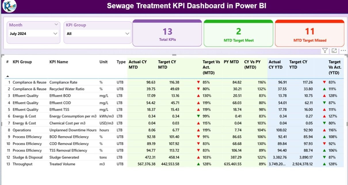
Summary Page
The Summary Page acts as the main control center of the dashboard.
Top-Level Slicers
At the top of the page, users can filter data using:
- Month slicer
- KPI Group slicer
Because of these slicers, users can instantly analyze performance for a specific period or KPI category.
KPI Performance Cards
The summary page displays three high-level cards:
- Total KPIs Count
- MTD Target Meet Count
- MTD Target Missed Count
These cards provide an immediate snapshot of overall plant performance. As a result, managers can quickly assess operational health.
Detailed KPI Table Explanation
Below the cards, the dashboard displays a detailed KPI table with the following columns:
- KPI Number – Unique sequence number for each KPI
- KPI Group – Category of the KPI (Operational, Compliance, Efficiency, etc.)
- KPI Name – Name of the KPI
- Unit – Unit of measurement (MLD, %, mg/L, etc.)
- Type – KPI type such as:
LTB (Lower the Better)
UTB (Upper the Better)
MTD (Month-to-Date) Performance Metrics
The table shows detailed MTD values, including:
- Actual CY MTD – Actual current year MTD value
- Target CY MTD – Target current year MTD value
- MTD Icon –
▲ Green arrow for target met
▼ Red arrow for target missed
Target vs Actual (MTD) –
Calculated using:
Actual MTD / Target MTD
PY MTD – Previous year MTD value
CY vs PY (MTD) –
Calculated using:
Current Year MTD / Previous Year MTD
Because of these metrics, users can clearly understand short-term performance trends.
YTD (Year-to-Date) Performance Metrics
The table also includes YTD performance values:
- Actual CY YTD
- Target CY YTD
YTD Icon – Visual status indicator
Target vs Actual (YTD) –
Formula:
Actual YTD / Target YTD
PY YTD
CY vs PY (YTD) –
Formula:
Current Year YTD / Previous Year YTD
Therefore, users can evaluate long-term performance with confidence.

Click to buy Sewage Treatment KPI Dashboard in Power BI
KPI Trend Page .
The KPI Trend Page focuses on performance trends over time.
Key Visuals on the KPI Trend Page
This page includes two combo charts:
- MTD Trend Chart
- YTD Trend Chart
Each chart displays:
- Current Year Actual values
- Previous Year Actual values
- Target values
Because of this design, users can easily identify seasonal patterns, performance gaps, and improvement trends.
KPI Selection Slicer
On the left side, a KPI Name slicer allows users to select a specific KPI. As soon as users select a KPI, the charts update dynamically.
As a result, root cause analysis becomes faster and more accurate.

Click to buy Sewage Treatment KPI Dashboard in Power BI
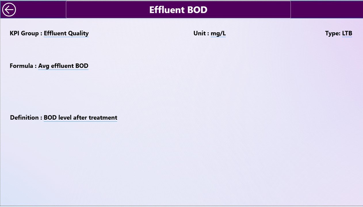
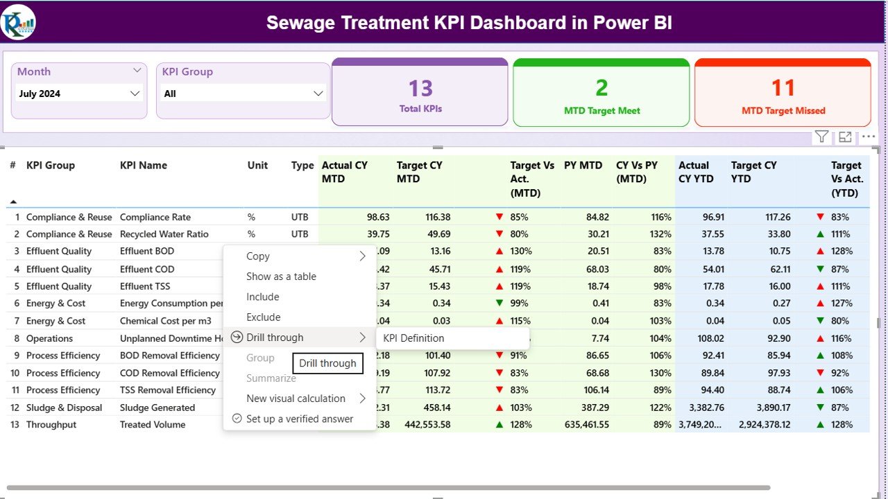
KPI Definition Page
The KPI Definition Page acts as a reference and governance layer.
Key Characteristics
- It is a drill-through page
- It remains hidden from normal navigation
- Users can access it by drilling through from the Summary Page
Information Available on the KPI Definition Page
This page displays:
- KPI Number
- KPI Group
- KPI Name
- Unit
- Formula
- KPI Definition
- KPI Type (LTB or UTB)
Because of this structure, users always understand what each KPI represents and how calculations work.
Easy Navigation
A Back button appears on the top-left corner of the page. By clicking it, users can instantly return to the Summary Page.
Click to buy Sewage Treatment KPI Dashboard in Power BI
What Excel Data Is Required for This Dashboard?
The dashboard uses an Excel file as its data source. This file contains three mandatory worksheets.
Input_Actual Sheet Explained
In the Input_Actual sheet, users enter actual KPI values.
Required Columns
- KPI Name
- Month (use the first date of the month)
- MTD Number
- YTD Number
Because of this simple structure, data entry remains fast and error-free.
Input_Target Sheet Explained
In the Input_Target sheet, users enter target values.
Required Columns
- KPI Name
- Month (use the first date of the month)
- MTD Target
- YTD Target
As a result, Power BI can compare targets with actuals automatically.
Click to buy Sewage Treatment KPI Dashboard in Power BI
KPI Definition Sheet Explained
The KPI Definition sheet acts as the master data table.
Required Fields
- KPI Number
- KPI Group
- KPI Name
- Unit
- Formula
- Definition
- Type (LTB or UTB)
This sheet ensures KPI standardization and governance.
Advantages of Sewage Treatment KPI Dashboard in Power BI
Using a Sewage Treatment KPI Dashboard in Power BI delivers multiple operational and strategic advantages.
Key Advantages
- Centralized KPI monitoring
- Real-time performance insights
- Easy Excel-based data input
- Clear MTD and YTD tracking
- Visual target vs actual indicators
- Previous year comparison
- Faster decision-making
- Improved regulatory compliance
Because of these benefits, utilities gain better control over plant operations.
Who Can Use This Dashboard?
This dashboard suits a wide range of users, including:
- Municipal sewage treatment authorities
- Water utility companies
- Environmental compliance teams
- Plant managers and engineers
- Government agencies
- Private wastewater operators
Therefore, both public and private organizations can benefit equally.
Best Practices for the Sewage Treatment KPI Dashboard in Power BI
To get the maximum value from this dashboard, follow these best practices.
Best Practices Checklist
- Update Excel data monthly without delays
- Standardize KPI definitions across teams
- Review MTD trends weekly
- Use YTD analysis for strategic planning
- Investigate red indicators immediately
- Train users on drill-through functionality
- Maintain clean and validated data
When teams follow these practices, performance transparency improves significantly.
How Does This Dashboard Improve Decision-Making?
This dashboard transforms raw sewage treatment data into actionable insights. Instead of guessing performance issues, users see them clearly through visuals.
As a result:
- Managers act faster
- Engineers focus on root causes
- Compliance teams reduce risks
- Leadership gains confidence in reporting
Conclusion
A Sewage Treatment KPI Dashboard in Power BI is no longer a luxury. Instead, it has become a necessity for modern wastewater management. By combining Excel-based data entry with powerful Power BI visuals, this dashboard delivers clarity, control, and confidence.
Moreover, its structured pages, clear calculations, and interactive features make it easy to use for both technical and non-technical users. When implemented correctly, this dashboard improves efficiency, compliance, and long-term sustainability.
Frequently Asked Questions About Sewage Treatment KPI Dashboard in Power BI
What is a Sewage Treatment KPI Dashboard in Power BI used for?
A Sewage Treatment KPI Dashboard in Power BI tracks operational, efficiency, and compliance KPIs of sewage treatment plants in a single interactive report.
Can I use Excel as the data source?
Yes, this dashboard uses an Excel file as its primary data source, which makes data entry simple and flexible.
How often should I update the data?
You should update the Excel data monthly. However, you can update it more frequently if operational monitoring requires it.
Does this dashboard support target vs actual comparison?
Yes, the dashboard clearly shows target vs actual comparisons for both MTD and YTD values using percentages and icons.
Can I add new KPIs later?
Yes, you can add new KPIs easily by updating the KPI Definition sheet and entering corresponding actual and target values.
Is this dashboard suitable for government utilities?
Yes, government and municipal sewage treatment authorities can use this dashboard effectively for compliance and performance monitoring.
Does the dashboard support drill-through analysis?
Yes, users can drill through from the Summary Page to the KPI Definition Page for detailed KPI explanations.
Do I need advanced Power BI skills to use it?
No, this dashboard is ready to use. You only need basic Excel knowledge to update the data.
Visit our YouTube channel to learn step-by-step video tutorials
Watch the step-by-step video tutorial:
Click to buy Sewage Treatment KPI Dashboard in Power BI