Managing electricity projects without clear performance visibility creates serious risks. Electricity projects involve high capital investment, strict timelines, regulatory compliance, and multiple stakeholders. Therefore, even a small deviation in performance can lead to cost overruns, schedule delays, and compliance issues.
That is exactly why an Electricity Project KPI Dashboard in Power BI becomes a critical management and decision-making tool.
In this detailed and SEO-friendly article, you will learn what an Electricity Project KPI Dashboard in Power BI is, why it is essential, how it works, its page structure, KPI logic, Excel data design, advantages, best practices, and frequently asked questions. By the end, you will clearly understand how this dashboard helps electricity utilities, EPC contractors, project managers, and energy companies monitor performance with confidence.
Click to buy Electricity Project KPI Dashboard in Power BI
What Is an Electricity Project KPI Dashboard in Power BI?
An Electricity Project KPI Dashboard in Power BI is a centralized analytical dashboard designed to track, analyze, and visualize key performance indicators related to electricity projects.
Instead of relying on scattered Excel files and manual reports, this dashboard consolidates all project KPIs into a single interactive Power BI report. As a result, decision-makers can instantly evaluate project health, identify performance gaps, and take corrective actions.
Moreover, because the dashboard uses Excel as a data source, teams can easily update data without advanced technical skills. Power BI then transforms this raw data into clear visuals, KPI indicators, and trend analysis.
Why Do Electricity Projects Need a KPI Dashboard?
Electricity projects operate under complex conditions. Therefore, manual monitoring often fails to deliver timely insights.
An Electricity Project KPI Dashboard in Power BI solves these challenges by:
- Providing real-time KPI visibility
- Tracking targets vs actual performance
- Comparing current year vs previous year
- Supporting data-driven decision-making
- Improving project governance and accountability
As a result, organizations gain control over performance before issues become costly problems.
How Does an Electricity Project KPI Dashboard in Power BI Work?
The dashboard works through a simple yet powerful flow:
Data Entry in Excel
Actual KPI data
Target KPI data
KPI definitions and metadata
Data Model in Power BI
Relationships between KPI tables
Time-based calculations for MTD and YTD
Measures for target comparison
Interactive Reporting
Slicers for month and KPI group
KPI status icons
Trend charts and drill-through analysis
Because of this structure, both technical and non-technical users can easily use the dashboard.
Page Structure of Electricity Project KPI Dashboard in Power BI
The Electricity Project KPI Dashboard in Power BI includes three well-structured pages, each designed for a specific analytical purpose.
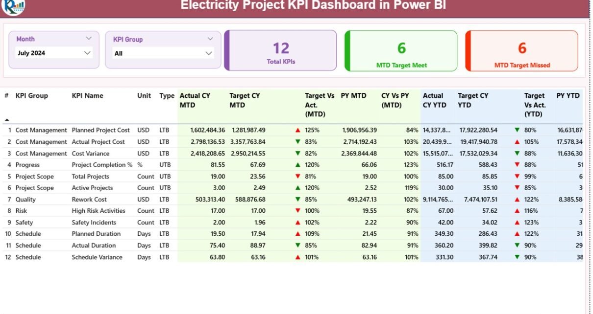
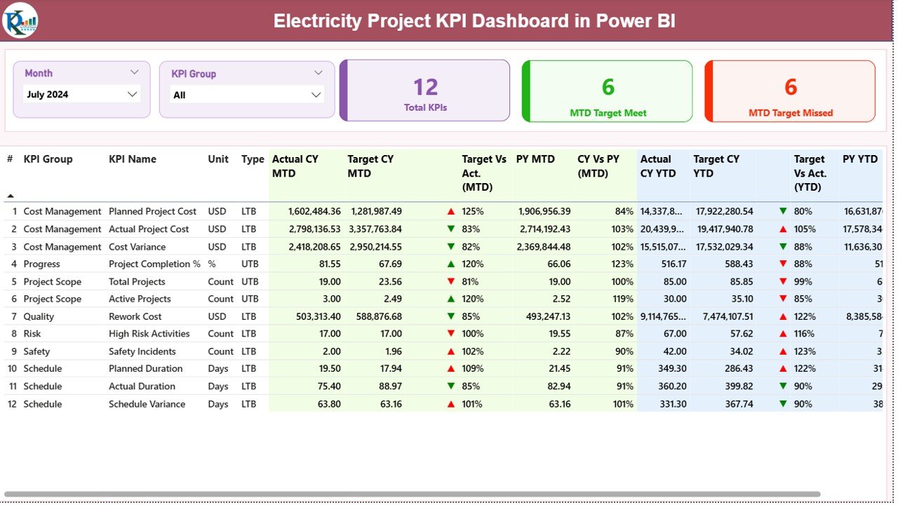
Summary Page
The Summary Page acts as the control center of the dashboard. It provides a high-level overview of all project KPIs.
Key Elements on the Summary Page
Slicers
- Month Slicer: Filters KPIs by reporting month
- KPI Group Slicer: Filters KPIs by category or functional group
These slicers ensure focused and quick analysis.
KPI Cards
The dashboard displays three important cards:
- Total KPIs Count
- MTD Target Meet Count
- MTD Target Missed Count
These cards instantly communicate project performance health.
What Information Appears in the KPI Detail Table?
Below the cards, the dashboard shows a detailed KPI table with rich performance metrics.
KPI Master Information
- KPI Number – Unique sequence number
- KPI Group – KPI category
- KPI Name – Name of the KPI
Unit – Unit of measurement
Type –
UTB (Upper the Better)
LTB (Lower the Better)
How Does MTD Performance Analysis Work?
Actual CY MTD – Current year actual MTD value
Target CY MTD – Current year target MTD value
MTD Icon –
▲ Green for target met
▼ Red for target missed
Target vs Actual (MTD) –
Formula:
Actual MTD / Target MTD
PY MTD – Previous year MTD value
CY vs PY (MTD) –
Formula:
CY MTD / PY MTD
Because of this structure, users instantly understand short-term performance.
How Does YTD Performance Analysis Work?
- Actual CY YTD – Current year actual YTD value
- Target CY YTD – Current year target YTD value
- YTD Icon – ▲ or ▼ performance indicator
- Target vs Actual (YTD) –
Formula:
Actual YTD / Target YTD - PY YTD – Previous year YTD value
- CY vs PY (YTD) –
Formula:
CY YTD / PY YTD
As a result, teams can evaluate long-term project trends.
Click to buy Electricity Project KPI Dashboard in Power BI
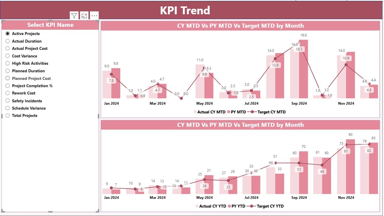
KPI Trend Page
The KPI Trend Page focuses on time-based performance visualization.
What Does This Page Include?
Two Combo Charts
MTD trend: Actual CY, Actual PY, Target
YTD trend: Actual CY, Actual PY, Target
KPI Name Slicer
Select one KPI at a time
View its monthly or cumulative trend
Because of these visuals, project managers can quickly identify patterns, fluctuations, and performance gaps.
Click to buy Electricity Project KPI Dashboard in Power BI
KPI Definition Page
The KPI Definition Page acts as a reference and governance layer.
Key Features of This Page
Hidden drill-through page
Accessible directly from the Summary Page
Displays:
KPI Formula
KPI Definition
KPI Type and Unit
This page ensures consistency and transparency across teams.
To return to the main dashboard, users simply click the Back Button on the top-left corner.

Click to buy Electricity Project KPI Dashboard in Power BI
Excel Data Structure Used in the Dashboard
The dashboard uses an Excel file as its data source. This approach keeps data management simple and flexible.
Input_Actual Sheet
This sheet captures actual project performance data.
Required Columns
- KPI Name
- Month (First date of the month)
- MTD Actual Value
- YTD Actual Value
Users update this sheet monthly to refresh dashboard performance.
Input_Target Sheet
This sheet captures target performance data.
Required Columns
- KPI Name
- Month (First date of the month)
- MTD Target Value
- YTD Target Value
Targets remain aligned with project plans and contracts.
KPI Definition Sheet
This sheet defines KPI metadata.
Required Columns
- KPI Number
- KPI Group
- KPI Name
- Unit
- Formula
- Definition
- Type (UTB or LTB)
Because of this structure, governance remains strong.
Advantages of Electricity Project KPI Dashboard in Power BI
An Electricity Project KPI Dashboard in Power BI delivers multiple benefits across the organization.
Centralized Performance Monitoring
Track all electricity project KPIs from a single dashboard instead of multiple reports.
Faster Decision-Making
Visual indicators and trends help leaders act quickly.
Improved Accountability
Clear targets and comparisons highlight responsibility.
Time and Cost Savings
Automation eliminates manual reporting effort.
Enhanced Transparency
All stakeholders see the same performance metrics.
Best Practices for Electricity Project KPI Dashboard in Power BI
To maximize value, follow these best practices.
Define Clear KPIs
Choose KPIs aligned with project goals and regulatory needs.
Maintain Data Discipline
Update actual and target data consistently.
Use Meaningful KPI Groups
Group KPIs logically for better analysis.
Review Trends Regularly
Do not rely only on monthly snapshots.
Train Users
Ensure teams understand KPI definitions and logic.
Who Can Use an Electricity Project KPI Dashboard in Power BI?
This dashboard suits many roles and industries:
- Electricity utilities
- Power generation companies
- EPC contractors
- Project managers
- Energy consultants
- Government electricity boards
Because of its flexibility, it adapts to different project scales.
How Does This Dashboard Improve Project Success?
The dashboard shifts project management from reactive to proactive. Instead of discovering issues late, teams spot problems early. As a result, corrective actions happen on time, budgets remain controlled, and stakeholders stay confident.
Conclusion: Why Electricity Project KPI Dashboard in Power BI Matters
Electricity projects demand precision, visibility, and accountability. Without a structured monitoring system, risks increase rapidly. Therefore, an Electricity Project KPI Dashboard in Power BI becomes an essential analytical solution.
By combining Excel-based data entry with powerful Power BI visuals, this dashboard delivers clarity, speed, and confidence. It transforms raw KPI data into actionable insights that support better project outcomes.
Frequently Asked Questions About Electricity Project KPI Dashboard in Power BI
What is the main purpose of this dashboard?
The dashboard helps track, analyze, and monitor electricity project KPIs in real time.
Do I need advanced Power BI skills to use it?
No. Data entry happens in Excel, and Power BI handles visualization automatically.
Can I add more KPIs?
Yes. You can easily add KPIs through the KPI Definition sheet.
How often should data be updated?
Monthly updates work best for MTD and YTD analysis.
Is this dashboard suitable for large projects?
Yes. It scales easily for both small and large electricity projects.
Watch the step-by-step video tutorial:
Visit our YouTube channel to learn step-by-step video tutorials
Click to buy Electricity Project KPI Dashboard in Power BI