Smart cities demand speed, transparency, cost efficiency, and accountability in every public purchasing decision. However, managing procurement data across multiple vendors, departments, and projects often creates complexity. Therefore, city administrators and procurement teams need a centralized, visual, and KPI-driven system to monitor performance effectively.
That is exactly where a Smart Cities Purchasing KPI Dashboard in Power BI delivers massive value. This ready-to-use dashboard transforms raw purchasing data into clear KPIs, visual indicators, trends, and comparisons, enabling smarter and faster decisions.
In this in-depth and SEO-friendly guide, you will learn what a Smart Cities Purchasing KPI Dashboard in Power BI is, how it works, its page structure, Excel data model, key advantages, best practices, and frequently asked questions. By the end, you will clearly understand how this dashboard strengthens procurement governance in smart city initiatives.
What Is a Smart Cities Purchasing KPI Dashboard in Power BI?
A Smart Cities Purchasing KPI Dashboard in Power BI is a centralized analytics and reporting solution designed to track, analyze, and monitor procurement performance for smart city projects.
Instead of managing purchasing data in scattered Excel sheets, emails, and static reports, this dashboard consolidates all KPIs into one interactive Power BI report. As a result, procurement teams gain real-time visibility into spending, targets, efficiency, and year-over-year performance.
The dashboard uses Excel as the data source and Microsoft Power BI as the visualization layer. Therefore, it offers flexibility, ease of use, and enterprise-level analytics without complex system integrations.
Why Do Smart Cities Need a Purchasing KPI Dashboard?
Smart cities manage infrastructure, technology, utilities, transport, healthcare, and public services simultaneously. Consequently, procurement teams must handle high vendor volumes, strict budgets, and compliance requirements.
Without structured KPI tracking, cities often face:
- Budget overruns
- Vendor delays
- Poor cost control
- Lack of transparency
- Weak performance accountability
However, a Purchasing KPI Dashboard in Power BI solves these challenges by delivering clear metrics, automated calculations, and visual alerts. As a result, decision-makers stay proactive instead of reactive.
How Does the Smart Cities Purchasing KPI Dashboard Work?
The dashboard follows a simple yet powerful workflow:
- Procurement teams enter Actual and Target data in Excel
- Power BI connects to the Excel file
- KPIs calculate automatically using predefined logic
- Visual indicators highlight performance instantly
- Users analyze MTD, YTD, and YoY trends interactively
Because of this structure, teams can update data monthly without changing dashboard design.
What Are the Key Pages in the Smart Cities Purchasing KPI Dashboard?
The dashboard contains three professionally designed pages, each serving a specific analytical purpose.
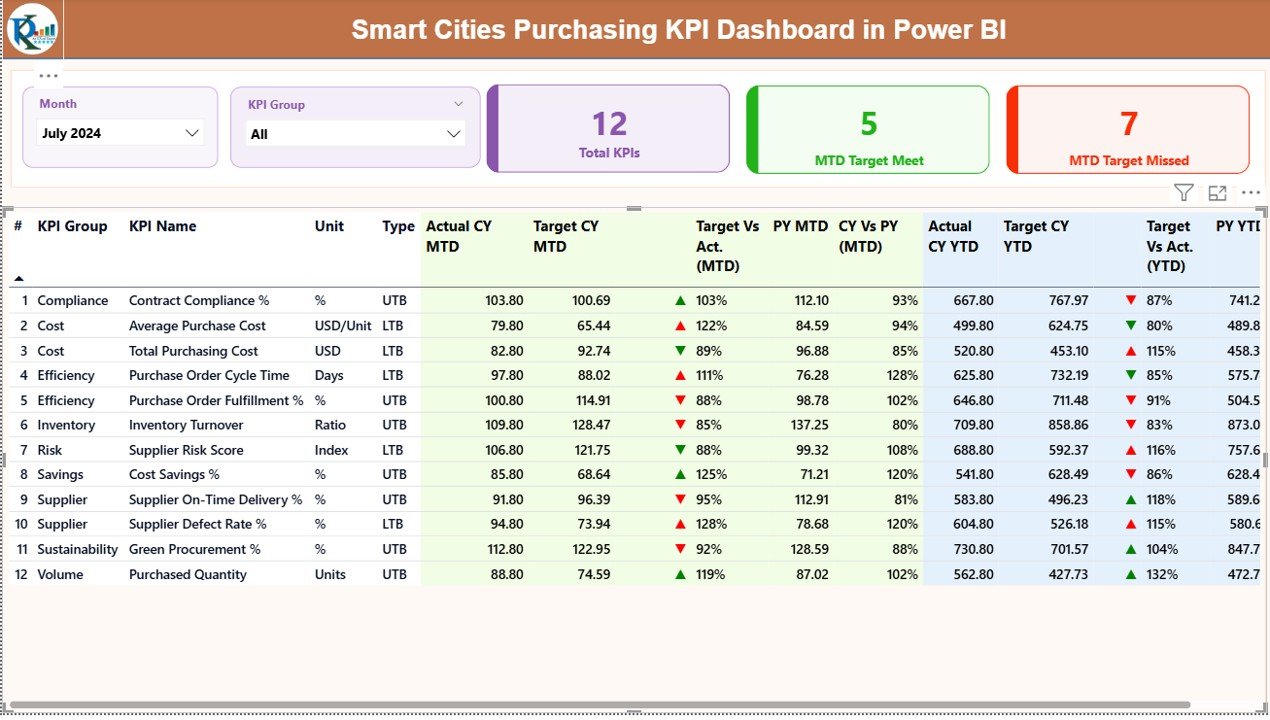
What Does the Summary Page Show?
The Summary Page acts as the command center of the dashboard. It provides a quick overview of procurement performance across all KPIs.
Top-Level Slicers
- Month slicer for reporting period selection
- KPI Group slicer for category-wise analysis
These slicers allow users to filter insights instantly.
KPI Cards
At the top, three KPI cards display:
- Total KPIs Count
- MTD Target Met Count
- MTD Target Missed Count
These cards immediately show whether procurement performance stays on track.
Detailed KPI Performance Table
Below the cards, the dashboard displays a comprehensive KPI table with the following columns:
- KPI Number – Sequential identifier
- KPI Group – Procurement category
- KPI Name – KPI description
- Unit – Measurement unit
- Type – LTB (Lower the Better) or UTB (Upper the Better)
MTD Performance Metrics
- Actual CY MTD – Current year actual MTD value
- Target CY MTD – Current year target MTD value
- MTD Icon – ▲ (green) or ▼ (red) based on target achievement
- Target vs Actual (MTD) – Actual ÷ Target
- PY MTD – Previous year MTD value
- CY vs PY (MTD) – CY MTD ÷ PY MTD
YTD Performance Metrics
- Actual CY YTD
- Target CY YTD
- YTD Icon
- Target vs Actual (YTD)
- PY YTD
- CY vs PY (YTD)
Because of this structured table, procurement teams can spot issues, trends, and improvements instantly.
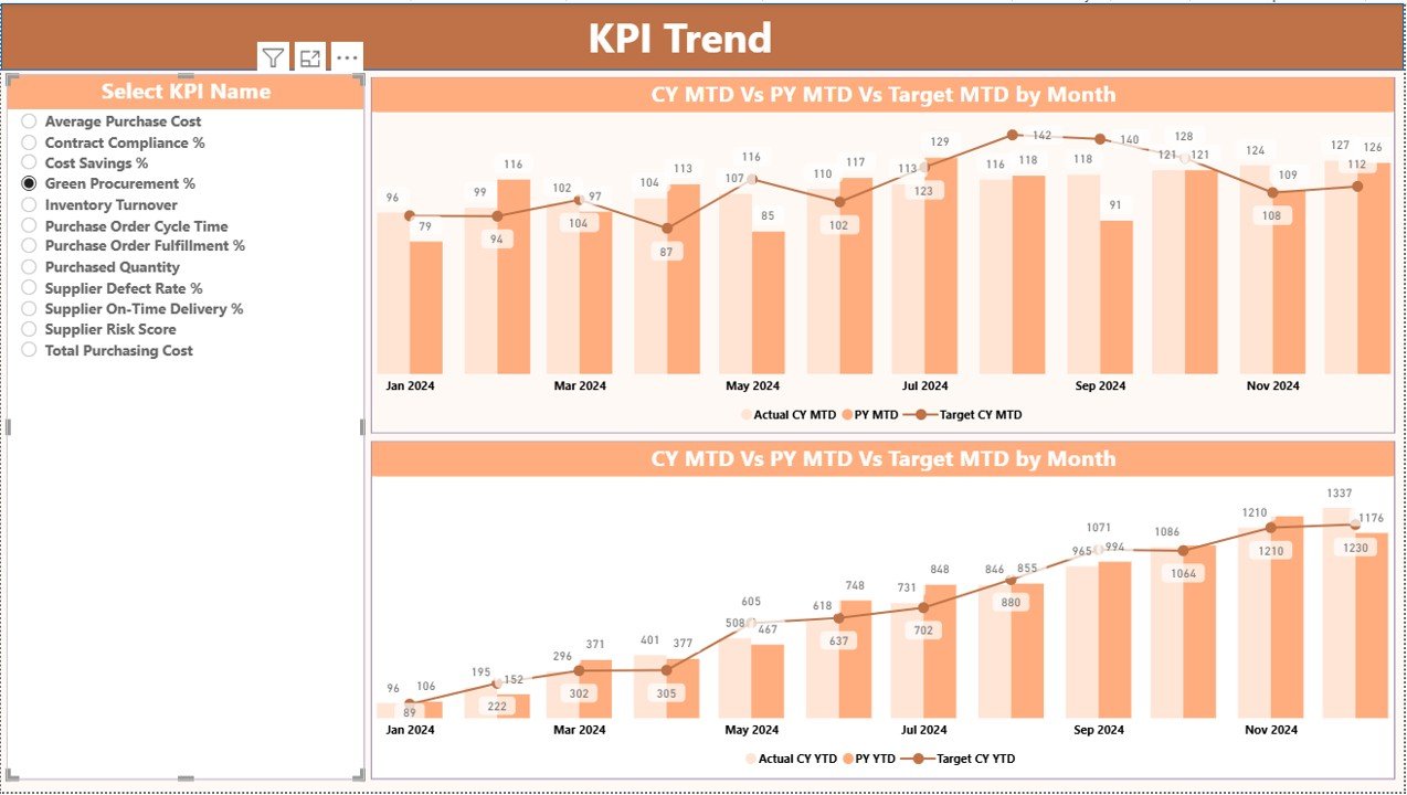
How Does the KPI Trend Page Help Analysis?
The KPI Trend Page focuses on time-based performance analysis.
Key Elements on the KPI Trend Page
- KPI Name slicer on the left
Two combo charts:
MTD: Actual CY, PY, and Target
YTD: Actual CY, PY, and Target
These charts help users:
- Track progress month by month
- Compare current performance with previous year
- Validate whether targets remain realistic
As a result, teams make data-backed forecasting decisions.
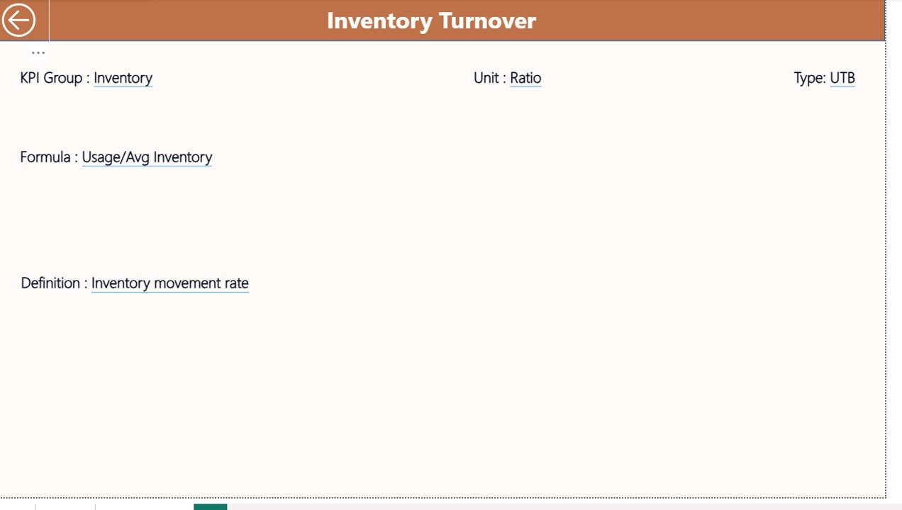
What Is the KPI Definition Page Used For?
The KPI Definition Page serves as a drill-through reference page.
What Information Does It Show?
- KPI Formula
- KPI Definition
- Unit of measurement
- KPI Type (LTB or UTB)
Since this page remains hidden, users access it only when needed. Moreover, the back button allows quick navigation to the Summary Page.
This design improves clarity, governance, and KPI understanding across departments.
How Is Excel Data Structured for This Dashboard?
The dashboard uses one Excel file with three structured worksheets. This design ensures easy data maintenance.
Input_Actual Sheet
In this sheet, users enter:
- KPI Name
- Month (first date of the month)
- MTD Actual Value
- YTD Actual Value
This sheet captures real procurement performance.
Input_Target Sheet
Here, users enter:
- KPI Name
- Month (first date of the month)
- MTD Target Value
- YTD Target Value
This sheet defines performance expectations.
KPI Definition Sheet
This sheet stores:
- KPI Number
- KPI Group
- KPI Name
- Unit
- Formula
- Definition
- Type (LTB or UTB)
Because of this separation, the dashboard stays scalable, clean, and audit-ready.
What KPIs Can Smart Cities Track Using This Dashboard?
Smart cities can track a wide range of procurement KPIs, such as:
- Procurement Cycle Time
- Cost Savings Percentage
- Vendor On-Time Delivery Rate
- Purchase Order Accuracy
- Contract Compliance Rate
- Emergency Procurement Ratio
- Budget Utilization Percentage
Therefore, the dashboard adapts easily to different smart city procurement models.
Advantages of Smart Cities Purchasing KPI Dashboard in Power BI
Using this dashboard delivers measurable operational benefits.
Centralized Procurement Visibility
- One dashboard for all purchasing KPIs
- No scattered reports or files
Real-Time KPI Monitoring
- Instant visibility into MTD and YTD performance
- Faster corrective actions
Improved Transparency & Accountability
- Clear responsibility across departments
- Better audit readiness
Data-Driven Decision Making
- YoY and trend analysis
- Smarter budget planning
Easy Maintenance
- Excel-based input
- No complex technical dependency
Best Practices for the Smart Cities Purchasing KPI Dashboard
Following best practices ensures long-term success.
Define Clear KPI Ownership
Assign owners for each KPI to ensure accountability.
Standardize KPI Definitions
Maintain consistent formulas and definitions across departments.
Update Data Regularly
Refresh Excel inputs monthly to keep insights accurate.
Use LTB and UTB Correctly
Classify KPIs properly to avoid misleading indicators.
Train Stakeholders
Educate users on KPI logic, filters, and drill-throughs.
How Does This Dashboard Support Smart City Governance?
Strong governance requires measurable performance. This dashboard:
- Aligns procurement goals with city strategy
- Enhances compliance tracking
- Supports transparency initiatives
- Strengthens public trust through data
As a result, smart cities move closer to sustainable and efficient procurement ecosystems.
Who Can Benefit from This Dashboard?
This dashboard helps:
- Smart City Procurement Teams
- City Finance Departments
- Urban Planning Authorities
- Public Sector Project Managers
- Municipal Leadership Teams
Therefore, it suits small municipalities and large metropolitan projects alike.
Conclusion: Why Smart Cities Should Adopt a Purchasing KPI Dashboard
Smart city procurement requires clarity, control, and continuous monitoring. A Smart Cities Purchasing KPI Dashboard in Power BI delivers all three in one solution.
By combining structured Excel data with powerful Power BI visuals, this dashboard enables:
- Faster decisions
- Better cost control
- Stronger transparency
- Improved procurement outcomes
Ultimately, this dashboard transforms procurement from a reactive function into a strategic driver of smart city success.
Frequently Asked Questions (FAQs)
What is a Smart Cities Purchasing KPI Dashboard in Power BI?
It is an interactive analytics solution that tracks procurement KPIs for smart city projects using Excel data and Power BI visuals.
Do I need advanced Power BI skills to use this dashboard?
No. You only need to update Excel data. The dashboard updates automatically.
Can I customize KPIs for my city?
Yes. You can add, remove, or modify KPIs easily using the KPI Definition sheet.
How often should data be updated?
Monthly updates work best for MTD and YTD performance tracking.
Is this dashboard suitable for large smart city programs?
Yes. It scales well for both small and large procurement operations.
Visit our YouTube channel to learn step-by-step video tutorials
Watch the step-by-step video tutorial: