Managing ship chartering operations has become increasingly data-driven. Charter rates fluctuate, vessel utilization changes daily, and operational costs rise constantly. Therefore, shipping companies, charterers, and maritime operators must track performance accurately and consistently. However, when chartering data remains scattered across multiple Excel files, emails, and reports, decision-making slows down. As a result, profitability and efficiency suffer.
That is exactly why a Ship Chartering KPI Dashboard in Excel plays a critical role in modern maritime operations.
In this in-depth, SEO-friendly, and easy-to-understand guide, you will learn what a Ship Chartering KPI Dashboard in Excel is, why it matters, how it works, and how each worksheet supports performance tracking. Moreover, this article explains its advantages, opportunities for improvement, and best practices. Finally, you will find frequently asked questions with clear answers to help you implement this dashboard confidently.
Click to buy Ship Chartering KPI Dashboard in Excel
What Is a Ship Chartering KPI Dashboard in Excel?
A Ship Chartering KPI Dashboard in Excel is a ready-to-use analytical template designed to monitor, analyze, and improve ship chartering performance. It converts raw chartering data into meaningful KPIs, comparisons, and trends. Because it is built in Microsoft Excel, it remains flexible, affordable, and accessible for shipping professionals worldwide.
Instead of manually reviewing multiple reports, this dashboard provides a centralized view of key chartering metrics. Consequently, decision-makers can track Month-to-Date (MTD) and Year-to-Date (YTD) performance, compare actual results with targets, and analyze trends over time.
Moreover, Excel dashboards allow teams to update data easily without complex tools or coding. Therefore, this solution suits small operators as well as large shipping organizations.
Why Is a Ship Chartering KPI Dashboard Important?
Ship chartering involves high-value contracts, tight margins, and constant operational risks. Therefore, visibility into performance becomes essential. A KPI dashboard supports this need in several ways.
First, it helps teams monitor charter revenue, vessel utilization, cost efficiency, and contract performance. Second, it highlights gaps between targets and actuals early. As a result, managers can take corrective actions quickly.
Additionally, a structured dashboard improves transparency across departments. Chartering teams, finance teams, and senior management can all rely on the same data source. Consequently, alignment improves and reporting errors reduce.
How Does a Ship Chartering KPI Dashboard in Excel Work?
A Ship Chartering KPI Dashboard in Excel works by linking structured input sheets with calculated KPI outputs and visuals. Users enter actual numbers, targets, and previous year data into dedicated sheets. Then, Excel formulas and pivot-based logic calculate MTD and YTD values automatically.
After that, the dashboard displays results using KPI cards, comparison indicators, and trend charts. Conditional formatting arrows show performance direction clearly. Therefore, users can instantly understand whether performance improves or declines.
Because the dashboard uses drop-down selections for months and KPIs, users can analyze data dynamically. As a result, the same dashboard supports multiple reporting needs without duplication.
What Are the Key Features of the Ship Chartering KPI Dashboard in Excel?
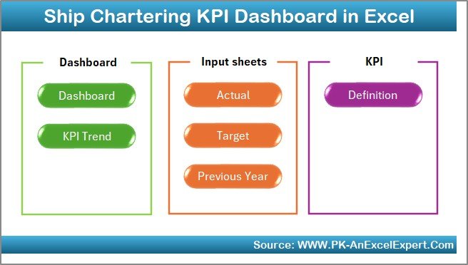
This Ship Chartering KPI Dashboard in Excel includes seven well-structured worksheets, each serving a specific purpose. Together, they create a complete performance management system for chartering operations.
the Summary Page
Summary Page (Index Sheet)
The Summary Page acts as the navigation hub of the dashboard. It improves usability and professional presentation.
Key highlights of the Summary Page include:
- Six navigation buttons to jump directly to relevant sheets
- Clean layout for executive-level usage
- Faster access to dashboard, trends, and data input sheets
Because of this structure, users do not waste time searching for worksheets. Instead, they move seamlessly between sections.
Click to buy Ship Chartering KPI Dashboard in Excel
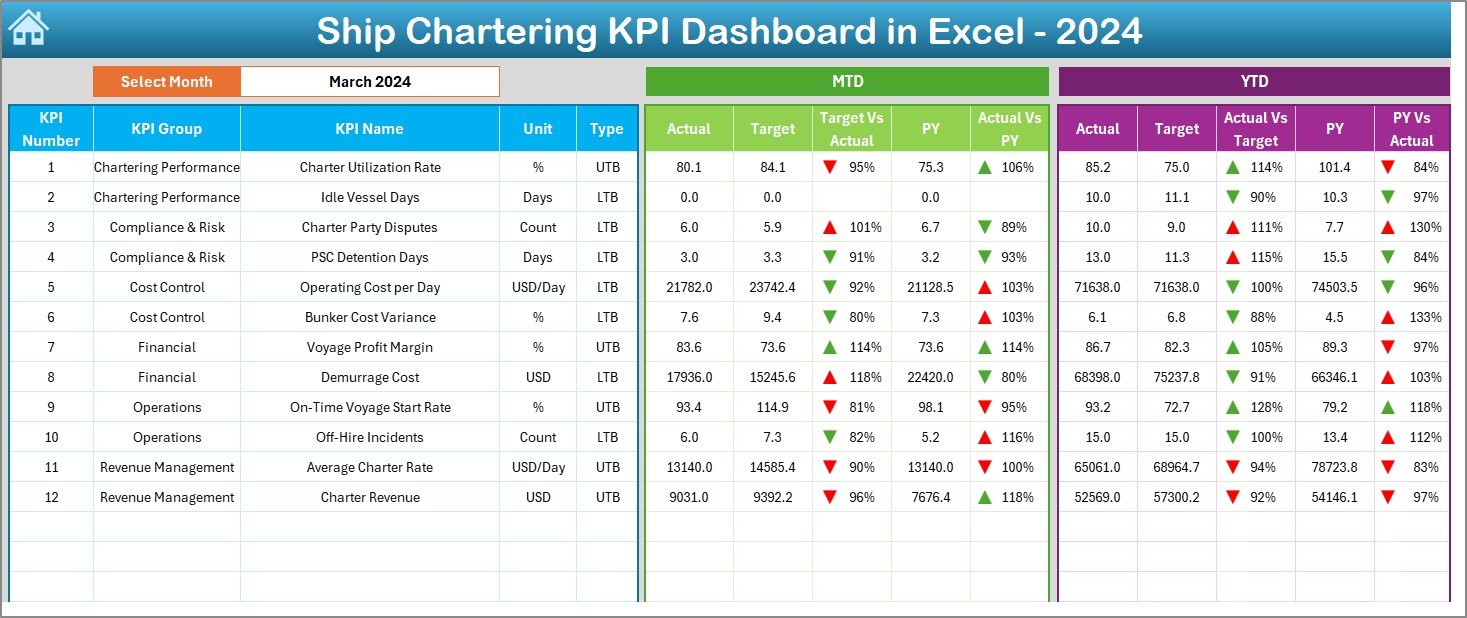
What Does the Dashboard Sheet Show?
Dashboard Sheet Tab
The Dashboard Sheet serves as the core of the entire system. It displays all major KPIs in one consolidated view.
Key functionalities of the Dashboard Sheet:
- Month selection using a drop-down in cell D3
- Automatic refresh of all KPIs based on the selected month
- Clear comparison between Actual, Target, and Previous Year values
MTD Performance Section:
- MTD Actual
- MTD Target
- MTD Previous Year
- Target vs Actual variance
- Previous Year vs Actual variance
- Conditional formatting with up and down arrows
YTD Performance Section:
- YTD Actual
- YTD Target
- YTD Previous Year
- Target vs Actual variance
- Previous Year vs Actual variance
- Conditional formatting for quick interpretation
Because of this layout, users can quickly assess short-term and long-term chartering performance.
Click to buy Ship Chartering KPI Dashboard in Excel
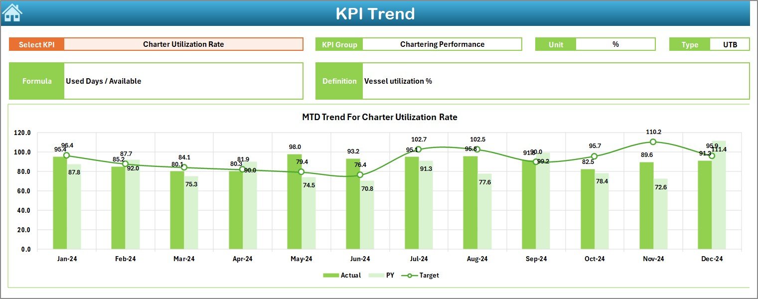
How Does the Trend Sheet Help in Analysis?
Trend Sheet Tab
The Trend Sheet focuses on KPI-level analysis and performance movement over time.
Features of the Trend Sheet include:
- KPI selection drop-down in cell C3
- Display of KPI Group, Unit, and KPI Type
- Clear indication of whether the KPI is “Upper the Better” or “Lower the Better”
- Formula and definition for each KPI
Additionally, this sheet shows MTD and YTD trend charts for:
- Actual values
- Target values
- Previous Year values
Therefore, users can understand performance direction and consistency. Moreover, this sheet supports data-driven discussions during reviews and audits.
Click to buy Ship Chartering KPI Dashboard in Excel
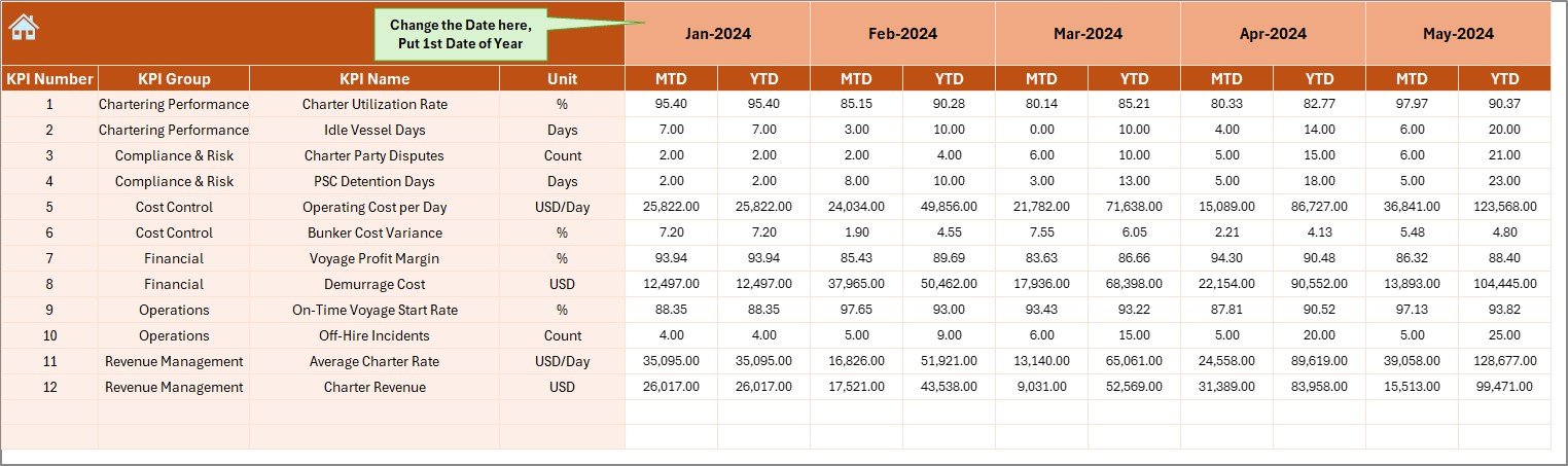
Where Do You Enter Actual Performance Data?
Actual Numbers Input Sheet
The Actual Numbers Input Sheet captures real performance data for the current year.
Important characteristics of this sheet:
- Month selector available in cell E1
- Ability to define the first month of the year easily
- Separate entry for MTD and YTD actual values
- Structured layout for error-free data entry
Because of this design, users maintain consistency across months. Moreover, automation reduces manual calculation errors significantly.
Click to buy Ship Chartering KPI Dashboard in Excel
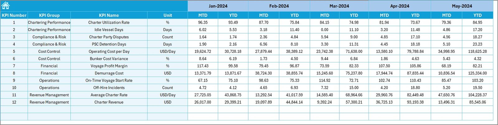
How Are Targets Managed in the Dashboard?
Target Sheet Tab
The Target Sheet stores planned performance numbers for each KPI.
Key features include:
- Monthly target entry for MTD values
- Cumulative target entry for YTD values
- KPI-wise structured layout
Since targets drive performance evaluation, this sheet plays a critical role. By comparing targets with actuals, managers can measure efficiency and goal achievement.
Click to buy Ship Chartering KPI Dashboard in Excel
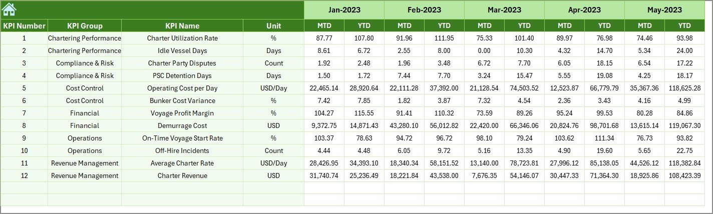
Why Is Previous Year Data Important?
Previous Year Number Sheet Tab
The Previous Year Sheet enables historical comparison.
Benefits of this sheet include:
- Entry of previous year MTD and YTD numbers
- Consistent structure with current year sheets
- Support for year-over-year performance analysis
Because shipping markets fluctuate, historical context becomes essential. This sheet helps teams understand trends, seasonality, and long-term improvement.
Click to buy Ship Chartering KPI Dashboard in Excel
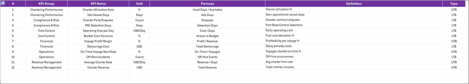
What Is the Purpose of the KPI Definition Sheet?
KPI Definition Sheet Tab
The KPI Definition Sheet acts as the knowledge base of the dashboard.
Information captured in this sheet includes:
- KPI Name
- KPI Group
- Unit of measurement
- KPI Formula
- Clear KPI definition
This sheet ensures consistency and clarity across teams. New users can understand KPIs easily. Moreover, audits and reviews become simpler because definitions remain documented.
Click to buy Ship Chartering KPI Dashboard in Excel
Advantages of Ship Chartering KPI Dashboard in Excel
Using a Ship Chartering KPI Dashboard in Excel delivers several measurable benefits.
Key Advantages
- Centralized tracking of all chartering KPIs
- Easy MTD and YTD performance comparison
- Clear Target vs Actual visibility
- Historical comparison with Previous Year data
- No coding or advanced tools required
- Flexible and customizable Excel-based structure
- Improved decision-making speed
- Reduced reporting errors
- Executive-ready visuals and trends
Because of these advantages, shipping companies gain better control over chartering performance.
Opportunities for Improvement in Ship Chartering KPI Dashboards
Although this dashboard offers strong functionality, continuous improvement always adds value.
Improvement Opportunities
- Integration with live chartering systems
- Additional vessel-level or route-level analysis
- Automated monthly data refresh using Power Query
- Advanced forecasting models
- Alert-based performance notifications
By implementing these improvements, organizations can evolve from reporting to predictive analytics.
Best Practices for the Ship Chartering KPI Dashboard in Excel
Following best practices ensures long-term success and accuracy.
Best Practices
- Maintain standardized KPI definitions
- Update actual numbers regularly
- Review targets quarterly and annually
- Validate data before monthly reporting
- Use trend analysis during management reviews
- Train users on dashboard navigation
- Archive previous versions for audit purposes
When teams follow these practices, the dashboard becomes a reliable decision-support tool.
Who Can Benefit from a Ship Chartering KPI Dashboard?
This dashboard suits a wide range of maritime professionals.
Primary users include:
- Ship owners
- Chartering managers
- Maritime finance teams
- Operations managers
- Shipping company executives
- Fleet performance analysts
Because Excel remains universally used, adoption remains quick and cost-effective.
How Does This Dashboard Improve Decision-Making?
This dashboard improves decision-making by presenting accurate, timely, and comparable data. Managers no longer rely on intuition alone. Instead, they analyze trends, variances, and performance gaps clearly.
Moreover, visual cues such as arrows and trend charts simplify complex data. As a result, teams identify risks early and act confidently.
Conclusion: Why Ship Chartering KPI Dashboard in Excel Is a Smart Choice
A Ship Chartering KPI Dashboard in Excel transforms raw chartering data into actionable insights. It simplifies performance tracking, enhances transparency, and supports strategic decisions. Because it combines MTD, YTD, target, and historical analysis in one place, it eliminates reporting complexity.
Furthermore, its structured seven-sheet design ensures clarity, usability, and scalability. When used consistently and correctly, this dashboard becomes a powerful management asset for any shipping organization.
Frequently Asked Questions (FAQs)
- What KPIs can I track in a Ship Chartering KPI Dashboard in Excel?
You can track charter revenue, vessel utilization, operating costs, profitability, contract performance, and efficiency ratios based on your business needs.
- Can I customize the KPIs in this dashboard?
Yes, you can customize KPI names, formulas, targets, and definitions easily using the KPI Definition sheet.
- Does this dashboard support monthly and yearly analysis?
Yes, it supports both Month-to-Date and Year-to-Date analysis with dynamic month selection.
- Do I need advanced Excel skills to use this dashboard?
No, basic Excel knowledge is enough. The dashboard uses structured inputs and automated calculations.
- Can I use this dashboard for multiple vessels?
Yes, you can extend the model by adding vessel-level data or separate dashboards for each fleet segment.
- How often should I update the dashboard?
You should update actual numbers monthly or more frequently if required for operational reviews.
- Is this dashboard suitable for executive reporting?
Yes, its clean visuals, comparisons, and trend charts make it ideal for executive-level reporting.
Watch the step-by-step video tutorial:
Visit our YouTube channel to learn step-by-step video tutorials
Click to buy Ship Chartering KPI Dashboard in Excel