The global shift toward renewable energy continues to accelerate. As a result, biofuels have become a critical component of sustainable energy strategies across industries. However, managing biofuel production, plant efficiency, feedstock usage, and revenue becomes complex without a structured analytical system. Therefore, organizations increasingly rely on a Biofuels Dashboard in Excel to track performance clearly and make data-driven decisions.
This detailed article explains everything you need to know about a Biofuels Dashboard in Excel. Moreover, it expands on the already created dashboard structure and explains how it supports monitoring, analysis, and reporting. Throughout this guide, you will learn what the dashboard is, how it works, its page-wise structure, advantages, best practices, and frequently asked questions. In addition, the article uses simple language, active voice, and practical explanations so that anyone can implement it confidently.
Click to Purchases Biofuels Dashboard in Excel
What Is a Biofuels Dashboard in Excel?
A Biofuels Dashboard in Excel is a ready-to-use analytical tool that converts raw biofuel operational data into meaningful visual insights. Instead of reviewing scattered spreadsheets or static reports, this dashboard centralizes all key metrics into a single interactive Excel file.
Because Excel remains widely accessible, this dashboard allows energy companies, sustainability teams, and plant managers to analyze production capacity, plant efficiency, revenue, maintenance status, and monthly trends without advanced technical skills.
Furthermore, the dashboard uses slicers, charts, and KPI cards to provide instant clarity across multiple dimensions such as region, plant, biofuel type, feedstock type, and time period.
Why Do Biofuel Organizations Need a Dashboard in Excel?
Biofuel operations involve multiple moving parts. Therefore, manual tracking often leads to delays, errors, and limited visibility. A Biofuels Dashboard in Excel solves these challenges effectively.
Here is why it becomes essential:
-
It provides real-time visibility into production and revenue metrics
-
It supports quick comparisons across plants, regions, and biofuel types
-
It reduces dependency on complex BI tools
-
It improves operational efficiency and decision-making
-
It aligns sustainability goals with measurable performance indicators
Because decision-makers need timely insights, Excel dashboards deliver value without additional infrastructure costs.
How Does a Biofuels Dashboard in Excel Work?
The dashboard follows a simple yet powerful workflow. First, users enter or update data in a structured Data Sheet. Then, Excel formulas, pivot tables, and charts automatically process the information. As a result, visual elements refresh instantly.
Additionally, slicers placed on the right side of each analytical page allow users to filter data dynamically. Therefore, users can analyze performance by month, plant, region, feedstock type, or biofuel category in seconds.
Key Features of the Biofuels Dashboard in Excel
This ready-to-use Biofuels Dashboard in Excel includes several powerful features designed for clarity and ease of use.
Page Navigator for Easy Navigation
The Page Navigator, located on the left side, allows users to move seamlessly between analytical pages. Instead of scrolling through sheets manually, users can click buttons to jump directly to the desired view.
As a result, navigation becomes faster and more intuitive, especially during presentations or reviews.
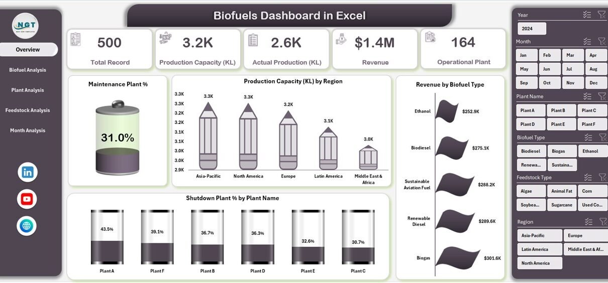
Overview Page: What Does the Overview Page Show?

The Overview Page serves as the main summary of the Biofuels Dashboard in Excel. Because decision-makers often need a quick snapshot, this page highlights the most critical KPIs.
Key Elements of the Overview Page
-
Right-side slicer for interactive filtering
-
4 KPI cards showing high-level performance metrics
-
4 visual charts for quick comparison
Charts Included on the Overview Page
-
Maintenance Plant %
This chart shows the percentage of plants under maintenance. Therefore, managers can quickly identify operational downtime. -
Production Capacity by Region
This chart compares installed capacity across regions. As a result, users can assess regional strengths and expansion opportunities. -
Revenue by Biofuel Type
This visualization highlights revenue contribution by biofuel type. Consequently, organizations can focus on high-performing fuel categories. -
Shutdown Plant % by Plant Name
This chart identifies plants that experience shutdowns. Hence, operational risks become visible instantly.
What Insights Can You Gain from the Overview Page?
Click to Purchases Biofuels Dashboard in Excel
The Overview Page answers several key questions:
-
Which regions contribute the highest production capacity?
-
Which biofuel types generate maximum revenue?
-
How many plants remain under maintenance or shutdown?
-
Where should management focus immediate attention?
Because all insights appear in one place, decision-makers can act quickly and confidently.
Biofuel Analysis Page: How Does It Support Fuel-Level Insights?

The Biofuel Analysis Page focuses on performance by biofuel type. Since different biofuels vary in cost, capacity, and output, this page provides granular insights.
Key Components of the Biofuel Analysis Page
-
Right-side slicer for filtering
-
Four focused analytical charts
Charts on the Biofuel Analysis Page
-
Production Capacity by Biofuel Type
This chart shows installed capacity for each biofuel type. Therefore, users understand capacity distribution clearly. -
Actual Production by Biofuel Type
This chart compares actual output across biofuel categories. As a result, efficiency gaps become visible. -
Production Cost per KL by Biofuel Type
This chart highlights cost differences per kiloliter. Consequently, cost optimization opportunities emerge. -
Operating Plant by Biofuel Type
This visualization shows how many plants operate per biofuel category. Hence, operational scale becomes transparent.
Why Is Biofuel-Level Analysis Important?
Biofuel-level analysis helps organizations:
-
Identify profitable fuel types
-
Control production costs effectively
-
Align capacity planning with demand
-
Optimize resource allocation
Because margins vary widely, this page plays a critical role in strategic planning.
Plant Analysis Page: How Does It Improve Plant-Level Decisions?

The Plant Analysis Page focuses on individual plant performance. Since plant-level efficiency directly affects profitability, this page provides detailed operational insights.
Key Components of the Plant Analysis Page
-
Right-side slicer for flexible filtering
-
Four plant-focused charts
Charts on the Plant Analysis Page
-
Active Production Capacity by Plant Name
This chart shows active capacity per plant. Therefore, underutilized plants become visible. -
Actual Production by Plant Name
This visualization compares actual output across plants. As a result, performance benchmarking becomes easy. -
Operating Plant % by Plant Name
This chart highlights operational efficiency percentages. Hence, management can identify improvement areas. -
Revenue by Plant Name
This chart links revenue directly to plant performance. Consequently, profitability analysis becomes straightforward.
What Decisions Can Plant Analysis Support?
Plant-level insights help answer important questions:
-
Which plants perform above or below expectations?
-
Where should maintenance investments focus?
-
Which plants drive the highest revenue?
-
How efficiently does each plant operate?
Because these insights remain visual and interactive, stakeholders gain clarity instantly.
Click to Purchases Biofuels Dashboard in Excel
Feedstock Analysis Page: Why Does Feedstock Matter?

Feedstock selection directly impacts production cost, output quality, and sustainability. Therefore, the Feedstock Analysis Page becomes a crucial part of the Biofuels Dashboard in Excel.
Key Components of the Feedstock Analysis Page
-
Right-side slicer for filtering
-
Four feedstock-related charts
Charts on the Feedstock Analysis Page
-
Revenue by Feedstock Type
This chart shows revenue generated by each feedstock. As a result, high-value feedstocks become clear. -
Production Capacity by Feedstock Type
This visualization highlights capacity allocation across feedstocks. Therefore, planning decisions improve. -
Maintenance Plant by Feedstock Type
This chart shows maintenance distribution by feedstock. Hence, operational risks surface early. -
Actual Production by Feedstock Type
This chart compares actual output across feedstocks. Consequently, efficiency differences become visible.
How Does Feedstock Analysis Improve Sustainability?
Feedstock analysis supports:
-
Cost-effective sourcing decisions
-
Sustainable feedstock planning
-
Risk reduction due to supply constraints
-
Improved production consistency
Because sustainability remains a core goal, this page aligns performance with environmental objectives.
Month Analysis Page: How Can You Track Trends Over Time?

The Month Analysis Page focuses on time-based performance. Since trends matter as much as totals, this page highlights monthly patterns.
Key Components of the Month Analysis Page
-
Right-side slicer for time filtering
-
Three time-based charts
Charts on the Month Analysis Page
-
Total Record by Month
This chart shows data volume trends. Therefore, activity levels become visible. -
Revenue by Month
This visualization highlights monthly revenue fluctuations. As a result, seasonality patterns emerge. -
Production Capacity by Month
This chart tracks capacity changes over time. Hence, growth or decline becomes easy to spot.
Why Is Monthly Analysis Critical?
Monthly analysis helps organizations:
-
Identify seasonal trends
-
Forecast future demand
-
Adjust production planning
-
Improve financial projections
Because trends influence long-term strategy, this page adds significant value.
Data Sheet and Support Sheet: What Happens Behind the Scenes?
Data Sheet
The Data Sheet acts as the backbone of the Biofuels Dashboard in Excel. Users enter structured data related to plants, production, revenue, feedstock, and time periods. Once updated, all dashboard visuals refresh automatically.
Support Sheet
The Support Sheet contains helper calculations, mappings, and reference tables. Therefore, it keeps the dashboard organized and scalable without cluttering the main data.
Advantages of Biofuels Dashboard in Excel
A Biofuels Dashboard in Excel offers several advantages that make it a preferred choice for many organizations.
Key Advantages
-
✔ Easy to use and widely accessible
-
✔ No advanced BI tools required
-
✔ Interactive slicers and visuals
-
✔ Centralized performance tracking
-
✔ Faster decision-making
-
✔ Cost-effective solution
-
✔ Customizable and scalable
Because Excel remains familiar to most users, adoption becomes effortless.
Best Practices for the Biofuels Dashboard in Excel
To get maximum value, organizations should follow best practices while using or maintaining the dashboard.
1. Maintain Clean and Structured Data
Always ensure that the Data Sheet follows consistent formats. Clean data improves accuracy and reliability.
2. Use Slicers Strategically
Use slicers to focus on specific regions, plants, or months. This approach improves clarity during analysis.
3. Review KPIs Regularly
Schedule monthly or quarterly reviews using the dashboard. Regular reviews encourage proactive decisions.
4. Standardize KPI Definitions
Keep KPI definitions consistent across teams. This practice avoids confusion and misinterpretation.
5. Update Data Frequently
Frequent updates ensure that insights remain relevant and actionable.
6. Protect Core Formulas
Lock support sheets and formulas to prevent accidental changes. This step maintains dashboard integrity.
Who Can Benefit from a Biofuels Dashboard in Excel?
This dashboard supports a wide range of users, including:
-
Biofuel plant managers
-
Renewable energy companies
-
Sustainability teams
-
Operations and maintenance teams
-
Finance and revenue analysts
-
Strategy and planning teams
Because the dashboard remains flexible, it adapts to different organizational needs.
Conclusion: Why Should You Use a Biofuels Dashboard in Excel?
A Biofuels Dashboard in Excel transforms raw data into meaningful insights that support smarter decisions. Instead of relying on fragmented reports, organizations gain a centralized, interactive view of production, revenue, plant efficiency, feedstock usage, and monthly trends.
Moreover, the dashboard remains easy to use, cost-effective, and scalable. As sustainability and efficiency continue to shape the energy sector, this dashboard empowers organizations to stay competitive and informed.
Frequently Asked Questions (FAQs)
What is a Biofuels Dashboard in Excel used for?
A Biofuels Dashboard in Excel helps track production capacity, revenue, plant performance, feedstock efficiency, and monthly trends using interactive visuals.
Can beginners use a Biofuels Dashboard in Excel?
Yes, beginners can use it easily because it relies on familiar Excel features like charts, slicers, and pivot tables.
How often should I update the data?
You should update the data monthly or more frequently if operations change rapidly.
Can I customize the dashboard?
Yes, you can customize charts, KPIs, slicers, and layouts based on business requirements.
Does this dashboard support sustainability reporting?
Yes, it supports sustainability analysis by tracking feedstock usage, production efficiency, and plant operations.
Is Excel enough for large biofuel operations?
For many organizations, Excel works well. However, very large operations may later integrate BI tools if needed.
Visit our YouTube channel to learn step-by-step video tutorials