The watches and timepieces industry moves fast. Trends change every season. Customer preferences shift quickly. Luxury buyers expect premium quality. Meanwhile, mass-market customers focus on price and value. Therefore, watch brands, distributors, and retailers must track performance carefully.
However, many businesses still use scattered Excel files. As a result, managers struggle to track sales, margins, inventory, and performance trends. They miss warning signals. They fail to compare targets with actual results. Consequently, profits suffer.
So, how can you track KPI performance for watches and timepieces in one structured and interactive system?
The answer is simple.
Click to Purchases Watches and Timepieces KPI Dashboard in Power BI
You need a Watches and Timepieces KPI Dashboard in Power BI.
In this detailed guide, you will learn:
-
What this dashboard is
-
Why watch businesses need it
-
Complete explanation of all 3 pages
-
KPI structure and calculations
-
Advantages of Watches and Timepieces KPI Dashboard in Power BI
-
Best practices for implementation
-
Frequently Asked Questions with answers
Let us explore everything step by step.
What Is Watches and Timepieces KPI Dashboard in Power BI?
A Watches and Timepieces KPI Dashboard in Power BI is a ready-to-use business intelligence solution designed for watch manufacturers, wholesalers, distributors, and retailers.
It captures KPI data in Excel and visualizes it in Power BI. Therefore, you can track:
-
Monthly performance
-
Year-to-date performance
-
Target achievement
-
Previous year comparison
-
KPI trends
-
Category-wise performance
Moreover, the dashboard provides clear visual indicators such as ▲ and ▼ icons. As a result, managers can instantly understand whether performance meets targets or not.
Why Does the Watch Industry Need a KPI Dashboard?
The watch industry includes multiple product segments:
-
Luxury watches
-
Smartwatches
-
Fashion watches
-
Mechanical watches
-
Sports watches
Each segment behaves differently. Therefore, you must track KPIs carefully.
Without a dashboard:
-
You rely on manual reports
-
You spend hours in calculations
-
You miss comparison insights
-
You react late to performance issues
However, with Power BI:
-
You see real-time performance
-
You compare MTD and YTD instantly
-
You track trends clearly
-
You make faster decisions
Consequently, your business grows stronger.
Complete Explanation of All Dashboard Pages
This dashboard contains 3 powerful pages inside the Power BI Desktop file.
Click to Purchases Watches and Timepieces KPI Dashboard in Power BI
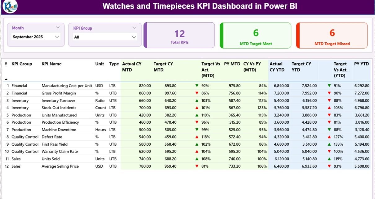
1️⃣ Summary Page – The Control Center
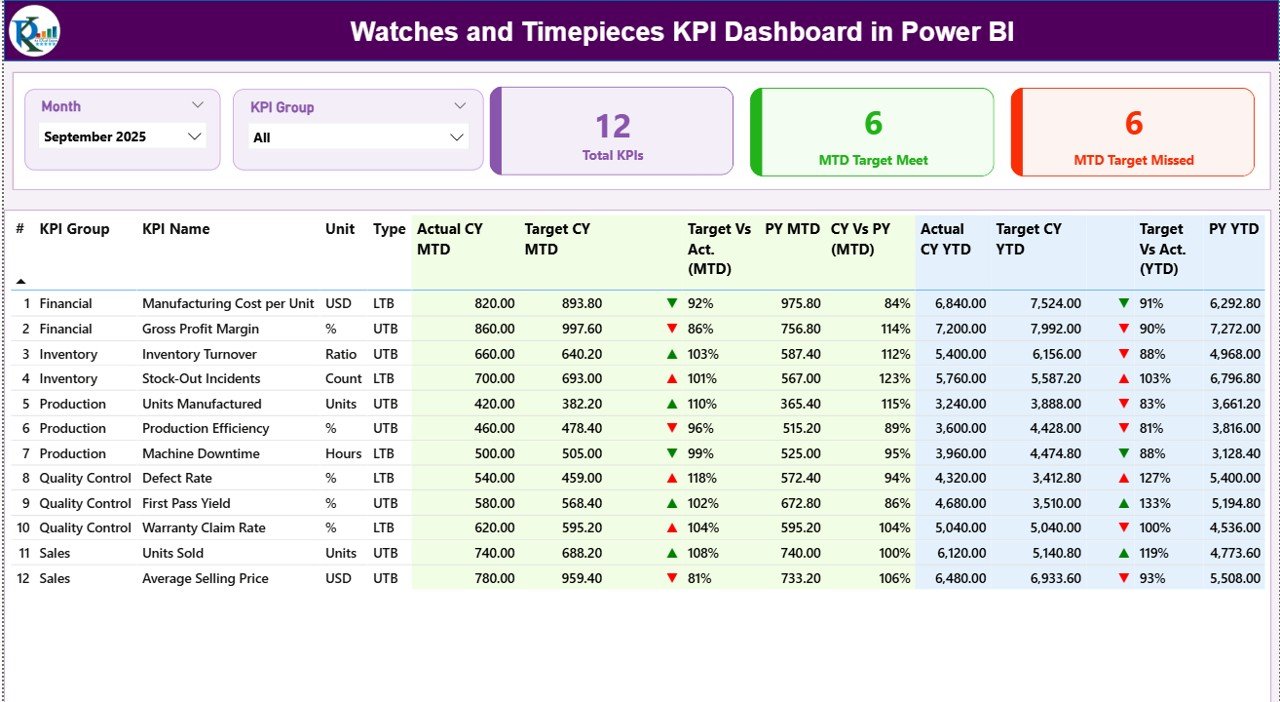
The Summary Page acts as the heart of the dashboard. It shows the overall KPI performance at one glance.
What Do You See at the Top?
At the top, you get:
-
Month Slicer
-
KPI Group Slicer
Therefore, you can filter performance by specific month and category.
KPI Cards Section
Below the slicers, you see 3 powerful KPI cards:
-
Total KPIs Count
-
MTD Target Meet Count
-
MTD Target Missed Count
These cards instantly tell you how many KPIs perform well and how many require attention.
For example:
-
If 18 out of 25 KPIs meet target, you know performance looks healthy.
-
However, if 10 KPIs miss targets, you must investigate.
Detailed KPI Performance Table
This section shows complete KPI analysis with structured columns:
KPI Number
Sequence number of KPI.
KPI Group
Category such as:
-
Sales
-
Inventory
-
Production
-
Customer
-
Finance
KPI Name
Specific performance metric.
Unit
Measurement type such as:
-
Percentage
-
Number
-
INR
-
USD
-
Units
Type
-
UTB (Upper the Better)
-
LTB (Lower the Better)
This classification helps the dashboard apply correct logic.
MTD Section (Month-to-Date)
Actual CY MTD
Current year actual performance for selected month.
Target CY MTD
Monthly target value.
MTD Icon
-
▲ Green → Target achieved
-
▼ Red → Target missed
Therefore, managers quickly identify performance.
Target Vs Actual (MTD)
Formula used:
PY MTD
Previous year value for same month.
CY Vs PY (MTD)
Formula used:
This comparison helps you measure growth.
Click to Purchases Watches and Timepieces KPI Dashboard in Power BI
YTD Section (Year-to-Date)
Similarly, you see:
-
Actual CY YTD
-
Target CY YTD
-
YTD Icon
-
Target Vs Actual (YTD)
-
PY YTD
-
CY Vs PY (YTD)
Therefore, you track both short-term and long-term performance.
2️⃣ KPI Trend Page – Performance Over Time
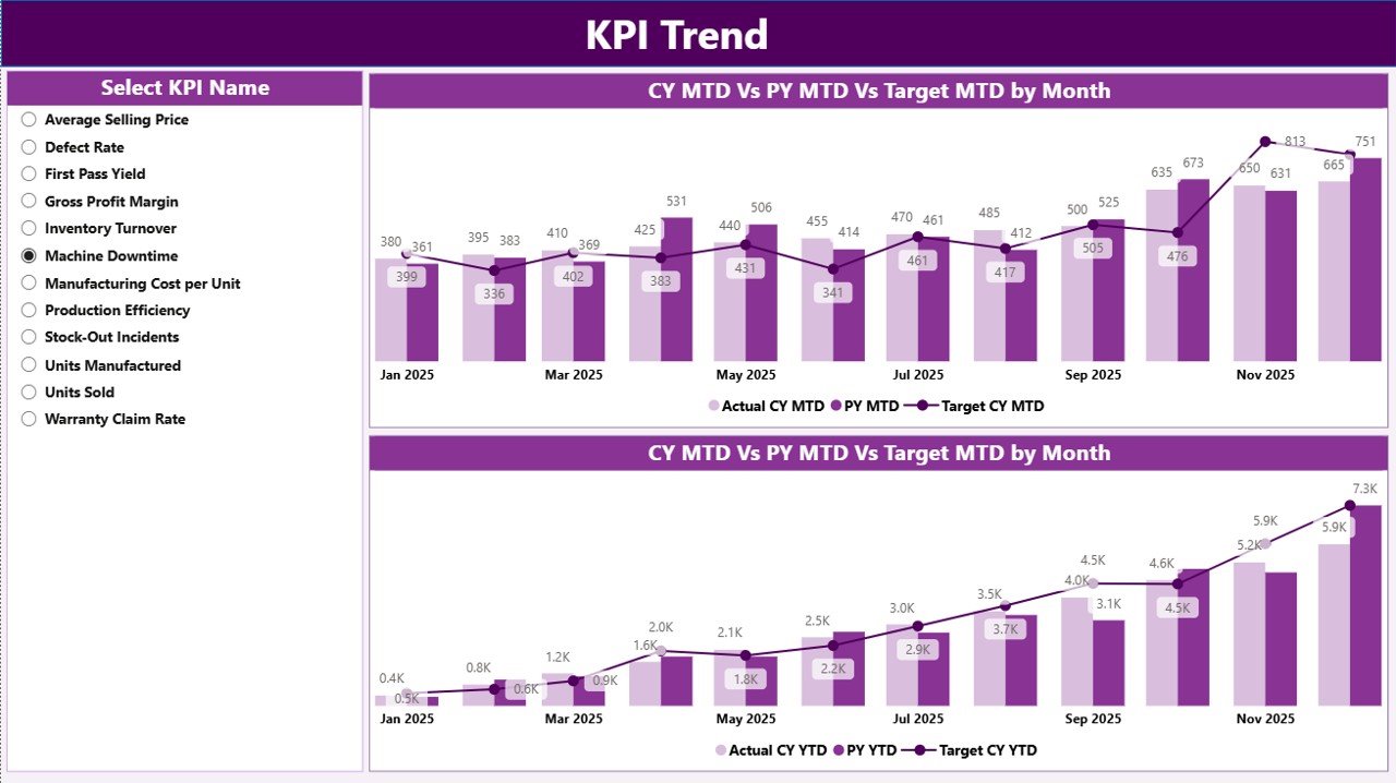
This page focuses on trend analysis.
On the left side, you get a KPI Name slicer.
Therefore, you can select any KPI and analyze its performance visually.
Two Combo Charts
MTD Combo Chart
Shows:
-
Current Year Actual
-
Previous Year Actual
-
Target
This chart helps you understand:
-
Seasonal movement
-
Monthly growth
-
Target gaps
YTD Combo Chart
Shows:
-
Current Year YTD
-
Previous Year YTD
-
Target YTD
This chart highlights:
-
Long-term growth
-
Performance consistency
-
Annual achievement trend
Consequently, management sees patterns clearly.
3️⃣ KPI Definition Page – Drill Through Intelligence
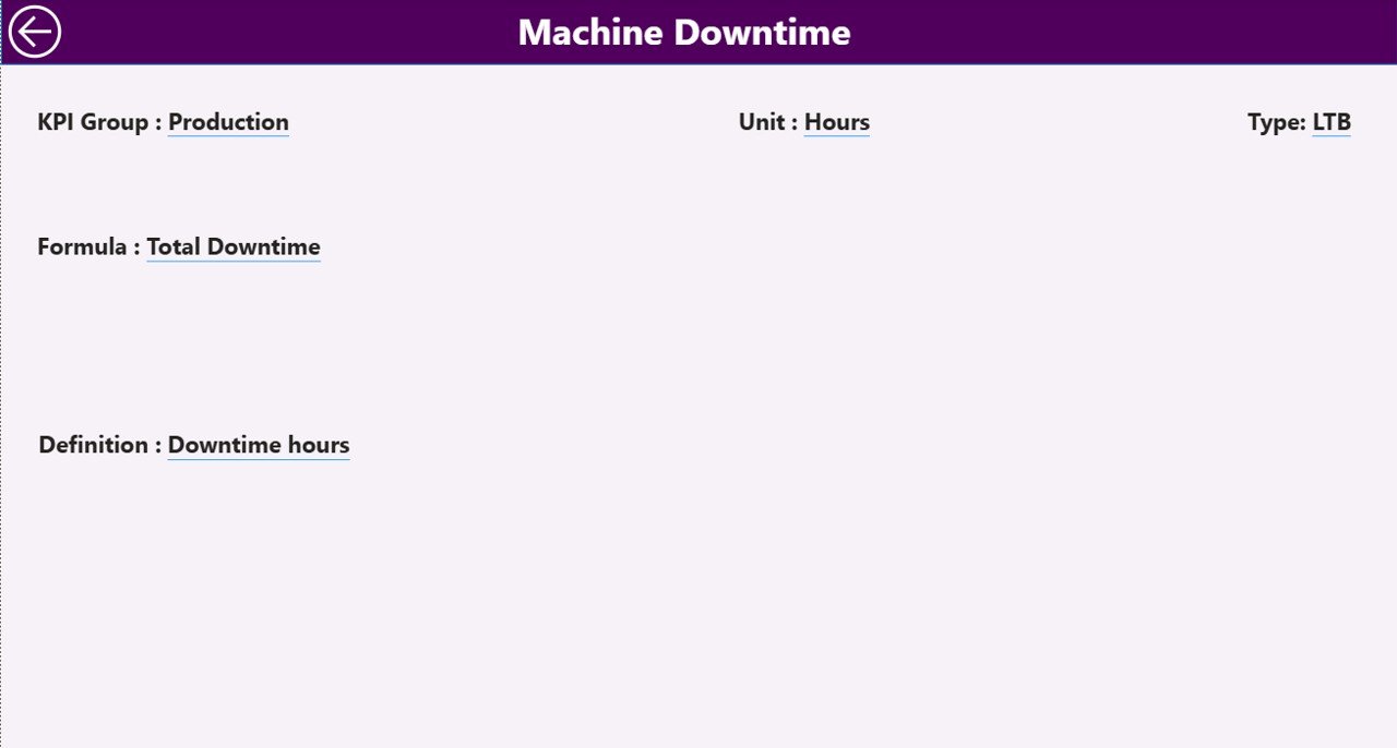
This page remains hidden.
From the Summary page, you can drill through to this page.
Here, you see:
-
KPI Number
-
KPI Name
-
Formula
-
Definition
-
Unit
-
Type
Therefore, whenever you want to understand how a KPI works, you can check it instantly.
To return, simply click the back button at top left corner.
Excel Data Structure – The Backbone
This dashboard uses Excel as data source.
You must maintain 3 worksheets.
1️⃣ Input_Actual Sheet
Fill:
-
KPI Name
-
Month (First date of month)
-
MTD Value
-
YTD Value
Make sure:
-
Month format = Date
-
Use first day of month (e.g., 01-Jan-2026)
2️⃣ Input_Target Sheet
Fill:
-
KPI Name
-
Month (First date of month)
-
MTD Target
-
YTD Target
Keep consistency in KPI naming.
3️⃣ KPI Definition Sheet
Fill:
-
KPI Number
-
KPI Group
-
KPI Name
-
Unit
-
Formula
-
Definition
-
Type (LTB or UTB)
This sheet controls the dashboard logic.
Important KPIs for Watches and Timepieces Industry
Here are some useful KPIs:
Sales KPIs
-
Net Sales
-
Gross Sales
-
Sales Growth %
-
Average Selling Price
Production KPIs
-
Production Volume
-
Rejection Rate
-
Manufacturing Cost
Inventory KPIs
-
Inventory Turnover
-
Stock Ageing
-
Stock Availability
Customer KPIs
-
Customer Return Rate
-
Warranty Claims
-
Repeat Purchase Rate
Finance KPIs
-
Profit Margin %
-
Operating Cost %
-
Revenue Growth %
Advantages of Watches and Timepieces KPI Dashboard in Power BI
Now let us understand the key benefits.
1️⃣ Real-Time Decision Making
You monitor performance instantly. Therefore, you take faster decisions.
2️⃣ Clear Target Tracking
You see target achievement with visual indicators. As a result, you detect issues immediately.
3️⃣ Month and Year Comparison
You compare current performance with previous year easily. Therefore, you measure growth clearly.
4️⃣ Drill-Through Analysis
You access KPI formulas and definitions directly. Consequently, transparency improves.
5️⃣ Easy Data Maintenance
You update Excel files only. Power BI refreshes automatically. Therefore, operations remain simple.
6️⃣ Better Strategic Planning
You identify:
-
Weak categories
-
Strong performing groups
-
Seasonal trends
As a result, planning becomes data-driven.
Best Practices for the Watches and Timepieces KPI Dashboard in Power BI
To maximize results, follow these best practices:
✔ Maintain Clean Excel Data
-
Use consistent KPI names
-
Use correct date format
-
Avoid blank rows
✔ Update Data Monthly
Fill Actual and Target data every month without delay.
✔ Classify KPIs Properly
Correctly assign LTB or UTB. Otherwise, status icons may show wrong signals.
✔ Use Meaningful KPI Groups
For example:
-
Sales
-
Production
-
Inventory
-
Finance
Clear grouping improves analysis.
✔ Review Trend Page Regularly
Monthly review helps you detect declining KPIs early.
✔ Validate Target Logic
Ensure realistic and achievable targets.
Who Should Use This Dashboard?
This solution fits:
-
Watch manufacturers
-
Luxury watch brands
-
Smartwatch companies
-
Watch distributors
-
Retail chains
-
Franchise owners
Moreover, financial controllers and sales managers benefit greatly.
How Does This Dashboard Improve Profitability?
Let us break it down.
-
It identifies underperforming KPIs
-
It highlights missed targets
-
It shows declining trends
-
It reveals growth opportunities
Therefore, you act before problems grow.
Consequently, profitability improves steadily.
Why Choose Power BI for Watch Industry Analytics?
Click to Purchases Watches and Timepieces KPI Dashboard in Power BI
Power BI offers:
-
Interactive visuals
-
Drill-through functionality
-
Dynamic slicers
-
Easy Excel integration
-
Fast performance
Moreover, it supports future scalability.
Conclusion
The watch industry demands precision. Every second matters. Therefore, businesses must track performance accurately.
The Watches and Timepieces KPI Dashboard in Power BI provides:
-
Structured KPI monitoring
-
MTD and YTD tracking
-
Target comparison
-
Previous year benchmarking
-
Trend visualization
-
Drill-through clarity
Instead of relying on scattered reports, you can centralize performance tracking in one intelligent system.
Therefore, if you want better control, stronger planning, and improved profitability, this dashboard becomes your powerful business tool.
Frequently Asked Questions with Answers
1️⃣ What type of businesses can use this dashboard?
Watch manufacturers, retailers, distributors, and luxury brands can use it.
2️⃣ Do I need advanced Power BI knowledge?
No. You only need to update Excel data. The dashboard works automatically.
3️⃣ Can I add more KPIs?
Yes. You can add new KPIs in the KPI Definition and data sheets.
4️⃣ How often should I update the data?
Update monthly for best results.
5️⃣ Can I change KPI groups?
Yes. You can modify groups in the KPI Definition sheet.
6️⃣ Does it support both LTB and UTB logic?
Yes. The dashboard supports both types with correct icon logic.
7️⃣ Can I track multiple years?
Yes. If you add data for multiple years, Power BI will compare them.
Visit our YouTube channel to learn step-by-step video tutorials