Managing transportation operations without clear visibility often leads to rising costs, delayed deliveries, and shrinking profits. As fuel prices fluctuate and customer expectations increase, transportation businesses must track performance accurately and in real time. Therefore, companies now rely heavily on analytics instead of assumptions. That is exactly where a Transportation Services Dashboard in Power BI becomes a powerful and practical solution.
In this detailed and SEO-friendly article, you will learn what a Transportation Services Dashboard in Power BI is, why it matters, how it works, its complete page-wise structure, advantages, best practices, and frequently asked questions. Moreover, this guide uses clear language, active voice, and real-world logic so you can easily apply it to your own transportation or logistics operations.
Click to Purchases Transportation Services Dashboard in Power BI
What Is a Transportation Services Dashboard in Power BI?
A Transportation Services Dashboard in Power BI is an interactive business intelligence tool that visually tracks, analyzes, and monitors transportation-related performance metrics in one centralized platform.
Instead of reviewing multiple spreadsheets and static reports, this dashboard brings operating cost, revenue, profit, delays, routes, fuel types, and service performance into a single dynamic view. As a result, decision-makers gain instant clarity and control.
Because the dashboard runs on Microsoft Power BI, it allows real-time filtering, slicing, and drill-down analysis. Therefore, managers can quickly identify inefficiencies and act before problems grow.
Why Do Transportation Companies Need a Power BI Dashboard?
Transportation businesses deal with complex operations every day. Without analytics, teams struggle to answer critical questions. For example:
-
Which transport mode generates the highest operating cost?
-
Which routes deliver the best profit?
-
How do fuel types impact margins?
-
Where do delays affect performance the most?
-
How do monthly trends change revenue and profit?
A Transportation Services Dashboard in Power BI answers all these questions instantly. Moreover, it replaces guesswork with data-backed decisions.
How Does a Transportation Services Dashboard in Power BI Work?
The dashboard works by connecting raw transportation data from Excel, databases, or ERP systems into Power BI. Then, Power BI transforms that data into interactive visuals.
Step-by-Step Working Logic
-
Data gets captured in structured source files
-
Power BI cleans and models the data
-
Measures calculate cost, revenue, profit, and percentages
-
Visuals display insights using charts and KPI cards
-
Slicers filter data by service type, fuel type, route, and time
As a result, users can explore data from multiple angles without technical complexity.
What Are the Key Features of a Transportation Services Dashboard in Power BI?
This dashboard includes five powerful analytical pages, each designed for a specific decision-making purpose. Let us explore them one by one.
1. Overview Page: How Do You Get Instant Performance Visibility?
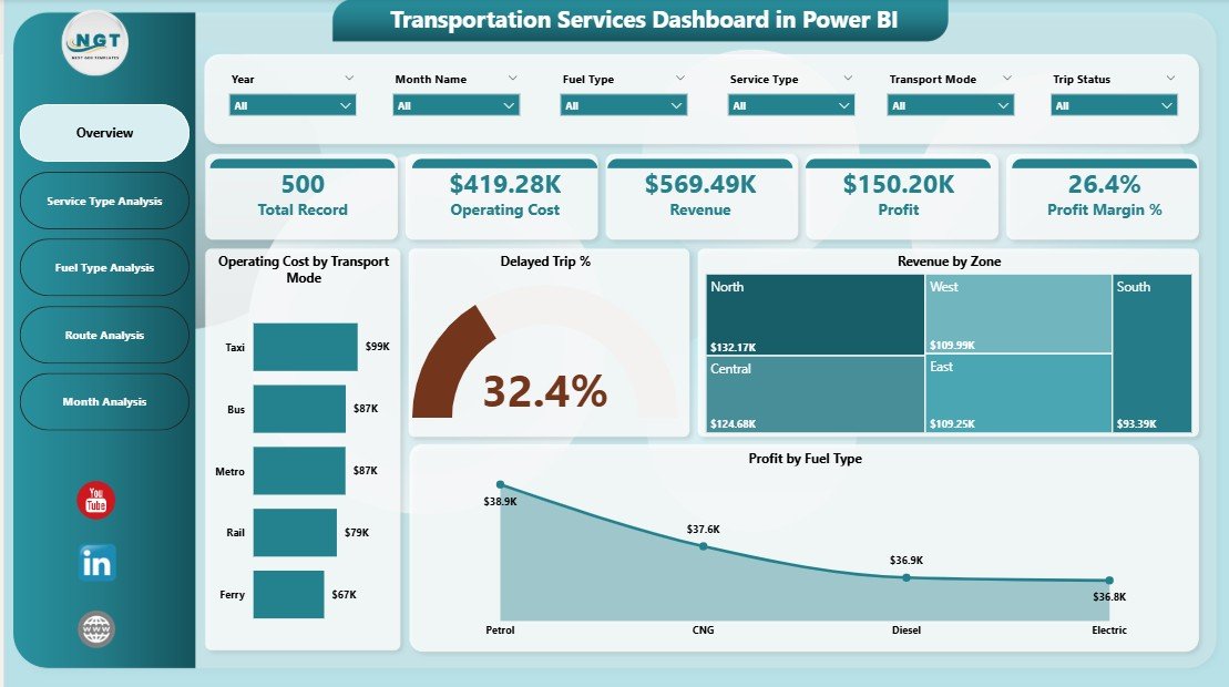
The Overview Page acts as the main landing page of the dashboard. It provides a quick snapshot of overall transportation performance.
Key Highlights of the Overview Page
-
Interactive slicers for easy filtering
-
High-level KPI cards for instant insights
-
Summary visuals for cost, revenue, delays, and profit
-
Click to Purchases Transportation Services Dashboard in Power BI
KPIs and Visuals on the Overview Page
-
Operating Cost by Transport Mode
-
Delayed Trip %
-
Revenue by Zone
-
Profit by Fuel Type
Because everything appears in one place, stakeholders can quickly understand overall performance. Moreover, slicers allow users to focus on specific periods or categories.
2. Service Type Analysis: How Do Different Services Perform?

Transportation companies often offer multiple service types such as express delivery, bulk transport, or regional distribution. Therefore, understanding service-level performance becomes critical.
Purpose of the Service Type Analysis Page
This page compares costs, revenue, and profit across different service types. As a result, managers can identify which services add value and which services reduce margins.
Charts Included in This Page
-
Operating Cost by Service Type
-
Revenue by Service Type
-
Profit by Service Type
Because slicers exist on this page, users can drill down by time, region, or mode. Consequently, service-level decisions become faster and more accurate.
Click to Purchases Transportation Services Dashboard in Power BI
3. Fuel Type Analysis: How Does Fuel Impact Profitability?
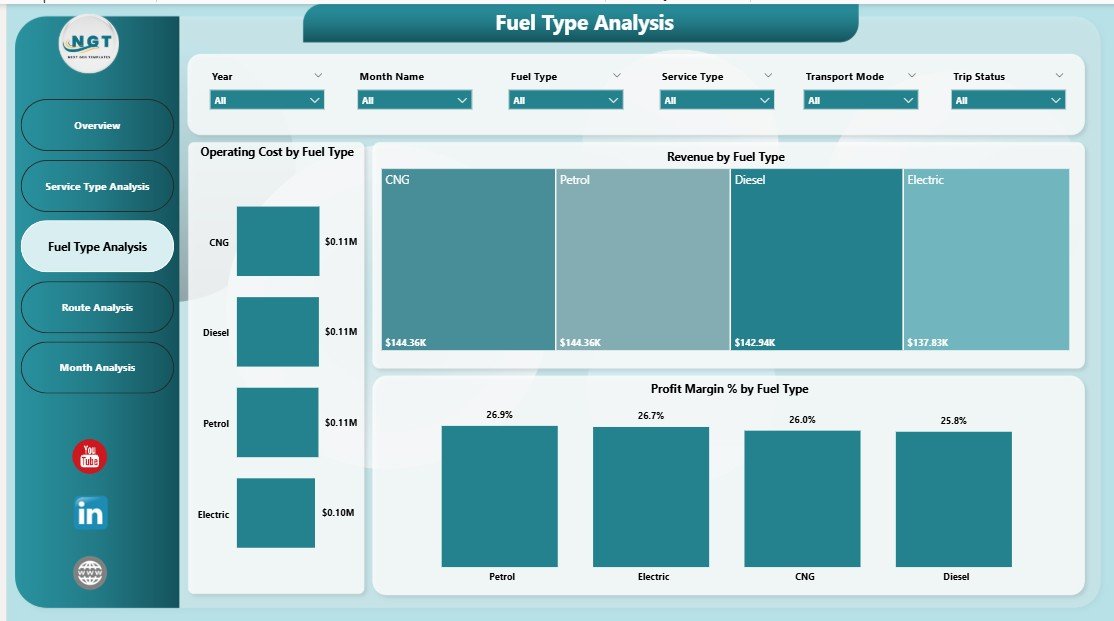
Fuel cost plays a major role in transportation expenses. Therefore, tracking fuel-wise performance becomes essential.
Why Fuel Type Analysis Matters
Different fuel types affect operating costs and profit margins differently. For example, diesel, petrol, electric, or hybrid vehicles may show varying efficiency.
Key Charts on the Fuel Type Analysis Page
-
Operating Cost by Fuel Type
-
Revenue by Fuel Type
-
Profit Margin % by Fuel Type
With these insights, organizations can optimize fuel strategies and invest in cost-effective options.
4. Route Analysis: Which Routes Deliver the Best Results?
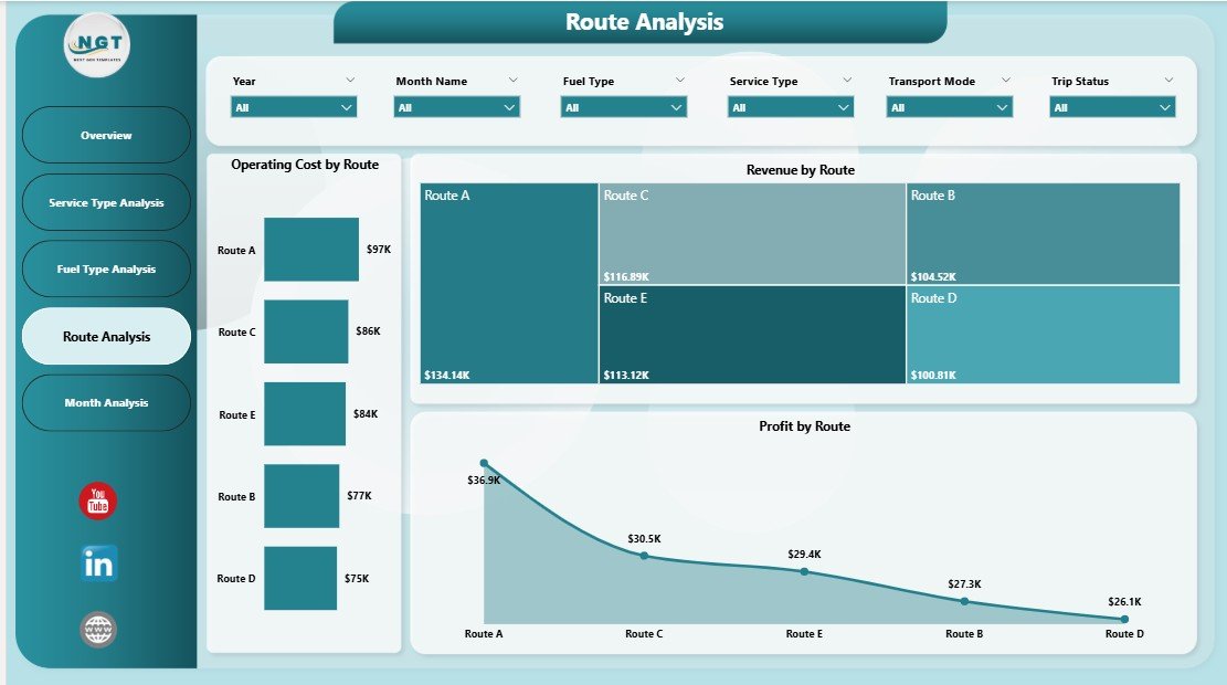
Not all routes perform equally. Some routes generate high revenue but low profit, while others operate efficiently.
Objective of the Route Analysis Page
This page evaluates transportation performance route-wise so managers can optimize logistics planning.
Key Visuals on the Route Analysis Page
-
Operating Cost by Route
-
Revenue by Route
-
Profit by Route
Because slicers remain active, users can analyze routes across months, fuel types, or service categories. Consequently, route optimization becomes data-driven.
Click to Purchases Transportation Services Dashboard in Power BI
5. Monthly Trends: How Does Performance Change Over Time?
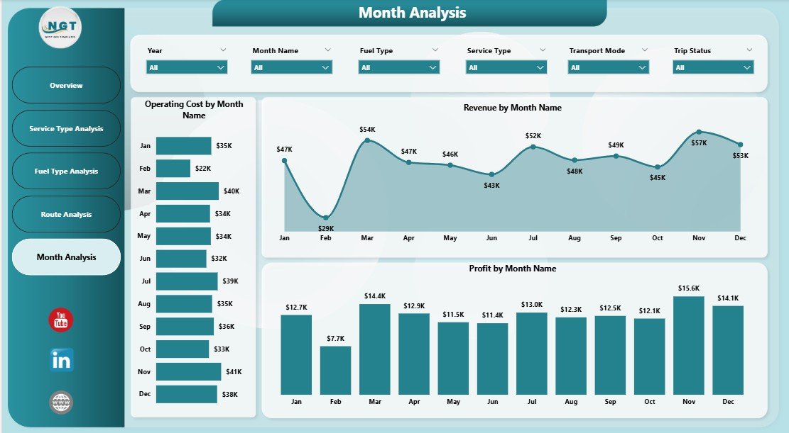
Tracking trends over time helps organizations predict future performance. Therefore, the Monthly Trends Page plays a crucial role.
Purpose of the Monthly Trends Page
This page shows how cost, revenue, and profit change month by month.
Charts on the Monthly Trends Page
-
Operating Cost by Month
-
Revenue by Month
-
Profit by Month
Because trends appear visually, teams can quickly identify seasonal patterns and prepare accordingly.
What Types of KPIs Can You Track in This Dashboard?
A Transportation Services Dashboard in Power BI supports a wide range of KPIs, including:
-
Operating Cost
-
Revenue
-
Profit
-
Profit Margin %
-
Delayed Trip %
-
Cost per Route
-
Revenue per Service Type
-
Fuel Efficiency Impact
Therefore, businesses can customize KPIs based on operational goals.
Advantages of Transportation Services Dashboard in Power BI
Using this dashboard provides multiple strategic and operational benefits.
1. Centralized Performance Monitoring
-
Combines all transportation metrics in one place
-
Eliminates scattered reports and files
-
Improves visibility across departments
2. Faster Decision-Making
-
Provides real-time insights
-
Reduces dependency on manual reports
-
Supports proactive management
3. Cost Optimization
-
Identifies high-cost routes and fuel types
-
Highlights inefficient service categories
-
Supports budget control
4. Improved Profitability
-
Tracks profit by route, fuel, and service
-
Helps focus on high-margin operations
-
Encourages data-driven pricing strategies
5. Better Operational Efficiency
-
Reduces delays through performance tracking
-
Improves planning using monthly trends
-
Enhances resource allocation
Who Can Use a Transportation Services Dashboard in Power BI?
This dashboard suits a wide range of users, including:
-
Transportation Companies
-
Logistics Providers
-
Fleet Managers
-
Operations Managers
-
Supply Chain Analysts
-
Finance Teams
-
Business Owners
Because Power BI offers a user-friendly interface, both technical and non-technical users can benefit.
How Is Power BI Better Than Traditional Excel Reports?
While Excel remains useful, Power BI offers several advantages.
Key Differences
-
Power BI supports interactive visuals
-
Power BI handles large datasets efficiently
-
Power BI enables real-time filtering
-
Power BI offers better data modeling
Therefore, a Transportation Services Dashboard in Power BI provides deeper insights than static Excel files.
Best Practices for the Transportation Services Dashboard in Power BI
Click to Purchases Transportation Services Dashboard in Power BI
To get maximum value, organizations must follow proven best practices.
1. Use Clean and Structured Data
-
Maintain consistent column names
-
Avoid missing values
-
Validate data before loading
2. Define Clear KPIs
-
Align KPIs with business goals
-
Avoid unnecessary metrics
-
Keep definitions consistent
3. Use Meaningful Visuals
-
Match charts to data type
-
Avoid overcrowding pages
-
Keep layouts simple and logical
4. Apply Slicers Strategically
-
Use slicers for time, route, and category
-
Avoid too many slicers
-
Place slicers consistently
5. Review Dashboard Regularly
-
Update data frequently
-
Refine KPIs as business evolves
-
Gather feedback from users
How Does This Dashboard Support Strategic Planning?
This dashboard does not only track performance. It also supports long-term strategy.
-
Identifies profitable routes for expansion
-
Highlights cost drivers for optimization
-
Supports investment decisions in fuel and fleet
-
Improves forecasting through trend analysis
As a result, leadership teams can plan confidently.
What Makes This Dashboard SEO-Friendly for Digital Products?
If you sell this dashboard as a digital product, it offers strong value:
-
Clear business use case
-
Multiple analytical pages
-
Customizable KPIs
-
Scalable for different company sizes
Therefore, it appeals to a broad audience.
Conclusion: Why Is a Transportation Services Dashboard in Power BI Essential?
A Transportation Services Dashboard in Power BI transforms raw transportation data into meaningful insights. Instead of reacting to problems late, businesses can act early and stay competitive.
By tracking operating cost, revenue, profit, routes, fuel types, service performance, and monthly trends, this dashboard empowers organizations to make smarter decisions. Moreover, its interactive nature ensures flexibility and scalability.
In today’s data-driven world, transportation companies cannot afford blind spots. Therefore, investing in a well-designed Power BI dashboard becomes not just useful—but essential.
Frequently Asked Questions (FAQs)
What is a Transportation Services Dashboard in Power BI?
A Transportation Services Dashboard in Power BI is an interactive analytics tool that tracks transportation performance metrics such as cost, revenue, profit, routes, fuel types, and delays in one centralized dashboard.
Can small transportation businesses use this dashboard?
Yes, small and medium-sized transportation businesses can easily use this dashboard. Because Power BI scales well, it fits both small datasets and large enterprise systems.
Do I need technical skills to use this dashboard?
No, users do not need advanced technical skills. Power BI offers an intuitive interface, and slicers make data exploration simple.
Can I customize KPIs in this dashboard?
Yes, you can fully customize KPIs, visuals, and filters based on your business needs.
How often should I update the dashboard data?
You should update data regularly. Daily or weekly updates work best for operational insights, while monthly updates suit strategic reviews.
Is Power BI better than Excel for transportation dashboards?
Yes, Power BI provides interactive visuals, faster performance, and advanced analytics compared to static Excel dashboards.
Visit our YouTube channel to learn step-by-step video tutorials