The education industry is changing faster than ever. Coaching institutes and tutoring centers no longer depend only on teaching quality. Instead, they also focus on data-driven decisions. Because of this shift, the Coaching & Tutoring Dashboard in Power BI has become an essential tool for modern education businesses.
Today, coaching centers manage hundreds or even thousands of students. They track enrollments, attendance, fees, subjects, cities, and performance scores every month. However, without a structured reporting system, decision-making becomes slow and inaccurate. Therefore, a Power BI dashboard for coaching and tutoring institutes solves this problem by turning raw data into meaningful insights.
In this detailed guide, you will learn what a Coaching & Tutoring Dashboard in Power BI is, why it matters, how it works, its key features, advantages, best practices, and frequently asked questions. Moreover, this article explains how a 5-page Power BI dashboard structure helps coaching businesses grow faster and smarter.
Click to Purchases Coaching & Tutoring Dashboard in Power BI
What Is a Coaching & Tutoring Dashboard in Power BI?
A Coaching & Tutoring Dashboard in Power BI is an interactive business intelligence solution that tracks and visualizes key performance metrics of coaching institutes and tutoring centers. It helps owners, managers, and academic teams monitor enrollment trends, fee collections, attendance levels, assessment scores, and training progress from a single platform.
Instead of working with scattered Excel files, this dashboard centralizes all information. As a result, decision-makers gain clarity and control. Moreover, Power BI enables slicers, filters, and visuals that update instantly based on selected criteria such as city, subject, coaching center, or month.
Because of this flexibility, coaching organizations can analyze performance at multiple levels without manual effort.
Why Do Coaching and Tutoring Institutes Need a Power BI Dashboard?
Coaching centers operate in a highly competitive market. Therefore, they must understand their performance clearly and act quickly. A Coaching & Tutoring Dashboard in Power BI supports this need in several ways.
First, it provides real-time visibility into enrollment and revenue. Second, it highlights attendance and training progress. Third, it identifies top-performing centers, cities, and subjects. Most importantly, it helps management make decisions based on facts rather than assumptions.
Without a dashboard, institutes rely on delayed reports. However, with Power BI, insights appear instantly.
How Does a Coaching & Tutoring Dashboard in Power BI Work?
The dashboard works on a simple yet powerful architecture.
First, the data gets captured in structured tables, usually through Excel or a database. Then, Power BI connects to this data source. After that, the dashboard applies calculations, relationships, and visuals. Finally, users interact with the dashboard using slicers and filters.
Because of this flow, users can drill down from high-level summaries to detailed analysis in seconds.
What Are the Key Pages in a Coaching & Tutoring Dashboard in Power BI?
This dashboard contains five well-structured pages, each designed for a specific analysis purpose. Together, these pages provide complete operational and strategic visibility.
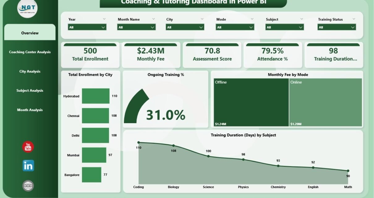
What Insights Does the Overview Page Provide?
1️⃣ Overview Page – A Complete Performance Snapshot
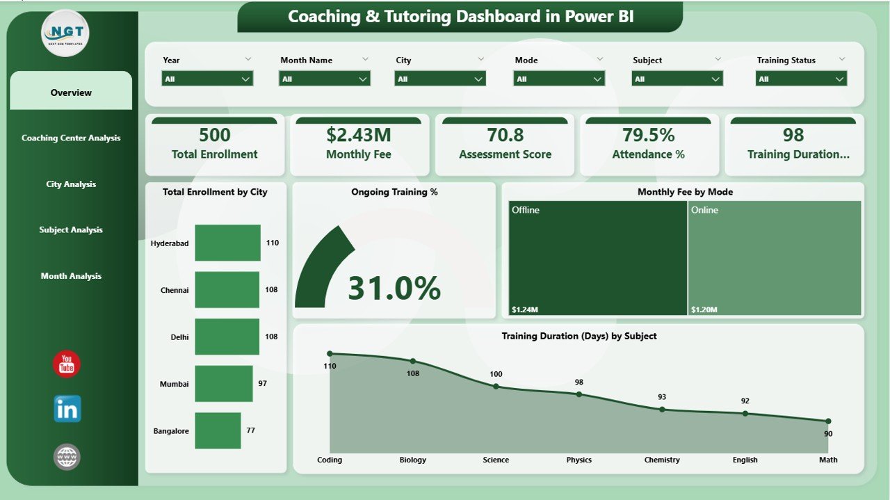
The Overview Page acts as the entry point of the dashboard. It presents high-level KPIs that summarize overall business performance.
This page includes interactive slicers, which allow users to filter data by city, subject, coaching center, mode, or month.
Key Metrics Displayed on the Overview Page
-
Total Enrollment by City
This card shows how many students enrolled in each city. As a result, management can quickly identify high-performing locations. -
Ongoing Training %
This metric highlights how many students actively attend training programs. Therefore, it helps measure engagement levels. -
Monthly Fee by Mode
This visualization compares fees across online, offline, and hybrid training modes. Consequently, institutes understand revenue contribution by delivery method. -
Training Duration by Subject
This insight helps analyze how much time students spend on different subjects.
Because this page summarizes the entire operation, leadership teams use it daily for quick decision-making.
How Does Coaching Center Analysis Improve Operational Control?

2️⃣ Coaching Center Analysis Page – Performance by Center
The Coaching Center Analysis page focuses on individual coaching centers. Since large institutes often operate multiple branches, this analysis becomes critical.
This page also includes slicers to filter results by time period, city, or subject.
Key Visuals on Coaching Center Analysis Page
-
Cost Assessment Score by Coaching Center
This chart evaluates performance efficiency against costs. Therefore, it helps identify centers that deliver better outcomes with optimal spending. -
Monthly Fee by Coaching Center
This visual compares revenue across centers. As a result, management can spot underperforming branches. -
Attendance % by Coaching Center
Attendance reflects student satisfaction and engagement. Hence, this metric plays a vital role in operational improvement.
Through this page, decision-makers can take corrective actions at the branch level.
Why Is City-Wise Analysis Important for Coaching Institutes?

3️⃣ City Analysis Page – Geographic Performance Insights
The City Analysis Page evaluates performance across different cities. Since student behavior, pricing, and demand vary by location, this analysis becomes essential.
Key Insights on the City Analysis Page
Click to Purchases Coaching & Tutoring Dashboard in Power BI
-
Assessment Score by City
This chart compares academic performance across cities. -
Monthly Fee by City
This insight highlights revenue contribution by location. -
Ongoing Training by City
This metric shows engagement and retention across regions.
Because city-level insights guide expansion and marketing strategies, this page supports long-term growth planning.
How Does Subject Analysis Improve Academic Outcomes?
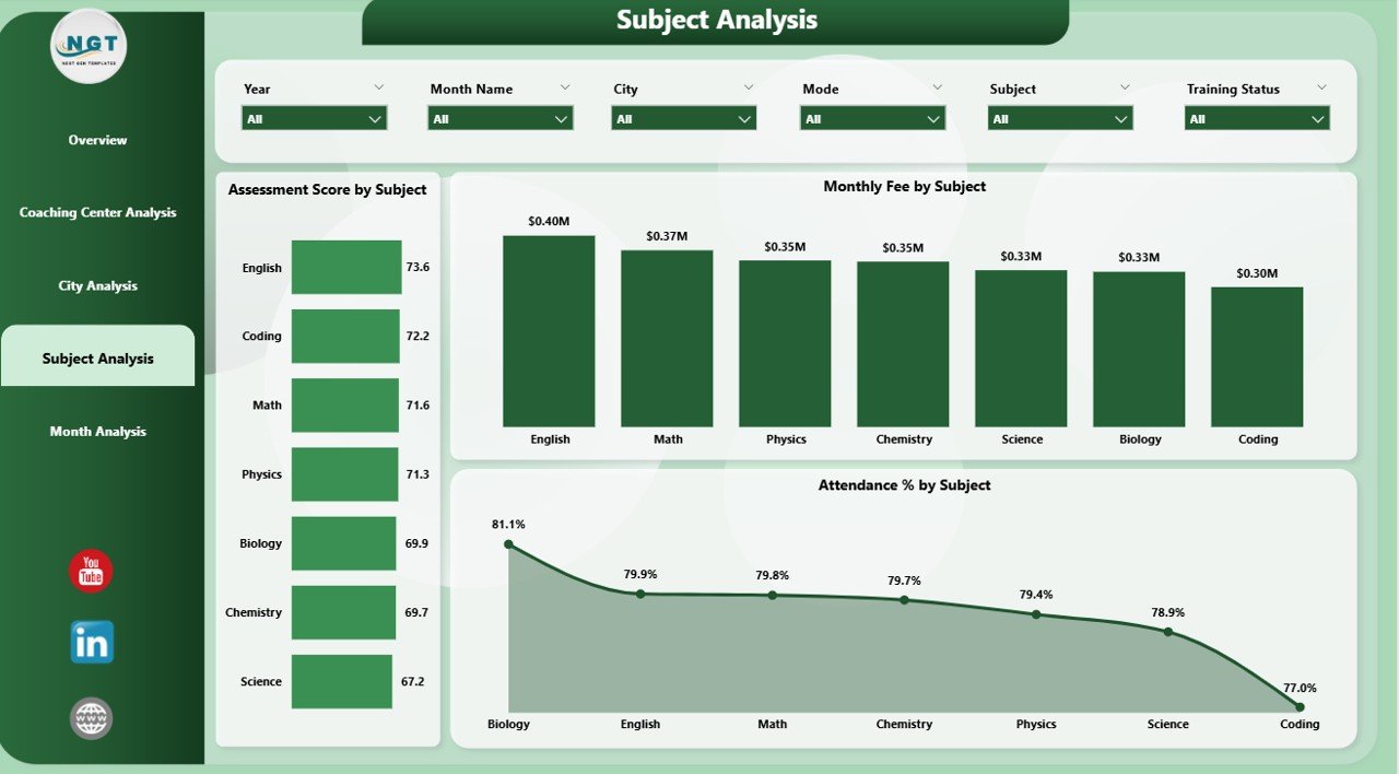
4️⃣ Subject Analysis Page – Subject-Wise Performance Tracking
The Subject Analysis Page focuses on academic performance and revenue by subject.
This page helps academic heads and curriculum planners understand which subjects perform best.
Key Visuals on the Subject Analysis Page
-
Assessment Score by Subject
This chart evaluates student performance across subjects. -
Monthly Fee by Subject
This insight reveals revenue contribution by subject. -
Attendance % by Subject
Attendance trends highlight student interest and teaching effectiveness.
Through this analysis, institutes can refine course offerings and allocate faculty more effectively.
Why Is Month-Wise Analysis Essential for Trend Tracking?
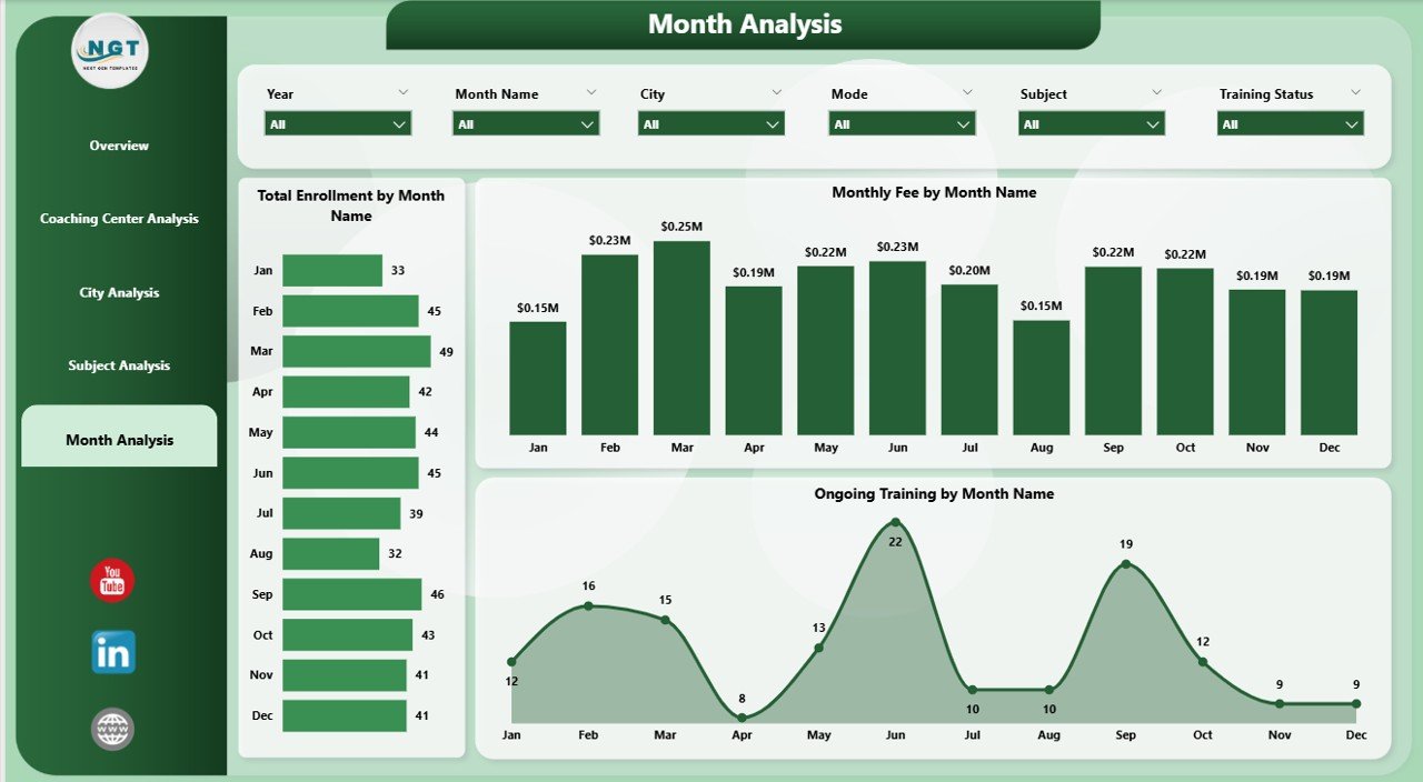
5️⃣ Month Analysis Page – Time-Based Trends
The Month Analysis Page shows how performance changes over time. Since trends matter more than single data points, this page plays a crucial role.
Key Metrics on the Month Analysis Page
-
Total Enrollment by Month
This chart highlights seasonal enrollment patterns. -
Monthly Fee by Month
This visual tracks revenue trends. -
Ongoing Training by Month
This metric measures consistency in student engagement.
As a result, management can forecast demand and plan marketing campaigns more effectively.
Advantages of Coaching & Tutoring Dashboard in Power BI
A Coaching & Tutoring Dashboard in Power BI delivers multiple business advantages.
🔹 Key Advantages
-
🚀 Centralized Reporting
All data stays in one place, which improves visibility. -
📊 Interactive Analysis
Users explore data using slicers and filters. -
⏱️ Faster Decision-Making
Real-time insights replace delayed reports. -
🎯 Performance Monitoring
Management tracks centers, cities, subjects, and months easily. -
💰 Revenue Optimization
Fee analysis helps maximize profitability. -
📈 Student Engagement Tracking
Attendance and training metrics highlight retention risks.
Because of these advantages, institutes gain a competitive edge.
Best Practices for the Coaching & Tutoring Dashboard in Power BI
Click to Purchases Coaching & Tutoring Dashboard in Power BI
To maximize value, institutes must follow proven best practices.
✅ Best Practices
-
📌 Use Clean and Structured Data
Always standardize city, subject, and center names. -
📌 Limit KPIs Per Page
Focus on clarity instead of clutter. -
📌 Use Meaningful Slicers
Add slicers for city, subject, center, and month. -
📌 Refresh Data Regularly
Keep insights up to date. -
📌 Train Users Properly
Ensure staff understands how to interpret visuals. -
📌 Review KPIs Monthly
Adjust metrics based on business goals.
By following these practices, institutes unlock the full potential of Power BI.
How Does This Dashboard Support Business Growth?
The dashboard does more than reporting. It drives growth.
Because management understands trends clearly, they optimize marketing spend. Since attendance issues appear early, teams act quickly. Moreover, revenue analysis helps pricing decisions. As a result, institutes improve profitability and student satisfaction simultaneously.
Conclusion: Why Should Coaching Institutes Adopt a Power BI Dashboard?
A Coaching & Tutoring Dashboard in Power BI transforms how education businesses operate. It replaces guesswork with clarity. It connects academic performance with financial outcomes. Most importantly, it empowers leadership to act confidently.
With its five powerful analysis pages, this dashboard provides complete visibility into enrollment, fees, attendance, assessments, and trends. Therefore, any coaching or tutoring institute that aims for scalable growth should adopt this solution.
Frequently Asked Questions (FAQs)
❓ What is the main purpose of a Coaching & Tutoring Dashboard in Power BI?
The dashboard helps coaching institutes track performance, revenue, attendance, and academic outcomes in one place.
❓ Who can use this dashboard?
Owners, managers, academic heads, and operations teams can all use it effectively.
❓ Can small coaching centers use Power BI dashboards?
Yes, both small and large institutes benefit from structured analytics.
❓ Does the dashboard support multiple cities and centers?
Yes, it supports city-wise and center-wise analysis through slicers.
❓ How often should data be refreshed?
Institutes should refresh data daily or weekly for accurate insights.
❓ Can this dashboard integrate with Excel?
Yes, Excel acts as a common data source for Power BI dashboards.
Visit our YouTube channel to learn step-by-step video tutorials