Managing special education programs requires clarity, accuracy, and timely insights. Schools, administrators, and policymakers must track therapy sessions, student progress, assessment outcomes, attendance, and improvement levels across multiple dimensions. However, when data stays scattered across spreadsheets and manual reports, decision-making becomes slow and reactive.
That is exactly why a Special Education Dashboard in Power BI becomes a powerful and essential solution.
In this detailed guide, you will learn what a Special Education Dashboard in Power BI is, why it matters, how it works, its key features, advantages, best practices, and frequently asked questions. This article explains everything in simple language while focusing on practical and real-world use cases.
Click to Purchases Special Education Dashboard in Power BI
What Is a Special Education Dashboard in Power BI?
A Special Education Dashboard in Power BI is an interactive data visualization tool that helps schools and education authorities monitor and analyze special education performance indicators in one centralized view.
Instead of working with multiple reports, educators can use a single dashboard to:
-
Track therapy sessions across schools and cities
-
Monitor assessment scores by disability type and support program
-
Analyze attendance trends month by month
-
Measure improvement percentages for special education students
-
Evaluate program effectiveness and cost patterns
Moreover, Power BI transforms raw education data into meaningful visuals that support faster and better decisions.
Why Is a Special Education Dashboard Important?
Special education programs require personalized learning, consistent monitoring, and evidence-based decisions. However, without proper analytics, schools struggle to identify gaps and measure real progress.
A Special Education Dashboard in Power BI solves this challenge by offering:
-
Real-time performance visibility
-
Clear comparison across schools, disability types, and programs
-
Early identification of students needing additional support
-
Data-driven program planning and budgeting
As a result, education teams can shift from guesswork to structured insights.
How Does a Special Education Dashboard in Power BI Work?
The dashboard connects structured data sources such as Excel files or databases that store:
-
Student therapy sessions
-
Assessment scores
-
Attendance records
-
Monthly fees
-
Improvement percentages
Power BI then uses this data to create interactive visuals, filters, and slicers. Users can slice data by month, school, disability type, or support program to instantly explore insights.
Because Power BI updates visuals dynamically, users always see the most recent information.
Key Features of the Special Education Dashboard in Power BI
This Special Education Dashboard includes five powerful analytical pages, each designed to answer specific questions.
Click to Purchases Special Education Dashboard in Power BI
1. Overview Page – What Is the Overall Performance of Special Education Programs?
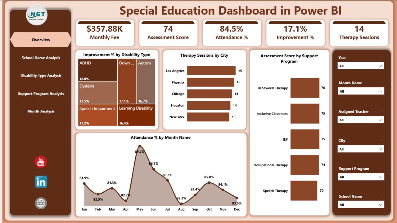
The Overview Page acts as the command center of the dashboard. It provides a high-level snapshot of special education performance.
Key Insights on the Overview Page
-
Improvement % by Disability Type
Helps identify which disability categories show stronger progress. -
Therapy Session by City
Displays therapy workload distribution across different locations. -
Assessment Score by Support Program
Evaluates the effectiveness of each special education support program. -
Attendance % by Month
Tracks student engagement and participation trends over time.
Why This Page Matters
Because this page summarizes critical KPIs, decision-makers can instantly assess performance without digging into details.
2. School Name Analysis – Which Schools Perform Better?
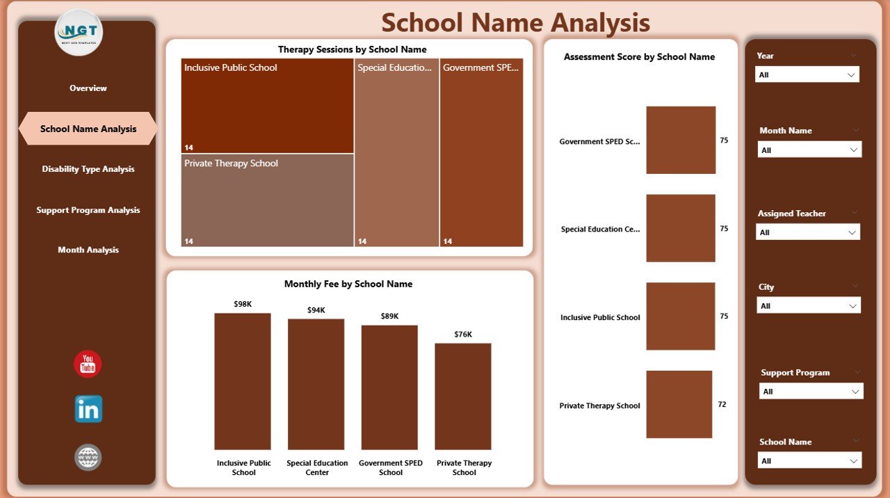
The School Name Analysis Page focuses on performance comparison across individual schools.
Key Charts on This Page
-
Therapy Session by School Name
Shows therapy load handled by each school. -
Assessment Score by School Name
Highlights academic and developmental outcomes across schools. -
Monthly Fee by School Name
Helps analyze cost distribution and funding utilization.
Value of This Analysis
With this page, administrators can identify high-performing schools and provide targeted support to underperforming ones.
3. Disability Type Analysis – How Do Outcomes Vary by Disability Type?
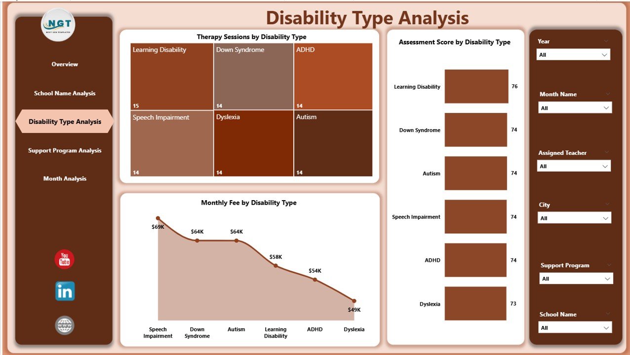
Different disability types require different intervention strategies. Therefore, this page focuses on outcome-based analysis by disability category.
Key Charts on This Page
-
Therapy Session by Disability Type
Shows therapy intensity required for each disability group. -
Assessment Score by Disability Type
Measures learning and development progress. -
Monthly Fee by Disability Type
Highlights cost patterns across disability categories.
Why This Page Is Critical
This analysis helps educators align resources with actual student needs while ensuring equitable support.
4. Support Program Analysis – Which Programs Deliver the Best Results?
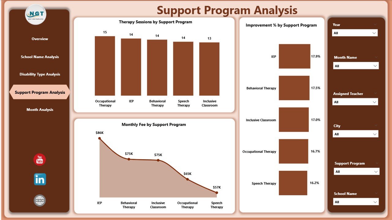
Support programs play a crucial role in special education success. This page evaluates program effectiveness.
Key Charts on This Page
-
Therapy Session by Support Program
Tracks program workload and reach. -
Assessment Score by Support Program
Measures learning outcomes per program. -
Monthly Fee by Support Program
Assesses cost efficiency. -
Improvement % by Support Program
Identifies programs that drive the most progress.
Strategic Benefit
This page enables schools to invest more in high-impact programs while optimizing underperforming ones.
Click to Purchases Special Education Dashboard in Power BI
5. Month Analysis – How Do Trends Change Over Time?
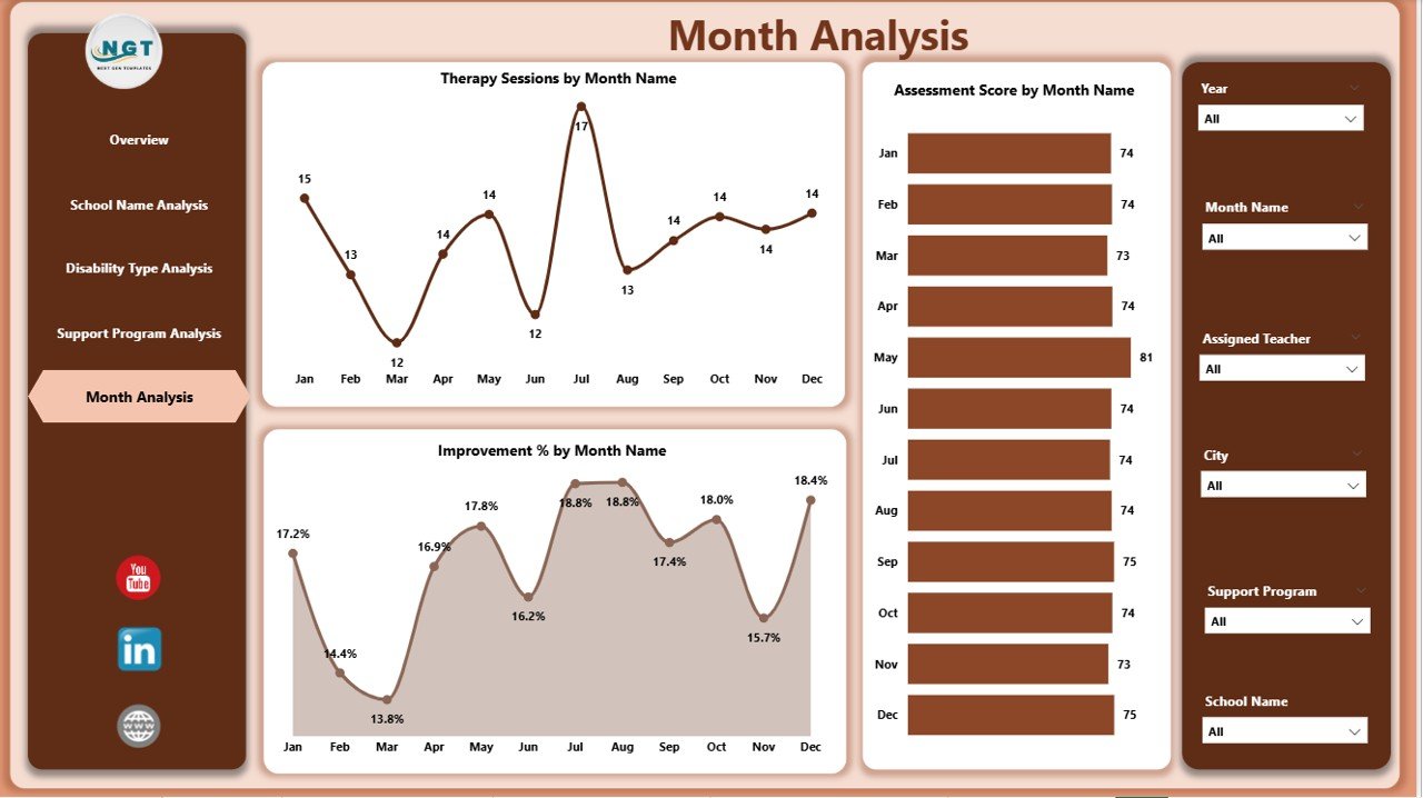
The Month Analysis Page focuses on time-based trends and seasonality.
Key Charts on This Page
-
Therapy Session by Month
-
Assessment Score by Month
-
Monthly Fee by Month
-
Improvement % by Month
Why Monthly Trends Matter
By analyzing trends over time, educators can:
-
Detect seasonal attendance issues
-
Plan therapy schedules more effectively
-
Evaluate the impact of interventions over months
What Type of Analysis Can You Perform with This Dashboard?
The Special Education Dashboard in Power BI supports multiple analytical perspectives.
Descriptive Analysis
-
What is the current attendance rate?
-
How many therapy sessions occurred this month?
Comparative Analysis
-
Which school performs better?
-
Which disability type shows higher improvement?
Trend Analysis
-
How do assessment scores change month by month?
-
Are improvement rates increasing over time?
Cost Analysis
-
How do monthly fees vary by school or program?
-
Which programs deliver better value for money?
Advantages of the Special Education Dashboard in Power BI
Using this dashboard delivers measurable benefits across education systems.
Key Advantages
-
📊 Centralized Reporting
Access all special education metrics in one place. -
⏱ Faster Decision-Making
Interactive visuals reduce reporting time. -
🎯 Targeted Interventions
Identify students and programs needing support. -
💡 Improved Transparency
Share insights with stakeholders confidently. -
📈 Data-Driven Planning
Align budgets and resources with real needs.
Opportunities for Improvement in Special Education Analytics
Even with a powerful dashboard, continuous improvement remains essential.
Areas to Enhance
-
Integrating real-time data feeds
-
Adding student-level drill-down analysis
-
Including predictive analytics for early intervention
-
Expanding outcome metrics beyond assessments
By improving analytics maturity, schools can maximize long-term impact.
Best Practices for the Special Education Dashboard in Power BI
Following best practices ensures accuracy, adoption, and long-term value.
1. Use Clean and Consistent Data
Ensure standardized data formats for dates, schools, and disability types.
2. Focus on Actionable KPIs
Track only metrics that drive decisions, not vanity numbers.
3. Use Slicers Effectively
Enable users to filter by month, school, disability type, or program.
4. Maintain Data Security
Restrict access to sensitive student information.
5. Update Data Regularly
Schedule refreshes to keep insights current and reliable.
Who Can Benefit from This Dashboard?
The Special Education Dashboard in Power BI serves multiple stakeholders.
-
School administrators
-
Special education coordinators
-
Therapists and counselors
-
Education policymakers
-
NGO and government education programs
Each group gains clarity and confidence through data-driven insights.
Why Choose Power BI for Special Education Reporting?
Click to Purchases Special Education Dashboard in Power BI
Power BI stands out because it offers:
-
Interactive visuals
-
Easy integration with Excel
-
Secure data sharing
-
Scalable analytics
As a result, Power BI becomes an ideal platform for education analytics.
Conclusion: Why the Special Education Dashboard in Power BI Is a Game-Changer
A Special Education Dashboard in Power BI transforms how schools understand, manage, and improve special education programs. Instead of relying on fragmented reports, educators gain a unified, interactive, and insight-driven system.
With five analytical pages, powerful visuals, and flexible filters, this dashboard supports better decisions, improved outcomes, and inclusive education success. Ultimately, it empowers educators to focus on what truly matters—student progress and well-being.
Frequently Asked Questions (FAQs)
What is the main purpose of a Special Education Dashboard in Power BI?
The dashboard helps monitor therapy sessions, assessments, attendance, costs, and improvement trends in one interactive view.
Can schools customize this dashboard?
Yes, schools can modify visuals, add KPIs, and adjust filters based on specific needs.
Is Power BI suitable for non-technical users?
Yes, Power BI offers user-friendly visuals and intuitive navigation.
How often should the data be updated?
Monthly updates work well, but weekly updates provide better monitoring.
Can this dashboard support government reporting?
Yes, it supports compliance reporting and performance audits.
Does the dashboard improve student outcomes?
Yes, data-driven insights help identify gaps and optimize interventions.
Visit our YouTube channel to learn step-by-step video tutorials
Click to Purchases Special Education Dashboard in Power BI