Managing elder care services requires constant attention to quality, safety, efficiency, and cost control. However, many elder care centers, nursing homes, and assisted living facilities still depend on manual reports, scattered Excel files, or basic registers. As a result, decision-making becomes slow, unclear, and reactive.
That is exactly where an Elder Care Services KPI Dashboard in Excel creates real value.
In this detailed and practical article, you will learn what an Elder Care Services KPI Dashboard in Excel is, why it is important, how it works, its worksheet-wise structure, key KPIs, advantages, best practices, and frequently asked questions. By the end of this guide, you will clearly understand how this ready-to-use Excel dashboard helps elder care providers monitor performance and improve service quality.
Click to buy Elder Care Services KPI Dashboard in Excel
What Is an Elder Care Services KPI Dashboard in Excel?
An Elder Care Services KPI Dashboard in Excel is a structured and visual performance monitoring tool designed to track key performance indicators (KPIs) related to elder care operations.
Instead of reviewing long reports or raw data, this dashboard presents KPIs in a clean and interactive format. It uses Excel features such as drop-downs, conditional formatting, charts, and formulas to show performance clearly.
Moreover, because the dashboard runs in Excel, elder care teams can easily update data, customize KPIs, and share reports without advanced technical skills.
As a result, management teams gain instant visibility into care quality, staff performance, safety metrics, and operational efficiency.
Why Do Elder Care Services Need a KPI Dashboard?
Elder care services operate in a sensitive and regulated environment. Therefore, tracking performance accurately becomes essential.
Without a KPI dashboard:
- Teams struggle to identify service gaps
- Managers react late to performance issues
- Data remains scattered across multiple files
- Compliance risks increase over time
However, when you use an Elder Care Services KPI Dashboard in Excel:
- You monitor service quality regularly
- You compare actual performance against targets
- You identify trends early
- You support data-driven decisions
Consequently, elder care facilities improve resident satisfaction and operational control.
How Does an Elder Care Services KPI Dashboard in Excel Work?
The dashboard works on a simple yet powerful concept.
First, users enter actual numbers, target values, and previous year data in dedicated input sheets.
Next, Excel formulas calculate MTD (Month-to-Date) and YTD (Year-to-Date) values.
Then, the dashboard compares these values and highlights performance using arrows and colors.
Finally, charts and tables present the results visually so that users can understand performance in seconds.
Because everything links dynamically, changing the selected month automatically updates the entire dashboard.
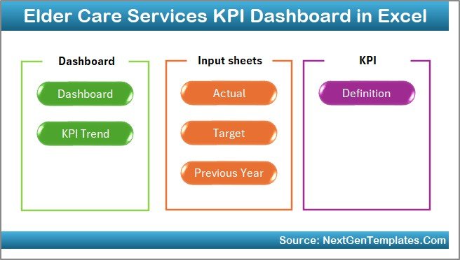
Worksheet-Wise Structure of the Elder Care Services KPI Dashboard in Excel
This dashboard consists of 7 well-structured worksheets, each serving a specific purpose. Let us understand each sheet in detail.
Summary Page – How Does the Summary Page Help Users?
The Summary Page acts as an index and navigation hub.
Key Features of the Summary Page
- Clean and simple layout
- Six navigation buttons
- Quick access to all major sheets
Why This Page Matters
Instead of scrolling through sheets, users jump directly to the required section. As a result, navigation becomes faster and user-friendly.
Click to buy Elder Care Services KPI Dashboard in Excel
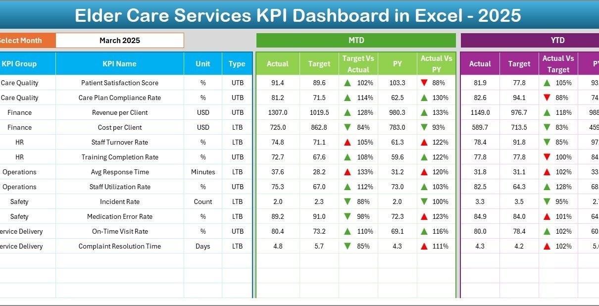
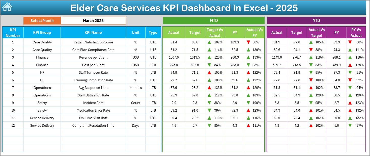
Dashboard Sheet – What Information Does the Main Dashboard Show?
The Dashboard sheet is the core of the Elder Care Services KPI Dashboard in Excel.
Key Features
- Month selection drop-down at cell D3
- Automatic update of all KPIs based on selected month
- Clear KPI comparison tables
- Visual performance indicators
KPIs Displayed on the Dashboard
The dashboard shows:
- MTD Actual vs Target
- MTD Actual vs Previous Year
- YTD Actual vs Target
- YTD Actual vs Previous Year
Visual Indicators Used
- Up arrows for positive performance
- Down arrows for negative performance
- Conditional formatting for quick insights
As a result, managers instantly identify areas performing well and areas needing attention.
Click to buy Elder Care Services KPI Dashboard in Excel
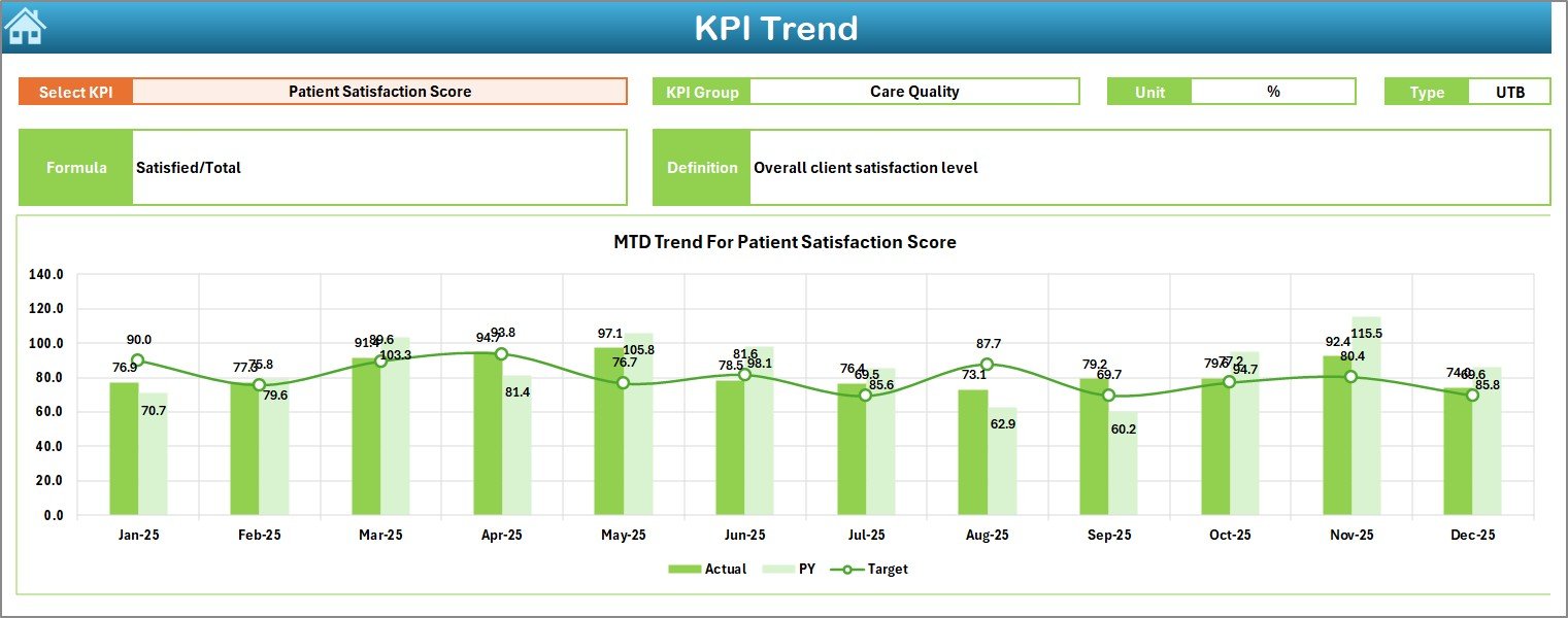
Trend Sheet – Why Is Trend Analysis Important?
The Trend sheet focuses on KPI performance over time.
How the Trend Sheet Works
- Select KPI name from drop-down at C3
- Dashboard displays detailed KPI information
- Charts update automatically
Information Displayed
- KPI Group
- Unit of measurement
- KPI Type (LTB or UTB)
- Formula
- Definition
Trend Charts Included
- MTD trend for Actual, Target, and Previous Year
- YTD trend for Actual, Target, and Previous Year
Because of this, users track performance patterns and predict future outcomes more accurately.
Click to buy Elder Care Services KPI Dashboard in Excel
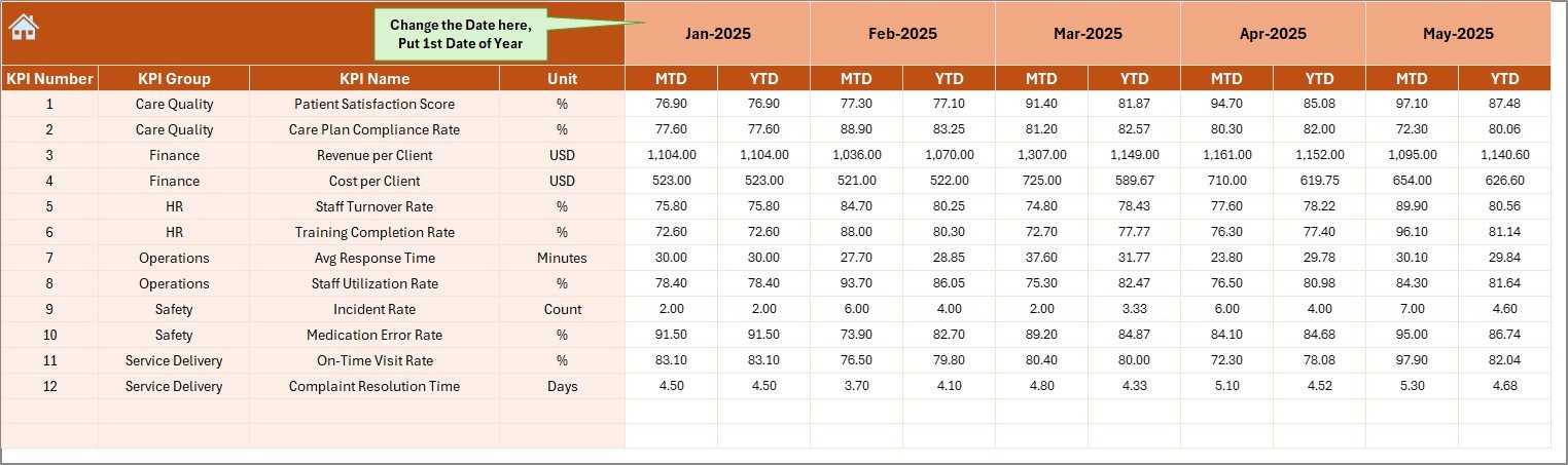
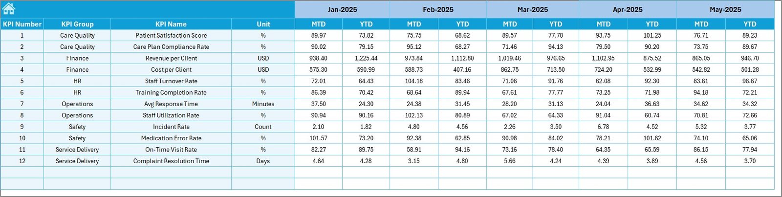
Actual Numbers Input Sheet – How Do Users Enter Actual Data?
The Actual Numbers Input sheet stores real performance data.
Key Features
- Month control at E1
- Easy data entry format
- Supports MTD and YTD values
How to Use This Sheet
- Enter the first month of the year in cell E1
- Update actual values for each KPI
- Change the month when needed
Once users update this sheet, all dashboard visuals update automatically. Therefore, data entry remains simple and controlled.
Click to buy Elder Care Services KPI Dashboard in Excel
Target Sheet – Why Are Targets Important?
The Target Sheet defines expected performance levels.
Key Features
- Monthly target entry
- MTD and YTD target values
- KPI-wise structure
Why This Sheet Matters
Targets create accountability. When teams compare actual performance against targets, they understand whether services meet expectations.
As a result, management teams set realistic goals and track progress consistently.
Click to buy Elder Care Services KPI Dashboard in Excel
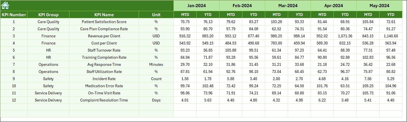
Previous Year Number Sheet – How Does Historical Comparison Help?
The Previous Year Number sheet stores last year’s data.
Key Features
- Same structure as current year data
- Supports MTD and YTD values
- Enables year-over-year comparison
Benefits of Using Previous Year Data
- Identify improvement or decline
- Understand seasonal patterns
- Measure long-term progress
Because of this, elder care centers plan improvements based on real trends.
Click to buy Elder Care Services KPI Dashboard in Excel
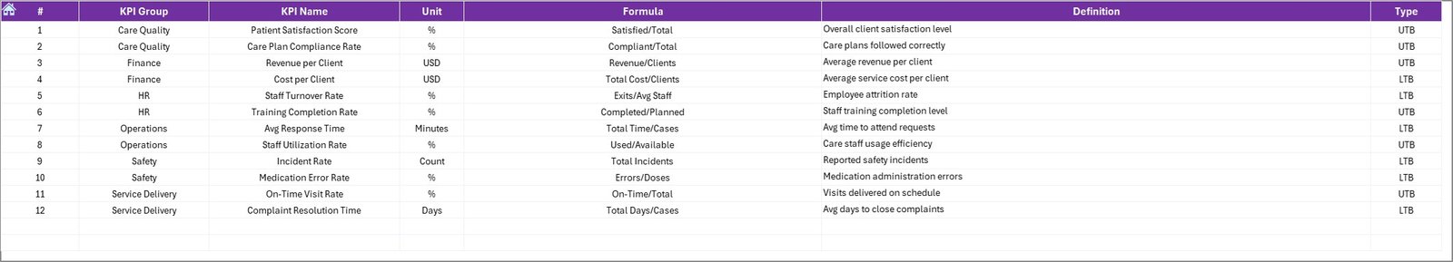
KPI Definition Sheet – Why Is KPI Standardization Important?
The KPI Definition sheet ensures clarity and consistency.
Information Captured
- KPI Name
- KPI Group
- Unit
- Formula
- KPI Definition
Why This Sheet Is Essential
When teams use standardized definitions, everyone understands what each KPI measures. Consequently, confusion reduces and reporting accuracy improves.
Click to buy Elder Care Services KPI Dashboard in Excel
What Are the Key KPIs for Elder Care Services?
An Elder Care Services KPI Dashboard in Excel can track various performance areas.
Common KPI Groups
- Care Quality
- Safety & Compliance
- Staff Performance
- Operational Efficiency
- Financial Performance
Example KPIs
- Resident Satisfaction Score
- Staff-to-Resident Ratio
- Incident Rate
- Medication Error Rate
- Average Response Time
- Cost per Resident
- Training Completion Rate
By tracking these KPIs, elder care facilities maintain service quality and compliance.
Advantages of Elder Care Services KPI Dashboard in Excel
Using this dashboard offers several practical benefits.
- Improves Decision-Making
Clear visuals and comparisons help managers take timely action.
- Enhances Service Quality
Continuous monitoring ensures better care for residents.
- Saves Time
Automated calculations reduce manual reporting effort.
- Increases Accountability
Targets and comparisons create performance ownership.
- Easy to Use and Customize
Excel familiarity makes adoption faster across teams.
Who Can Use This Elder Care KPI Dashboard?
This dashboard suits multiple roles:
- Elder Care Facility Managers
- Nursing Home Administrators
- Operations Managers
- Quality Assurance Teams
- Finance and Compliance Teams
Because of its flexible design, both small and large elder care organizations can use it effectively.
How Does Excel Make This Dashboard Powerful?
Excel offers strong features that enhance dashboard functionality.
Key Excel Features Used
- Drop-down lists
- Conditional formatting
- Charts
- Formulas
- Structured tables
As a result, the dashboard remains dynamic, reliable, and scalable.
Best Practices for the Elder Care Services KPI Dashboard in Excel
To get the best results, follow these best practices.
- Define Clear KPIs
Always align KPIs with elder care goals.
- Update Data Regularly
Enter actual data monthly to maintain accuracy.
- Use Realistic Targets
Set achievable targets based on capacity and resources.
- Review Trends Monthly
Analyze trend charts to spot early warnings.
- Maintain KPI Definitions
Keep definitions updated to avoid confusion.
- Train Users
Ensure staff understand how to read and use the dashboard.
How Does This Dashboard Support Compliance and Audits?
Elder care services face strict compliance requirements.
This dashboard:
- Stores historical data
- Tracks safety and quality KPIs
- Provides documented performance evidence
As a result, audit preparation becomes easier and faster.
How Does the Dashboard Improve Resident Satisfaction?
When teams monitor care quality KPIs:
- Response times improve
- Error rates reduce
- Service consistency increases
Consequently, resident satisfaction rises steadily.
How Can Elder Care Facilities Scale This Dashboard?
As facilities grow, they can:
- Add new KPIs
- Expand monthly data ranges
- Customize charts
- Integrate additional analysis sheets
Therefore, the dashboard grows with the organization.
Conclusion
An Elder Care Services KPI Dashboard in Excel is more than a reporting tool. It is a decision-support system that helps elder care providers deliver better services, maintain compliance, and optimize operations.
By using structured worksheets, clear KPIs, and dynamic visuals, this dashboard transforms raw data into actionable insights. Moreover, because it runs in Excel, it remains accessible, flexible, and cost-effective.
If you want to improve performance, enhance care quality, and gain full control over operations, this KPI dashboard becomes an essential solution for elder care services.
Frequently Asked Questions (FAQs)
What is an Elder Care Services KPI Dashboard in Excel used for?
It tracks and analyzes performance metrics related to elder care quality, safety, staff, and operations.
Can non-technical users use this dashboard?
Yes, the dashboard uses simple Excel features and requires no advanced skills.
How often should data be updated?
You should update data monthly to ensure accurate MTD and YTD analysis.
Can I customize KPIs in this dashboard?
Yes, you can easily add, remove, or modify KPIs using the KPI Definition sheet.
Does this dashboard support year-over-year comparison?
Yes, it compares current performance with previous year data.
Is this dashboard suitable for small elder care centers?
Absolutely. Both small and large facilities can use and scale it.
Can this dashboard help during audits?
Yes, it provides historical data and performance records required for audits.
Does the dashboard update automatically?
Yes, selecting a month updates all calculations and visuals instantly.
Visit our YouTube channel to learn step-by-step video tutorials
Watch the step-by-step video tutorial:
Click to buy Elder Care Services KPI Dashboard in Excel