Destination Management Companies (DMCs) operate in a fast-moving, service-driven environment. They manage tours, events, transportation, hotels, vendors, and client expectations—all at the same time. Because of this complexity, DMCs need clear visibility into performance. However, scattered Excel files and manual reports slow down decisions and increase risk.
That is exactly where a Destination Management Companies KPI Dashboard in Power BI becomes a game-changer.
This in-depth guide explains what a Destination Management Companies KPI Dashboard in Power BI is, why DMCs need it, how it works, its dashboard pages, Excel data structure, advantages, best practices, and frequently asked questions. By the end of this article, you will clearly understand how this ready-to-use Power BI dashboard helps DMCs improve efficiency, profitability, and decision-making.
Click to Purchases Destination Management Companies KPI Dashboard in Power BI
What Is a Destination Management Companies KPI Dashboard in Power BI?
A Destination Management Companies KPI Dashboard in Power BI is an interactive performance monitoring solution designed specifically for DMC operations. It tracks, analyzes, and visualizes key performance indicators related to bookings, operations, service quality, and financial outcomes.
Instead of reviewing multiple spreadsheets or static monthly reports, DMC managers use one centralized Power BI dashboard to:
-
Monitor Month-to-Date (MTD) performance
-
Analyze Year-to-Date (YTD) results
-
Compare actual performance with targets
-
Track previous year performance
-
Identify underperforming KPIs quickly
Because Power BI offers slicers, visuals, drill-throughs, and dynamic calculations, this dashboard turns raw data into actionable insights.
Why Do Destination Management Companies Need KPI Dashboards?
Destination Management Companies handle multiple moving parts daily. Therefore, small delays or inefficiencies can quickly impact customer satisfaction and revenue.
Key Challenges Faced by DMCs Without KPI Dashboards
-
Manual reporting consumes time and effort
-
Data remains scattered across multiple Excel files
-
Management lacks real-time performance visibility
-
Teams react late to operational issues
-
Targets remain unclear or poorly tracked
However, a KPI dashboard in Power BI solves these challenges by providing a single source of truth.
How Does a Destination Management Companies KPI Dashboard in Power BI Work?
The dashboard works on a simple yet powerful concept: Excel as the data source and Power BI as the analytics layer.
Step-by-Step Working Process
-
You enter actual KPI values in Excel
-
You enter target KPI values in Excel
-
You define KPI logic, units, and types
-
Power BI connects to the Excel file
-
Visuals update automatically based on slicers
As a result, DMC managers always see the latest performance without manual recalculation.
What Are the Key Features of the Destination Management Companies KPI Dashboard in Power BI?
This ready-to-use dashboard includes three structured pages designed for operational clarity and management insight.
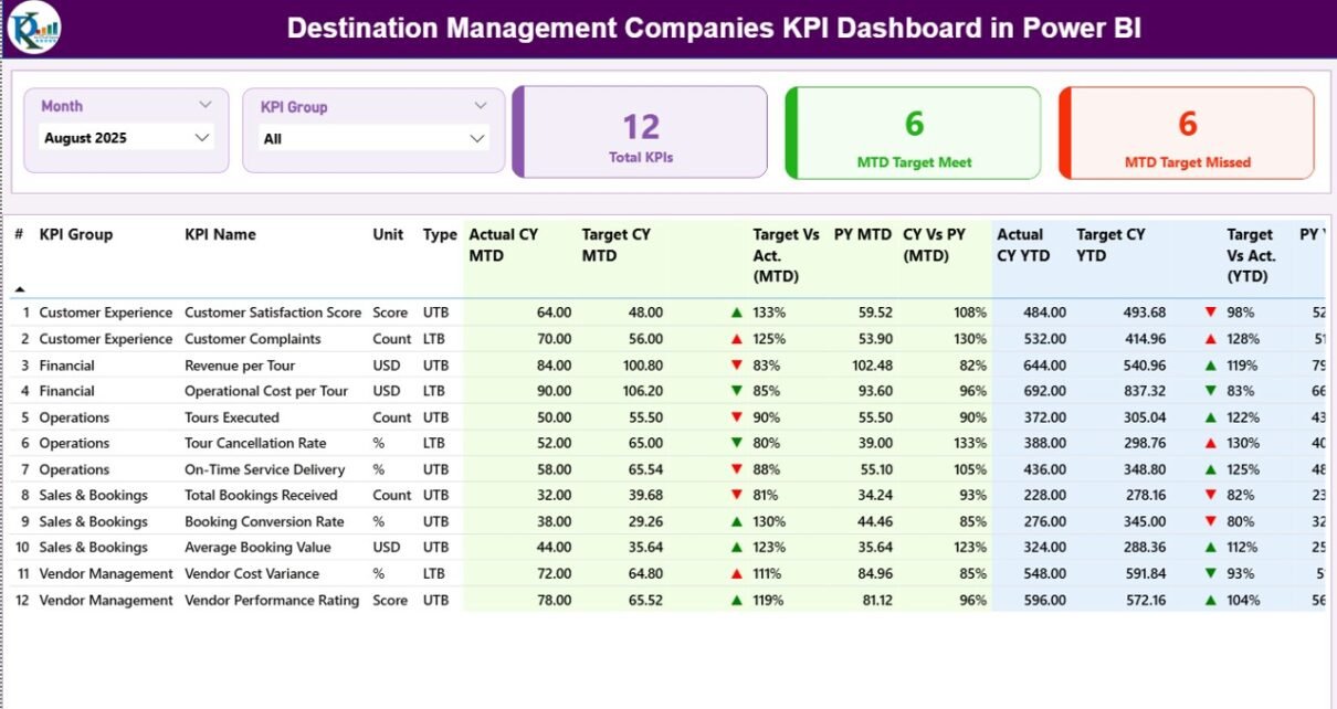
What Is Included in the Summary Page of the KPI Dashboard?
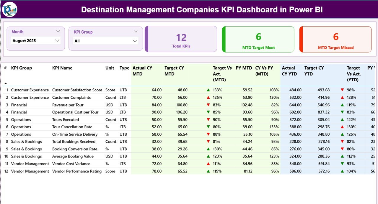
The Summary Page serves as the main landing page of the dashboard. It provides a complete performance snapshot at a glance.
Top-Level Slicers and KPI Cards
At the top of the page, you will find:
-
Month Slicer – Select the reporting month
-
KPI Group Slicer – Filter KPIs by category
Additionally, three KPI cards highlight:
-
Total KPIs Count
-
MTD Target Meet Count
-
MTD Target Missed Count
These cards immediately show how many KPIs perform well and how many need attention.
What Information Does the KPI Detail Table Show?
Below the KPI cards, a detailed KPI table displays comprehensive performance data.
KPI Table Columns Explained
-
KPI Number
Shows the sequence number of each KPI -
KPI Group
Represents the category or department of the KPI -
KPI Name
Displays the name of the KPI -
Unit
Shows the unit of measurement -
Type (LTB / UTB)
Indicates whether Lower is Better or Upper is Better -
Actual CY MTD
Displays the current year’s actual Month-to-Date value -
Target CY MTD
Shows the target Month-to-Date value -
MTD Icon
Uses ▲ green and ▼ red arrows to show target achievement -
Target vs Actual (MTD)
Calculates Actual ÷ Target for MTD -
PY MTD
Shows the previous year’s MTD value -
CY vs PY (MTD)
Compares current MTD with previous year MTD -
Actual CY YTD
Displays the current year’s actual Year-to-Date value -
Target CY YTD
Shows the target Year-to-Date value -
YTD Icon
Indicates YTD performance using arrows -
Target vs Actual (YTD)
Calculates Actual ÷ Target for YTD -
PY YTD
Displays previous year YTD value -
CY vs PY (YTD)
Compares current YTD with previous year YTD
Because of this structure, managers can quickly identify trends and problem areas.
How Does the KPI Trend Page Help DMCs?
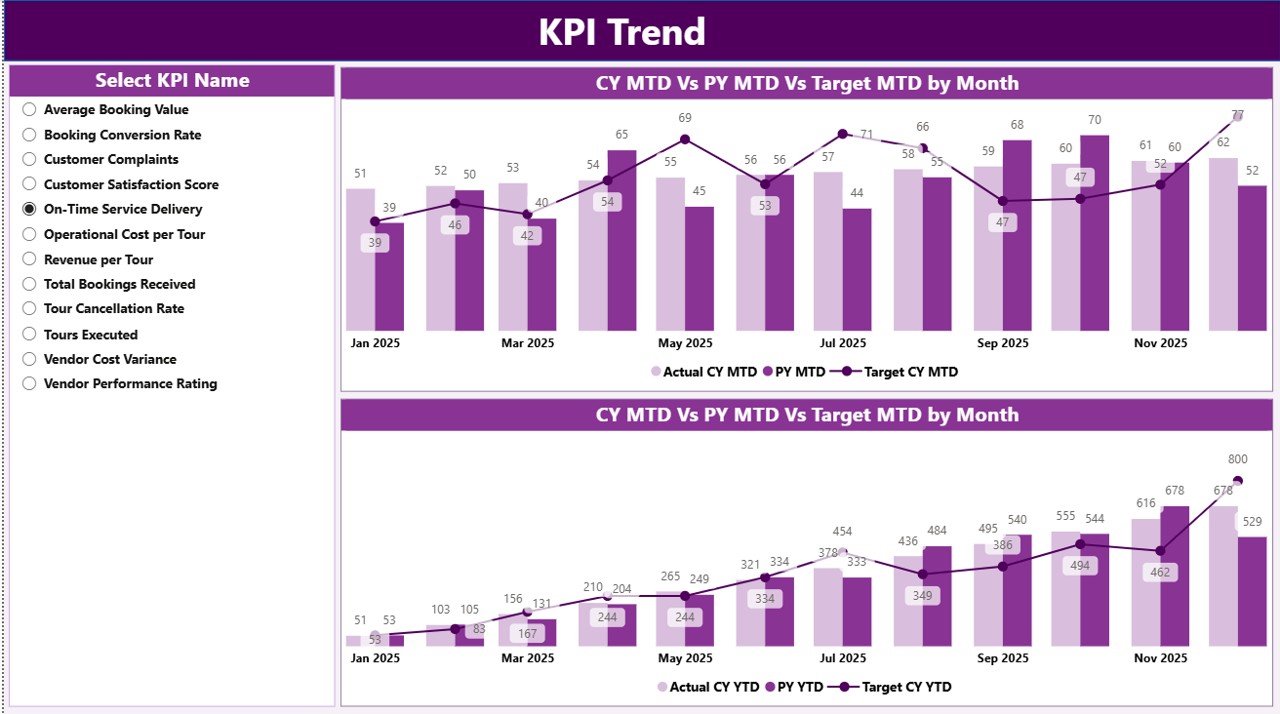
The KPI Trend Page focuses on performance trends over time.
Key Highlights of the KPI Trend Page
-
Two combo charts display:
-
Current Year Actual
-
Previous Year Actual
-
Target values
-
-
Separate charts show MTD trends and YTD trends
-
A KPI Name slicer allows focused analysis
As a result, managers can visually understand whether performance improves or declines across months.
Click to Purchases Destination Management Companies KPI Dashboard in Power BI
What Is the Purpose of the KPI Definition Page?
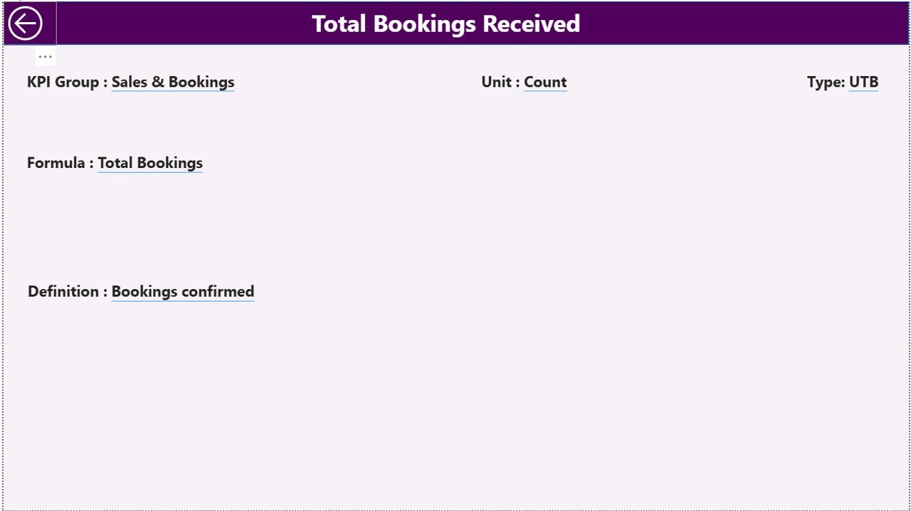
The KPI Definition Page ensures clarity and consistency.
Key Features of the KPI Definition Page
-
Hidden drill-through page
-
Accessible directly from the Summary Page
-
Displays:
-
KPI Formula
-
KPI Definition
-
KPI Unit
-
KPI Type
-
Moreover, users can return to the Summary Page using the Back button on the top-left corner.
How Is Excel Used as the Data Source for This Dashboard?
Excel acts as the backbone of this Power BI dashboard. You only need to update Excel sheets, and Power BI refreshes visuals automatically.
What Is the Input_Actual Sheet?
In the Input_Actual sheet, you enter actual performance values.
Columns to Fill
-
KPI Name
-
Month (use first date of the month)
-
MTD Actual
-
YTD Actual
Because of this structure, Power BI calculates all comparisons accurately.
What Is the Input_Target Sheet?
In the Input_Target sheet, you enter target values.
Columns to Fill
-
KPI Name
-
Month (use first date of the month)
-
MTD Target
-
YTD Target
This separation of actual and target data improves clarity and control.
What Is the KPI Definition Sheet?
The KPI Definition sheet stores KPI metadata.
Required Columns
-
KPI Number
-
KPI Group
-
KPI Name
-
Unit
-
Formula
-
Definition
-
Type (LTB or UTB)
As a result, KPI logic remains transparent and standardized.
Advantages of Destination Management Companies KPI Dashboard in Power BI
A Destination Management Companies KPI Dashboard in Power BI delivers several business benefits.
Key Advantages
-
Centralized performance monitoring
-
Faster and better decision-making
-
Clear visibility into MTD and YTD performance
-
Easy comparison with targets and previous year
-
Reduced manual reporting effort
-
Improved accountability across teams
-
Scalable and customizable dashboard design
Because of these advantages, DMCs move from reactive management to proactive control.
Best Practices for Destination Management Companies KPI Dashboard in Power BI
Click to Purchases Destination Management Companies KPI Dashboard in Power BI
To get maximum value, DMCs should follow proven best practices.
Best Practices You Should Follow
-
Define KPIs clearly before implementation
-
Keep KPI definitions simple and measurable
-
Use consistent units and formulas
-
Update Excel data regularly
-
Validate data before refreshing Power BI
-
Limit the number of KPIs to what truly matters
-
Train teams to interpret dashboard insights
-
Review trends monthly and quarterly
By following these practices, DMCs ensure long-term dashboard success.
How Does This Dashboard Improve Decision-Making for DMCs?
This dashboard transforms raw data into insights.
-
Managers instantly spot underperforming KPIs
-
Teams act quickly to fix operational gaps
-
Leaders align strategy with real performance data
-
Businesses improve service quality and profitability
Therefore, the dashboard becomes a strategic management tool rather than just a reporting solution.
Conclusion: Why Should DMCs Use a KPI Dashboard in Power BI?
A Destination Management Companies KPI Dashboard in Power BI provides clarity, control, and confidence. It replaces manual reports with real-time insights. It connects Excel-based data with powerful visuals. Most importantly, it helps DMCs track performance, improve operations, and achieve business goals consistently.
If you want structured performance management and smarter decisions, this Power BI dashboard delivers exactly that.
Frequently Asked Questions (FAQs)
What is a Destination Management Companies KPI Dashboard in Power BI?
It is an interactive dashboard that tracks and analyzes DMC performance using KPIs, targets, and trend analysis in Power BI.
Do I need advanced Power BI skills to use this dashboard?
No. You only need to update Excel data and refresh Power BI to use the dashboard effectively.
Can I customize KPIs in the dashboard?
Yes. You can add, remove, or modify KPIs by updating the Excel input sheets.
Is Excel mandatory as a data source?
Yes. This dashboard uses Excel as the primary data source for actuals, targets, and KPI definitions.
Can this dashboard handle multiple years of data?
Yes. The dashboard supports current year and previous year comparisons for both MTD and YTD.
How often should I update the data?
You should update data monthly or more frequently, depending on operational needs.
Is this dashboard suitable for small and large DMCs?
Yes. Both small and large Destination Management Companies can scale this dashboard easily.
Visit our YouTube channel to learn step-by-step video tutorials