Civil rights organizations work every day to protect justice, equality, and human dignity. However, passion alone does not drive impact. Data drives impact. Measurement creates clarity. Accountability builds trust.
So, how do you track advocacy campaigns, legal cases, outreach programs, funding performance, and operational efficiency in one structured system?You need a Civil Rights Organizations KPI Dashboard in Excel.This detailed guide will help you understand everything about this ready-to-use Excel dashboard. Moreover, you will learn how to use it effectively, which KPIs to track, why it matters, and how it transforms reporting for boards, donors, and leadership teams.Let’s explore step by step.
Click to buy Civil Rights Organizations KPI Dashboard in Excel
What Is a Civil Rights Organizations KPI Dashboard in Excel?
A Civil Rights Organizations KPI Dashboard in Excel is a structured performance tracking template designed specifically for advocacy groups, nonprofit organizations, human rights foundations, and community justice programs.
Instead of using scattered spreadsheets and manual reports, this dashboard centralizes:
- Advocacy performance metrics
- Case resolution data
- Community outreach numbers
- Donor engagement KPIs
- Policy impact tracking
- Budget vs actual comparisons
As a result, leadership teams gain instant visibility. Moreover, boards receive clear reports. Donors see measurable outcomes. Most importantly, organizations improve strategic decisions.
Because Excel works offline and online, teams can easily customize and scale the dashboard according to their needs.
Why Do Civil Rights Organizations Need a KPI Dashboard?
Civil rights work involves multiple programs, stakeholders, funding sources, and advocacy efforts. Therefore, organizations must measure progress consistently.
Without structured KPI tracking:
- Teams rely on assumptions
- Reports take too much time
- Leadership lacks real-time insights
- Donors question accountability
- Strategic decisions become reactive
However, when organizations use a KPI dashboard:
- They monitor progress monthly
- They compare actual vs target results
- They evaluate year-over-year growth
- They identify gaps early
- They strengthen transparency
Therefore, a KPI Dashboard does not just track numbers. It protects mission integrity.
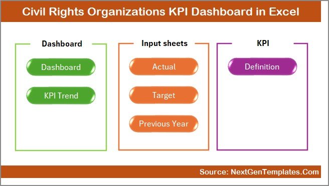
What Are the 7 Worksheets in the Civil Rights Organizations KPI Dashboard in Excel?
This ready-to-use Excel template includes 7 structured worksheets. Each sheet serves a specific purpose.
Let us break them down clearly.
the Summary Page
The Summary Page works as an index sheet.
Here, you will find:
- 6 navigation buttons
- Quick access to all sheets
- Clean interface for easy movement
Because navigation matters, this sheet improves user experience. Instead of scrolling through tabs, users jump instantly to the desired sheet.
Therefore, it saves time and reduces confusion.
Click to buy Civil Rights Organizations KPI Dashboard in Excel
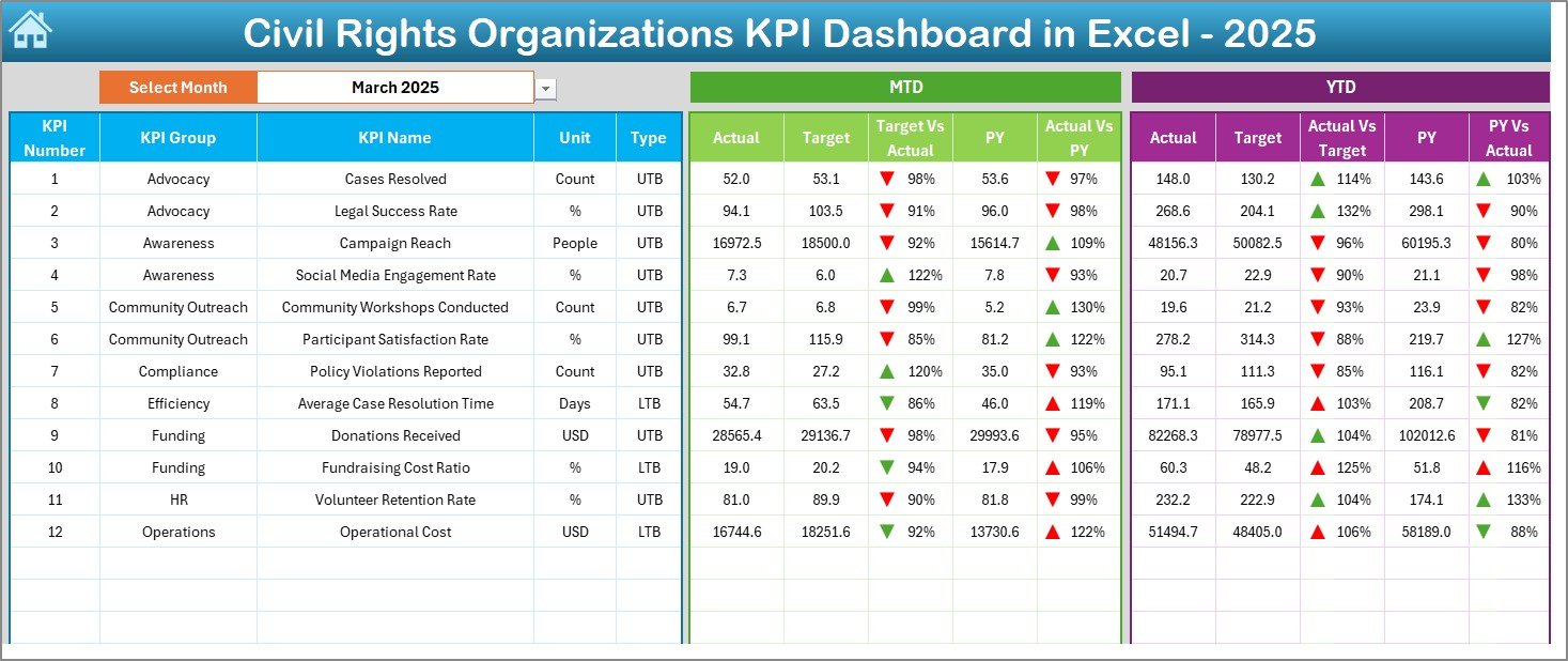
Dashboard Sheet
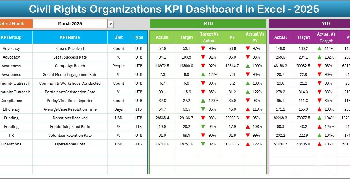
The Dashboard Sheet acts as the heart of the system.
On cell D3, you can select the month from a drop-down. As soon as you change the month, the entire dashboard updates automatically.
What Does It Display?
The dashboard shows:
MTD (Month-To-Date) Metrics
- Actual
- Target
- Previous Year
- Target vs Actual (with up/down arrow)
- PY vs Actual (with conditional formatting arrows)
YTD (Year-To-Date) Metrics
- Actual
- Target
- Previous Year
- Target vs Actual comparison
- PY vs Actual comparison
Because the dashboard uses conditional formatting arrows, users instantly understand performance trends.
If numbers rise positively, you see upward arrows. If performance declines, downward arrows appear. Therefore, leadership reads performance in seconds.
Click to buy Civil Rights Organizations KPI Dashboard in Excel
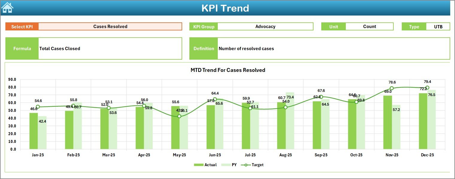
What Happens in the Trend Sheet?
The Trend Sheet focuses on deep analysis.
On cell C3, you select the KPI name from a drop-down list.
Once selected, the sheet displays:
- KPI Group
- KPI Unit
- KPI Type (Lower is Better or Higher is Better)
- KPI Formula
- KPI Definition
Moreover, the sheet shows:
- MTD trend chart (Actual, Target, PY)
- YTD trend chart (Actual, Target, PY)
Therefore, this sheet supports strategic review meetings, board presentations, and donor discussions.
Instead of static reports, you see performance movement across months.
Click to buy Civil Rights Organizations KPI Dashboard in Excel
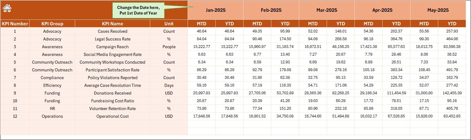
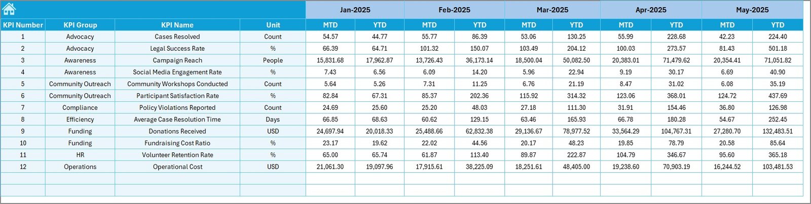
How Does the Actual Numbers Input Sheet Work?
The Actual Numbers Input Sheet captures real data.
On cell E1, you select the first month of the year. After that, you enter:
- MTD values
- YTD values
Because data entry remains centralized, you reduce errors. Moreover, you ensure consistency across reports.
Click to buy Civil Rights Organizations KPI Dashboard in Excel
What Is the Target Sheet Used For?
The Target Sheet stores planned KPI values.
Here, you enter:
- Monthly targets (MTD)
- Cumulative targets (YTD)
Therefore, leadership compares planned goals with actual performance.
Without targets, numbers lack meaning. However, with structured targets, organizations measure accountability.
Click to buy Civil Rights Organizations KPI Dashboard in Excel
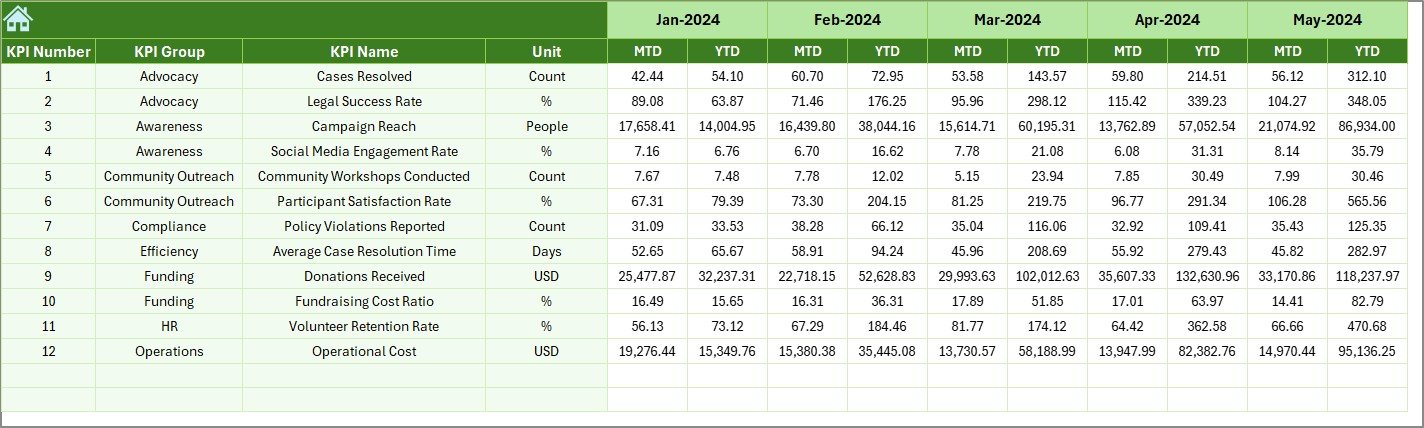
Why Use the Previous Year Numbers Sheet?
The Previous Year Numbers Sheet helps you track growth.
You enter the same KPI values from the previous year. Then, the dashboard automatically compares:
- Current vs Previous Year (MTD)
- Current vs Previous Year (YTD)
Therefore, you measure progress, identify improvement, and present year-over-year growth.
Click to buy Civil Rights Organizations KPI Dashboard in Excel
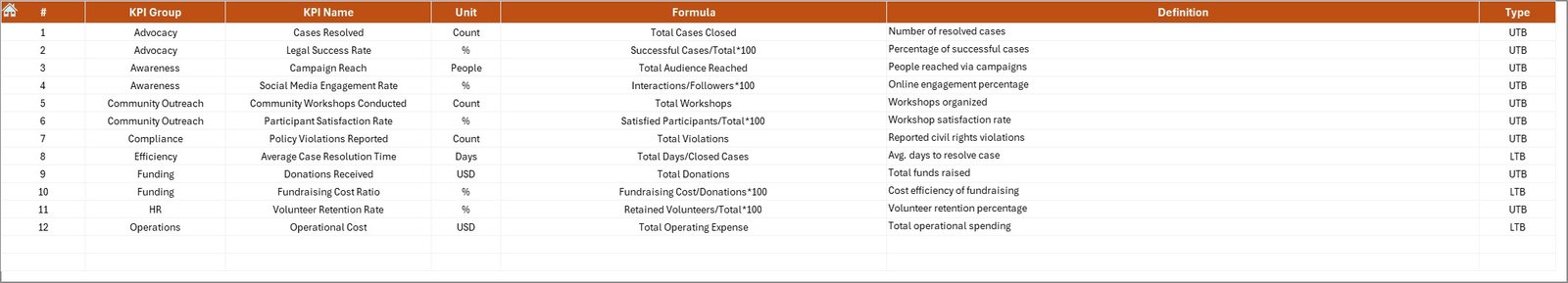
What Is the KPI Definition Sheet?
The KPI Definition Sheet acts as the brain of the system.
Here, you define:
- KPI Name
- KPI Group
- KPI Unit
- KPI Formula
- KPI Definition
Because clear definitions matter, this sheet prevents confusion.
For example:
- “Number of Legal Cases Resolved”
- “Policy Advocacy Success Rate”
- “Community Outreach Participation”
- “Donor Retention Rate”
- “Funding Utilization Efficiency”
When everyone understands the formula, teams align better.
Click to buy Civil Rights Organizations KPI Dashboard in Excel
What KPIs Should Civil Rights Organizations Track?
Although each organization has unique goals, most civil rights groups should monitor these categories:
Advocacy & Legal KPIs
- Number of cases filed
- Cases resolved
- Case success rate
- Average case resolution time
Community Outreach KPIs
- Workshops conducted
- Event attendance
- Volunteer engagement rate
- Community feedback score
Policy Impact KPIs
- Policy proposals submitted
- Legislative wins
- Public awareness campaigns
Financial KPIs
- Donation growth rate
- Budget utilization rate
- Fundraising campaign ROI
- Cost per program
Operational KPIs
- Staff productivity
- Volunteer retention rate
- Administrative expense ratio
Because civil rights work touches multiple areas, KPI tracking must stay comprehensive.
Advantages of Civil Rights Organizations KPI Dashboard in Excel
Now let us explore the key benefits.
Improves Transparency
First, the dashboard creates visibility. Leadership sees real-time numbers. Donors receive measurable results. Boards gain confidence.
Saves Time
Instead of preparing manual reports every month, you update numbers once. Then, the dashboard calculates everything automatically.
Enhances Accountability
When teams see targets clearly, they focus more. Moreover, performance discussions become objective.
Strengthens Strategic Planning
Because you track YTD and PY comparisons, you identify trends early. Therefore, you adjust strategy quickly.
Supports Grant Applications
Data-backed performance improves funding proposals. Funders trust organizations that track impact clearly.
Encourages Data-Driven Culture
Over time, staff members start thinking in metrics. As a result, decisions become smarter and faster.
How to Use the Civil Rights Organizations KPI Dashboard Effectively?
Follow these simple steps:
- Define KPIs clearly in the KPI Definition sheet.
- Enter previous year data.
- Input target numbers.
- Enter monthly actual values.
- Select the month from D3 in the dashboard.
- Analyze MTD and YTD trends.
Because the dashboard updates automatically, you focus on insights rather than calculations.
Best Practices for the Civil Rights Organizations KPI Dashboard in Excel
To maximize value, follow these best practices:
Keep KPI List Focused
Do not track too many KPIs. Instead, select 10–20 high-impact indicators.
Review KPIs Monthly
Schedule monthly review meetings. Analyze variances carefully.
Train Team Members
Ensure everyone understands KPI definitions and formulas.
Update Data Consistently
Enter data at the same time every month.
Use Visual Insights in Reports
Export charts for board presentations and donor updates.
Compare Trends, Not Just Numbers
Look at growth direction. Small monthly improvement leads to large yearly impact.
How Does This Dashboard Improve Board Reporting?
Board members prefer concise data.
Instead of long documents, you present:
- Performance arrows
- Trend charts
- Target vs Actual comparisons
- Year-over-year growth
Therefore, board meetings become productive and focused.
How Does It Help Donor Communication?
Donors want impact.
When you show:
- Case success rate growth
- Community reach increase
- Funding utilization efficiency
- Year-over-year improvements
You build trust.
Consequently, donor retention improves.
Can Small Civil Rights Groups Use This Dashboard?
Absolutely.
Even small organizations can:
- Track volunteer activity
- Monitor event participation
- Measure campaign impact
- Analyze fundraising growth
Because Excel remains accessible, organizations of all sizes can use it easily.
Conclusion
Civil rights organizations fight for justice, equality, and systemic change. However, sustainable impact requires measurement.
The Civil Rights Organizations KPI Dashboard in Excel provides structure, clarity, and accountability. It transforms scattered data into meaningful insights. Moreover, it strengthens leadership decisions, donor trust, and board communication.
If your organization wants to grow responsibly, improve transparency, and measure real impact, this dashboard provides the perfect solution.
Frequently Asked Questions with Answers
What is a Civil Rights Organizations KPI Dashboard in Excel?
It is a ready-to-use Excel template that tracks performance metrics such as advocacy success, outreach numbers, funding growth, and operational efficiency.
How many worksheets does the dashboard include?
The dashboard includes 7 worksheets: Summary, Dashboard, Trend, Actual Input, Target, Previous Year, and KPI Definition.
Can I customize KPIs?
Yes. You can easily modify KPIs in the KPI Definition sheet according to your organization’s goals.
Does the dashboard compare previous year performance?
Yes. It compares current performance with previous year values for both MTD and YTD.
Is this dashboard suitable for nonprofits only?
Although it focuses on civil rights organizations, other nonprofit advocacy groups can also use it.
Do I need advanced Excel skills?
No. Basic Excel knowledge helps. The dashboard performs calculations automatically.
How often should we update the dashboard?
You should update it monthly. However, you can also review quarterly or yearly trends.
Watch the step-by-step video tutorial:
Click to buy Civil Rights Organizations KPI Dashboard in Excel
Visit our YouTube channel to learn step-by-step video tutorials