In today’s competitive SaaS industry, speed matters. However, clarity matters even more. You may build an innovative product, yet without performance tracking, growth slows down. Teams struggle. Leaders guess. Investors question numbers.So, how can SaaS companies track development performance, revenue growth, churn trends, and operational efficiency in one structured system?You need a SaaS Development KPI Dashboard in Power BI.This ready-to-use Power BI dashboard transforms raw Excel data into interactive insights. Moreover, it gives you instant visibility into MTD (Month-To-Date) and YTD (Year-To-Date) performance. As a result, leadership teams make faster and smarter decisions.
In this complete guide, you will learn:
- What a SaaS Development KPI Dashboard in Power BI is
- Why SaaS companies need it
- Detailed explanation of all 3 dashboard pages
- How the Excel data structure works
- Advantages of the dashboard
- Best practices for implementation
- Frequently Asked Questions with answers
Click to buy SaaS Development KPI Dashboard in Power BI
What Is a SaaS Development KPI Dashboard in Power BI?
A SaaS Development KPI Dashboard in Power BI is a ready-to-use performance monitoring solution designed specifically for SaaS companies.
It helps you:
- Track development KPIs
- Monitor subscription metrics
- Compare actual vs target performance
- Analyze MTD and YTD results
- Review previous year comparisons
- Identify underperforming KPIs instantly
Instead of using multiple spreadsheets, you can centralize all data in one structured Power BI file. Furthermore, you can drill down into KPI definitions, compare targets, and monitor trends without manual calculations.
Why Do SaaS Companies Need a KPI Dashboard?
SaaS businesses operate on recurring revenue. Therefore, even small changes in churn rate or customer acquisition cost impact profitability.
However, many SaaS teams face these challenges:
- Scattered Excel reports
- Manual KPI calculations
- No clear comparison against targets
- Limited visibility of development efficiency
- Delayed monthly reporting
As a result, leaders waste time consolidating data.
Instead, a SaaS Development KPI Dashboard solves these issues because it:
- Automates calculations
- Displays KPI status with visual indicators
- Shows comparison with previous year
- Highlights target achievements clearly
Consequently, teams focus more on improvement and less on reporting.
What Are the Key Features of the SaaS Development KPI Dashboard in Power BI?
This dashboard includes 3 powerful pages inside the Power BI desktop file. Each page serves a clear purpose.
Let us break them down one by one.
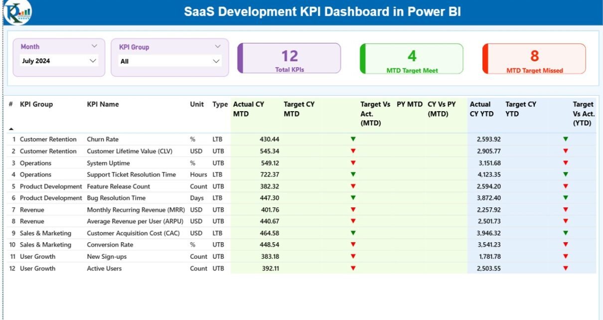
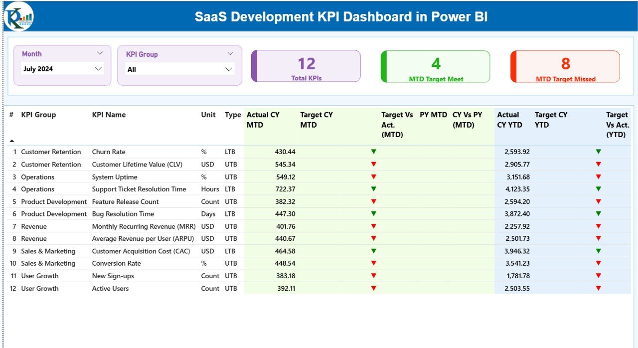
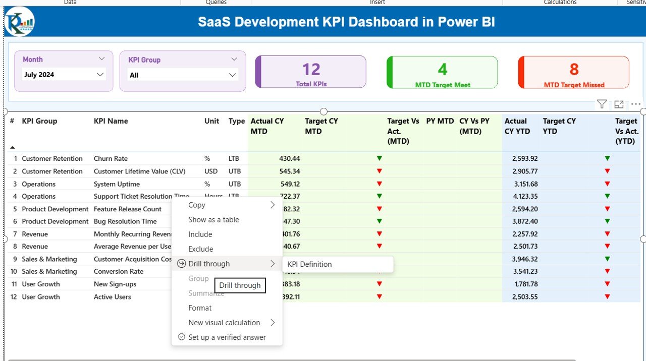
Summary Page
The Summary Page acts as the main control center.
Top Section – Slicers and KPI Cards
At the top, you will find:
- Month Slicer
- KPI Group Slicer
Therefore, you can filter data instantly.
In addition, you will see three KPI cards:
- Total KPIs Count
- MTD Target Meet Count
- MTD Target Missed Count
These cards give you an instant overview of performance.
Detailed KPI Table – What Information Does It Display?
Below the cards, the dashboard displays a detailed KPI table. This table includes:
- KPI Number – Sequence number
- KPI Group – Category of KPI
- KPI Name – Name of KPI
- Unit – Measurement unit
- Type – LTB (Lower the Better) or UTB (Upper the Better)
- Actual CY MTD – Current Year MTD actual value
- Target CY MTD – Current Year MTD target value
- MTD Icon – ▲ or ▼ indicator with color
- Target Vs Act. (MTD) – Actual / Target percentage
- PY MTD – Previous Year MTD value
- CY Vs PY (MTD) – Current vs Previous comparison
- Actual CY YTD
- Target CY YTD
- YTD Icon
- Target Vs Act. (YTD)
- PY YTD
- CY Vs PY (YTD)
Because of these metrics, you can instantly understand performance direction.
For example:
- Green ▲ shows improvement
- Red ▼ shows decline
Therefore, management can react immediately.
Click to buy SaaS Development KPI Dashboard in Power BI
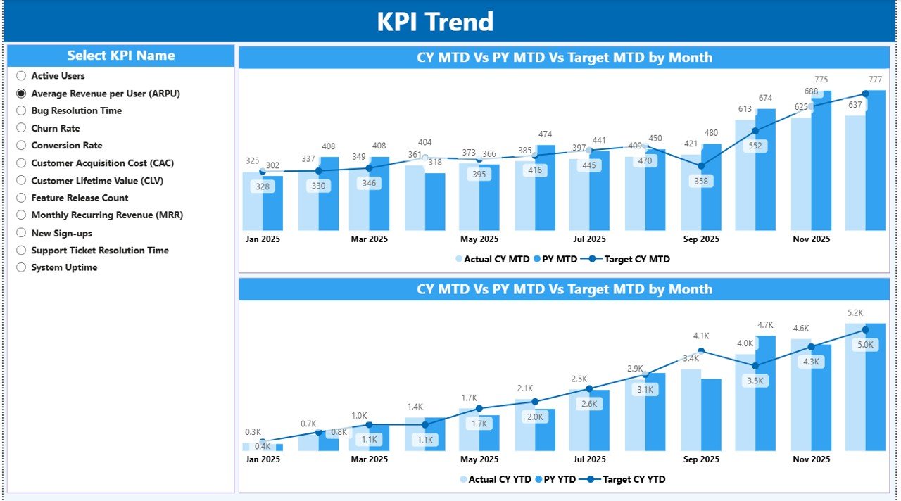
KPI Trend Page
The KPI Trend Page focuses on visual comparison.
Two Powerful Combo Charts
This page displays:
- MTD Actual vs Target vs Previous Year
- YTD Actual vs Target vs Previous Year
As a result, you can analyze:
- Growth trends
- Seasonal impact
- Performance stability
- Target achievement patterns
Moreover, a slicer on the left allows you to select any KPI. Therefore, you can analyze one KPI at a time in depth.
Consequently, teams can identify patterns quickly.
Click to buy SaaS Development KPI Dashboard in Power BI
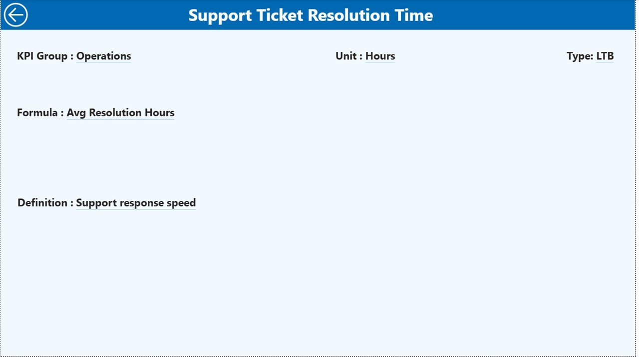
KPI Definition Page
The KPI Definition Page acts as a drill-through page.
Although the page stays hidden, you can access it directly from the Summary page.
This page displays:
- KPI Formula
- KPI Definition
- KPI Group
- KPI Unit
- KPI Type
Therefore, stakeholders can understand the exact meaning of each KPI.
Additionally, a back button on the top left corner helps you return to the Summary page instantly.
Click to buy SaaS Development KPI Dashboard in Power BI
How Does the Excel Data Structure Work?
The dashboard connects to an Excel file. You need to maintain three worksheets.
Input_Actual Sheet
In this sheet, you must fill:
- KPI Name
- Month (First date of month)
- MTD Number
- YTD Number
This sheet stores actual performance data.
Click to buy SaaS Development KPI Dashboard in Power BI
Input_Target Sheet
In this sheet, you must fill:
- KPI Name
- Month (First date of month)
- MTD Target
- YTD Target
This sheet stores target values.
KPI Definition Sheet
Here you must fill:
- KPI Number
- KPI Group
- KPI Name
- Unit
- Formula
- Definition
- Type (LTB or UTB)
Because of this structured format, Power BI reads and calculates everything automatically.
What KPIs Can You Track in a SaaS Development Dashboard?
You can track various SaaS KPIs, such as:
- Monthly Recurring Revenue (MRR)
- Annual Recurring Revenue (ARR)
- Customer Acquisition Cost (CAC)
- Customer Lifetime Value (CLV)
- Churn Rate
- Active Users
- Feature Adoption Rate
- Deployment Frequency
- Bug Resolution Time
- Sprint Velocity
Therefore, you get a full view of both financial and development performance.
Advantages of SaaS Development KPI Dashboard in Power BI
Now let us understand why this dashboard creates real value.
Improves Decision Making
Because it shows live comparisons, leaders make data-driven decisions quickly.
Saves Reporting Time
Instead of manual reporting, you update Excel once. Then Power BI updates instantly.
Enhances Transparency
Teams clearly see target achievements. Therefore, accountability increases.
Tracks Growth Clearly
MTD and YTD comparison highlights short-term and long-term growth.
Identifies Performance Gaps
Red indicators immediately highlight weak areas.
Supports Investor Reporting
Because it provides structured KPIs, you can share clean reports confidently.
Opportunities for Improvement in SaaS KPI Tracking
Although dashboards provide clarity, companies can improve further.
- Standardize KPI definitions across departments
- Align targets with quarterly OKRs
- Review KPI relevance every quarter
- Add automated data integration
- Include predictive forecasting models
Therefore, you ensure continuous improvement.
Best Practices for the SaaS Development KPI Dashboard
To maximize impact, follow these best practices.
Define Clear KPI Ownership
Assign responsibility for each KPI. Therefore, accountability increases.
Update Data Regularly
Enter data monthly without delay.
Align Targets with Strategy
Set realistic targets that match growth goals.
Review Trends Monthly
Do not wait for quarterly review. Analyze trends every month.
Keep KPI Definitions Simple
Ensure everyone understands formulas.
Avoid Tracking Too Many KPIs
Focus on critical metrics that drive growth.
How Does This Dashboard Support SaaS Scaling?
Scaling SaaS requires:
- Stable revenue
- Low churn
- High feature adoption
- Efficient development
Because this dashboard tracks both financial and technical KPIs, it creates a unified view.
As a result:
- Product teams align with revenue goals
- Finance teams understand performance trends
- Leadership gains full visibility
Therefore, growth becomes structured and predictable.
Conclusion
A SaaS company cannot grow on assumptions. It needs clarity, structure, and real-time visibility.
The SaaS Development KPI Dashboard in Power BI delivers exactly that.
It centralizes Excel data. It calculates performance automatically. It highlights trends visually. Moreover, it compares current performance with targets and previous year results.
Because of these features, SaaS companies gain stronger control over growth, development efficiency, and revenue stability.
If you want smarter decisions, faster reporting, and better visibility, this dashboard becomes your strategic advantage.
Frequently Asked Questions (FAQs)
What is a SaaS Development KPI Dashboard?
It is a Power BI dashboard that tracks SaaS performance metrics such as revenue, churn, and development KPIs.
Can I customize KPIs?
Yes. You can edit the KPI Definition sheet in Excel and update KPIs easily.
How often should I update the data?
You should update data monthly using the first date of the month format.
What does LTB and UTB mean?
LTB means Lower the Better.
UTB means Upper the Better.
Does this dashboard support MTD and YTD analysis?
Yes. It shows both Month-To-Date and Year-To-Date comparison with targets and previous year.
Do I need advanced Power BI skills to use it?
No. You only need to update Excel sheets. Power BI handles calculations automatically.
Can investors use this dashboard?
Yes. It provides structured and professional KPI reporting suitable for stakeholders.
Click to buy SaaS Development KPI Dashboard in Power BI
Visit our YouTube channel to learn step-by-step video tutorials